Using Tile Wizard
Tile Wizard provides a user-friendly, browser-based graphical user interface that leads you through the steps involved in creating and publishing a tile. Portal administrators and nontechnical users can use Tile Wizard to integrate and transform data from a variety of data sources.
During the tile creation process, Tile Wizard presents a series of numbered steps. Each step appears in a numbered path at the top of the page to indicate where you are in the tile creation process as shown in the following example:
This labeled path assists you in navigating forward and back through the steps in the wizard, which enables you to review or edit tile definition values. Once you’ve completed a step, Tile Wizard automatically takes you to the next appropriate step.
Tile Wizard leads you through the following steps that are typically used to create a tile:
Specify tile information.
Select the data source (and specify data source parameters when applicable).
Select the target page and tile repository location.
Specify display properties.
Review and publish the tile definition.
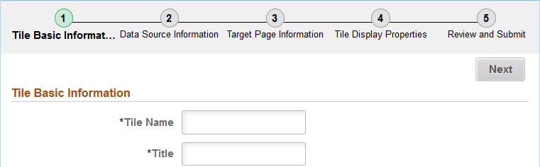
Use the Tile Basic Information page to specify the ID and title for the tile.
Navigation:
.
Click the:
Create a new Tile button to create a new tile definition.
Edit button for an existing tile to edit the definition.
This example illustrates the fields and controls on the Tile Basic Information page. You can find definitions for the fields and controls later on this page.
Field or Control |
Description |
|---|---|
Tile Name |
Enter an ID for the tile definition. Each tile that you build with Tile Wizard must have a unique ID. |
Title |
Enter a descriptive title for the tile. |
Tile Wizard supports the following data types:
Field or Control |
Description |
|---|---|
Application classes |
Use the application class data type to specify a custom application class that implements the PTGP_APPCLASS_TILE:Tiles:Tile base class and one of its required SetTileContentAs methods to show charts, HTML, key performance indicators (KPIs), or images as tile content. |
Free text |
Use the free text data type to present free-form HTML or simple text in a tile. |
Images |
Use the image data type to create an image-only tile for an existing content reference. |
Navigation collections |
Use the navigation collections data type to select an existing navigation collection to be displayed as a “fluid navigation collection” in an activity guide or in the NavBar. |
OBIEE (Oracle Business Intelligence Enterprise Edition) |
Use the OBIEE data type to select an existing OBIEE report or dashboard from the OBIEE server as the data source for the tile. |
PeopleSoft queries and SQL definitions |
Use the PSQuery/SQL data type to select PeopleSoft queries, stored SQL statements, or a combination to specify the data displayed on the tile. Note: If data masking for personally identifiable information or other sensitive data has been enabled on a record field that is part of the criteria for the PeopleSoft query, then these data values are masked when displayed via Tile Wizard tiles. |
Pivot grids |
Use the pivot grid data type to select existing pivot grid instances, which use interactive pivot tables and charts that display application data that you can filter and pivot across multiple dimensions. |
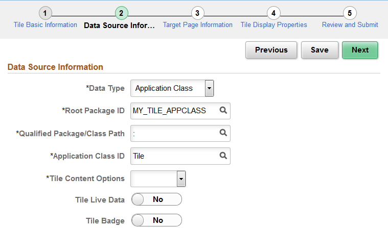
Use the Data Source Information page for the Application Class data type to specify which application class data source.
Navigation:
On the Tile Basic Information page, click the Next button.
Select the Application Class data type.
This example illustrates the fields and controls on the Data Source Information page for the Application Class data type. You can find definitions for the fields and controls later on this page.
Field or Control |
Description |
|---|---|
Root Package ID |
Select a custom application package that includes the class that implements the PTGP_APPCLASS_TILE:Tiles:Tile base class and one of its required SetTileContentAs methods. |
Qualified Package/Class Path |
Select the package name or package path to the implemented class. |
Application Class ID |
Select the class that implements the required getTileLiveData method. |
Tile Content Options |
Select the tile content type:
Note: This setting can be overridden in the getTileLiveData method. |
Tile Live Data |
Select this option to indicate whether the tile displays the live data region. Note: This setting can be overridden in the getTileLiveData method. |
Tile Badge |
Select this option to indicate whether the tile displays the badge region. Note: This setting can be overridden in the getTileLiveData method. |
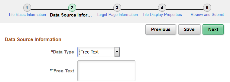
Use the Data Source Information page for the Free Text data type to enter free text as the data source.
Navigation:
On the Tile Basic Information page, click the Next button.
Select the Free Text data type.
This example illustrates the fields and controls on the Data Source Information page for the Free Text data type. You can find definitions for the fields and controls later on this page.
Field or Control |
Description |
|---|---|
Free Text |
Use the free text data type to present free-form HTML or simple text in a tile. You can use the following HTML tags only: <h1>, <h2>, <h3>, <h4>, <h5>, <h6>, <br>, <p>, <b>, <i>, and <img>. Within the <img> tag, src, width, height, and alt are allowable attributes. Use the %Image meta-HTML element to identify an image to include within the HTML: Note: For translatable text in the free text data type, use %Message(message_set,message_num) MetaHTML for the text content. |
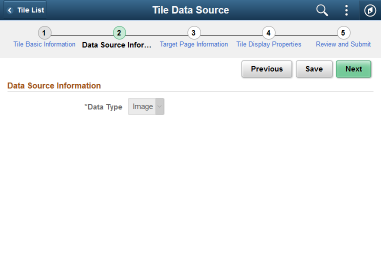
Use the Data Source Information page to select Image as the data type.
Navigation:
On the Tile Basic Information page, click the Next button.
Select the Image data type.
This example illustrates the fields and controls on the Data Source Information page for the Image data type. You can find definitions for the fields and controls later on this page.
Field or Control |
Description |
|---|---|
Image |
Use the image data type to create an image-only tile for an existing content reference. |
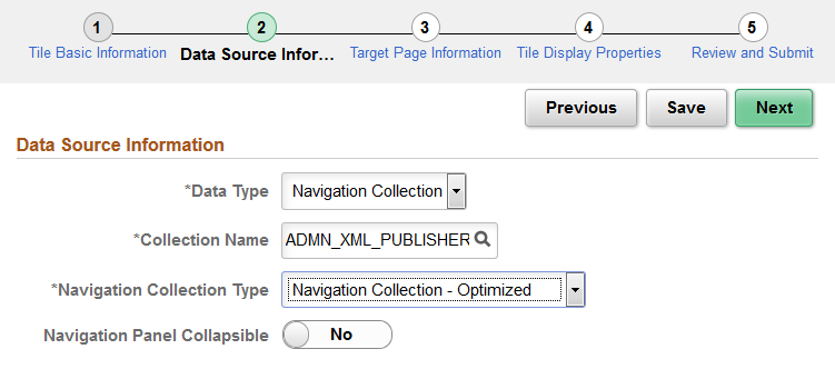
Use the Data Source Information page for the Navigation Collection data type to specify which navigation collection data source is to be displayed as a “fluid navigation collection.”
Navigation:
On the Tile Basic Information page, click the Next button.
Select the Navigation Collection data type.
This example illustrates the fields and controls on the Data Source Information page for the Navigation Collection data type. You can find definitions for the fields and controls later on this page.
Field or Control |
Description |
|---|---|
Collection Name |
Select the navigation collection. |
Navigation Collection Type |
Select the manner in which the navigation collection content will be displayed when a user clicks on the tile:
|
Navigation Panel Collapsible |
Select Yes to present the left panel as collapsible for all users. Otherwise, the left panel only becomes collapsible when the browser width falls below a threshold. Note: This field is displayed only when Navigation Collection Optimized is selected. |
Fluid navigation collections
support additional URL parameters that cannot be set in Tile Wizard—specifically, &JumpPage, &NewWindow, and &AgInHistory. See Manually Creating Tile Definitions to Launch Fluid Navigation Collections for information on how to modify the content reference definition
to include additional URL parameters.
Use the Data Source Information page for the OBIEE data type to specify which OBIEE report or OBIEE dashboard data source.
Navigation:
On the Tile Basic Information page, click the Next button.
Select the OBIEE data type.
This example illustrates the fields and controls on the Data Source Information page for the OBIEE data type. You can find definitions for the fields and controls later on this page.
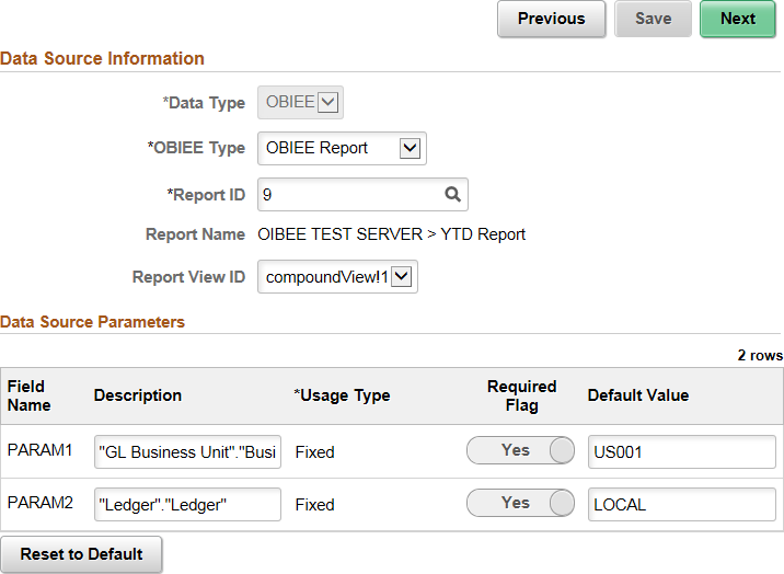
Data Source Information
Field or Control |
Description |
|---|---|
OBIEE Type |
Select either:
|
Report ID |
Select the ID of the report or dashboard that you want to be the data source. Only reports or dashboards that have been loaded into the PeopleSoft system appear in this list. |
Report Name |
This field displays the OBIEE server name and the report name. This field is display-only. |
Report View ID |
For OBIEE reports only, select the view or report type as created in the OBIEE application. |
Data Source Parameters
Tile Wizard analyzes the selected OBIEE data source and generates the list of parameters shown in this step. You cannot add to the list of parameters.
Field or Control |
Description |
|---|---|
Description |
Displays a description of the parameter. |
Usage Type |
All data source parameters are Fixed, meaning the data source parameter cannot be modified by users of the tile. |
Required |
Select to require a value for the parameter. |
Default Value |
Enter the parameter value that the system uses by default. |
Reset to Default |
Click to set all values on this page to the default values specified by the data source API. |
Use the Data Source Information page for the PSQuery/SQL data type to specify which PeopleSoft queries, stored SQL statements, or a combination to specify the data displayed on the tile.
Navigation:
On the Tile Basic Information page, click the Next button.
Select the PSQuery/SQL data type.
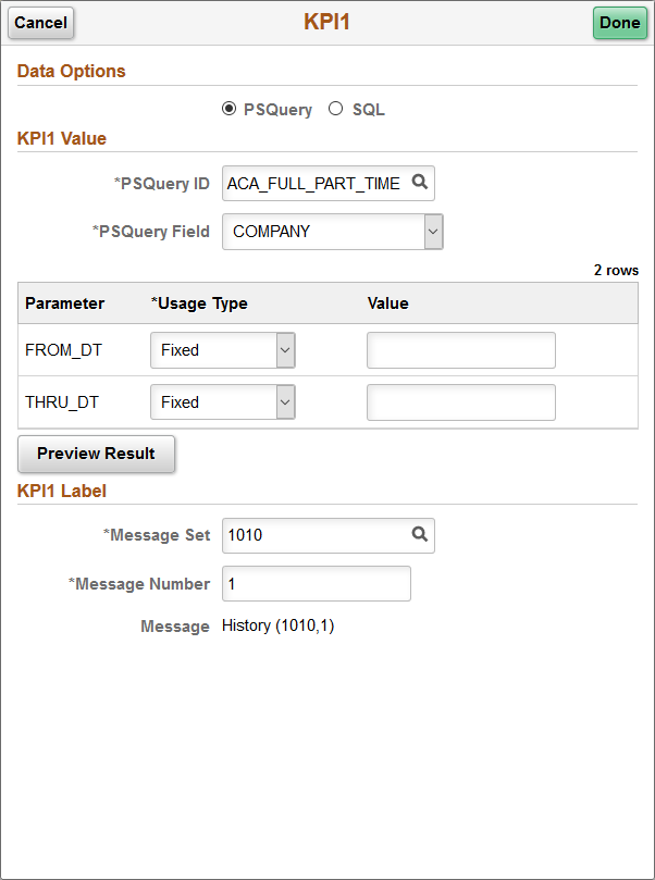
This example illustrates the fields and controls on the Data Source Information page for the PSQuery/SQL data type. In this example, settings for KP1 have already been selected. You can find definitions for the fields and controls later on this page.
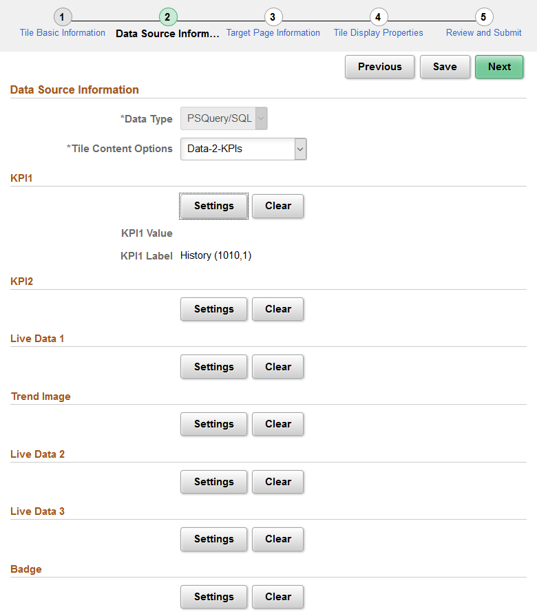
The PSQuery/SQL data type provides an interface for using a PeopleTools-delivered implementation of the PTGP_APPCLASS_TILE:Tiles:Tile base class that allows you to select one or more PeopleSoft queries, SQL definitions, and Message Catalog entries to provide the data and text to display on the face of a tile. Using this data type does not require you to write or understand PeopleCode. However, you do need to understand the elements that can be displayed on a tile (for example, key performance indicators (KPIs), live data, badge data, and so on), the data types for these elements, and where these elements are displayed. See Understanding Application Class Tile Content for more information.
When selecting PeopleSoft queries, SQL definitions, and Message Catalog entries to configure a tile, note the following limitations:
Regardless of the number rows and columns of data returned by a query or SQL, only the first row is used.
Only Message Catalog entries that do not use bind variables can be used.
Note: If data masking for personally identifiable information or other sensitive data has been enabled on a record field that is part of the criteria for the PeopleSoft query, then these data values are masked when displayed via Tile Wizard tiles.
Field or Control |
Description |
|---|---|
Tile Content Options |
Select one of the following:
|
Settings |
Click the Settings button to configure the values for an element. |
Clear |
Click the Clear button to clear the values for an element. |
Configuring Settings
Click the Settings button to configure the values for an element.
The following example illustrates the settings page for the KPI1 element using a PeopleSoft query as the data source.
Field or Control |
Description |
|---|---|
Data Options |
Select either PSQuery or SQL. |
PSQuery ID |
When PSQuery has been selected as the data option, select the PeopleSoft query. |
PSQuery Field |
When PSQuery has been selected as the data option, select the column from the PeopleSoft query to return the data value. |
SQL ID |
When SQL has been selected as the data option, select the SQL definition. |
SQL Field |
When SQL has been selected as the data option, select the column from the SQL to return the data value. |
Parameter |
Displays input parameters as is appropriate for the selected query. |
Message SetMessage Number |
Select a message set and number to return a label for the data value. |
Use the Data Source Information page for the Pivot Grid data type to specify which pivot grid data source.
Navigation:
On the Tile Basic Information page, click the Next button.
Select the Pivot Grid data type.
This example illustrates the fields and controls on the Data Source Information page for the Pivot Grid data type. You can find definitions for the fields and controls later on this page.
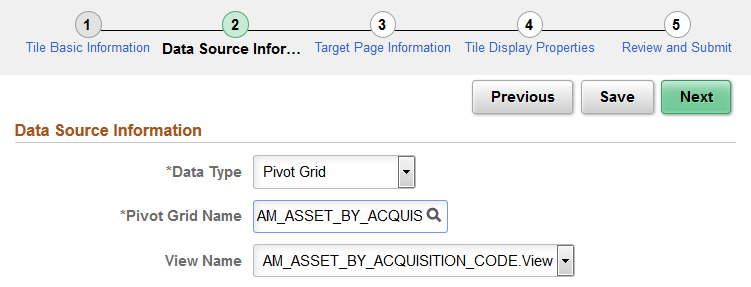
Data Source Information
Field or Control |
Description |
|---|---|
Pivot Grid Name |
Select the pivot grid that you want the tile to display. |
View Name |
The view name is generated and selected automatically by the system. |
Use the Target Page Information page to select the target page and specify certain attributes of the tile’s content reference definition.
Navigation:
On the Data Source Information page, click the Next button.
This example illustrates the fields and controls on the Target Page Information page. You can find definitions for the fields and controls later on this page.
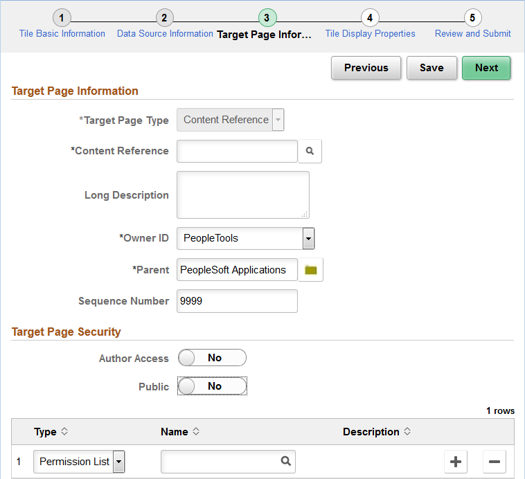
Target Page Information
Field or Control |
Description |
|---|---|
Target Page Type |
Select from the following options:
|
Content Reference |
When Content Reference is selected as the target page type, select an existing content reference from the portal registry on the Select CRef page. |
Target Page Name |
When either OBIEE Report or Pivot Grid Viewer is selected as the target page type, the value in this field is generated automatically. Note: When the field is editable, you can modify this to any unique name. |
Long Description |
Enter a description for the content reference (or content reference link) definition to be created. |
Owner ID |
Select an owner ID for the content reference (or content reference link) definition to be created. |
Parent |
Select a folder in the tile repository for the content reference (or content reference link) definition to be created. |
Sequence Number |
Enter a sequence number for the content reference (or content reference link) definition to be created. |
Target Page Security
Note: For a content reference link, security is defined on the target content reference. The fields displayed are read-only.
Field or Control |
Description |
|---|---|
Public |
Select whether to allow public or selected security access:
|
Author Access |
Select Yes to provide the tile author with access to the target page regardless of any security restrictions assigned to the tile. This access is granted based on the author’s user ID. |
Type |
Select the type of security to assign to the target page definition. Options are:
|
Name |
Select the name of the permission list or role to which to authorize access to the tile. |
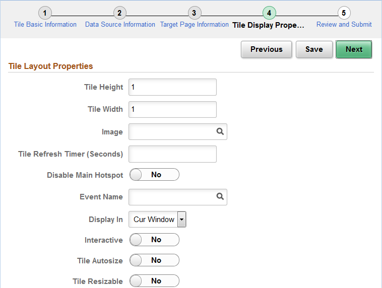
Use the Tile Layout Properties page to specify the fluid attributes of the tile definition.
Navigation:
On the Target Page Information page, click the Next button.
This example illustrates the fields and controls on the Tile Layout Properties page. You can find definitions for the fields and controls later on this page.
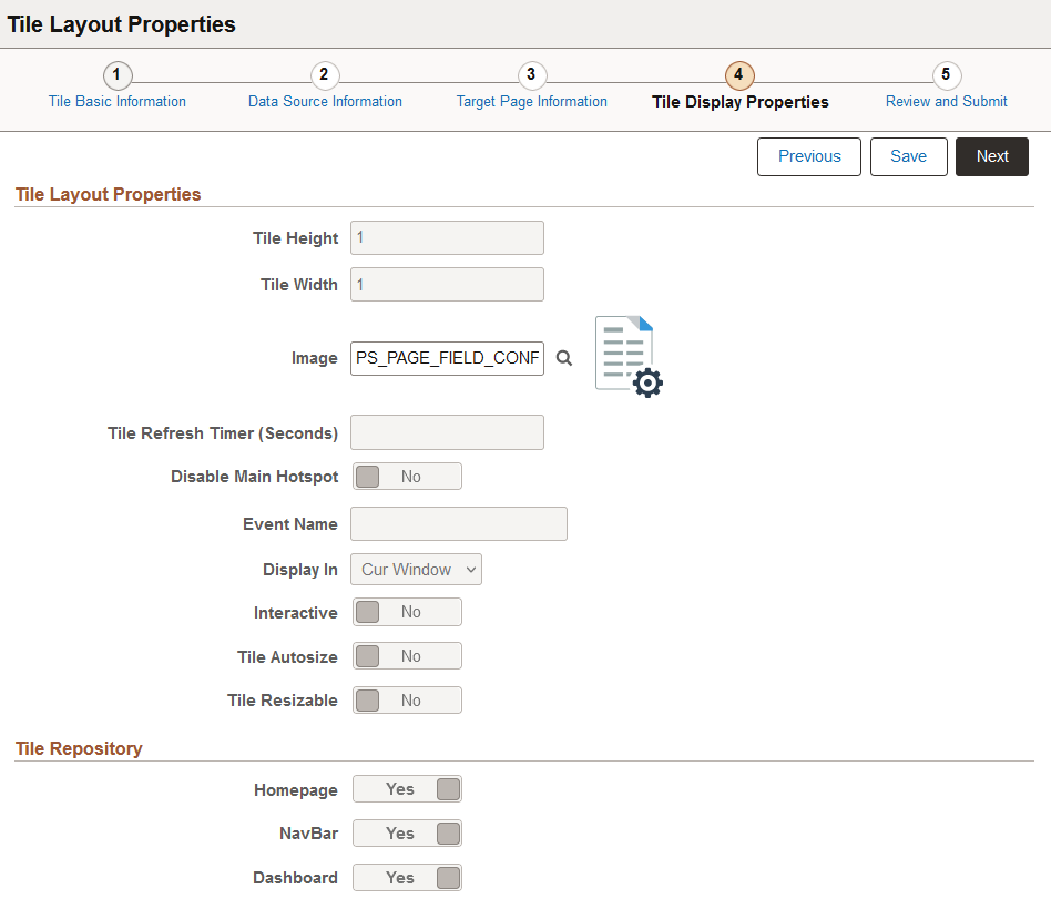
Tile Layout Properties
Field or Control |
Description |
|---|---|
Tile Height |
Set the height of the tile. The default dimensions of a tile are 1 tile unit by 1 tile unit. Tiles up to 8x8 are supported. Note the following conditions and limitations with respect to the height and width of a tile:
See the information on the Fluid Attribute page tab for more information including for a table of tile widths and heights from 1 to 8. |
Tile Width |
Set the width of the tile. |
Image |
Click the Image lookup button to display the Browse Image Catalog page, which allows you to select an image (in SVG format only) from the database to display a custom static image as the fluid content. Otherwise the default image is displayed. See the following section, "Using the Browse Image Catalog Page" for more information. Note: When dynamic content is also configured for a tile, this static image is displayed only until the dynamic content is loaded. |
Tile Refresh Timer (Seconds) |
Enter the time in seconds to set an automatic refresh period for dynamic content on a tile. When the timer limit has been reached, the system re-draws the tile so that it displays the current data, such as in the case with chart. The default value of 0 disables any automatic refresh. Note: The system enforces a 10 second minimum limit. Any value entered less than 10 seconds is ignored and is treated as 10 seconds. When setting this value, be sure to monitor performance of the page refreshes and adjust accordingly. Note: When an event name is selected, this field is disabled. |
Disable Main Hotspot |
Select this option to allow links that are displayed dynamically within the tile to be available and usable. Selecting this option disables clicking the tile to display the target content defined for the tile. |
Event Name |
Select the event name to subscribe to a push notification event defined on the server. Subscribing to an event allows the tile content to be updated by the event. See Understanding the Push Notification Framework and Defining Eventsfor more information on defining push notification events. |
Display In |
Control how the target transaction or content appears once a user taps the tile. Options are:
|
Modal Parameters |
Enter custom modal options. See Modal Options for more information. |
Interactive |
Select this option to display the fluid content as interactive, which allows users to enter data or click buttons within the fluid content. Since interactive fluid content require more resources than non-interactive ones, select this option only as needed. Note: The Interactive option is disabled for pivot grid tiles and OBIEE tiles. |
Tile Autosize |
Select this option to allow the fluid content to dynamically resize itself based on the size of the content. Note the following conditions and limitations with respect to the autosize option:
|
Tile Resizable |
Select this option to allow the tile to be redisplayed at the specified alternate dimensions. Note the following conditions and limitations with respect to the resizable option:
|
Alternate Height |
Set the alternate height for a resizable tile. |
Alternate Width |
Set the alternate width for a resizable tile. |
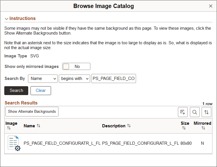
Using the Browse Image Catalog Page
Use the Browse Image Catalog page to select an SVG from the database to display a custom static image as the fluid content.
This example illustrates the fields and controls on the Browse Image Catalog page.
|
Field or Control |
Description |
|---|---|
|
Image Type |
SVG is selected by default and cannot be changed. |
|
Show only mirrored images |
Select Yes to only retrieve images that are mirrored. Otherwise, both mirrored and unmirrored images are retrieved. |
|
Search By |
Select Name or Description and additional search criteria to limit the search results. |
|
Search |
Click the Search button to retrieve the images meeting the search criteria from the database. |
|
Clear |
Click the Clear button to clear both the search criteria and the grid. |
|
Show Alternate Backgrounds |
Click the Show Alternate Backgrounds button to redisplay each image in the current grid on three background colors: white, gray, and black. This option allows you to view white images, which are not visible on the default white background. In this example, the white check mark is visible on the gray and black backgrounds:
|

Select an image in the grid to use it as the custom static image.
Tile Repository
Field or Control |
Description |
|---|---|
Homepage |
Select this option to allow the definition to be listed when the Add Tile dialog box is accessed from fluid homepages. |
Dashboard |
Select this option to allow the definition to be listed when the Add Tile dialog box is accessed from fluid dashboards. |
NavBar |
Select this option to allow the definition to be listed when the Add Tile dialog box is accessed from the NavBar. |
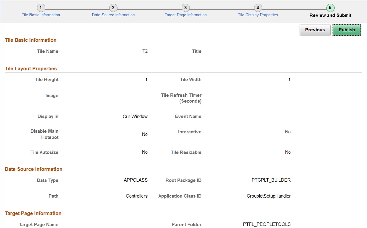
Use the Review and Submit page to review and publish the tile definition.
Navigation:
On the Tile Display Properties page, click the Next button.
This example illustrates the fields and controls on the Review and Submit page. You can find definitions for the fields and controls later on this page.
Field or Control |
Description |
|---|---|
Publish |
Click the Publish button to initially publish the tile definition. Note: After the tile definition has been published, subsequent modifications can be saved by clicking the Save button on any Tile Wizard page when the Save button is displayed and is active. However, you must click the Publish button and re-publish the changes to update the behavior of the tile. |
Use the Tile List page to review, edit, or delete existing tile definitions that have been created with Tile Wizard.
Note: While the tile repository may contain additional tile definitions, only those created through Tile Wizard are listed here.
Navigation:
This example illustrates the fields and controls on the Tile List page. You can find definitions for the fields and controls later on this page.
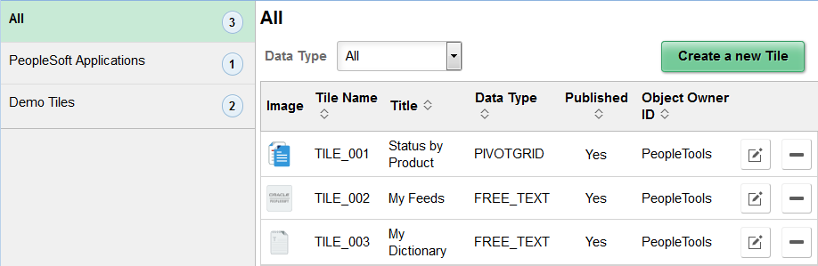
Use the categories in the left panel to filter the tiles displayed in the tile list.
Note: The left panel is collapsible depending on the width of the device used to access the page.
Field or Control |
Description |
|---|---|
Data Type |
Select a data type to filter the tiles displayed in the tile list. |
Create a new Tile |
Click this button to create access Tile Wizard to create a new tile definition. |
Edit |
Click the Edit button to edit an existing tile definition. Note: Alternatively, click anywhere in the row (except on the Delete button) to edit an existing definition. |
Delete |
Click the Delete button to delete an existing tile definition. |
Add to Project |
Click the Add to Project button to access the Add To Project page to insert one or more tile definitions into an ADS project. See Adding Data Set Instances from Object Designer Pages for more information. |