Creating and Maintaining Activity Guide Templates
This section discusses how to create and maintain activity guide templates.
Note: See the “Terminology” section for definitions of terms including optimized, non-optimized, activity guide-optimized fluid components, and others.
Guidelines for All Activity Guide Types
All fluid components must adhere to the following guidelines to be used in an activity guide template of any type (optimized or non-optimized):
-
The fluid component must be defined as a Standard fluid component.
Important! A fluid wrapper component (that is, another fluid activity guide, a master/detail component, or fluid navigation collection) can never be included as target content inside a fluid activity guide.
Typically, for each page defined within the fluid component, the outermost group box must include the ps_apps_content style or another styling appropriate to the page design.
-
The fluid component must have the search page type set to None to be included in a fluid activity guide. Otherwise, if the search page type is set to Standard or Master/Detail, the fluid component cannot be included in a fluid activity guide.
Unless AJAX transfers are enabled on the activity guide, the fluid component should not perform a transfer to another component. This includes transfers via a hyperlink, a push button, a PeopleCode program, or transfers from the left panel. Such transfers will result in the user exiting that activity guide instance in an invalid manner. See AJAX Transfers for more information.
The activity guide instance maintains the fluid banner and the visibility of items in the banner.
Direct manipulation of the fluid banner via PeopleCode (to set the page title, for example) will result in a PeopleCode error. Therefore, use the PT_PAGE_UTILS:Banner application class to indirectly attempt to manipulate the fluid banner. When used, the methods and properties of PT_PAGE_UTILS:Banner are ignored and have no effect if the component is rendered in a context that does not allow access to the fluid banner and Actions menu such as in an activity guide instance. See Banner Class Methods for more information.
In addition, pages in the fluid component cannot include an “application header”—that is, the use of any of the Custom Header group box types (Left, Right, Middle, or Bottom) is not allowed.
Nevertheless, custom Actions menu items can be defined using the Custom Action Menu group box type.
If the fluid component includes a page definition for a Header page type, this page definition will be ignored and not displayed within an activity guide instance.
Additional Guidelines for Optimized Activity Guide Types
The following additional guidelines and limitations apply to “activity guide-optimized fluid components”:
-
If the target content is a fluid component that employs an internal two-panel construct (that is, it either includes a Side Page 1 page, was built from the PeopleTools 8.54 PSL_TWOPANEL layout page, or was designed with an internal left panel similar to PSL_TWOPANEL), you must enable left panel collision handling with the slide-out left panel on the activity guide. See Left Panel Collision Handling with Slide-out Left Panels for more information.
For each page defined within the component, include a group box of type Page Title that is defined to be visible when the page is rendered within an activity guide context. Depending on the implementation, the activity guide itself might control the title displayed by this group box. To hide this page title if the page is rendered outside of an activity guide instance, use the psc_hideinmode-notag style.
To maintain a clear and consistent user experience, Oracle recommends that the fluid component not include a page definition for a Footer Page type.
To use a multi-page fluid component in an optimized activity guide, you can do one of the following to maintain a clear and consistent user experience:
Re-parent the page tabs to a group box of type Page Tab that is included on each page definition.
Include PT_SIDE_PAGETABS in the component definition to re-parent the page tabs to the left panel. You must also enable left panel collision handling with the slide-out left panel on the activity guide. See Left Panel Collision Handling with Slide-out Left Panels for more information.
Hide the page tabs. You can do so in the component definition by deselecting the Display Folder Tabs (top) on the Internet tab. Alternatively, you can use delivered styles to hide the page tabs.
Activity guide templates provide a mechanism for defining the properties, security, action items, contextual data, and other options for activity guides once. Then, individual activity guide instances can be generated from these reusable templates. Once an activity guide has been instantiated from a template, the instance cannot be associated with a different template. In addition, while the activity guide template can be modified, any active or inactive instances already generated from that template will not be altered by the modifications.
Typically, activity guide properties, security, advanced options, and other attributes are created and maintained at the activity guide template level only. However, you can also maintain these attributes within activity guide instances; the same pages with the same fields are used in both cases. While the examples in this section illustrate creating and maintaining these attributes within an activity guide template, these examples could apply equally to activity guide instances.
Terminology
The following terms are used to differentiate the types of activity guides that can be created, and the types of processes these activity guides support:
Term |
Definition |
|---|---|
Optimized |
Optimized activity guides support only activity guide-optimized fluid components as well as classic components. This allows an optimized activity guide to control the use and display of the left panel. Non-optimized activity guides support any fluid components that adhere to the guidelines noted previously as well as classic components. Instead of presenting the action items in the left panel, a non-optimized activity guide presents a vertical drop-down list in the fluid banner (or header) or uses an activity guide pagelet for classic activity guides. |
Activity guide-optimized fluid components |
An activity guide-optimized fluid component adheres to the guidelines for all fluid components as well as the additional guidelines for optimized activity guide types. |
Sequential |
In a sequential activity guide, action items are numbered and must be completed in the specified order. With non-sequential activity guides, action items are not numbered and can be completed in any order unless dependencies are defined. Note: Auto-save is enabled for sequential activity guides automatically. However, each fluid component used on a step should implement a standard PeopleTools save processing mechanism—for example, a Save button with the toolbar action set to Save on the page field properties. |
Guided |
Guided activity guides include Next and Previous in the activity guide subbanner. Non-guided activity guides do not include any navigation buttons; in addition, non-guided activity guides display the standard fluid banner. |
Activity guide subbanner |
The activity guide subbanner displays Next and Previous navigation buttons, as well as any custom action buttons defined for the activity guide. |
Simple |
Simple activity guides support a simple hierarchy with only one level of action items. Otherwise, activity guides can support up to two levels of action items: summary and detail. |
Single unit of work (SUOW) |
Certain activity guide types can be defined as a single unit of work spanning multiple components in the same system. No data is committed until a submit is performed at the final step; if the user exits the activity guide before the submit, all changes are rolled back. All SUOW activity guides are sequential; moreover, data dependencies can be configured between action items using input/output parameters. |
Single component |
Certain activity guide types can be defined as single component, which allows different pages from the same component to be displayed as separate steps within the activity guide. Similar to a SUOW activity guide, no data is committed until a submit is performed at the final step; if the user exits the activity guide before the submit, all changes are lost. However, unlike a SUOW activity guide, a Save button can be configured to perform a save at any step. |
Note the following differences between single unit of work and single component activity guides along with important limitations:
|
Single Unit of Work |
Single Component |
|---|---|
|
Each action item (step) is a separate component. |
Each action item (step) is a page from the same component. |
|
Supported only in optimized guided sequential activity guide types. Important! Although optimized activity guide types also support classic components, classic components are not supported in SUOW activity guides. |
Supported in optimized guided sequential or non-sequential activity guide types. Important! Although optimized activity guide types also support classic components, classic components are not supported in single component activity guides. |
|
Executes component PeopleCode events such as PreBuild and PostBuild for each component. |
Executes component PeopleCode events such as PreBuild and PostBuild once only. |
|
Auto-save is enabled for SUOW activity guides automatically. SaveEdit PeopleCode is triggered for every action item after a user clicks the Next button or navigates to any other action item. Important! Components included in this activity guide must never invoke the DoSave or DoSaveNow built-in PeopleCode functions. Note: Any push button configured with the Save action type is automatically hidden. |
Auto-save is not enabled for single component activity guides. SaveEdit PeopleCode is triggered only once after a submit configured on the last step of the component. To perform validation at a specific action item, override the behavior of the default Next or Previous buttons. |
|
Does not support components from multiple PeopleSoft applications—that is, all the components have to be defined on the same local PeopleSoft application in which the activity guide is defined. |
NA |
Template Process Types
When an activity guide template is defined, you select one of seven process types for the template and its instances. The following table summarizes the features available with each activity guide type. Note the following regarding the columns in this table:
Opt Fl: Activity guide-optimized fluid components (that comply with the guidelines listed previously).
Fluid: Any standard fluid components (that comply with the guidelines listed previously).
Classic: Any classic components.
S/D: Summary-detail action items.
SUOW: Single unit of work.
1 Comp: Single component.
Note: Except for the one type labeled horizontal, all other activity guides present the list of action items in one type of vertical format or another.
|
Activity Guide Template Type |
Opt Fl |
Fluid |
Classic |
S/D |
SUOW |
1 Comp |
|---|---|---|---|---|---|---|
|
Horizontal optimized guided sequential
|
Y |
N |
Y |
N |
Y1 |
Y1 |
|
Optimized guided sequential
|
Y |
N |
Y |
Y |
Y1 |
Y1 |
|
Optimized guided non-sequential
|
Y |
N |
Y |
Y |
N |
Y1 |
|
Optimized non-guided non-sequential
|
Y |
N |
Y |
Y |
N |
N |
|
Non-optimized guided sequential
|
Y |
Y |
Y |
Y |
N |
N |
|
Non-optimized guided non-sequential
|
Y |
Y |
Y |
Y |
N |
N |
|
Non-optimized non-guided non-sequential
|
Y |
Y |
Y |
Y |
N |
N |
Note:
1 Classic components are not supported in SUOW or single component activity guides.
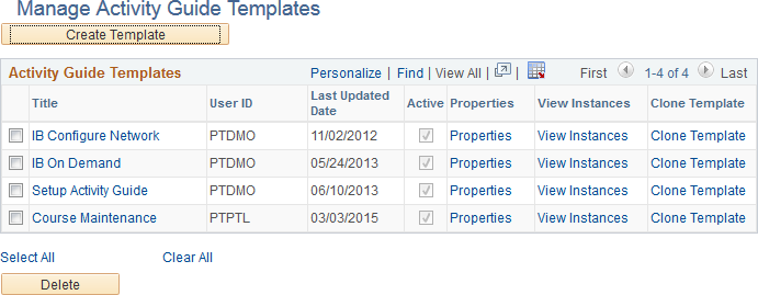
Use the Manage Activity Guide Templates page to manage the activity guide templates.
Navigation:
This example illustrates the fields and controls on the Manage Activity Guide Templates page. You can find definitions for the fields and controls later on this page.
Field or Control |
Description |
|---|---|
Create Template |
Click the Create Template button to create a new activity guide template. After you specify the activity guide template type (and data type), the new activity guide template is displayed in the Setup Activity Guide WorkCenter. |
Title |
Click a title link to manage the action items for this template. Clicking this button opens Setup Activity Guide WorkCenter with the Configure Action Items step selected. |
Properties |
Click the Properties link to manage the properties for this template. Clicking this button opens Setup Activity Guide WorkCenter with the Template Properties step selected. |
View Instances |
Click the View Instances link to view the Manage Activity Guide Instances page displaying all instances created from this template. |
Clone Template |
Click the Clone Template link to make a copy of this activity guide template. |
Select All |
Click to select all templates. |
Clear All |
Click to clear the selection of any templates. |
Delete |
Click to delete the selected templates. |
Use the Select Activity Guide Template Type page to select the activity guide data type and process type.
Navigation:
On the Manage Activity Guide Templates page, click the Create Template button to create a new template definition.
This example illustrates the fields and controls on the Select Activity Guide Template Type page. You can find definitions for the fields and controls later on this page.
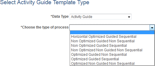
Field or Control |
Description |
|---|---|
Data Type |
Select Activity Guide to use the PeopleTools-delivered activity guide data source. Note: If you have created a custom activity guide data type, you can select it instead of Activity Guide. See Creating a Custom Activity Guide Data Type for more information. |
Choose the type of process |
Select one of the seven activity guide template types. See the preceding section, “Template Process Types,” for a table describing the features of each of the template types. Important! Once a template type has been selected, it cannot be changed for that template definition. |
Use the Template Properties: Properties page to define the properties for an activity guide template.
Navigation:
On the Manage Activity Guide Templates page, click the Properties link to modify an existing template.
Note: In addition, on the Manage Activity Guide Instances page, click the Properties link for an existing instance.
In the Setup Activity Guide WorkCenter, click the Template Properties task.
This example illustrates the fields and controls on the Template Properties: Properties page. You can find definitions for the fields and controls later on this page.
Field or Control |
Description |
|---|---|
Activity Guide ID |
Enter up to 10 characters as an identifier for the template. When you save the template, the system will fill characters up to the 10-character maximum. Important! You must ensure that each template ID is unique. |
Title |
Enter a name for the template. |
Description |
Enter a description for the template. |
Target URL |
For classic activity guides only, select the URL for the WorkCenter that provides access to this activity guide. Defining the URL here provides access from the Activity Guides - In Progress homepage pagelet to the WorkCenter. Important! To ensure that the URL is valid, select the URL from the lookup list, rather than typing or pasting a URL. |
Active |
Select this option to make the template active. If this option is cleared, the template definition remains in the system, but is not available to be used to create new activity guide instances. |
Enable Questionnaire |
Select this option to enable a questionnaire for this template. Note: The Questionnaire page tab will be displayed after you save the template definition. |
Enable Email Notification |
Select this option to enable email notifications to the users assigned to action items of type Process. Note: Email messages are sent when the process has completed successfully or if it has terminated with an error. |
Restart Activity Guide |
Select this option to have the activity guide instance deleted and restarted if the user exits without completing the activity guide. If this option is not selected, the default is to return to and display the current step whenever the user exits and returns to the activity guide. Note: SUOW and single component activity guides that have not been submitted as complete always restart at the first step, similar to selecting this option. This is because the old instance is deleted and a new instance is generated whenever the user re-enters the activity guide. Important! Do not set restart on multi-user activity guides. Note the following important considerations for single user and multi-user activity guides:
|
System Data |
Select this option to lock the activity guide definition including all template properties and action item definitions. Important! Once you select this option, you will be unable to make any modifications to the template definition. Do not select this option before you have completed specified all template properties, defined all action items, and generated and tested activity guide instances. |
Single Unit of Work |
Select this option to enable this activity guide as a single unit of work. This option is available for two activity guide template types:
Note: SUOW and single component activity guides that have not been submitted as complete always restart at the first step, similar to selecting the restart option. This is because the old instance is deleted and a new instance is generated whenever the user re-enters the activity guide. Important! Do not set SUOW on multi-user activity guides. Note the following important considerations for single user and multi-user activity guides:
|
Single Component |
Select this option to enable this activity guide as a single component. This option is available for three activity guide template types:
Note: SUOW and single component activity guides that have not been submitted as complete always restart at the first step, similar to selecting the restart option. This is because the old instance is deleted and a new instance is generated whenever the user re-enters the activity guide. Important! Do not set single component on multi-user activity guides. Note the following important considerations for single user and multi-user activity guides:
|
Show Notifications |
Select this option to display the Notification icon in the fluid banner. This option is available for the five guided activity guide template types:
|
Side panel fixed |
Select this option to fix the left panel, which disables the users’ ability to hide the left panel on any device except for small form factor devices. This option is available for the three vertical optimized activity guide template types:
Note: On small form factor devices or when the browser width is too narrow, this option is ignored and the left panel becomes collapsible and expandable. |
Generate Instance data for all languages |
Select this option to indicate that multi-language data present in the template is to be copied when creating a new instance from the template. Changing this option in an already created instance has no effect since the translation data can only be copied from the template at instance creation. However, any instance-specific action items added programmatically using the InstanceCreation method will not have translations in the generated instance unless the application code also adds the translation data. In addition, other programmatic updates handled during instance creation may have translation impacts. For example, if the title of the activity guide is changed to reflect the specific instance, then the application code should also update the title in all languages supported by the template. Important! For performance reasons during instance creation, enable this setting only on templates that require it. |
Hide steps that are not assigned to current user/role |
Select this option to indicate that steps that are not assigned to the current user are hidden and not displayed to that user. This setting can be changed dynamically or manually in instances created from any activity guide template. This option can be used on non-sequential activity guides without dependencies among steps. Use care if the non-sequential activity guide has dependencies among steps to ensure that each contributor user is able to access at least one step in the activity guide when they access the instance. Otherwise, an error will occur. Note: This option is not available for sequential activity guides, single component activity guides, or single unit of work activity guides, or for activity guides that have restart enabled. |
Start Date |
Select a start date. |
Due Date |
Select a due date. Note: The start and due dates specified at the template level do not have any effect on start and due dates at the action item level. |
Object Owner ID |
Select the object owner ID. |
Create Instance |
Use the Create Instance button to create an activity guide instance from this template. |
Add To Project |
Click the Add To Project button to access the Add To Project page to insert this activity guide template definition into an ADS project. See Adding Data Set Instances from Object Designer Pages for more information. |
Publish As Tile
Use the Publish As Tile group box to publish a tile definition that opens the My Activity Guide Instances page for this activity guide template. This tile definition will include the template ID only, and no context data or instance IDs. Therefore, users who use this tile will be redirected to the My Activity Guide Instances page, on which they can select from a list of existing activity guides instances generated from the template for which they have contributor privileges.
Important! The published tile cannot be used as a general deployment mechanism or to generate new activity guide instances. See Deploying Optimized and Non-Optimized Fluid Activity Guides for information on how to deploy fluid activity guides.
Field or Control |
Description |
|---|---|
Target Folder |
Select the tile repository folder in which you want to create the tile definition. |
Publish |
Click the Publish button to publish the tile definition. |
Edit Tile Properties |
Click this link to open and edit the content reference definition for the tile within the portal registry. |
Use the Template Properties: Security page to manage participants and privileges for the template.
Navigation:
In the Setup Activity Guide WorkCenter, click the Template Properties task.
Select the Security page.
This example illustrates the fields and controls on the Template Properties: Security page. You can find definitions for the fields and controls later on this page.
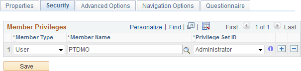
Use the Administrator privilege set for the roles (or users) who will be responsible for maintaining this template and any activity guide instances generated from it. Use the Contributor privilege set for the users (or roles) who will be assigned to complete the action items within an active instance.
Field or Control |
Description |
|---|---|
Member Type |
Select the type of participant you want to add to the activity guide template. Available values include:
|
Member Name |
Specify the user ID or role name for the participant. |
Privilege Set ID |
Select a privilege level you want to assign to the participant:
|
Use the Template Properties: Advanced Options page to define advanced options for this template.
Navigation:
In the Setup Activity Guide WorkCenter, click the Template Properties task.
Select the Advanced Options page.
This example illustrates the fields and controls on the Template Properties: Advanced Options page. You can find definitions for the fields and controls later on this page.
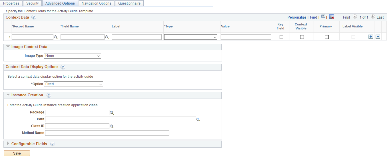
Context Data
Important! If multiple activity guide instances will be generated from the same template (for example, a life events activity guide template), then you must define at least one key context field in order to identify and differentiate these activity guide instances.
You can define contextual data that will be passed to the activity guide instance when it is created. Contextual data defined as key fields will be used to uniquely identify each activity guide instance. For example, if the employee ID were defined as a key contextual field, then each activity guide instance will be created for a specific employee ID. Contextual data defined as non-key fields is not used to differentiate an instance, but can be passed to the instance nevertheless. For example, non-key data can be displayed in the activity guide pagelet by specifying the Context Visible option for the field. In this way, instead of displaying the employee ID, you could display the employee name in the pagelet.
Field or Control |
Description |
|---|---|
Record Name |
Specify the record name that is the source for the contextual field. |
Field Name |
Specify the name of the source contextual field. |
Label |
Enter a label for the contextual field. This label can be displayed along with the data value in the activity guide pagelet on the WorkCenter page. |
Type |
Select one of the following context types:
|
Value |
Enter the value when the context type is fixed value. Alternatively, select the system variable from the look up list when the context type is system variable. Note: No value is entered when the context type is runtime. |
Key Field |
Specify whether the contextual field is a key field. Note: Keys fields are used to uniquely identify an activity guide instance. |
Context Visible |
Specify whether to display the contextual data and labels in the activity guide. |
Primary |
For fluid activity guides only, specify whether this contextual data field is to be displayed as the primary field (that is, larger and in bold). Note: If the Label Visible option is selected for any field, then this selection is ignored. |
Label Visible |
Specify whether the labels are displayed in addition to the contextual data. Note: If this option is selected for any field, then labels are displayed for all visible contextual data fields. |
Image Context Data
You can specify a static or dynamic image to be displayed in each activity guide instance. Depending on the selected value of the Image Type field, additional fields are displayed.
Field or Control |
Description |
|---|---|
Image Type |
Select an image type:
|
App Class: Package |
Enter the name of the application package that contains the method to be invoked to dynamically return the image URL. |
App Class: Path |
Enter the names of each subpackage in the application class hierarchy that define the location of the application class. Separate subpackage names by a colon. If the class is defined in the top-level application package, enter or select the colon. |
App Class: Class ID |
Enter the name of the application class that contains the method to be invoked to dynamically return the image URL. |
App Class: Method Name |
Enter the name of the method to be invoked to dynamically return the image URL. |
Image Catalog: Image Name |
Select the static image from the database. |
Static:Static URL |
Specify the fully qualified URL to a static image. |
Context Data Display Options
You can select an option for how the context data is displayed.
Field or Control |
Description |
|---|---|
Option |
Select a context data display option:
|
Modal: Package |
Enter the name of the application package that contains the method to be invoked to dynamically return the URL for the content of the modal window. |
Modal: Path |
Enter the names of each subpackage in the application class hierarchy that define the location of the application class. Separate subpackage names by a colon. If the class is defined in the top-level application package, enter or select the colon. |
Modal: Class ID |
Enter the name of the application class that contains the method to be invoked to dynamically return the URL for the content of the modal window. |
Modal: Method Name |
Enter the name of the method to be invoked to dynamically return the URL for the content of the modal window. |
Instance Creation
You can identify a method that will be executed whenever an activity guide instance is created from this template. When an instance is created from the template, the instance properties and action item details are initially set based on the template definitions. Then, use this method to initialize instance properties, participants, and action item properties (such as status, due date, assignment, and so on), or even to hide or show action items.
Field or Control |
Description |
|---|---|
Package |
Enter the name of the application package that contains the method to be invoked at instance creation. |
Path |
Enter the names of each subpackage in the application class hierarchy that define the location of the application class. Separate subpackage names by a colon. If the class is defined in the top-level application package, enter or select the colon. |
Class ID |
Enter the name of the application class that contains the method to be invoked at instance creation. |
Method Name |
Enter the name of the method to be invoked to initialize the activity guide instance. |
Configurable Fields
You can also define labels for fields that will appear on the Related Data page for an action item. In the action item definition, use these additional fields to associate data that will be used by the related content service at run time.
For example, a configurable field could be used to pass a run control ID to the related content service (and its underlying component, a run control page). A different action item definition—in the same template even—could be defined to supply a different run control ID to the same related content service.
Field or Control |
Description |
|---|---|
Text Fields |
Enter the label for up to five configurable text fields. |
Yes/No Fields |
Enter the label for up to five configurable yes/no fields. |
Use the Setup Activity Guide - Navigation Options page to add custom action elements and to define pagelet properties including pagelet pre-processing.
Navigation:
In the Setup Activity Guide WorkCenter, click the Template Properties task.
Select the Navigation Options page.
This example illustrates the fields and controls on the Template Properties: Navigation Options page. You can find definitions for the fields and controls later on this page.
Field or Control |
Description |
|---|---|
Package Name |
Enter the name of the application package that contains the method (or methods) to be invoked to create custom action buttons. |
Path |
Enter the names of each subpackage in the application class hierarchy that define the location of the application class. Separate subpackage names by a colon. If the class is defined in the top-level application package, enter or select the colon. |
Class ID |
Enter the name of the application class that contains the method (or methods) to be invoked to create custom action buttons. In addition to or in lieu of navigation buttons, this application class can define a pagelet pre-processing method that will be executed every time the pagelet is loaded or reloaded in the WorkCenter pagelet area. This method must be named PageletPreProcess. See Performing Pre-Processing for the Activity Guide Pagelet for an example. |
Pagelet Progress Bar Visible |
Indicates whether the progress bar will be displayed in the activity guide pagelet on the WorkCenter page. Note: This option applies to classic activity guides only when accessed through a WorkCenter. |
Pagelet Buttons
In fluid activity guides, these buttons are rendered in the activity guide subbanner. In classic activity guides, these buttons are rendered in the navigation frame of the classic WorkCenter.
Note: For classic activity guides, Next and Previous buttons are displayed in the navigation frame of the classic WorkCenter. Oracle recommends that you add no more than two additional custom action buttons to classic activity guides.
Field or Control |
Description |
|---|---|
Method Name |
Enter the name of the method to be invoked to create the additional navigation button. Important! The method named here must exist in the selected class. No validation is performed to ensure this is the case when the template definition is saved. You can implement certain methods with reserved names (MarkComplete, for example). In addition, you can use certain reserved words (for example, PTAI_NAV_SAVE, PTAI_NAV_SAVE_NEXT, and others) as method names to invoke other delivered functionality. See Developing Custom Action Buttons for detailed information. |
Button Label |
Enter the label for the custom action button as it will be displayed to users. Note: Button labels are ignored for the following reserved word methods: PTAI_NAV_AUTO_SAVE, PTAI_NAV_SAVE_NEXT, PTAI_NAV_SAVE_PREV, and ExitAGProcess. |
Active |
Select this option to retain the button definition as active. |
Message Set |
Specify the message set containing an optional message to be displayed after the user clicks the button. |
Message Number |
Specify the message number containing an optional message to be displayed after the user clicks the button and before invoking the specified method. For example, if the user clicks a Cancel button to cancel an activity guide instance, this could display a confirmation message. |
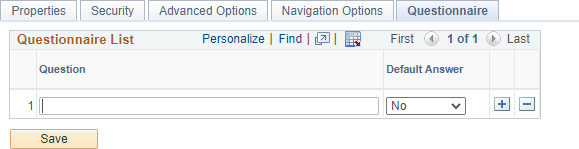
Use the Template Properties: Questionnaire page to define the questions that can be associated with action items.
Navigation:
In the Setup Activity Guide WorkCenter, click the Template Properties task.
Select the Questionnaire page.
This example illustrates the fields and controls on the Template Properties: Questionnaire page. You can find definitions for the fields and controls later on this page.
Field or Control |
Description |
|---|---|
Question |
Enter the complete text for the question. Important! Only questions with a yes or no answer are supported. |
Default Answer |
Select a default answer for the question. |
Use the New Activity Guide Template Details page to create a copy of the selected activity guide template.
Navigation:
Click the Clone Template link for an activity guide template.
This example illustrates the fields and controls on the New Activity Guide Template Details page. You can find definitions for the fields and controls later on this page.
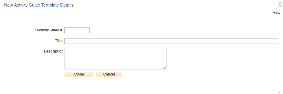
Note: When you copy an activity guide template, the IDs for all action items will be updated to new and unique values in the new template.
Field or Control |
Description |
|---|---|
Activity Guide ID |
Enter an unique identifier for the template. When you save the template, the system will fill characters up to the 10-character maximum. |
Title |
Enter a name for the template. |
Description |
Enter a description for the template. |
Clone |
Click the Clone button to create a new activity guide template. |