
 Understanding the Chart Class
This chapter provides an overview of the PeopleSoft Chart class and discusses the following topics:
Chart terms.
Chart types.
Style sheets and charts.
Font considerations for extended languages.
Component processor considerations.
Translation considerations.
Label considerations.
Bar chart considerations.
iScripts and charts.
Bubble chart considerations.
Line chart considerations.
Data series.
Gantt charts.
Error handling.
Data type of a chart object.
Scope of a chart object.
Chart class reference.
Chart class built-in functions.
Understanding the Chart Class
The PeopleSoft Chart class enables you to plot data in charts according to your specifications. You can create a chart by setting data using PeopleCode. You can create a chart based on a chart control on a page, or at runtime using an Internet Script (iScript).
Possible uses for the chart control include:
charting dynamic data, such as current prices of selected commodities, from a rowset.
plotting stored data, such as product prices, for graphic analysis of trends, from a record.
The chart class supports the following features:
Three-dimensional representation.
Support for all major chart types.
Control over the various elements of the chart such as the axes, legend, and titles.
Interactive charts. The user can click on the different data elements of the chart to trigger further processing.
You can specify a rowset and have it graphed using a chart object with minimal PeopleCode. Within this rowset there must be a column containing data for the X axis and one for the Y axis. If more than one series of data is used, an additional column should indicate the series values. Color and popup text for each point could also be set in this rowset using additional columns.
The following distinguishable types of data can be involved in a chart:
Primary data.
Secondary or overlay data.
The overlay data may be quite different to the primary data so an additional rowset is needed.
There is only one object used with the chart class, that is, a chart object. There are no subobjects. All methods and properties are used with the chart object. You do not have to instantiate a subobject to access its properties and methods.
However, for a conceptual overview, it's easier to view the chart object in pieces. Just remember that these pieces do not represent subobjects.
A chart contains the following major parts:
X Axis
Y Axis
Overlay
Legend
Data
Title
The X, Y, and Overlay axes have access to titles and labels associated with their data. The following is a conceptual overview of the chart class.
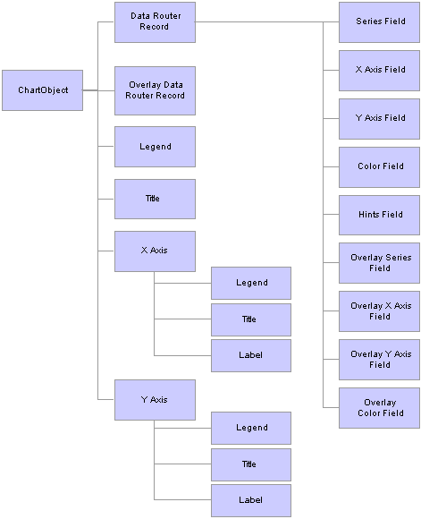
Overview of chart class
Chart TermsCharts can be composed of many different elements, such as a legend, a title, a label, and so on. The following is a list of general chart terms and their description. Specific chart terminology (such as for Gantt charts) is found in those specific sections:
|
Series |
A group of related information. For example, if you were tracking sales for several divisions over many years, each division could be a series. Generally, every series in a chart has a distinct color. You can have more than one series in a chart for comparison. |
|
Label |
Text that identifies the data on one of the axis. |
|
Legend |
Text that identifies the different series in the chart. |
|
Overlay |
Related data represented by a line drawn over the background chart. You can also specify a data series, with different line types for each overlay. |
|
Title |
There are three titles: Main, X axis, and Y axis. These are text that identifies that portion of the chart. |
|
TrueXY |
A type of line chart that uses a numeric X axis, in stead of a categorical X axis. The numeric X axis supports non-uniform X data, that is, each series need not have the same number of points and those points along the X axis need not match up across the series. |
|
X axis |
The axis that data is measured against. For a Gantt chart, the X axis is the display of dates which items in the Y axis span. |
|
Y axis |
The axis that contains the data. In most charts, this is the vertical axis. In a horizontal bar chart, this is the horizontal axis. For a Gantt chart, the Y axis is the display of tasks or activities, and is displayed as rows. |
See Also
Understanding Gantt Chart Terms
Chart TypesThe following chart types are available for PeopleSoft Chart:
2D Bar.
2D Histogram.
2D Horizontal Bar.
2D Horizontal Percent Bar.
2D Horizontal Stacked Bar.
2D Line.
2D Percent Bar.
2D Pie.
2D Scatter.
2D Stacked Bar.
3D Bar.
3D Percent Bar.
3D Pie.
3D Stacked Bar.
Gantt.
2D BarThe following is an example of a two-dimensional bar chart.
2D HistogramThe following is an example of a two-dimensional histogram chart.
2D Horizontal BarThe following is an example of a two-dimensional horizontal bar chart.
2D Horizontal Stacked BarThe following is an example of a two-dimensional horizontal stacked bar chart.
2D Horizontal Percent BarThe following is an example of a two-dimensional horizontal percent bar chart.
2D LineThe following is an example of a two-dimensional line chart without numeric axes, that is, with IsTrueXY specified as False.
The following is an example of a two-dimensional line chart with a numeric X and Y axis, that is, with IsTrueXY specified as True.
2D Percent BarThe following is an example of a two-dimensional percent bar chart.
2D PieThe following is an example of a two-dimensional pie chart.
2D ScatterThe following is an example of a two-dimensional scatter chart.
2D Stacked BarThe following is an example of a two-dimensional stacked bar chart.
3D BarThe following is an example of a three-dimensional bar chart.
3D Percent BarThe following is an example of a three-dimensional percent bar chart.
3D PieThe following is an example of a three-dimensional pie chart.
3D Stacked BarThe following is an example of a three-dimensional stacked bar chart.
GanttThe following is an example of a Gantt chart.
Style Sheets and ChartsA style sheet is a definition, like a record or field definition, that you create in PeopleSoft Application Designer. It contains a collection of formatting styles (called classes) each of which can be applied to either the entire chart or to specific elements within a chart.
You can use a style sheet, and the styles in a style sheet, for the different parts of a chart. You can either specify a style sheet for the entire chart (using either the chart Style or StyleSheet property) or for an element (using that element's Style property.) The override rules are:
If you specify the Style property for any element (XAxis, XAxisTitle, YAxis, YAxisTitle, Legend, MainTitle, and so on) the style is used.
If you don't specify the Style property for any element of a chart object, but you specify either the Style or StyleSheet property for the chart object itself, that style is used for the unspecified elements.
If you don't specify styles for any elements of a chart object, and you don't specify style for the chart object itself, a default style for any chart object is used.
Note. PeopleSoft recommends not using your own styles or style sheets unless absolutely necessary.
See Also
Creating Style Sheet Definitions
Considerations Using Style Sheets
The following style sheet properties are only supported for PeopleSoft Chart:
Font Family.
Font Foreground Color.
Font Size.
Font Style (only Normal and Italic are supported.)
Font Weight (only Normal and Bold are supported).
Default Style Sheet ClassesThe default style sheet associated with a PeopleSoft Chart is PTSTYLEDEF. The default classes associated with this style sheet include:
|
Style Sheet Class Name |
Associated Chart Element |
|
PSCHARTDEFAULT |
Used with the chart section of the Gantt chart, as well as with the following properties:
|
|
PSCHARTTITLE |
used with MainTitleStyle |
|
PSCHARTAXISTITLE |
used with XAxisTitleStyle |
|
PSCHARTAXISTITLE |
used with YAxisTitleStyle |
|
PSCHARTGANTTGRID |
used with the table section of the Gantt chart |
Considerations for Gantt Charts
In Gantt charts, the PSCHARTDEFAULT style class uses an 8 point font with a normal weight. This style class affects all text in the chart area, such as task labels, DateTime X-axis labels, and hints. The PSCHARTGANTTGRID style class uses a 10 point font, also with a normal weight, and affects all text in the table area. For the font size between the table and chart areas to be the same, the point size in the PSCHARTGANTTGRID style class should be 1.25 times the point size of the font defined in PSCHARTDEFAULT. Note, however, that the font size for PSCHARTGANTTGRID should not exceed 13; otherwise, column text may bleed over into another column.
Font Considerations for Extended Languages
The environment variable JAVA_FONTS must be set correctly so the fonts that are used in charting can be picked up by the application server's Java Virtual Machine. It must be set to include the paths to any TrueType fonts that are used to support extended languages. This can be set at the system level or in psconfig.sh.
The following is is an example of this variable being set:
JAVA_FONTS=$PS_HOME/jre/lib/fonts:/usr/share/fonts/default/TrueType:/usr/share/fonts/ja/TrueType:/usr/share/fonts/zh_CN/TrueType:/usr/share/fonts/zh_TW/TrueType:/usr/share/fonts/ko/TrueType;export
JAVA_FONTS
Component Processor ConsiderationsSometimes records at level zero on a page are considered work records, even when they aren’t specified as such in PeopleSoft Application Designer. Work records aren’t updated by the database and are skipped when the component is run.
A level zero record gets marked as a work record when:
All the fields for the record are used as read-only fields.
All the values for these fields can be read from the input keys.
When a chart field is attached to a level zero record field of a record considered a work record, it’s also skipped when the system determines that record's 'work' status.
See Also
Referencing Data in the Component Buffer
Translation ConsiderationsIf you hardcode a value for a label, a title, a data hint, and so on, that value is not translated. Be sure to specify field values or message catalog entries that will be translated.
Label ConsiderationsChart labels are shown based on the size of the axis, fonts, and charts on the page. If all the labels are not displaying for your chart, you should either make the chart larger or the font smaller.
Pie chart labels are staggered, so that, in most cases, both labels can be read. However, if one or both of the labels are very long, they could be truncated or completely missing from the chart.
For Gantt charts, use double quotes to correctly display the use of single quotes in your label, if applicable.
Bar Chart ConsiderationsIf the bars on a bar chart are too narrow, a user may not be able to click on them. Sometimes this affects a few bars on a chart, sometimes all of the bars cannot be clicked. The workaround is to put fewer bars on your chart, or to make your chart bigger, so that each bar is wider.
iScripts and ChartsPeopleSoft supports two types of charts:
Charts generated using the chart control on a page.
Charts generated at runtime and used in an iScript.
To build a chart at runtime, use the CreateObject function instead of the GetChart function. You can then use the GetChartURL Response class method to use the URL in your application.
The following is an example of building a chart using a standalone rowset:
Function IScript_GetChartURL()
local object &MYCHART;
local string &MYURL;

&MYCHART = CreateObject("Chart");
&MYCHART.SetData(xx);

/* xx will be a data row set */

&MYURL = %Response.GetChartURL(&MYCHART);

/* use &MYURL in your application */
...
End-Function;
See Also
Creating a Chart Using an iScript
Bubble Chart ConsiderationsBubble charts are a type of scatter chart, where points of data are plotted in two dimensional space along a numeric X and Y axis. Bubble charts add the ability of being able to display an extra dimension of data through the size of each point or glyph, that is, the size of the glyphs is scaled from the data.
Each point in a bubble chart can be individually colored, clicked on to start PeopleCode program, and can have pop up text associated with it. Programming a scatter chart is similar to creating the other charts: at a minimum, you need to specify the data record (rowset), the X data field, and the Y data field.
The size of the glyphs can be set within the data. Each point in the chart, along with the regular pop up text can also have online annotations associated with it.
When you create a bubble or scatter chart, a TrueXY axis is automatically set, that is, the IsTrueXY property is set to true.
See Also
Line Chart ConsiderationsThe X axis on a line chart is either a category axis or a TrueXY axis:
With a category axis, each data marker is placed along the axis according to its position in the data series.
With a TrueXY axis, each data marker is placed along the axis according to its numeric value.
You use the IsTrueXY property to control whether the X axis is a TrueXY axis or not.
The following charts use the exact same data series:
|
X axis |
Y axis |
|
2 |
4 |
|
4 |
2 |
|
6 |
6 |
|
3 |
3 |
In the first example, IsTrueXY is set to false, which means that the X axis is a category axis and the values along it are place in the order in which they occur in the data set. Note the order of the numbers along the X axis:
In the following example, IsTrueXY is set to true, so the X axis is a TrueXY axis. The order of the numbers along the X axis is now numeric.
See Also
Data Series
A data series is a group of related information. You can group the same information into more than one series. All of the following charts use the same data set.
|
Product |
Region |
Sales |
|
1 |
X |
5.50 |
|
1 |
Y |
4.60 |
|
2 |
X |
5.70 |
|
2 |
Y |
6.00 |
|
3 |
X |
6.00 |
|
3 |
Y |
7.20 |
|
3 |
Z |
8.25 |
|
4 |
X |
6.50 |
|
4 |
Y |
7.30 |
|
5 |
X |
7.00 |
|
5 |
Y |
7.40 |
|
6 |
X |
7.50 |
|
6 |
Y |
7.50 |
|
6 |
Z |
-3.40 |
|
7 |
X |
8.00 |
|
7 |
Y |
7.00 |
|
7 |
Z |
2.30 |
|
8 |
X |
8.10 |
In the following example, there are three data series, based on product:
Each series is indicated with its own discreet line.
In the following example, each data series is grouped by product. There are several different products, each with its own data series.
Gantt Charts
A Gantt chart displays tasks along a timeline. Gantt charts are frequently used in project management because they can provide a graphical illustration of a schedule, which helps to plan, coordinate, and track specific tasks in a project.
This section provides an overview of Gantt chart terminology and discusses how to:
Use Gantt charts in PeopleSoft Pure Internet Architecture.
Create Gantt charts.
Specify DateTime axis format.
Work with start and end dates.
Use Gantt glyphs.
Understanding Gantt Chart TermsGantt charts can be composed of many different elements, such as a title, a label, and so on. The following is a list of terms that apply specifically to Gantt charts.
|
Activity or Task |
See Task. |
|
Baseline |
A point-in-time snapshot of the project plan that allows for the identification of how the project plan has changed since that point in time. |
|
Data area |
The part of the chart that shows graphically the span of dates that each task (or activity) covers. (The right side of the displayed chart.) |
|
Dependencies |
A relationship between one task and other tasks that drives when tasks can begin and end. A dependent task cannot start before the task it’s dependent upon is either started or completed (depending on business rules defined in the application). |
|
Milestone |
A specialized row on the Y axis that names a point in time that is meaningful. |
|
Resource |
Something that is assigned to work on an activity or task. |
|
Task or Activity |
For a Gantt chart, each row (task or activity), is represented in the Y axis of the chart, and the span of dates for each row is displayed on the X axis. |
|
X axis |
The axis that data is measured against. For a Gantt chart, the X axis is the display of dates which items in the Y axis span. |
|
X axis labels |
The part of the chart that lists the time scale. The X-axis labels support multiple levels of granularity: second, minute, hour, day, week, month, year. |
|
Y axis |
The axis that contains the data. In most charts, this is the vertical axis. In a horizontal bar chart, this is the horizontal axis. For a Gantt chart, the Y axis is the display of tasks or activities, and is displayed as rows. |
|
Y axis labels |
The part of the chart that lists the activities and attributes of those activities. The activities are shown hierarchically, and subtasks can be hidden or displayed by expanding or collapsing higher-level tasks. |
Using Gantt Charts in PeopleSoft Pure Internet Architecture
The Gantt chart consists of two sections: a table section and chart section.
The left side of the chart, where you see the table, is the table section. The other side, where you see the bars, is the chart section.
Table Section
The table section contains all of the tasks and associated subtasks and displays them in a hierarchy. Tasks that contain subtasks are called parent tasks and subtasks are called child tasks. You can click on the expand (collapse) image to the left of the task name (Baby, above) to expand or collapse the hierarchy of subtasks. Note that subtasks may also act as parent tasks to other subtasks.
Each task has a name Born, Baby, Childhood, and so on.) It also has a level. Parent tasks have a higher level than child tasks.
Horizontal scrollbars are provided under the table section to support scrolling through the task-related columns. The amount that a table section scrolls depends on the value set for the SetTableXScrollBar method. Each click on the arrow scrollbar scrolls the task either left or right by the amount set with the SetTableXScrollBar method (or 10% of the table area, if a value isn't set.)
See SetTableXScrollbar.
Chart Section
The chart section displays the tasks, task dependencies, and milestones graphically.
In the example above, each horizontal bar represents a single task. The progress bar, that is, the percentage complete for a particular task, is indicated with a bar of a different color on top of the task bar. The milestone date (in the above screen shot, Graduate) is represented with a circle.
You can also have dependencies between the tasks. These are represented as lines connected the task bars.
Creating Gantt ChartsEvery Gantt chart has at least one data set used to define the tasks and the information related to each task, such as start date, end date, milestones, percent finished, and so on.
A second data set can be used to describe dependencies between the tasks.
The following is a list of the required methods for using the Gantt chart:
SetTaskData
Use this method to specify where most of the information for the Gantt chart is stored. You can specify either a rowset or a record.
SetTaskID
Use this method to specify the task ID, or name, of the task. Every task must have a unique task identifier. The task ID is used to support task linking and dependencies.
SetPlannedStartDate
Use this method to specify the planned starting date of the task. Each task must have its own planned starting date.
SetPlannedEndDate
Use this method to specify the planned ending date of the task. Each task must have its own planned ending date.
Though not required, PeopleSoft recommends also using the SetTaskName method to display meaningful information in the table section of the Gantt chart.
If you only use the required methods, and do not use the SetTaskAppData method, PeopleSoft recommends that you also use the SetChartArea method and dedicate most, if not all, of the entire area to the chart (and not the table.)
If you specify one actual date, either for start or end, you must specify the other (SetActualStartDate, SetActualEndDate).
In addition, if you want to use dependency data, the following methods are required:
SetTaskDependencyData
Use this method to specify where most of the information for the dependency data is stored. You can specify either a rowset or a record.
SetTaskDependencyParentID
In a dependency, one task depends on another. Use this method to specify the parent task, that is, the one that the other (child) task depends upon.
SetTaskDependencyChildID
In a dependency, one task depends on another. Use this method to specify the child task, that is, the one that depends on another.
Specifying DateTime Axis FormatsYou can control the display of the label format that describes the DateTime axis in up to six different time increments, from seconds to years, or any combination thereof simultaneously for a given time period. Each time increment, if enabled through the DateTimeAxis specific methods, occupies a single level within the X axis hierarchy. Smaller time increments display closer to the axis, while larger time increments display farther from the axis.
The following example shows the levels of the labels for the DateTime axis. The first level, in seconds, is the closest level to the chart edge, next are minutes at the second level, then hours at the third level, and so on. Generally, the smallest unit should be on the lowest level. So, if months and years are displayed, months display at the first level and years display at the second.
In the following example, days, months, and years are defined at levels 1, 2, and 3, respectively. This means that the days of the month (1, 10, 20) are displayed closest to the chart area, the months are displayed below them, and the years below that.
By default, the DateTime axis displays both the year and the months, with the major tick mark marking the months.
Note. The charting algorithm may or may not display a given time increment, even if it is enabled. The resolution of the given time increments may be too great, depending on the length of the time period defined in the chart section.
See Also
Gantt Chart DateTimeAxis Specific Methods
Working with Start and End Dates
You must set the end date to be after the start date, for both the planned as well as actual dates, or else you receive an error.
Both the start and end dates you specify for a task must fall within the axis dates, that is, the dates specified by the AxisEndDateTime and AxisStartDateTime properties. If you specify task dates that fall outside of the axis dates, the task is still displayed in the table section of the Gantt chart, but no bar displays in the chart section of the Gantt chart, even if one of the dates does fall inside the axis dates.
Using Gantt GlyphsThe following lists all the glyphs you can use with the Gantt chart.
You can use either the numeric or constant value.
|
|
Constant: %ChartGlyph_Axe Numeric value: 1 |
|
|
Constant: %ChartGlyph_Bar Numeric value: 2 |
|
|
Constant: %ChartGlyph_Box Numeric value: 3 |
|
|
Constant: %ChartGlyph_Circle Numeric value: 4 |
|
|
Constant: %ChartGlyph_Cross Numeric value: 5 |
|
|
Constant: %ChartGlyph_Diamond Numeric value: 6 |
|
|
Constant: %ChartGlyph_Dodecahedron Numeric value: 7 |
|
|
Constant: %ChartGlyph_Icosahedron Numeric value: 8 |
|
|
Constant: %ChartGlyph_Sphere Numeric value: 9 |
|
|
Constant: %ChartGlyph_Square Numeric value: 10 |
|
|
Constant: %ChartGlyph_Star Numeric value: 11 |
|
|
Constant: %ChartGlyph_Triangle Numeric value: 12 |
Error HandlingThe PeopleCode program is terminated if a field or record is missing at runtime.
If a valid record is specified but no data is found, or for any other error, the chart is replaced by the message " Image creation failed."
If the Java Runtime Environment (JRE) is missing, an error appears and is logged.
Data Type of a Chart ObjectChart objects are declared using the Chart data type. For example,
Local Chart &MyChart;

Component Chart &Abs_Hist_Chart;
Scope of a Chart Object
A chart object can be instantiated only from PeopleCode.
You can use this object only in PeopleCode programs that are associated with an online process, not in an Application Engine program, a message subscription, a Component Interface, and so on.
Chart Class Reference
The following sections contain the methods and properties used with a chart.
The reference is divided up among the different parts of a chart, however, all methods and properties are used with the chart object: there are no subobjects in a chart.
Chart Data Methods and Properties: Used to set X and Y axes data.
Chart Appearance Properties: Used to set the type of graph, the line style, and so on.
Chart Color Methods: Used to set and manipulate colors for either a series or for each point.
Chart Axis Methods and Properties: Used to further control the appearance of the axes.
Chart Title Properties: Used to set the text and style of titles for the graph and the axes.
Chart Legend Methods and Properties: Used for each series legend.
Chart Overlay Methods and Properties: Used to set and manipulate overlay data.
Bubble Chart Methods and Properties: Used to set and manipulate bubble charts.
TrueXY Line Chart Properties: Used to set and manipulate TrueXY line charts.
Gantt Chart Methods and Properties: Used to set and manipulate Gantt charts.
Chart Class Built-in Functions
Chart Data MethodsThese methods are used to set X and Y axes data.
RefreshSyntax
Refresh()
Description
Use the Refresh method if the underlying data of the chart has changed, and you want to update the chart.
Note. You don't need to use the Refresh method after setting a property or method of the chart itself, such as setting the starting point or changing colors. When a method or property is used, the refresh method is automatically called.
Parameters
None.
Returns
None.
Example
&MyChart.Refresh();
See Also
chart data class: DataStartRow property, DataWidth property, SetDataXAxis method, SetDataYAxis method.
Reset
Syntax
Reset()
Description
Use the Reset method to clear out all existing chart settings and data.
Parameters
None.
Returns
None.
See Also
chart data class: Refresh method.
SetDataSyntax
SetData({Record_Name | &Rowset})
Description
Use the SetData method to specify where the data from the chart is coming from.
You can use either a record name or an already instantiated, populated rowset. In general, specify a record when building a chart from page data and a rowset when building a chart from a standalone rowset.
If you make a change to the underlying data of a chart, use the Refresh method to update the chart.
Parameters
|
Record_Name |
Specify the name of a record to be used to populate the chart with data. |
|
&Rowset |
Specify the name of an already instantiated rowset to populate the chart with data. This is generally a standalone rowset. |
Returns
None.
Example
The following is the minimum code you need to create a Peoplesoft chart.
Local Chart &MyChart;

&MyChart = GetChart(ABS_HIST.CHART);
&MyChart.SetData(ABS_HIST);
&MyChart.SetDataYAxis(ABS_HIST.Reason);
&MyChart.SetDataXAxis(ABS_HIST.Duration);
The following example creates a chart using a standalone rowset.
Function IScript_GetChartURL()
local object &MYCHART;
local string &MYURL;
local rowset &MYROWSET;

&MYCHART = CreateObject("Chart");

&MYROWSET = CreateRowset(Record.ABS_HIST);

&EmplID = %Emplid;

&MYROWSET.Fill("Where EMPLID :=1", &EmplID);

&MYCHART.SetData(&MYROWSET);
&MYCHART.SetDataXAxis(ABS_HIST.ABSENCE_TYPE);
&MYCHART.SetDataYAxis(ABS_HIST.DURATION_DAYS);

&MYURL = %Response.GetChartURL(&MYCHART);

/* use &MYURL in your application */
...
End-Function;
See Also
chart data class: SetDataXAxis method, SetDataYAxis method.
SetDataHintsSyntax
SetDataHints(Record_Name.Field_Name)
Description
Use the SetDataHints method to specify the field that contains the text that displays as a data hint.
What displays for a data hint depends on the value specified for the data hints method, as well as the value specified for the series and the data method.
Series Data but No Data Hints
If you do not specify data hints, but you do specify both the data series and data methods, the hints appear as follows:
Value value for point x position of series series
Where:
value is the Y data value
x position is the X axis label
series is the series value
The following is an example of this type of data hints. The pop-up menu appears when the cursor hovers over any data value.
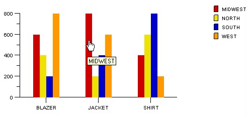
Data Hints, Data, and Series
If you specify data hints, that is the value that appears. In the following example, the data hints are set to the same value as the series is set, that is, the region.
Data and Series, but no Data Hints
If you do not specify SetDataHints and do not specify SetDataSeries, the value of the Y axis appears in the data hint:
Parameters
|
Record_Name.Field_Name |
Specify the name of the record, and the field on that record, that contains the data hints for the chart. |
Returns
None.
Example
The following PeopleCode example:
&oChart.SetDataHints(QE_CHART_RECORD.QE_CHART_REGION);
Could produce data hints as follows:
Data hints set to the region value
See Also
chart data class: SetDataXAxis method, SetDataSeries method.
SetDataSeriesSyntax
SetDataSeries(Record_Name.Field_Name)
Description
Use the SetDataSeries method to specify the name of the field containing the series values. Every distinct value in this field is considered a unique series.
The series is plotted in the order given by the record.
By default, the legend is populated by the value of this field.
If this value is Null, the system assumes there is only one series to plot.
Parameters
|
Record_Name.Field_Name |
Specify the name of the record, and the field on that record, that contains the series values for the chart. |
Returns
None.
Example
&MYCHART.SetDataSeries(MYRECORD.MYSERIES);
See Also
chart data class: SetDataXAxis method, SetDataYAxis method.
SetDataURLsSyntax
SetDataURLs(FieldName)
Description
Use the SetDataURLs method to specify a URL to be launched when a data point is clicked in the chart. The URL for each point must be given as a string, that is, enclosed with quotation marks. You can also specify recordname.fieldname. Use this method for charts created from a chart control or a standalone rowset.
One use of this method could be to launch a JavaScript that generates a pop-up menu.
Parameters
|
FieldName |
Specify a field name that's used to populate the URL for each data point. |
Returns
None.
Example
&MyChart.SetDataURLs(MyRecord.URL);
SetDataXAxisSyntax
SetDataXAxis(Record_Name.Field_Name)
Description
Use the SetDataXAxis method to specify the groups along the X axis.
If this value is not set or Null, the Y values are plotted along the X axis in groups labeled by their order number.
The order of the data is plotted in the order of the data in the record.
By default, the labels along the X axis are populated by the value of this field.
Parameters
|
Record_Name.Field_Name |
Specify the name of the record, and the field on that record, that contains the data for the X axis for the chart. |
Returns
None.
Example
In the following example, the Y axis is set to a numeric amount, while the X axis is set to the products.
&oChart = GetChart(QE_CHART_DUMREC.QE_CHART_FIELD);

&oChart.SetData(Record.QE_CHART_RECORD);
&oChart.SetDataYAxis(QE_CHART_RECORD.QE_CHART_SALES);
&oChart.SetDataXAxis(QE_CHART_RECORD.QE_CHART_PRODUCT);
&oChart.SetDataSeries(QE_CHART_RECORD.QE_CHART_REGION);
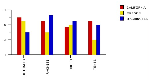
X axis set with product data
See Also
chart data class: SetDataYAxis method, SetData method.
SetDataYAxisSyntax
SetDataYAxis(Record_Name.Field_Name)
Description
Use the SetDataYAxis to specify the data to plot in the chart.
The Y axis is always considered the data axis.
The Y axis must always be numeric. If the greatest Y axis value is less than ten, the Y axis labels are given a decimal place. If the greatest Y axis value is greater than or equal to ten, the Y axis labels are displayed as integers.
Note. If you've specified negative numbers in the Y axis, the X axis is drawn according to the XAxisCross property.
Parameters
|
Record_Name.Field_Name |
Specify the name of the record, and the field on that record, that contains the data for the Y axis for the chart. |
Returns
None.
Example
&oChart.SetDataYAxis(QE_CHART_RECORD.QE_CHART_SALES);
See Also
chart data class: SetDataXAxis method, SetData method.
Chart Data PropertiesThese properties are used to set X and Y axes data.
DataStartRowDescription
This property sets or returns the row number (after any preprocessing) at which to start plotting. This is useful when you have many rows of data in a rowset, and you want to start at a particular row. This can also be useful for creating your own 'scrolling' effect, by specifying both the start row and how many rows to be displayed (by using the DataWidth property.)
If this property is not set, then the value is 1.
This property is read-write.
See Also
chart data class: DataWidth property.
DataWidthDescription
This property returns or sets the number of rows to plot for a series. The starting point for the number of rows is set with the DataStartRow property. If the DataWidth property value is not set, then the width is from the DataStartRow to the last element in the rowset. If the property value is less than zero, then it will automatically be set to one.
This property is read-write.
Example
Suppose your rowset returned 400 rows. You wouldn't want all 400 to display in your chart. Instead, you'd pick a subset of those rows. The row to start with is set with DataStartRow, while how many rows to display is set with DataWidth.
The following code could be used with a pushbutton connected with a chart. The pushbutton enables the next set of data to be displayed with the chart. Note that you don't need to use the Refresh method with this code example. When a method or property is used, the refresh method is automatically called.
Local Chart &MyChart;

&MyChart = GetChart(ChartRec.DisplayField);
&Start = &MyChart.DataStartRow;
/* display the next 20 rows of data */
&MyChart.DataStartRow = &Start + 20;
&MyChart.DataWidth = 20;
See Also
chart data class: DataStartRow property.
ImageMapDescription
This property returns the HTML client-side image map. The image map is what makes the chart interactive.
This property is read-only.
See Also
Creating a Chart Using an iScript.
IsTrueXY
Description
Use this property to enable a TrueXY, or numeric, axis. This causes the X axis data to be loaded as continuous linear numeric data, rather than discrete data, as is used in bar charts for example.
This property is only applicable to scatter, line or histogram charts where the X axis can be numeric.
This property is read-write.
See Also
Chart Appearance PropertiesThese properties are used to set the type of graph, the line style, and so on.
GridLinesDescription
Use this property to specify whether to show grid lines with the chart.
If you don't specify a value, no grid lines are shown.
This property controls only the display of grid lines. If you want to specify the style of the grid lines, use the GridLineType property.
The values are:
|
Numeric Value |
Constant Value |
Description |
|
0 |
%ChartGrid_None |
Don't show grid lines (default) |
|
1 |
%ChartGrid_Horizontal |
Show horizontal grid lines |
|
2 |
%ChartGrid_Vertical |
Show vertical grid lines |
|
3 |
%ChartGrid_Both |
Show both vertical and horizontal grid lines |
This property is read-write.
Considerations for Gantt Charts
Gantt charts only support the %ChartGrid_Vertical and %ChartGrid_None values.
Grid lines are shown within the chart section of the Gantt chart, if enabled, and are tied to the major tick mark. The major tick mark is associated with the smallest time increment displayed on the DateTime axis using the SetFormat functions such as the SetMonthFormat, SetDayFormat, and so on. For example, if you choose to display both years and months on the DateTime axis, the major tick marks denote the months.
See Specifying DateTime Axis Formats.
See Also
GridLineType
Description
Use this property to specify the style of the grid lines when either or both vertical or horizontal grid lines are turned on.
The default value is %ChartLine_Solid. The possible values are:
|
Value |
Description |
|
%ChartLine_Solid |
Draw grid lines with solid lines. |
|
%ChartLine_Dash |
Draw grid lines with lines composed of dashes. |
|
%ChartLine_Dot |
Draw grid lines with lines composed of dots. |
|
%ChartLine_DashedDot |
Draw grid lines with lines composed of both dashes and dots. |
This property is read-write.
HeightDescription
Use this property to specify the height of the chart. This property takes a numeric value. The unit of measurement is pixels.
Generally this property is used with charts created for iScripts, to specify the height of the image, before generating the image map. You can also use it to overwrite the height set in PeopleSoft Application Designer.
If you try to read this property before setting it, the value returned is zero.
This property is read-write.
IsDrillableDescription
Use this property to specify whether the end-user can click on the chart and trigger a PeopleCode program in the FieldChange event for that row.
By default, when the chart data comes from a record, a PeopleCode program in the FieldChange event for the Y-Data field of the clicked row is executed.
This property takes a Boolean value: True if the end-user can click on the chart to initiate an action, False otherwise.
Note. Setting this property has no effect if the IsPlainImage property is set as True.
Note. When using a chart in an iScript, this property must be used in conjunction with the SetDataURLs method. The SetDataURLs method must point to a field that is populated with the URLs to be triggered for each data point in the chart.
The default value for this property is False.
This property is read-write.
Considerations for Gantt Charts
The IsDrillable property is used with the task bars as well as the task dependency lines in the chart section of a Gantt chart. Where the user is directed depends on whether a URL is provided or not.
|
User Action |
If URL is not provided: |
If URL is provided: |
|
Clicks on a task bar. |
FieldChange event associated with the Planned End Date field in the Task table. |
Redirects to URL provided by field identified using the SetTaskBarURL method. |
|
Clicks on a task dependency line. |
FieldChange event associated with the Child ID field in the Task Dependency table. |
Redirects to URL provided by field identified using the SetTaskDependencyURL method. |
|
Clicks on an expand/collapse icon. |
FieldChange event associated with the task data. |
Redirects to URL provided by field identified using the SetTaskBarURL method. |
See Also
IsPlainImageDescription
Use this property to specify whether the chart is built without any extra HTML, such as SRC or MAP tags.
If this property is specified as True, the end-user won't be able to click on the chart to trigger an event. In addition, the pop-up data hints won't appear when the end-user passes a mouse over the chart. However, you may see a performance improvement if your chart has an extremely complicated image map and you specify this property as True.
This property takes a Boolean value: True if the chart is built without extra HTML, False otherwise.
The default value of this property is False.
This property is read-write.
LineTypeDescription
Use the LineType property to specify the style of series that are plotted as lines. This is for a regular series only. To specify the style of line for overlay data, use the OLLineType property.
This property takes either a numeric or constant value. The values are:
|
Numeric Value |
Constant Value |
Description |
|
1 |
%ChartLine_Solid |
Draw series with a solid line. |
|
2 |
%ChartLine_Dash |
Draw series with a line composed of dashes. |
|
3 |
%ChartLine_Dot |
Draw series with a line composed of dots. |
|
4 |
%ChartLine_DashedDot |
Draw series with a line composed of both dashes and dots. |
This property is read-write.
See Also
chart overlay class: OLLineType property.
RotationAngleDescription
Use this property to specify the rotation angle of the chart. This property is valid only with 3D style charts, that is, charts that have Type set as %ChartType_3DBar, %ChartType_3DStackedBar, and so on.
Note. This property has no effect on the 3D pie chart.
If you change the value of this property, you don't have to use the Refresh method to refresh the chart.
This property takes a numeric value from 1 to 360.
This property does not take negative numbers.
The chart is rotated in a clockwise direction.
This property is read-write.
StyleDescription
A style sheet is a definition, like a record or field definition, that you create in PeopleSoft Application Designer. It contains a collection of formatting styles, called classes, each of which can be applied to either the entire chart or to specific elements within a chart.
Use this property to specify the overall style of the chart by specifying a style sheet class. The value must be a valid class within the style sheet specified for the chart.
Individual style properties (such as SetXAxisStyle, MainTitleStyle, and so on) can be used to override this value for individual elements of the chart.
This property is read-write.
StyleSheetDescription
Use this property to associate a style sheet with a chart.
The PTSTYLEDEF style sheet is the default style sheet associated with a chart.
Both the Style property for the chart, and individual style properties (such as SetXAxisStyle, MainTitleStyle, and so on) can be used to override this value for individual elements of the chart.
This property is read-write.
TypeDescription
Use this property to specify the type of chart that you want. You can specify either a numeric or constant value for this property. The valid values are:
|
Numeric Value |
Constant Value |
Description |
|
0 |
%ChartType_2DBar |
Two-dimensional bar chart |
|
1 |
%ChartType_2DStackedBar |
Two-dimensional stacked bar chart |
|
2 |
%ChartType_2DPercentBar |
Two-dimensional percent bar chart |
|
3 |
%ChartType_2DHorizStackedBar |
Two-dimensional stacked horizontal bar chart |
|
4 |
%ChartType_2DLine |
Two-dimensional line chart |
|
5 |
%ChartType_2DHistogram |
Two-dimensional histogram chart |
|
6 |
%ChartType_2DPie |
Two-dimensional pie chart |
|
7 |
%ChartType_3DBar |
Three-dimensional bar chart |
|
8 |
%ChartType_3DStackedBar |
Three-dimensional stacked bar chart |
|
9 |
%ChartType_3DPie |
Three-dimensional pie chart |
|
10 |
%ChartType_2DHorizPercentBar |
Two-dimensional horizontal percent chart |
|
11 |
%ChartType_3DPercentBar |
Three-dimensional percent bar char |
|
13 |
%ChartType_2DHorizBar |
Two-dimensional horizontal bar chart |
|
14 |
%ChartType_Scatter |
Scatter chart. |
|
15 |
%ChartType_Gantt |
Gantt chart. |
This property is read-write.
See Also
WidthDescription
Use this property to specify the width of the chart. This property takes a numeric value. The unit of measurement is pixels.
Generally this property is used with charts created for iScripts, to specify the width of the image, before generating the image map. You can also use it to overwrite the width set in PeopleSoft Application Designer.
If you try to read this property before setting it, the value returned is zero.
This property is read-write.
Chart ColorsThe following lists all the values you can use with the chart color methods. You can use either the numeric or constant value.
|
Numeric Value |
Constant Value |
Description |
|
-1 |
%ChartColor_Series_Default |
Default series color. When a data point is set to this, the default series color or the color that has been set by the user for that series is used instead. This value works only with the SetColorArray method. |
|
0 |
%ChartColor_Black |
Black |
|
1 |
%ChartColor_Blue |
Blue |
|
2 |
%ChartColor_Cyan |
Cyan |
|
3 |
%ChartColor_DarkGray |
DarkGray |
|
4 |
%ChartColor_Gray |
Gray |
|
5 |
%ChartColor_Green |
Green |
|
6 |
%ChartColor_LightGray |
LightGray |
|
7 |
%ChartColor_Magenta |
Magenta |
|
8 |
%ChartColor_Orange |
Orange |
|
9 |
%ChartColor_Pink |
Pink |
|
10 |
%ChartColor_Red |
Red |
|
11 |
%ChartColor_White |
White |
|
12 |
%ChartColor_Yellow |
Yellow |
|
13 |
%ChartColor_Red_Orange |
Red_Orange |
|
14 |
%ChartColor_Yellow_Green |
Yellow_Green |
|
15 |
%ChartColor_Blue_Violet |
Blue_Violet |
|
16 |
%ChartColor_Purple |
Purple |
|
17 |
%ChartColor_Yellow_Orange |
Yellow_Orange |
Chart Color MethodsThese methods are used to set and manipulate colors for either a series or for each point.
SetColorArraySyntax
SetColorArray(&Array_of_Color)
Description
Use the SetColorArray method to set the colors for a series. You can specify only a one-dimensional array for the parameter. This method applies only to base chart data, not to the overlay data.
The type of array can be any of the following:
String
Number
Integer
Decimal
SetDataColor does not work with line charts. Individual line segments can not be colored as there are less line segments than points. SetColorArray must be used instead to color each complete line (series).
Parameters
|
&Array_of_Color |
Specify an already instantiated array that contains the color values that you want for the series. You can specify either a constant or a number. |
See Chart Colors.
Returns
None.
Example
The following example sets the four series in the chart:
&NumArray = CreateArray(1, 3, 6, 9);

&oChart.SetColorArray(&NumArray);
See Also
SetDataColorSyntax
SetDataColor(Record_Name.Field_Name)
Description
Use the SetDataColor method to specify a field that contains the color for each data point. Each field for each datapoint must contain either a number or a constant, specifying the color you want to use.
SetDataColor does not work with line charts. Individual line segments can not be colored as there are less line segments than points. SetColorArray must be used instead to color each complete line (series).
Note. This method has no effect when used with an overlay.
Parameters
|
Record_Name.Field_Name |
Specify the name of the record, and the field on that record, that contains the colors for each data point. You can specify either a constant or a number. |
See Chart Colors.
Returns
None.
Chart Axes MethodsThese methods are used to further control the appearance of the axes.
SetXAxisLabelsSyntax
SetXAxisLabels(&Array_of_Any)
Description
Use the SetXAxisLabels method to specify an array of labels for the X axis. By default, the labels are populated from the record field specified by SetDataXAxis. Labels specified with SetXAxisLabels overwrite the default labels.
Note. Default label text is automatically translated. If you set your own labels, be sure to use translated text, such as message catalog entries.
Parameters
|
&Array_of_Any |
Specify an already instantiated array of any that contain the labels that you want to use for the X Axis. |
See Also
chart data class: SetDataXAxis method.
SetYAxisLabelsSyntax
SetYAxisLabels(&Array_of_Any)
Description
Use the SetYAxisLabels method to specify an array of labels for the Y axis. Labels specified with SetYAxisLabels overwrite the default labels.
If the greatest Y axis value is less than ten, the default Y axis labels are given a decimal place. If the greatest Y axis value is greater than or equal to ten, the default Y axis labels are displayed as integers.
Note. Default label text is automatically translated. If you set your own labels, be sure to use translated text, such as message catalog entries.
If you set the labels yourself, you may need to set the YAxisTicks and YAxisMax because you no longer have numbers that correlate to the data points.
Parameters
|
&Array_of_Any |
Specify an already instantiated array of any that contain the labels that you want to use for the Y Axis. |
See Also
SetDataXAxis, YAxisTicks, YAxisMax.
Chart Axes PropertiesThese properties are used to further control the appearance of the axes.
XAxisCrossDescription
Use this property to specify the appearance of the X axis data when there are both negative and positive values.
You can specify either a numeric value or a constant for this property. Values are:
|
Numeric Value |
Constant Value |
Description |
|
0 |
%ChartXAxisCross_Zero |
The X axis extrudes from the zero point on the Y axis. |
|
–1 |
%ChartXAxisCross_Bottom |
The X axis extrudes from the Y minimum on the Y axis. |
|
–2 |
%ChartXAxisCross_ZeroLineBttm |
The X axis extrudes from the Y minimum on the Y axis, and a line is drawn from the zero point on the Y axis. |
|
-3 |
%ChartXAxisCross_ZeroLblsBttm |
The X axis extrudes from the Y minimum on the Y axis. |
Example
The following code:
&MyChart.XAxisCross = %ChartXAxisCross_ZeroLineBttm;
produces a chart similar to this:
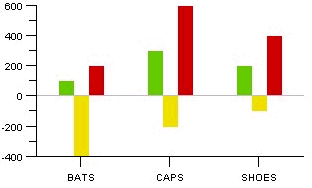
Example of %ChartXAxisCross_ZeroLineBttm
XAxisLabelOrientDescription
Use this property to specify whether the X axis label is displayed horizontally or vertically.
The default value is horizontal.
You can specify either a numeric value or a constant for this property. Values are:
|
Numeric Value |
Constant Value |
Description |
|
0 |
%ChartText_Horizontal |
The X axis label is displayed horizontally. |
|
90 |
%ChartText_Vertical |
The X axis label is displayed vertically |
This property is read-write.
XAxisStyleDescription
Use this property to specify the style of the X axis. The values for this property are the style classes contained in the style sheet associated with the chart.
Note. Pie chart labels take their style from this property.
This property is read-write.
See Also
XAxisTicksDescription
Use this property to specify the number of minor tick marks along the X axis. This property takes a numeric value. To control the major tick marks use the XAxisScaleResolution method.
This property is read-write.
See Also
YAxisLabelOrientDescription
Use this property to specify whether the Y axis label is displayed horizontally or vertically.
The default value is horizontal.
You can specify either a numeric value or a constant for this property. Valid values are:
|
Numeric Value |
Constant Value |
Description |
|
0 |
%ChartText_Horizontal |
The Y axis label is displayed horizontally. |
|
90 |
%ChartText_Vertical |
The Y axis label is displayed vertically |
This property is read-write.
YAxisMaxDescription
Use this property to specify the maximum value of the Y (data) axis. This property takes a numeric value.
The maximum value sets the largest value that is displayed on the axis.
Note. If the YAxisMax and YAxisMin properties are not set, or are set to too narrow a range, ticks may not appear on the Y axis.
This property is read-write.
YAxisMinDescription
Use this property to specify the minimum value of the X axis. This property takes a numeric value.
The minimum value sets the point at which the chart plots in positive and negative directions.
The default minimum value is the default value of the Y axis.
Note. If the YAxisMax and YAxisMin properties are not set, or are set to too narrow a range, ticks may not appear on the Y axis.
This property is read-write.
YAxisStyleDescription
Use this property to specify the style of the Y axis. The values for this property are the style classes contained in the style sheet associated with the chart.
This property is read-write.
See Also
YAxisTicksDescription
Use this property to specify the number of minor tick marks along the Y (data) axis. This property takes a numeric value. To control the major tick marks use the YAxisScaleResolution method.
This property is read-write.
See Also
Chart Title PropertiesThese properties are used to set the text and style of titles for the graph and the axes.
MainTitleDescription
Use this property to specify the text for the main title of the chart.
This property takes a string value.
This property is read-write.
MainTitleOrientDescription
Use this property to specify the orientation of the text for the main title.
The default value is horizontal.
You can specify either a number or a constant for this property. The values are:
|
Numeric Value |
Constant Value |
Description |
|
0 |
%ChartText_Horizontal |
Title text is displayed horizontally. |
|
90 |
%ChartText_Vertical |
Title text is displayed vertically. |
This property is read-write.
MainTitleStyleDescription
Use this property to specify the style of the main title. The values for this property are the style classes contained in the style sheet associated with the chart.
This property is read-write.
See Also
XAxisTitleDescription
Use this property to specify the text for the X axis title.
This property is read-write.
XAxisTitleOrientDescription
Use this property to specify the orientation of the text for the X axis title.
You can specify either a number or a constant for this property. The values are:
|
Numeric Value |
Constant Value |
Description |
|
0 |
%ChartText_Horizontal |
Title text is displayed horizontally. |
|
90 |
%ChartText_Vertical |
Title text is displayed vertically. This property is read-write. |
XAxisTitleStyleDescription
Use this property to specify the style of the X axis title. The values for this property are the style classes contained in the style sheet associated with the chart.
This property is read-write.
See Also
YAxisTitleDescription
Use this property to specify text of the title for the Y axis.
This property is read-write.
YAxisTitleOrientDescription
Use this property to specify the orientation of the text for the Y axis title.
You can specify either a number or a constant for this property. The values are:
|
Numeric Value |
Constant Value |
Description |
|
0 |
%ChartText_Horizontal |
Title text is displayed horizontally. |
|
90 |
%ChartText_Vertical |
Title text is displayed vertically. This property is read-write. |
YAxisTitleStyleDescription
Use this property to specify the style of the Y axis title. The values for this property are the style classes contained in the style sheet associated with the chart.
This property is read-write.
See Also
Chart Legend MethodsThese methods are used for each series legend.
SetLegendSyntax
SetLegend(&Array_of_String)
Description
Use the SetLegend method to specify alternative legends. By default, the legends are populated from the record field specified with SetDataSeries.
This method is used to write both the overlay legend and the series legend. The labels are overwritten in the order of elements in the array, that is, the first element overwrites the first series, the second overwrites the second, and so on, with the last element in the array overwriting the overlay legend. There can be more than one series in an overlay.
If you don't specify an element for an array (that is, a blank or a null) then no legend is listed for that series.
Note. Default label text is automatically translated. If you set your own labels, be sure to use translated text, such as message catalog entries.
Parameters
|
&Array_of_String |
Specify an already instantiated array of string, containing the text that you want to use for the legend. |
Returns
None.
Example
The following example displays a legend containing only the overlay.
&LegendArray = CreateArray("", "", "Revenue");

&MyChart.SetLegend(&LegendArray);
See Also
chart data class: SetDataSeries method.
Chart Legend PropertiesThese properties are used for each series legend.
HasLegendDescription
Use this property to specify if a legend is displayed with the chart. This property takes a Boolean value: True, if the legend is displayed with the chart, False otherwise.
The default value is False.
This property is read-write.
LegendMaxEntriesDescription
Use this property to specify the number of legend entries before a new column (or row) is created.
When the legend position is specified as left or right, the legend is drawn vertically so a new column is created when this property is exceeded.
When the legend position is specified as top or bottom, the legend is drawn horizontally and a new row is created when this property is exceeded.
The default value of this property is five.
This property is read-write.
LegendPositionDescription
Use this property to specify where the legend should appear, in relationship to the chart. You can specify either a numeric or constant value for this property.
Note. ChartLegend_Separate generates a legend without a chart. The legend takes over the entire charting area. The legend appears in the center of the chart.
The values are:
|
Numeric Value |
Constant Value |
Description |
|
0 |
%ChartLegend_Left |
Display legend to the left of the chart. |
|
1 |
%ChartLegend_Right |
Display legend to the right of the chart. |
|
2 |
%ChartLegend_Top |
Display legend on top of the chart. |
|
3 |
%ChartLegend_Bottom |
Display legend below the chart. |
|
4 |
%ChartLegend_Separate |
Generate a legend without a chart. This property is read-write. |
LegendStyleDescription
Use this property to specify the style of the legend. The values for this property are the style classes contained in the style sheet associated with the chart.
This property is read-write.
See Also
Chart Overlay MethodsThese methods are used to set and manipulate overlay data.
SetOLDataSyntax
SetOLData({Record_Name | &Rowset})
Description
Use the SetOLData method to specify where the data for the overlay is coming from. If you make a change to the underlying data of a chart, use the Refresh method to update the chart.
There are no default values for the overlay data. You must specify the data.
It is possible to specify two different Y axis fields, however, you must make certain that different data plotted against the same axis makes sense. For example, plotting two dollar amounts would probably be okay. However, plotting dollars against the number of sales, and sharing the same axis, though technically it would work, it wouldn't look correct.
Parameters
|
Record_Name |
Specify the name of a record to be used to populate the overlay of the chart with data. |
|
&Rowset |
Specify the name of an already instantiated rowset to populate the overlay of the chart with data. |
See Also
chart data class: SetDataXAxis method, SetDataYAxis method, SetData method.
SetOLDataSeriesSyntax
SetOLDataSeries(Record_Name.Field_Name)
Description
Use the SetOLDataSeries method to specify the name of the field containing the overlay series values. Every distinct value in this field is considered a unique series.
The series is plotted in the order given by the rows in the record.
If this value is Null, the system assumes there is only one series to plot.
Parameters
|
Record_Name.Field_Name |
Specify the name of the record, and the field on that record, that contains the series values of the overlay for the chart. |
See Also
chart data class: SetDataSeries method.
SetOLDataXAxisSyntax
SetOLDataXAxis(Record_Name.Field_Name)
Description
Use the SetOLDataXAxis method to specify the groups along the X axis if the axis is non-numeric for the overlay.
If the X axis is numeric, this method is used to give the position of the points along the axis. Only discrete values are supported for the X axis.
If this value is Null, the Y values are plotted along the X axis in groups labeled by their order number.
The order of the data is plotted in the order of rows in the record.
Parameters
|
Record_Name.Field_Name |
Specify the name of the record, and the field on that record, that contains the data for the X axis for the overlay of the chart. |
SetOLDataYAxisSyntax
SetOLDataYAxis(Record_Name.Field_Name)
Description
Use the SetOLDataYAxis to specify the data to plot for the overlay of the chart.
This value must always be numeric.
There is no default value for this method.
Parameters
|
Record_Name.Field_Name |
Specify the name of the record, and the field on that record, that contains the data for the overlay of the chart. |
See Also
chart data class: SetDataXAxis method, SetDataYAxis method.
Chart Overlay PropertiesThese properties are used to set and manipulate overlay data.
OLLineTypeDescription
Use the OLLineType property to specify the style of an overlay line.
This property takes either a numeric or constant value. The values are:
|
Numeric Value |
Constant Value |
Description |
|
1 |
%ChartLine_Solid |
Draw series with a solid line. |
|
2 |
%ChartLine_Dash |
Draw series with a line composed of dashes. |
|
3 |
%ChartLine_Dot |
Draw series with a line composed of dots. |
|
4 |
%ChartLine_DashedDot |
Draw series with a line composed of both dashes and dots. This property is read-write. |
See Also
chart appearance class: LineType property.
OLTypeDescription
Use this property to specify the style of the overlay line.
You can specify either a numeric or a constant value for this property. The values are:
|
Numeric Value |
Constant Value |
Description |
|
4 |
%ChartType_2DLine |
Overlay is drawn as a 2D line. |
|
5 |
%ChartType_2DHistogram |
Overlay is drawn as a 2D histogram. |
This property is read-write.
Scatter Chart MethodsThe methods in this section are only applicable when the chart has been specified as a 2D Scatter chart.
SetDataAnnotationsSyntax
SetDataAnnotation(Record_Name.Field_Name)
Description
Use the SetDataAnnotations method to specify an optional text label that can be associated with each point in the chart.
Parameters
|
Recordname.Fieldname |
Specify the field name (and the record it's associated with) that contains the text for the optional label. |
See Also
SetDataGlyphScaleSyntax
SetDataGlyphScale(Record_Name.Field_Name)
Description
Use the SetDataGlyphScale method to specify a field that contains numerical data defining the size of each glyph. These values are mapped to a range of size values between a predefined minimum and maximum.
Parameters
|
Recordname.Fieldname |
Specify the field (and the record associated with it) that contains numerical data used to define the size of each glyph. |
See Also
SetOLDataAnnotationsSyntax
SetOLDataAnnotation(Record_Name.Field_Name)
Description
Use the SetOLDataAnnotations method to specify an optional text label that can be associated with each point in the overlay of the chart.
Parameters
|
Recordname.Fieldname |
Specify the field name (and the record it's associated with) that contains the text for the optional label. |
See Also
SetOLDataGlyphScaleSyntax
SetOLDataGlyphScale(Record_Name.Field_Name)
Description
Use the SetOLDataGlyphScale method to specify a field that contains numerical data defining the size of each glyph in the overlay chart. These values are mapped to a range of size values between a predefined minimum and maximum.
Parameters
|
Recordname.Fieldname |
Specify the field (and the record associated with it) that contains numerical data used to define the size of each glyph. |
See Also
Scatter Chart PropertyThe property in this section is only applicable when the chart has been specified as a 2D Scatter chart.
ShowCrossHairDescription
Use the ShowCrossHair property to specify whether the chart should be split into quadrants.
This property takes a boolean value. If you specify true, two lines are drawn, one from the middle of the X axis and one from the middle of the Y axis.
TrueXY Line Chart PropertiesThe properties in this section are only applicable when the chart has been specified as a TrueXY line chart, that is, if the IsTrueXY property has been set to true.
XAxisCrossPointDescription
Use the XAxisCrossPoint property to specify the point at which the X axis intersects a numeric Y axis. The value is in the coordinate system of the Y axis scale.
This property is read-write.
See Also
XAxisMaxDescription
The maximum value of the X axis.
This property is only applicable to scatter, line or histogram charts where the X axis is numeric, that is, the IsTrueXY property has been set to true.
This property is read-write.
XAxisMinDescription
The minimum value of the X axis.
This property is only applicable to scatter, line or histogram charts where the X axis is numeric, that is, the IsTrueXY property has been set to true.
This property is read-write.
XAxisPrecisionDescription
Use the XAxisPrecision property to control the number of decimal places displayed in the labels of a numeric X axis.
This property is only applicable to scatter, line or histogram charts where the X axis is numeric, that is, the IsTrueXY property has been set to true.
This property is read-write.
See Also
XAxisScaleResolutionDescription
Use the XAxisScaleResolution property to control the level of detail displayed on a numeric axis. Use this property to increase or reduce the number of major tick marks and labels on the X axis.
This property is only applicable to scatter, line, bubble, or histogram charts where the X axis is numeric, that is, the IsTrueXY property has been set to true.
The values are:
|
Numeric Value |
Constant Value |
Description |
|
0 |
%ChartAxisResolution_Fine |
Specify fine resolution for the chart, that is, increase the number of major ticks and labels on the X axis. The fine scale resolution uses extra tick marks to give a more detailed division of the axis. This means that there may not be a one-to-one relationship between the axis labels and the tick marks. |
|
1 |
%ChartAxisResolution_Coarse |
Specify coarse resolution for the chart, that is, reduce the number of major ticks and labels on the X axis. The coarse scale value maintains a one-to-one relationship between the axis labels and the tick marks. |
This property is read-write.
See Also
YAxisCrossPointDescription
Use the YAxisCrossPoint property to specify the point at which the Y axis intersects a numeric X axis. The value is in the coordinate system of the X axis scale.
This property is only applicable to scatter, line or histogram charts where the X axis is numeric, that is, the IsTrueXY property has been set to true.
This property is read-write.
See Also
YAxisMaxDescription
The maximum value of the Y axis.
This property is only applicable to scatter, line, or histogram charts.
This property is read-write.
YAxisMinDescription
The minimum value of the Y axis.
This property is only applicable to scatter, line, or histogram charts.
This property is read-write.
YAxisPrecisionDescription
Use the YAxisPrecision property to control the number of decimal places displayed in the labels of a numeric Y axis.
This property is only applicable to scatter, line or histogram charts.
This property is read-write.
See Also
YAxisScaleResolutionDescription
Use the YAxisScaleResolution property to control the level of detail displayed on a numeric axis. Use this property to increase or reduce the number of major ticks and labels on the Y axis.
This property is only applicable to scatter, line, or histogram charts.
The values are:
|
Numeric Value |
Constant Value |
Description |
|
0 |
%ChartAxisResolution_Fine |
Specify fine resolution for the chart, that is, increase the number of major ticks and labels on the Y axis. The fine scale resolution uses extra tick marks to give a more detailed division of the axis. This means that there may not be a one-to-one relationship between the axis labels and the tick marks. |
|
1 |
%ChartAxisResolution_Coarse |
Specify coarse resolution for the chart, that is, reduce the number of major ticks and labels on the Y axis. The coarse scale value maintains a one-to-one relationship between the axis labels and the tick marks. |
This property is read-write.
See Also
Gantt Chart MethodsThe methods in this section are only applicable when the chart has been specified as a Gantt chart.
SetActualEndDateSyntax
SetActualEndDate(RecordName.FieldName)
Description
Use the SetActualEndDate method to specify the field in the record that defines the actual end date. This is an optional method, and is used in conjunction with the SetPlannedEndDate method. If an actual end date is specified, then an actual start date must also be specified. When defined, the actual or baseline tasks are visually shown as a separate task bar and are layered beneath the planned task if the two overlap.
Note. The Gantt chart logs a warning to the file PSJChart.log for any task that has a bad date format in this method or the SetActualStartDate method, but continues with its normal processing. For these tasks, the overlayed baseline information isn't displayed in the chart section.
Parameters
|
RecordName.FieldName |
Specify the field and its associated record that contains the value used to define the actual end date. This field must be of DateTime or Date type. |
See Also
SetActualStartDate, SetPlannedEndDate, SetPlannedStartDate.
SetActualStartDateSyntax
SetActualStartDate(RecordName.FieldName)
Description
Use the SetActualStartDate method to specify the field in the record that defines the actual start date. This is an optional method, and is used in conjunction with the SetPlannedStartDate method. If an actual start date is specified, then an actual end date must also be specified. When defined, the actual or baseline tasks are visually shown as a separate task bar and are layered beneath the planned task if the two overlap.
Note. The Gantt chart logs a warning to the file PSJChart.log for any task that has a bad date format in this method and the SetActualEndDate method, but continues with its normal processing. For these tasks, the overlayed baseline information is displayed in the chart section.
Parameters
|
RecordName.FieldName |
Specify the field and its associated record that contains the value used to define the actual start date. This field must be of DateTime or Date type. |
See Also
SetActualEndDate, SetPlannedEndDate, SetPlannedStartDate.
SetActualTaskBarColorSyntax
SetActualTaskBarColor(RecordName.FieldName)
Description
Use the SetActualTaskBarColor method to specify the field in the record that defines the colors for either the actual task bar or the actual milestone glyph.
Parameters
|
RecordName.FieldName |
Specify the field, and its associated record, that defines the task bar color. This field must be of type number, which means you can only use the numeric value for the color. See Chart Colors. |
See Also
SetPlannedTaskBarColor, TaskMilestoneGlyph.
SetChartAreaSyntax
SetChartArea(Percentage)
Description
Use the SetChartArea method to specify what percentage of the Gantt chart is allocated to displaying the chart section. By default, both the task and chart sections are allocated 50% of the available space provided by the Gantt chart.
Parameters
|
Percentage |
Specify the percentage of the page space for a Gantt chart that is allocated for displaying the chart area. PeopleSoft recommends setting this value above .20 or 20%. Any point below .20 may cause the task bars and task dependency lines to become compressed and hard to read. If the percentage is set less than or equal to .10 or 10%, this parameter automatically takes a value of 0, enabling the table area to occupy the entire Gantt chart area. This parameter takes a float value. |
SetPlannedEndDateSyntax
SetPlannedEndDate(RecordName.FieldName)
Description
Use the SetPlannedEndDate method to specify the field in the record that defines the planned end date. If planned versus actual dates are not used, this method specifies the end date of the task.
This method is required when creating a Gantt chart.
Note. The Gantt chart logs an error to the file PSJChart.log and stops its normal processing if it finds a bad date format in any of the rows in the field associated with this method and the SetPlannedStartDate method.
Parameters
|
RecordName.FieldName |
Specify the field and its associated record that contains the value used to define the planned end date. This field must be of DateTime or Date type. |
See Also
SetActualEndDate, SetActualStartDate, SetPlannedStartDate.
SetPlannedStartDateSyntax
SetPlannedStartDate(RecordName.FieldName)
Description
Use the SetPlannedStartDate method to specify the field in the record that defines the planned start date. If planned versus actual dates are not used, this method specifies the start date of the task.
This method is required when creating a Gantt chart.
Note. The Gantt chart logs an error to the file PSJChart.log and stops its normal processing if it finds a bad date format in any of the rows in the field associated with this method and the SetPlannedEndDate method.
Parameters
|
RecordName.FieldName |
Specify the field and its associated record that contains the value used to define the planned start date. This field must be of DateTime or Date type. |
See Also
SetActualEndDate, SetPlannedEndDate, SetPlannedStartDate.
SetPlannedTaskBarColorSyntax
SetPlannedTaskBarColor(RecordName.FieldName)
Description
Use the SetPlannedTaskBarColor method to specify the field in the record that defines the colors for either the planned task bar or the planned milestone glyph.
Parameters
|
RecordName.FieldName |
Specify the field, and its associated record, that defines the task bar color. This field must be of type number, which mean you can only use the numeric values for specifying color. See Chart Colors. |
See Also
SetActualTaskBarColor, TaskMilestoneGlyph.
SetTableXScrollbarSyntax
SetTableXScrollbar(Scroll_ArrowAmount)
Description
Use the SetTableXScrollbar method to specify the amount that the scroll bar in the table section of the Gantt chart scroll data when the user clicks on the arrows or scrollbar.
Parameters
|
Scroll_ArrowAmount |
Specify the amount to scroll in the table section of the Gantt chart when the user clicks on the horizontal scrollbar arrow. The scroll amount must be a value between zero and one. The default value is 0.10. The amount specified indicates the percentage of the table section that is scrolled when the user clicks the scroll bar. |
SetTaskAppDataSyntax
SetTaskAppData(RecordName.FieldName1 [, RecordName.FieldName2 [,RecordName.FieldName3. . .]])
Description
Use the SetTaskAppData method to specify the fields in the record that define the application data to be viewed in the table section.
In the table section, column one (or the leftmost column) always displays the work breakdown structure (WBS) numbering (if given) and name of the task (or task ID if the name is not given). This method allows applications to define additional task data columns to be displayed in the rightmost columns of the table section.
Parameters
|
RecordName.FieldNames |
Specify the fields and their associated record that defines one or more application specific fields to be displayed as a column in the table section. The order in which the fields are given as parameters defines their column order in the table section. Because the task name (or task ID if the name is not given) is always shown in column one, the first record field value is displayed in column two. |
See Also
SetTaskAppDataTitles, SetTaskData, SetTaskDependencyData.
SetTaskAppDataTitlesSyntax
SetTaskAppDataTitles(&TitleArray)
Description
Use the SetTaskAppDataTitles method to specify the column titles to be displayed in the table section, starting with column two. The title for column one (that is, the leftmost column) in the table section is set using the SetTaskTitle method.
The length of the array should match the number of application data fields specified with the SetTaskAppData method. Additional strings beyond the number of application data fields are not displayed. If the number of strings in the array specified by this method is less than the number of application data fields, the blanks are displayed in these title columns.
Parameters
|
&TitleArray |
Specify an array of strings containing the column titles to be displayed in the table section. |
See Also
SetTaskBarURLSyntax
SetTaskBarURL(RecordName.FieldName)
Description
Use the SetTaskBarURL method to specify the field in the record which defines the URL the browser redirects to when the user clicks on a task bar.
By default, the FieldChange event on the planned end date field of the Gantt task data record is triggered if the image map based interactivity is turned on (using the IsDrillable property). This can be overriden by specifying a URL that is triggered when the task bar is clicked.
Use the SetTaskDependencyURL method to specify the URL to be used when the user clicks on a dependency line in the chart section.
Parameters
|
Record.Fieldname |
Specify the field, and its associated record, that defines the URL the browser is redirected to when the task bar is clicked. This field must be of type character. The URL must be an absolute URL. |
See Also
SetTaskDataSyntax
SetTaskData({Record.RecordName | &Rowset})
Description
Use the SetTaskData method to specify from where the task data is to be populated, either from a record or an already instantiated rowset.
Note. If you specify a rowset, the data in the rowset must be provided in the correct display order.
This method is required when you're creating a Gantt chart.
Parameters
|
RecordName | &Rowset |
Specify the record or rowset that contains the task data. If you specify a record, you must prefix the record name with the keyword Record. |
See Also
SetTaskDependencyChildIDSyntax
SetTaskDependencyChildID(RecordName.FieldName)
Description
The dependent task is the task where the dependency arrow ends. Use the SetTaskDependencyChildID method to specify the field in the record that defines the task ID for the dependent task.
The ID must match up to an ID in the Task data set.
This method is required if you specify dependency data.
Parameters
|
RecordName.FieldName |
Specify the field, and its associated record, that defines the task ID for the dependant task. This field must be of type number. |
See Also
SetTaskDependencyData, SetTaskDependencyURL, SetTaskDependencyParentID.
SetTaskDependencyDataSyntax
SetTaskDependencyData({RecordName | &Rowset})
Description
Use the SetTaskDependencyData method to specify either a record, or an already instantiated rowset, that contains the dependency data.
Note. If you specify a rowset, the data in the rowset must be provided in the correct display order.
Parameters
|
RecordName | &Rowset |
Specify the record or rowset that contains the task data. If you specify a record, you must prefix the record name with the keyword Record. |
See Also
SetTaskData, SetTaskDependencyChildID, SetTaskDependencyURL, SetTaskDependencyParentID.
SetTaskDependencyURLSyntax
SetTaskDependencyURL(RecordName.FieldName)
Description
Use the SetTaskDependencyURL method to specify the field in the record that defines the URL the browser redirects to when the user clicks on a task bar.
By default, the FieldChange event on the child ID field of the task dependency record is triggered if the image map based interactivity is turned on (using the IsDrillable property). This can be overriden by specifying a URL that is triggered when the task bar is clicked.
Use the SetTaskBarURL method to specify the URL to be used when the user clicks on a task bar in the chart section.
Parameters
|
RecordName.FieldName |
Specify the field, and its associated record, that defines the URL the browser is redirected to when the dependency arrow is clicked. This field must be of type character. The URL must be an absolute URL. |
See Also
SetTaskBarURL, SetTaskDependencyChildID, SetTaskDependencyData, SetTaskDependencyParentID.
SetTaskDependencyParentIDSyntax
SetTaskDependencyParentID(RecordName.FieldName)
Description
The depender task is the task where the dependency arrow originates. Use the SetTaskDependencyParentID method to specify the field in the record that defines the task ID for the depender task.
The ID must match up to an ID in the Task data set.
This method is required if you specify dependency data.
Parameters
|
RecordName.FieldName |
Specify the field and its associated record that defines the task ID for the depender task. This field must be of type number. |
See Also
SetTaskDependencyChildID, SetTaskDependencyData.
SetTaskExpandedSyntax
SetTaskExpanded((RecordName.FieldName)
Description
Use the SetTaskExpanded method to specify the field in the record that defines the expanded state of parent tasks.
Whenever an end user changes the expanded state by clicking on the expand (collapse) icon in the table section, the expanded state in the rowset is updated. In addition, a field change event occurs to allow applications to synchronize expanded state changes with other parts of their application.
Parameters
|
RecordName.FieldName |
Specify the field, and its associated record, that defines the text in the task hint popup. This field must be of type character, that is, Y or N. |
SetTaskHintsSyntax
SetTaskHints(RecordName.FieldName)
Description
Use the SetTaskHints method to specify the field in the record which defines the task hint popup text. The description is displayed in a popup bubble when a cursor hovers over the task bar or milestone glyph.
Parameters
|
RecordName.FieldName |
Specify the field, and its associated record, that defines the text in the task hint popup. This field must be of type character. |
See Also
SetTaskIDSyntax
SetTaskID(Recordname.FieldName)
Description
Use the SetTaskID method to specify the field that defines the unique task identifier. The task ID is used to support task linking and dependencies.
This method is required when you're creating a Gantt chart.
Parameters
|
RecordName.FieldName |
Specify the record name and the field name of the field that defines the unique task identifier. The field must be of type number. |
See Also
SetTaskLabelSyntax
SetTaskLabel(RecordName.FieldName)
Description
Use the SetTaskLabel method to specify the field in the record that defines the task label. The label is displayed alongside its corresponding task bar in the chart area. If a task label is not provided, the task name is used instead. If a task name is not provided, the task id is used.
Parameters
|
RecordName.FieldName |
Specify the field, and its associated record, that contains the task label. This field must be of type character. |
See Also
SetTaskLevelSyntax
SetTaskLevel(RecordName.FieldName)
Description
Use the SetTaskLevel method to specify the field in the record that defines the level for the task. The outermost summary tasks are always defined as task level one. Tasks with task levels greater than one are subtasks. Subtasks may also contain other subtasks.
If a field is not provided to define the level, all tasks are defined at level 1. A maximum of 32 levels are supported.
The following table shows an example of the different levels that could be used, as well as what the parent task level is.
Note. The parent task is not actually part of the data.
|
Task Name |
Task Level |
Parent Level |
|
Phase I |
1 |
None |
|
Evaluation |
2 |
Phase I |
|
Research |
3 |
Evaluation |
|
Report Findings |
3 |
Evaluation |
|
Create Budget |
2 |
Phase I |
|
Approve Budget |
3 |
Create Budget |
|
Phase II |
1 |
None |
|
Code and Test |
2 |
Phase II |
|
Phase III |
1 |
None |
|
Training |
2 |
Phase III |
Parameters
|
RecordName.FieldName |
Specify the field, and its associated record, that contains the information about the task level. This field must be of type number. Up to 32 levels are supported. |
See Also
SetTaskMilestoneSyntax
SetTaskMilestone(RecordName.FieldName)
Description
Use the SetTaskMilestone method to specify the field in the record that defines whether the task should be treated as a milestone.
The fields specified by the SetPlannedStartDate and SetActualStartDate methods are used for determining the dates for the planned and actual milestones. The other date fields in the rowset are ignored
Parameters
|
RecordName.FieldName |
Specify the field and its associated record that defines whether the task should be treated as a milestone. The field must be of type Character, and be one character long. The possible values for this field are Y, used to specify that this task is a milestone, or N, if not. |
See Also
SetActualStartDate, SetTaskMilestone, SetPlannedStartDate.
SetTaskNameSyntax
SetTaskName(RecordName.FieldName)
Description
Use the SetTaskName method to specify the field in the record that defines the task name. If you don't specify a task name, the task ID is used in the table section of the Gantt chart.
Although this method is not required, PeopleSoft recommends using it to display meaningful information in the table section of the Gantt chart.
Parameters
|
RecordName.FieldName |
Specify the field name and its associated record that defines the task name. The field must be of type character. |
See Also
SetTaskProgressSyntax
SetTaskProgress(RecordName.FieldName)
Description
Use the SetTaskProgress method to specify the field in the record that defines the length of the progress bar for this task as shown in the chart area of the Gantt chart.
The value in the field must be between 0 and 100, inclusive. Zero indicates no progress bar is shown, 100 indicates that the progress bar should cover the entire length of the task bar. Values greater than 100 are automatically converted to 100.
Parameters
|
RecordName.FieldName |
Specify the field, and its associated record, that defines the length of the progress bar for this task. This field must be of type number. The value in the field must be between 0 and 100, inclusive. You must not specify a value greater than 100. |
See Also
SetTaskProgressBarColorSyntax
SetTaskProgressBarColor(RecordName.FieldName)
Description
Use the SetTaskProgressBarColor method to specify the field in the record that defines the color for the progress bar.
In order for the progress bar to be visible, its color must contrast with the task bar color. There are no borders drawn around the progress bar.
Parameters
|
RecordName.FieldName |
Specify the field, and its associated record, that defines the task progress bar color. This field must be of type numeric, which means that you can only use the numeric value for the chart colors, not the constant. See Chart Colors. |
See Also
SetActualTaskBarColor, SetTaskProgress.
SetWBSNumberingSyntax
SetWBSNumbering(RecordName.FieldName)
Description
Use the SetWBSNumbering method to specify the field in the record that defines the work breakdown structure (WBS) numbering to be displayed for each task row in the table section of the Gantt chart.
A WBS is very similar in structure and layout to a document outline. Each item at a specific level of a WBS is numbered consecutively (that is, 10, 20, 30, 40, 50). Each item at the next level is numbered within the number of its parent item (that is, 10.1, 10.2, 10.3, 10.4). For example:
1.
   1.1
      1.1.1
      1.1.2
      1.1.3
   1.2
      1.2.1
      1.2.2
2.
. . .
If no field name is provided, WBS numbering is not displayed along with the tasks.
Regardless if WBS numbering is provided, child tasks are indented to the right of their parent task.
Parameters
|
RecordName.FieldName |
Specify the field name and its associated record that defines the WBS numbering to be displayed. The field must be of type character. |
Gantt Chart PropertiesThis section discusses Gantt chart properties. The properties are described in alphabetical order.
AxisEndDateTimeDescription
Use this property to specify the date and time where the chart axis should end. The value must be of type Date or DateTime.
This property is read-write.
AxisStartDateTimeDescription
Use this property to specify the date and time where the chart axis should begin. The value must be of type Date or DateTime.
This property is read-write.
DataEndDateTimeDescription
Use this property to specify where the chart should stop displaying data. The value must be of type DateTime.
This property is read-write.
DataStartDateTimeDescription
Use this property to specify where the chart should start displaying data. The value must be of type DateTime.
This property is read-write.
PixelsPerRowDescription
This property returns an integer value of the row height (in pixels) for each row in the table section. Use this property to properly size the height of the table section of your Gantt chart so that all rows in the table are displayed. You can do so by multiplying the value for the PixelsPerRow property by the number of visible rows in the rowset.
The system calculates the value of the PixelsPerRow property at runtime after the Gantt image is rendered. To do so, this property must be read after the PeopleCode Activate event. This can be done by reading in the PixelPerRow value during a FieldChange event on a refresh button on the page.
This property is read-only.
ShowTaskLabelsDescription
Use this property to specify whether or not task labels are displayed alongside the corresponding task bar in the chart area. This property takes a boolean value; true to display the labels, false to not display the labels. The default is to display the labels.
This property is read-write.
TaskDependencyLineTypeDescription
Use this property to specify an integer value that specifies the line type of the line connecting dependent tasks. This value affects all the dependency lines for the entire Gantt chart, not just for a specific set of tasks.
This property is read-write.
|
Numeric Value |
Constant Value |
Description |
|
0 |
%ChartLine_Solid |
Solid line |
|
1 |
%ChartLine_Dashed |
Dashed line |
|
2 |
%ChartLine_Dotted |
Dotted line |
|
3 |
%ChartLine_Mixed |
Mixture of dashes and dots |
TaskMilestoneGlyphDescription
Use this property of type integer to specify which field in the record defines the glyph to represent a task milestone (for both planned and actual milestones). This glyph is used for the entire chart, not just for a specific task.
By default a diamond shaped glyph will be used.
Milestones associated with planned dates use colors defined by the SetPlannedTaskBarColor method. Milestones associated with actual dates use colors defined by the SetActualTaskBarColor method.
This property is read-write.
See Also
TaskTitleDescription
Use this property to specify the column title to be displayed in column one (that is, the leftmost column) in the table section of the Gantt chart. Use the SetTaskAppDataTitles method to specify the column titles for the application specific data fields (that is, column two and beyond).
This property is read-write.
See Also
XAxisPositionDescription
Use this property to specify the position of the X axis relative to the Y axis.
Note. This property is not supported in Gantt charts.
You can use either a constant or a numeric value for this property. Valid values are:
|
Numeric Value |
Constant Value |
Description |
|
1 |
%ChartAxis_ZeroPosition |
Positions the axis in line with the 0 on the opposite axis. Default position for the axis. |
|
2 |
%ChartAxis_LowPosition |
Positions the axis in line with the lowest value on the opposite axis. |
|
3 |
%ChartAxis_HighPosition |
Positions the axis in line with the highest value on the opposite axis. |
This property is read-write.
YAxisPositionDescription
Use this property to specify the position of the Y axis relative to the X axis.
Note. This property is not supported in Gantt charts.
You can use either a constant or a numeric value for this property. Valid values are:
|
Numeric Value |
Constant Value |
Description |
|
1 |
%ChartAxis_ZeroPosition |
Positions the axis in line with the 0 on the opposite axis. Default position for the axis. |
|
2 |
%ChartAxis_LowPosition |
Positions the axis in line with the lowest value on the opposite axis. |
|
3 |
%ChartAxis_HighPosition |
Positions the axis in line with the highest value on the opposite axis. |
This property is read-write.
Gantt Chart DateTimeAxis Specific MethodsThis section discusses the DateTimeAxis specific methods that can be used with Gantt charts. The methods are listed in hierarchical order.
See Also
Specifying DateTime Axis Formats
SetSecondFormatSyntax
SetSecondFormat(Format)
Description
Use the SetSecondFormat method to specify how seconds display on a DateTime axis.
Locale-specific time separators are used to format the time.
Parameters
|
Format |
Specify the format for how the seconds should be displayed: |
|
Value |
Description |
|
%Chart_SecondFormat |
Displays the seconds using a one or two digit number. |
|
%Chart_SecondFormat_2Digit |
Displays seconds using a two digit number. |
See Also
SetHourFormat, SetMinuteFormat.
SetMinuteFormatSyntax
SetMinuteFormat(Format)
Description
Use the SetMinuteFormat method to specify how minutes are displayed on the DateTime axis.
Locale-specific time separators are used to format the time.
Parameters
|
Format |
Specify how the minutes should be displayed: |
|
Value |
Description |
|
%Chart_MinuteFormat |
Displays the minutes using a one or two digit number. |
|
%Chart_MinuteFormat_2Digit |
Displays the minutes using a two digit number. |
See Also
SetHourFormat, SetSecondFormat.
SetHourFormatSyntax
SetHourFormat(Format)
Description
Use the SetHourFormat method to specify how the hour displays on a DateTime axis.
Parameters
|
Format |
Specify the format the hours should be displayed in. The values are: |
|
Value |
Description |
|
%Chart_HourFormat_24 |
Display the hour using one or two digits in a 24 hour clock, that is 0–24. |
|
%Chart_HourFormat_24_2Digit |
Display the hour using two digits for a 24 hour clock, that is 00–24. |
|
%Chart_HourFormat_12 |
Display the hour using one or two digits using a 12 hour clock. A.M. or P.M. is displayed next to the value. |
|
%Chart_HourFormat_12_2Digit |
Display the hour using one or two digits using a 12 hour clock. A.M. or P.M. is displayed next to the value. |
See Also
SetDayFormat, SetMinuteFormat, SetSecondFormat.
SetDayFormatSyntax
SetDayFormat(Format)
Description
Use the SetDayFormat method to specify the format of the day on a DateTime axis.
Parameters
|
Format |
Specify the format the day should display in. The values are: |
|
Value |
Description |
|
%Chart_DayFormat |
Display the day in a one or two digit format. |
|
%Chart_DayFormat_2Digit |
Display the day in a two digit format. |
|
%Chart_DayFormat_Name |
Display the day using the full name, such as Monday, Tuesday, and so on. |
|
%Chart_DayFormat_DOY |
Display the day of the year in a numeric format, that is 1 — 366. |
|
%Chart_DayFormat_DOY_2Digit |
Display the day of the year in a two digit numeric format, that is 01 — 366. |
See Also
SetHourFormat, SetMinuteFormat, SetMonthFormat, SetSecondFormat.
SetMonthFormatSyntax
SetMonthFormat(Format)
Description
Use the SetMonthFormat method to specify the format of months on a DateTime axis.
Parameters
|
Format |
Specify the format of how the month should be displayed. Values are: |
|
Value |
Description |
|
%Chart_MonthFormat |
Display the month using a numeric one or two digit number. |
|
%Chart_MonthFormat_2Digit |
Display the month using a numeric two digit number. |
|
%Chart_MonthFormat_FullName |
Display the month using the full name. |
See Also
SetYearFormatSyntax
SetYearFormat(Format)
Description
Use the SetYearFormat method to specify the format of years on the DateTime axis.
Parameters
|
Format |
Specify the format of how the year should be displayed. Values are: |
|
Value |
Description |
|
%Chart_YearFormat |
Display the year using a numeric one or two digit number. |
|
%Chart_YearFormat_2Digit |
Display the year using a numeric two digit number. |
|
%Chart_YearFormat_4Digit |
Display the year using a numeric four digit number. |
See Also
Chart ExamplesThe following are some example charts, with the PeopleCode used to create them.
Creating a ChartIn the following example, the chart is created from a record with three fields, relating to sales, month, and product. The series in the chart are based on the product. The following is the complete code sample: the steps explain each line.
Global Chart &oChart;

&oChart = GetChart(QE_CHART_DUMREC.QE_CHART_FIELD);

&oChart.SetData(Record.QE_CHART_RECORD);
&oChart.SetDataYAxis(QE_CHART_RECORD.QE_CHART_SALES);
&oChart.SetDataXAxis(QE_CHART_RECORD.QE_CHART_PRODUCT);

&oChart.SetDataSeries(QE_CHART_RECORD.QE_CHART_REGION);

&oChart.Type = %ChartType_2DStackedBar;

&oChart.HasLegend = True;
&oChart.LegendPosition = %ChartLegend_Right;

&oChart.XAxisLabelOrient = %ChartText_Vertical;
The following is the chart produced by the previous code:
To create a chart:
Open PeopleSoft Application Designer.
Open the page where the chart is to be inserted.
Insert the chart control by either:
Clicking on the chart icon in the toolbar, or
Selecting Insert, Chart
Draw the chart control on the page.
Associate the chart control with a record field
Every chart control must be associated with a record field. This is just the field for the chart control. It is not the field used for drilling down for data in the chart.
Bring up the chart control properties by either
Double-clicking on the chart control, or
Right-clicking on the chart control and selecting Page Field Properties.
Select the record name and field for the chart.
On the Record tab of the chart control properties, select the record and field for the chart.
To make the control a page anchor, select the Enable as Page Anchor on the General tab.
Write your PeopleCode.
In some event on the page, such as Activate, put the PeopleCode you need for populating the chart.
Get the chart.
The first thing you must do is get the chart. You must use the record and field name that you associated with the chart control on the page.
&oChart = GetChart(QE_CHART_DUMREC.QE_CHART_FIELD);
Set the data records.
Set the data record. The SetData function associates the record data with the chart. Then use the SetDataYAxis and SetDataXAxis functions to associate specific fields in the record with the Y axis data and the X axis data.
&oChart.SetData(Record.QE_CHART_RECORD);
&oChart.SetDataYAxis(QE_CHART_RECORD.QE_CHART_SALES);
&oChart.SetDataXAxis(QE_CHART_RECORD.QE_CHART_PRODUCT);
This is all the code needed to create a chart. You don’t need to set the chart type: the default is a 2D bar chart. You don't need to set the series unless you want to group your data. Everything else is also optional.
(Optional) Set the data series.
In this example, we want to set the region as the series. This means that the data will be grouped according to the region.
&oChart.SetDataSeries(QE_CHART_RECORD.QE_CHART_REGION);
(Optional) Set the chart type.
Because we want a stacked bar for the chart, we must set the Type property of the chart. This means that each product (footballs, rackets, and so on) will have a single bar, and the data series (California, Oregon, and so on) will be what is 'stacked'.
&oChart.Type = %ChartType_2DStackedBar;
(Optional) Set legend and label attributes.
For this example, we want a legend, and want it to appear in the right side. In addition, because the text of the series labels is so large, they must be vertical to display all of them.
&oChart.HasLegend = True;
&oChart.LegendPosition = %ChartLegend_Right;

&oChart.XAxisLabelOrient = %ChartText_Vertical;
Creating a Gantt ChartThe following is the complete code sample: the steps explain each line.
&oGantt = GetGanttChart(QE_CHART_DUMREC.QE_CHART_FIELD);

/*/ /////////
// Required
// ////////*/

/*/ Assign record which holds the task related data */
&oGantt.SetTaskData(Record.QE_GANTT_TASK);
&oGantt.SetTaskID(QE_GANTT_TASK.QE_ID);
&oGantt.SetPlannedStartDate(QE_GANTT_TASK.PLANNED_START_DATE);
&oGantt.SetPlannedEndDate(QE_GANTT_TASK.PLANNED_END_DATE);


/*// //////////////////
// General options //
// //////////////////*/

&oGantt.SetTableXScrollbar(0.20);
&oGantt.SetChartArea(QE_GANTT_PROJ.QE_CHART_PERCENT);
&oGantt.width = QE_GANTT_PROJ.QE_WIDTH;
&oGantt.height = QE_GANTT_PROJ.QE_HEIGHT;
&oGantt.DataStartRow = QE_GANTT_PROJ.QE_START_ROW;
&oGantt.DataWidth = QE_GANTT_PROJ.QE_DATA_SIZE;
&oGantt.IsDrillable = QE_GANTT_PROJ.QE_DRILLABLE;
&oGantt.ShowTaskLabels = QE_GANTT_PROJ.QE_SHOWTASKLABELS;

&oGantt.GridLineType = QE_GANTT_PROJ.QE_GRIDLINE_TYPE;
If QE_GANTT_PROJ.QE_GRIDLINE_ENABLE = "Y" Then
   &oGantt.GridLines = %ChartGrid_Vertical;
Else
   &oGantt.GridLines = %ChartGrid_None;
End-If;


/*// ////////////////////////////////////////
// Optional fields specific to task data //
// //////////////////////////////////////// */

&oGantt.SetTaskName(QE_GANTT_TASK.QE_NAME);
&oGantt.SetTaskWBSNumbering(QE_GANTT_TASK.QE_WBS_ID);
&oGantt.SetTaskLevel(QE_GANTT_TASK.QE_LEVEL);
&Gantt.SetTaskLabel(QE_GANTT_TASK.QE_LABEL);
&Gantt.SetTaskProgress(QE_GANTT_TASK.QE_PROGRESS);
&Gantt.SetTaskHints(QE_GANTT_TASK.QE_HINTS);
&Gantt.SetTaskBarURL(QE_GANTT_TASK.QE_URL);
&oGantt.SetTaskMilestone(QE_GANTT_TASK. QE_MILESTONE);
&oGantt.TaskMilestoneGlyph = QE_GANTT_PROJ.QE_MILESTONE_GLYPH;
&oGantt.SetTaskExpanded(QE_GANTT_TASK.QE_EXPANDED);

&Gantt.SetPlannedTaskBarColor(QE_GANTT_TASK.QE_PLANNED_TASK_COLOR);
&Gantt.SetActualTaskBarColor(QE_GANTT_TASK.QE_ACTUAL_TASK_COLOR);
&Gantt.SetTaskProgressColor(QE_GANTT_TASK.QE_PROGRESS_COLOR);


/*// /////////////////////////
// Specific to Table Area //
// /////////////////////////*/

&oGantt.SetTaskAppData(QE_GANTT_TASK.QE_PLANNED_START,
QE_GANTT_TASK.QE_PLANNED_END,
QE_GANTT_TASK.QE_TASK_PROGRESS,
QE_GANTT_TASK.QE_TASK_NAME,
QE_GANTT_TASK.QE_EXPANDED);

 &oGantt.TaskTitle = "Tasks";
 &appDataArray = CreateArray("Start", "End", "Progress", "Name", "Expanded");
 &oGantt.SetTaskAppDataTitles(&appDataArray);


/*     //////////////////////////////////////////////
     // Optional fields for task dependency data //
     ////////////////////////////////////////////// */

/*// Assign record which holds the task dependency related data */
&oGantt.SetTaskDepenencyData(Record.QE_GANTT_TASKD);
&oGantt.SetTaskDependencyParentID(QE_GANTT_TASKD.QE_PARENT_TASK_ID);
&oGantt.SetTaskDependencyChildID(QE_GANTT_TASKD.QE_TASK_ID);
&oGantt.TaskDependencyLineType = QE_GANTT_PROJ.QE_LINETYPE_CHAR;
&oGantt.SetTaskDependencyURL(QE_GANTT_TASKD.URL);


/*// ///////////////////
// Enable baselines //
// /////////////////// */

&oGantt.SetActualStartDate(QE_GANTT_TASK.QE_ACTUAL_START);
&oGantt.SetActualEndDate(QE_GANTT_TASK.QE_ACTUAL_END);


/*////////////////////////////
// DateTime Axis specific //
////////////////////////////*/
&oGantt.AxisStartDateTime = DateTimeValue("07/15/2002 8:00:00");
&oGantt.AxisEndDateTime = DateTimeValue("09/15/2002 8:00:00");

&oGantt.SetMonthFormat(%Chart_MonthFormat_FullName);
&Gantt.SetDayFormat(%Chart_DayFormat_2Digit);
To create a Gantt chart:
Get a Gantt chart.
Get the chart using the GetGanntChart function. The record and field name specified are associated with a chart definition in PeopleSoft Application Designer.
Local Gantt &oGantt;

&oGantt = GetGanttChart(QE_CHART_DUMREC.QE_CHART_FIELD);
Specify values for the required methods.
There are several methods that are required for the Gantt chart, such as setting the task data, the start and end dates, and so on.
&oGantt.SetTaskData(Record.QE_GANTT_TASK);
&oGantt.SetTaskID(QE_GANTT_TASK.ID);
&oGantt.SetPlannedStartDate(QE_GANTT_TASK.START_DATE);
&oGantt.SetPlannedEndDate(QE_GANTT_TASK.END_DATE);
Specify values for the additional methods controlling the display of the data.
After you've set the required methods, you can set additional methods to control the display of the chart. The following code specifies the amount that the scroll bars scroll when clicked, the percentage of the entire chart that is taken up by the chart area, the width and height of the chart, on what row the chart should begin displaying data, the width of the data, if the user can click on the chart area of the Gantt chart and either execute a function or a URL, and whether labels should display with the tasks in the task section.
&oGantt.SetTableXScrollbar(0.20);
&oGantt.SetChartArea(QE_GANTT_PROJ.QE_CHART_PERCENT);
&oGantt.width = QE_GANTT_PROJ.QE_WIDTH;
&oGantt.height = QE_GANTT_PROJ.QE_HEIGHT;
&oGantt.DataStartRow = QE_GANTT_PROJ.QE_START_ROW;
&oGantt.DataWidth = QE_GANTT_PROJ.QE_DATA_SIZE;
&oGantt.IsDrillable = QE_GANTT_PROJ.QE_DRILLABLE;
&oGantt.ShowTaskLabels = QE_GANTT_PROJ.QE_SHOWTASKLABELS;
Specify how the grid lines are displayed.
Depending on the type of data that you are using, you can specify the type of grid lines that should display in the chart section of the Gantt chart.
&oGantt.GridLineType = QE_GANTT_PROJ.QE_GRIDLINE_TYPE;
If QE_GANTT_PROJ.QE_GRIDLINE_ENABLE = "Y" Then
   &oGantt.GridLines = %ChartGrid_Vertical;
Else
   &oGantt.GridLines = %ChartGrid_None;
End-If;
Additionally specify how the data is to be displayed.
The following methods control how the different parts of the task data displays, such as the label, what hints display when the mouse is passed over the task data, and so on.
&oGantt.SetTaskName(QE_GANTT_TASK.QE_NAME);
&oGantt.SetTaskWBSNumbering(QE_GANTT_TASK.QE_WBS_ID);
&oGantt.SetTaskLevel(QE_GANTT_TASK.QE_LEVEL);
&Gantt.SetTaskLabel(QE_GANTT_TASK.QE_LABEL);
&Gantt.SetTaskProgress(QE_GANTT_TASK.QE_PROGRESS);
&Gantt.SetTaskHints(QE_GANTT_TASK.QE_HINTS);
&Gantt.SetTaskBarURL(QE_GANTT_TASK.QE_URL);
&oGantt.SetTaskMilestone(QE_GANTT_TASK. QE_MILESTONE);
&oGantt.TaskMilestoneGlyph = QE_GANTT_PROJ.QE_MILESTONE_GLYPH;
&oGantt.SetTaskExpanded(QE_GANTT_TASK.QE_EXPANDED);

&Gantt.SetPlannedTaskBarColor(QE_GANTT_TASK.QE_PLANNED_TASK_COLOR);
&Gantt.SetActualTaskBarColor(QE_GANTT_TASK.QE_ACTUAL_TASK_COLOR);
&Gantt.SetTaskProgressColor(QE_GANTT_TASK.QE_PROGRESS_COLOR);
Specify the additional fields to be displayed in table section.
You can specify application data to also be displayed with the task data.
&oGantt.SetTaskAppData(QE_GANTT_TASK.QE_PLANNED_START,
QE_GANTT_TASK.QE_PLANNED_END,
QE_GANTT_TASK.QE_TASK_PROGRESS,
QE_GANTT_TASK.QE_TASK_NAME,
QE_GANTT_TASK.QE_EXPANDED);
Specify titles for the task bars.
You can specify different titles for the different task bars.
 &oGantt.TaskTitle = "Tasks";
 &appDataArray = CreateArray("Start", "End", "Progress", "Name", "Expanded");
 &oGantt.SetTaskAppDataTitles(&appDataArray);
Specify the fields for task dependency data.
You do not need to specify dependency data. However, if you do, you must also specify the parent ID and the child ID (where the dependency data starts and ends.) You can also specify optional things, like the type of line used between the dependencies, as well as a URL that the browser will open to if the user clicks a dependency line.
&oGantt.SetTaskDepenencyData(Record.QE_GANTT_TASKD);
&oGantt.SetTaskDependencyParentID(QE_GANTT_TASKD.QE_PARENT_TASK_ID);
&oGantt.SetTaskDependencyChildID(QE_GANTT_TASKD.QE_TASK_ID);
&oGantt.TaskDependencyLineType = QE_GANTT_PROJ.QE_LINETYPE_CHAR;
&oGantt.SetTaskDependencyURL(QE_GANTT_TASKD.URL);
Specify the actual dates for the project.
If you know the actual start and end date, in addition to the planned date, you can add those to your chart as well.
&oGantt.SetActualStartDate(QE_GANTT_TASK.QE_ACTUAL_START);
&oGantt.SetActualEndDate(QE_GANTT_TASK.QE_ACTUAL_END);
Specify the DateTime axis values.
You can specify values for where the DateTime axis starts and ends.
&oGantt.AxisStartDateTime = DateTimeValue("07/15/2002 8:00:00");
&oGantt.AxisEndDateTime = DateTimeValue("09/15/2002 8:00:00");
Specify the format of the DateTime axis values.
You can specify the format of the DateTime elements, such as how the days of the week display, whether as a number or using the full name, and so on.
&oGantt.SetMonthFormat(%Chart_MonthFormat_FullName);
&Gantt.SetDayFormat(%Chart_DayFormat_2Digit);
Creating a Chart Using an iScriptYou can also create a chart using an iScript. The following example creates a chart, populates it, then sends the chart URL to a response object. The following is the complete code sample: the steps explain each line.
Function IScript_GetChartURL()

   Local Chart &oChart;
   Local Rowset &oRowset;
   Local string &sMap;
   Local string &sURL;

   &oChart = CreateObject("Chart");

   &oRowset = CreateRowset(Record.QE_CHART_RECORD);
   &oRowset.Fill("where QE_CHART_REGION= :1", "MIDWEST");
   &oChart.SetData(&oRowset);

   &oChart.Width = 400;
   &oChart.Height = 300;

   &oChart.SetDataYAxis(QE_CHART_RECORD.QE_CHART_SALES);
   &oChart.SetDataXAxis(QE_CHART_RECORD.QE_CHART_PRODUCT);
   &oChart.SetDataSeries(QE_CHART_RECORD.QE_CHART_REGION);

   &oChart.HasLegend = True;
   &oChart.LegendPosition = %ChartLegend_Right;

   &sURL = %Response.GetChartURL(&oChart);
   &sMap = &oChart.ImageMap;

   %Response.Write("<HTML><IMG SRC=");
   %Response.Write(&sURL);
   %Response.Write("  USEMAP=#THEMAP></IMG><MAP NAME=THEMAP>");
   %Response.Write(&sMap);
   %Response.Write("</MAP></HTML>");

End-Function;
To create a chart using an iScript:
Create the chart object.
For this example, there is no chart control on a page to be referenced. So to create the chart object, you must use the CreateObject function. The string passed in to the function must be the word 'chart'.
&oChart = CreateObject("Chart");
Create a rowset for the chart data and set the chart data.
The CreateRowset function creates a rowset data structure. Using the Fill method populates the empty rowset with data. The SetData method associates the rowset data with the chart.
   &oRowset = CreateRowset(Record.QE_CHART_RECORD);
   &oRowset.Fill("where QE_CHART_REGION= :1", "MIDWEST");
   &oChart.SetData(&oRowset);
Set the height and width for the chart.
Because the chart isn’t associated with a chart control on a page, you have to specify the size of the chart image to be generated using the Height and Width properties. The unit of measurement for both these properties is pixels.
   &oChart.Width = 400;
   &oChart.Height = 300;
Set the data axes, series, and legend for the chart.
As with all charts, you must set the data axes. If necessary for your data, also set the data series and the legend.
   &oChart.SetDataYAxis(QE_CHART_RECORD.QE_CHART_SALES);
   &oChart.SetDataXAxis(QE_CHART_RECORD.QE_CHART_PRODUCT);
   &oChart.SetDataSeries(QE_CHART_RECORD.QE_CHART_REGION);

   &oChart.HasLegend = True;
   &oChart.LegendPosition = %ChartLegend_Right;
Generate the URL for the chart.
Use the GetChartURL method of the Response class to generate the URL referencing the chart data.
&sURL = %Response.GetChartURL(&oChart);
Generate the image map.
Use the ImageMap property to generate the image map for the chart. The Response object uses this to draw the map.
&sMap = &oChart.ImageMap;
Create the response chart.
Use the Write Response class method to generate the chart. Note that first the data is set, using the URL generated with GetChartURL, then the image map is used.
   %Response.Write("<HTML><IMG SRC=");
   %Response.Write(&sURL);
   %Response.Write("  USEMAP=#THEMAP></IMG><MAP NAME=THEMAP>");
   %Response.Write(&sMap);
   %Response.Write("</MAP></HTML>");
Note. If one or more labels does not render in the chart increase the width of the chart, use shorter label text, or reduce the data set being charted.