
 Understanding Style Sheets and Classes
This chapter provides an overview of style sheets and classes and discusses how to:
Create style sheets.
Add a new class.
Set class attributes.
Change the default style sheet for an application.
Specify a style sheet for a page.
Change colors on tabs.
Understanding Style Sheets and Classes
This section discusses:
Types of classes.
PSSTYLEDEF
The default styles that PeopleSoft ships with your product come from style sheets. A style sheet is a definition, like a record or field definition, that you create in PeopleSoft Application Designer. It is a collection of formatting styles, each of which can be applied to page controls. A style sheet is a standalone definition that can be upgraded, deleted, renamed, and so on.
Style sheets are useful because they enable developers to change the formatting of many page attributes across multiple pages quickly and easily.
In the same way that PeopleTools supports subrecords, you can define sub style sheets to share a common set of classes. A sub style sheet has all of the properties of a style sheet.
Types of ClassesEach style sheet comprises individual classes that affect the formatting of each page control. Classes control a broad range of characteristics, including font size, spacing, alignment, border width, weight, and color.
Style sheets have two different types of classes: default and custom. When you create a new style sheet, a series of default classes is included in the definition.
Note. If you change a style attribute for any default classes, you change every occurrence of that control throughout an application (unless that control is overridden in the page field properties dialog box).
Each type of page control specifies an explicit default class. If the Style drop-down list box of a page element shows Use Default Style, the default class controls the formatting of that element on that page. You can override these classes by using the properties dialog box for each specific control.
Individual page controls do not have to be associated with the default class. By creating new custom classes and overriding the default style, you can have unique pages in an application.
When you select the Style drop-down list box in the properties dialog box for the page control, all of the classes in the style sheet for that page appear.
Overriding Page Styles in a Field
Many page field controls have a style field in their field properties. Using this field property, you can specify a style class other than the default. You can also specify a different style class for a field at runtime using the Style property in PeopleCode.
Note. You can specify only a single style sheet for a page or an application. You can specify different style classes within that style sheet for a control. You cannot specify a page-field control class from a style sheet that is not associated with the page.
Depending on the page control, you can assign a style sheet class to either the label or the control itself. For example, for an edit box, you can specify the color that appears in the edit box and the color of the label and its text.
Example of Style Class Assigned at Runtime
To set a style class to a field at runtime, use PeopleCode to define the Style property for a field definition. This example sets a different style class to a field, depending on the value of the field:
Local Field &field;

&field = GetField();

If TESTFIELD1 = 1 Then;
   &field.Style = "PSHYPERLINK";
End-If;

If TESTFIELD1 = 2 Then;
   &field.Style = "PSIMAGE";
End-If;
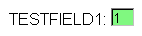
Example of a field with PSHYPERLINK style applied
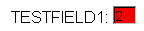
Example of a field with PSIMAGE style applied
See Also
PSSTYLEDEFPSSTYLEDEF is the default style sheet that is delivered with your PeopleTools software and consists of these sub style sheets:
PSALTERNATE: Defines application alternatives to PS defaults.
PAALTERNATE: Defines PeopleSoft Portal Solutions alternatives to PS defaults.
PTSTYLEDEF: Defines the standard PeopleSoft Pure Internet Architecture and portal defaults.
If you want to change the style sheet, in the PeopleSoft Pure Internet Architecture select PeopleTools, Utilities, Administration, PeopleTools Options; then, select the desired style sheet in the Style Sheet Name field.
You can also change the sub style sheets associated with a style sheet.
See Inserting a Sub Style Sheet.
See Also
Creating Style SheetsThis section discusses how to:
Create a new style sheet or sub style sheet.
Insert a sub style sheet into a style sheet.
Creating a New Style Sheet
To create a new style sheet or sub style sheet:
Select File, New.
Select Style Sheet from the list.
When you create a new style sheet, the system sets the parent to be the style sheet listed in the PeopleTools Options page (default is PSSTYLEDEF).
Select File, Definition Properties.
The Style Sheet Properties dialog box appears.
Specify the style sheet options.
|
Standard Style Sheet and Sub Style Sheet |
Select the type of style sheet. Use sub style sheets as you would use subrecords or subpages. |
|
Parent Style Sheet |
If this is a standard style sheet, the default style sheet (PSSTYLEDEF) is the parent. |
Inserting a Sub Style SheetTo insert a sub style sheet into a style sheet:
Create or open a style sheet.
Select Insert, Insert Sub Style Sheet.
In the drop-down list box, select the sub style sheet that you want to insert into the style sheet.
Click OK.
If you are replacing sub style sheets, you can delete the existing ones from the style sheet by highlighting the sub style sheet and pressing Delete.
Adding a New ClassYou can add a new style class to a style sheet and use it like any other class.
To add a new class:
Open (or create) the style sheet to which you want to add a class.
Select Insert, Insert Style Class from the PeopleSoft Application Designer menu.
Enter the name of the new class.
To copy the class attribute from another style class, select that class from the Copy Values From Style Class drop-down list box.
Click OK.
Setting Class AttributesThis section provides overviews of class attributes and fonts and discusses how to:
Access class attributes.
Specify fonts.
Set font attributes for a specific language.
Specify spacing and alignment.
Specify background attributes.
Reference a background image URL.
Specify border attributes.
Specify margins.
Specify miscellaneous attributes.
Understanding Class Attributes
Class attributes are grouped into categories and are displayed in a tabbed dialog box for each class.
Note. PeopleSoft Application Designer does not always reflect the formatting attributes that are specified for a control. You might be able to see only one attribute at runtime. Also, not all browsers support every attribute.
PeopleSoft Pure Internet Architecture supports the attributes that are listed in the World Wide Web Consortium (W3), Cascading Style Sheets, Level 1.
See http://www.w3.org/TR/REC-CSS1
Every class has each of these major attributes, which correspond to a tab in the Class Attribute definition.
|
Controls the font in which text appears. If more than one font is specified, the browser displays the first font; if it cannot find it, it displays the next font. |
|
|
Controls the spacing in addition to the default spacing. You can specify additional spacing between words and between letters. You can also specify the alignment, height, indent, and white space. |
|
|
Controls the background colors for the page control. If the background is an image, you can select how the image appears. |
|
|
Controls the border that is displayed around the element. You can specify width, color, and style. |
|
|
Controls the margins and padding on each side of the element. |
|
|
Controls the display of list-item markers, URLs, and cursor formats. |
Understanding Generic and Installed FontsWhen you add a font, the dialog box provides a choice between generic fonts and installed fonts.
Generic fonts can be displayed on all browsers. This table displays examples of some of the generic fonts:
|
Generic Font |
Example |
|
Cursive |
Zapf-Chancery |
|
Fantasy |
Western |
|
Monospace |
Courier |
|
Sans serif |
Helvetica |
|
Serif |
Times Roman |
Installed Fonts
Installed fonts are installed on your computer. If you use an installed font for a style class, PeopleSoft recommends that you:
Verify that all users of your application have the same installed font.
Specify the installed font first, followed by a generic font.
This way, if the installed font is not available to the user of your application, the generic font can be used.
Accessing Class AttributesTo access class attributes:
Open a style sheet.
Select File, Open, Style Sheet.
Select the style sheet that you want to access from the Definition Type drop-down list box
Double-click the class name.
Specifying FontsAccess the class dialog box. Select the Font tab.
Specify the font in which you want the text to appear. You can specify more than one font, so that if the browser cannot display the first font, it attempts to display the next font, and so on, until it finds a font that it can use.
|
Absolute |
Select to use a size from the drop-down list box (xx-small, x-small, small, medium, and so on.) There is a scaling factor of 1.5 between adjacent sizes. |
|
Length |
Specify the size with a number, and select the measurement type from the drop-down list box (em, ex, Pixels, Inches, Millimeters, and so on). |
|
Percentage |
Specify a number, followed by a percent sign (%). Percentage values are always relative to the parent element. |
|
Relative Larger and Relative Smaller |
Select to interpret the font relative to the table of font sizes and the font size of the parent element. For example, if the parent element has a font size of medium, and you select Relative Larger, this font size is large. |
|
Select the weight of the font. The values 100 to 900 form an ordered sequence, in which each number indicates a weight that is at least as dark as its predecessor. The value Normal is synonymous with 400, and Bold is synonymous with 700. |
|
|
Font Style |
Select the style of the font. Values are: Normal, Italic, or Oblique. These are matched to existing fonts with those names. |
|
Font Variant |
Select a variant. Values are: Normal or Small Caps. In a small caps font, the lowercase letters look similar to the uppercase ones, but they’re in a smaller size and with slightly different proportions. |
|
Specify the color or select the color from a color palette. |
Setting Font Attributes for a Specific LanguageYou can change the fonts that are available based on the base language settings. The default for the base language is English, providing generic fonts. If these fonts are not appropriate for a particular language, you must set the language preference before opening a style sheet. You can then set the font name list, font size, or font weight for the selected language.
To set font attributes for a specific language:
Select PeopleTools, Utilities, International, Preferences from your browser.
Select the appropriate language for the style sheet from the drop-down list box.
Save the new selected language as the base language.
Open the style sheet definition in which you want to save the font name list, font size, or font weight for the selected language.
Specifying Spacing and AlignmentAccess the class dialog box. Select the Spacing/Alignment tab.
|
Word Spacing and Letter Spacing |
Select Normal or Length. If you select Length, specify a number to indicate an addition to the default space between words or letters. Values can be negative, but there might be implementation-specific limits. |
|
Vertical Alignment |
Select the vertical positioning of the element. Values are: Baseline: Aligns the baseline of the element (or the bottom, if the element doesn't have a baseline) with the baseline of the parent. Sub: (subscript) Aligns the top of the element with the baseline of the parent element. Super: (superscript) Aligns the baseline of the element with the top of the parent element. Top: Aligns the top of the element with the tallest element on the line. Text Top: Aligns the top of the element with the top of the parent elements font. Middle: Aligns the vertical midpoint of the element (typically an image) with the baseline plus half of the x-height of the parent. Bottom: Aligns the bottom of the element with the lowest element on the line. Text Bottom: Aligns the bottom of the element with the bottom of the parent elements font. Percentage: Refers to the value of the line-height property of the element itself. It raises the baseline of the element (or the bottom, if it has no baseline) to the specified amount above the baseline of the parent. Negative values are possible. For example, a value of −100% lowers the element so that the baseline of the element is where the baseline of the next line should have been. This allows precise control over the vertical position of elements (such as images that are used in place of letters) that don't have a baseline. Note. Using the top and bottom alignments could cause a loop where there are element dependencies. |
|
Line Height |
Set the distance between the baselines of two adjacent lines. When a numerical value is specified, the line height is provided by the font size of the current element multiplied with the numerical value. This differs from a percentage value in the way it inherits. When a numerical value is specified, child elements inherit the factor itself, not the resultant value (as is the case with percentage and other units). Negative values are not allowed. |
|
Text Indent |
Specify the indentation that appears before the first formatted line. This value may be negative, but there might be implementation-specific limits. An indentation is not inserted in the middle of an element that was broken by another. |
|
Text Align |
Specify how text is aligned in the element. Because Text Align inherits, all block-level elements inside the DIV element with CLASS=center are centered. Note. Alignments are relative to the width of the element, not the canvas. |
|
White Space |
Specify how to handle white space inside the element. Values are: Normal: White space is collapsed. Pre: Behaves like the PRE element in HTML. Nowrap: Wrapping is done only through elements having a line break. |
Specifying Background AttributesAccess the class dialog box. Select the Background tab.
|
Background Color |
Specify the background color of an element. |
|
Set the background image of an element to an image file that is previously defined. When you set a background image, also set a background color to use when the image is unavailable. When the image is available, it appears on top of the background color. |
|
|
Background Repeat |
If you specify a background image, indicate whether the image is repeated, and if it is, how many times. |
|
Background Attachment |
If you specify a background image, indicate whether it is fixed to the canvas or whether it scrolls along with the content. |
|
Background Position |
If you specify a background image, set its initial position. Value are: Top: Aligns the background to the top of the element. Left: Aligns the background to the left of the element. Center: Aligns the background to the midpoint of the element (typically an image). Bottom: Aligns the background to the bottom of the element. Right: Aligns the background to the right of the element. Length: Specify the length of the background and the unit of measure. Percentage: Refers to the value of the line-height property of the background itself. It raises the baseline of the element (or the bottom, if it has no baseline) the specified amount above the baseline of the parent. Negative values are possible. For example, a value of −100% lowers the element so that the baseline of the element is where the baseline of the next line should have been. This allows precise control over the vertical position of elements without a baseline, such as images used in place of letters. |
Examples of Percentage and Length Value Pairs and Keywords
This table lists background positions, value pairs, and their effect:
|
Background Position |
Value Pairs |
Effect |
|
Percentage |
0 and 0 |
Places the upper, left-hand corner of the image in the upper, left-hand corner of the box that surrounds the content of the element (that is, not the box that surrounds the padding, border, or margin). |
|
Percentage |
100 and 100 |
Places the lower, right-hand corner of the image in the lower, right-hand corner of the element |
|
Percentage |
14 and 84 |
Places the point that is 14 percent across and 84 percent down the image at the point that is 14 percent across and 84 percent down the element. |
|
Length |
2cm and 2cm |
Places the upper, left-hand corner of the image 2 centimeters (cm) to the right and 2 cm below the upper, left-hand corner of the element. |
|
Top Left or Left Top |
NA |
The same as 0 percent and 0 percent. |
|
Top Center or Center Top |
NA |
The same as 50 percent and 0 percent. |
|
Right Top or Top Right |
NA |
The same as 100 percent and 0 percent. |
|
Left Center or Center Left |
NA |
The same as 0 percent and 50 percent. |
|
Center and Center |
NA |
The same as 50 percent and 50 percent. |
|
Right Center or Center Right |
NA |
The same as 100 percent and 50 percent |
|
Bottom Left or Left Bottom |
NA |
The same as 0 percent and 100 percent. |
|
Bottom Center or Center Bottom |
NA |
The same as 50 percent and 100 percent. |
|
Bottom Right or Right Bottom |
NA |
The same as 100 percent and 100 percent. |
Note. If you set only one percentage or length value, the system sets the horizontal position only and the vertical position becomes the default 50 percent. If you set two values, the first one is the horizontal position. You can set negative positions and combinations of length and percentage values, for example 50 percent and 2 cm.
Referencing a Background Image URLTo specify a background image URL, select from a drop-down list box that is populated by entries in the URL Maintenance table. To reference a background image file on a designated server, add its location to the URL Maintenance table.
You reference a background image in the URL Maintenance table in the same way you would register any other URL.
See URL Maintenance.
Specifying Border AttributesAccess the class dialog box. Select the Border tab.
|
Border Width |
Specify the width of each line in the border. Values are:Thin, Medium, or Thick, or you can specify Length, which enables you to specify a font size (with a number) and the measurement type from the drop-down list box (Pixels, Inches, Millimeters, and so on). |
|
Specify the color of each line in the border. You can specify a hexadecimal value for the color or select the color from a color palette. |
|
|
Border Style |
Specify the style of line in the border. Values are: None: No border is drawn (regardless of the <border-width> value). Dotted: Border is a dotted line that is drawn on top of the background of the element. Dashed: Border is a dashed line that is drawn on top of the background of the element. Solid: Border is a solid line. Double: Border is a double line that is drawn on top of the background of the element. The sum of the two single lines and the space between equals the <border-width> value. Groove: Border is a three-dimensional groove that is drawn in colors based on the <color> value. Ridge: Border is a three-dimensional ridge that is drawn in colors based on the <color> value. Inset: Border is a three-dimensional inset that is drawn in colors based on the <color> value. Outset: Border is a three-dimensional outset is that is drawn in colors based on the <color> value. |
Specifying MarginsAccess the class dialog box. Select the Margins tab.
|
Margin and Padding |
Specify the margin and padding for each side of the element. Values are: Length: Specify a font size and the measurement type from the drop-down list box (pixels, inches, millimeters, and so on). Percentage: Specify a number, followed by a percent sign (%). The percentage value is relative to the parent element. Auto: The system calculates the width. Do not use negative values for padding. |
|
Width and Height |
Set the width and height of text elements. These properties are most useful with replaced elements, such as images. The system scales the image to fit the value that you specify. If you set either property to Auto, and the image needs scaling, the system preserves the aspect ratio of the image. Do not use negative values. Note. If the width and height of a replaced element are both set to Auto, the system sets these properties to the intrinsic dimensions of the element. |
Specifying Miscellaneous AttributesAccess the class dialog box. Select the Miscellaneous tab.
|
Specify the appearance of the list-item marker if List Style Image URL is blank or if the system cannot display the image that is referenced by the URL. |
|
|
List Style Image Url (list style image uniform resource locator) |
Specify the URL containing the image to display as the list-item marker. |
|
List Style Position |
Specify how the list-item marker is drawn relative to the content. Values are: Inside and Outside. |
|
Display |
Specify how an element is displayed on the canvas (which might be on a printed page or a computer display). Values are: Block: Opens a new box. The box is positioned relative to adjacent boxes. Typically, elements like H1 and P are block types. ListItem: Similar to block, except that a ListItem marker is added. In HTML, LI typically has this value. Inline: Results in a new inline box on the same line as the previous content. The box dimensions are based on the formatted size of the content. If the content is text, it might span several lines, and there will be a box on each line. The margin, border, and padding properties apply to inline elements but do not affect the line breaks. None: Deactivates the display of the element, including children elements and the surrounding box. |
|
Float |
Specify how the element floats with the text. Values are: None: Causes the element to appear where it appears in the text. Left and Right: Cause the element to move to the left or right, and the text wraps on the right-hand or left-hand side of the element, respectively. With a Left or Right value, the element is treated as block-level and the Display property is ignored. |
|
Clear |
Specify the sides of an element on which floating elements are not accepted. Values are: Left: An element appears below any floating element on the left-hand side. None: Floating elements are allowed on all sides. |
|
Transform |
Use for text elements only. Values are: Capitalize, Uppercase, Lowercase, and None. |
|
Specify how the cursor displays when passed over the element. |
Pseudo classes are mechanisms that extend the expressiveness of style sheets. Using pseudo classes, you can change the style of page links based on whether and when the links have been visited. Pseudo classes do not exist in HTML; that is, they are not visible in the HTML code.
PeopleSoft uses pseudo classes to specify how a browser indicates to a user the status of links in a document that the user is viewing. For example, it is common for a browser to display a document link in a different color than the rest of the text.
|
Link |
Specify how the link should appear normally. |
|
Visited |
Specify how the link should appear if it has been visited. |
|
Active |
Specify how the link should appear when it is actively selected. |
|
Hover |
Specify how the link should appear when it is designated but not activated. For example, when the cursor hovers over a box that is generated by the element. |
|
Disabled Field |
Specify how the link should appear when the link (or field) is disabled. |
Changing the Default Style Sheets for an ApplicationYou can change the default style sheet for an entire application on the PeopleTools Options page. PeopleSoft Pure Internet Architecture generated pages always default to the style sheet you specify on this page. The system default style sheet is PSSTYLEDEF.
To change the default style sheet for the application:
From your browser, select PeopleTools, Utilities, Administration, PeopleTools Options.
Type in the style sheet name in the Style Sheet Name field.
Alternatively, click the prompt button to select one from the list of available values.
Save the page.
Specifying a Style Sheet for a PageTo specify styles for a page:
Open the page in PeopleSoft Application Designer.
Access the Page Properties dialog box.
Select the Use tab.
Select a style sheet from the Page Style Sheet drop-down list box.
Selecting a different page style sheet for a specific page overrides the style sheet that is selected for the application. If you do not select a different page style sheet (keeping Use Default Style), the system uses the style sheet that is specified on the PeopleTools Options page.
Select a page background from the drop-down list box.
Selecting a different page background style class for a specific page overrides the background style of the page style sheet that you just specified. If you keep the Use Default Style value, the background of this page is determined by the default background of the page style sheet that you just specified.
Changing Colors on TabsThis section provides an overview of tab definitions and discusses how to create tab images.
Understanding Tab Definitions
You can change the background colors of folder tabs in a component and tabs in a grid. To change the background colors of tabs, it is helpful to have a basic understanding of how tab definitions are built and stored in the database.
PeopleSoft stores tab definitions as images in an HTML table. Each tab, or image definition, has three parts that are stored as rows in the HTML table:
Row 1 contains code representing the top border.
Row 2 contains the tab itself.
Row 3 contains the bottom border.
Because tabs look different depending on where they are located relative to other tabs and whether they are active, they must be defined in sets for a combination of active and inactive tab colors.
Active General tab with inactive tabs
The tab image names reflect the role of the image in the tab row and the colors that it uses. Colors are encoded using the 6-character, hexadecimal RGB value of the color.
When the system displays tabs on a page, it verifies the existence of all of the images that are required for the pair of colors that is specified by the active and inactive tab styles. If these images are found, the tabs are drawn using these colors. If the system cannot find the images, it uses white (FFFFFF) for the active tab and blue (6666FF) for the inactive tab. If the images for these colors are not in the database, then the tabs do not appear at all.
Computer colors comprise various combinations of red, green, and blue—known as the RGB scale. The RGB decimal scale of colors are converted to the hexadecimal scale for use on a web page. To define HTML colors using the hexadecimal system, set the first two digits to the amount of red, the next two to the amount of green, and the last two to the amount of blue. In this scheme, 000000 represents black and FFFFFF represents white.
The hexadecimal color representation is always preceded by the # symbol, as shown in this table, which lists 16 named colors:
|
Color |
Hexadecimal Number |
|
Black |
#000000 |
|
Green |
#008000 |
|
Silver |
#C0C0C0 |
|
Lime |
#00FF00 |
|
Gray |
#808080 |
|
Olive |
#8080000 |
|
White |
#FFFFFF |
|
Yellow |
#FFFF00 |
|
Maroon |
#800000 |
|
Navy |
#000080 |
|
Red |
#FF0000 |
|
Blue |
#0000FF |
|
Purple |
#800080 |
|
Teal |
#008080 |
|
Fuchsia |
#FF00FF |
|
Aqua |
#00FFFF |
Tab Image Naming Scheme
This section describes in detail how tab images are named. However, to change tab colors, change only the RGB values.
All tab images are named in this format:
PT_TABNABBRRGGBB
PT_TAB: System-defined image definition name prefix.
N: HTML table row.
Values are 1, 2, or 3. Create images only for 2 or 3.
A: Location of the tab parts in a tab.
Values are:
L: Left end.
B: Between.
R: Right end.
M: Middle of a tab.
BB: Relative position to other tabs.
Values are:
AI: Piece between active and inactive.
IA: Piece between inactive and active.
II: Piece between two inactive tabs.
AX: Piece of an active tab.
IX: Piece of an inactive tab.
RRGGBB is either omitted (when the tab image does not use any color), or it is one or two 6-character hexadecimal codes for inactive and active tab colors.
This screen shot shows a partial list of predefined tab images:
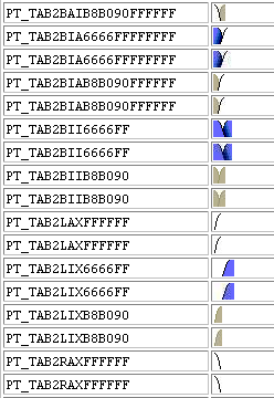
Predefined tab images
The first entry in the table is PT_TAB2BAIB8090FFFFFF, which represents a tab (PT_TAB2) part in the second row of the HTML table, BAI (between an active and inactive tab), B8B090 (inactive tab color of beige), and FFFFFF (active tab color of white). When the tab image requires two colors, the inactive tab color is always listed first.
Creating Tab Images
Before you can assign a new background color to the active or inactive tabs, you must create the necessary tab images with that color.
To produce tabs in a different color combination:
Open the image definitions for the tabs that you want to change.
Because you want to change only the color of tabs, open only those image definitions that already contain an RGB color code.
If you are changing both the active and inactive tab color, access these image definitions:
PT_TAB2LAXFFFFFF
PT_TAB2RAXFFFFFF
PT_TAB2LIXB8B090
PT_TAB2RIXB8B090
PT_TAB2BAIB8B090FFFFFF
PT_TAB2BIAB8B090FFFFFF
PT_TAB2BIIB8B090
PT_TAB3LAXFFFFFF
PT_TAB3RAXFFFFFF
PT_TAB3MAXFFFFFF
PT_TAB3LIXB8B090
PT_TAB3RIXB8B090
PT_TAB3MIXB8B090
PT_TAB3BAIB8B090FFFFFF
PT_TAB3BIAB8B090FFFFFF
PT_TAB3BIIB8B090
If you are changing only the inactive color, which is beige, you need only the files that contain the beige color code, B8B090. Similarly, if you are changing only the active tab color, which is white, you need only the files that include FFFFFF. However, for the changes to apply, you must change all those files with that color code. If one file is missed or there is a typographical error in the file name, the default style still applies.
To export the files to a directory, select File, Export Image.
In the Save Image dialog box, select the directory in which you want to place the images.
Use any image editor to alter the image colors.
Note. Do not change the size or shape of the images, and do not replace any of the transparent pixels with solid pixels.
In PeopleSoft Application Designer, add the new image definitions by selecting File, New, Image.
Save the new image files under the appropriate name. The new images must have new names reflecting the HTML colors that they represent. For example, replace FFFFFF with the new active tab color, and replace B8B090 with the new inactive tab color. Be careful when naming these images. If the images with the correct colors for the tab style are not in the database, the system automatically applies the default images.
Open the appropriate style sheet.
If you are changing the tab folder colors, use PSSTYLEDEF. If you are changing grid tabs, use PSSTYLEDEF or the style sheet that is associated with the page definition in which the grid is located.
Note. The grid tab styles can be set for each grid individually using the grid properties. However, for page tabs, you can set the styles using only the default styles in the application style sheet.
You must access PSACTIVETAB, PSINACTIVE TAB, and any other tab classes that your application uses (for example, PSLEVEL1GRIDACTIVETAB).
For folder tabs, open the PSACTIVETAB class by double-clicking the class name.
On the Background tab, select the color of the background of the active tab (matching the color of the tab image that you created).
Use the drop-down list box to find the color or browse through the color choices.
Do the same for the PSINACTIVETAB class (or any others that you need) for folder tabs by double-clicking the class name and selecting the Background tab.
For grid tabs, access the style class that is associated with the grid tab.
Change the colors as indicated in the previous steps.
Save the style sheet.
Examples
This is an example of folder tabs with a green background. In addition, the color of the text on the tabs was changed to black.
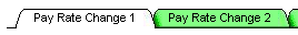
Green tabs
In the example, the active tab color stayed the same (FFFFFF). Only the inactive tab color changed. Therefore, only these files were created and added to the list of images:
PT_TAB2LIX80FF80
PT_TAB2RIX80FF80
PT_TAB2BAI80FF80FFFFFF
PT_TAB2BIA80FF80FFFFFF
PT_TAB2BII80FF80
PT_TAB3LIX80FF80
PT_TAB3RIX80FF80
PT_TAB3MIX80FF80
PT_TAB3BAI80FF80FFFFFF
PT_TAB3BIA80FF80FFFFFF
PT_TAB3BII80FF80