Viewing PeopleSoft Quality Graphics
This topic discusses how to view PeopleSoft Quality graphics.
|
Page Name |
Definition Name |
Usage |
|---|---|---|
|
QS_ANLZ_STSSUM_SPG |
View a control chart associated with the selected subgroups. |
|
|
QS_HISTOGRAM_RVW |
View a histogram associated with the selected subgroups. |
|
|
QS_PARETO_RVW |
View a Pareto chart of type comments, corrective actions, defects, or probable causes associated with the selected subgroups. |
|
|
QS_BARGRAPH_RVW |
View a bar graph associated with the selected subgroup. |
Use the Compare Dataset Statistics page (QS_ANLZ_STSSUM_SPG) to view a control chart associated with the selected subgroups.
Navigation:
Select the View Chart button on the Data Entry From Access List - Review page: Results tab or on the Data Entry By Control Plan - Review page: Results tab.
Select the Control Chart in the Display Graph field on the Review Ctrl Plan Performance - Stream Review inquiry page.
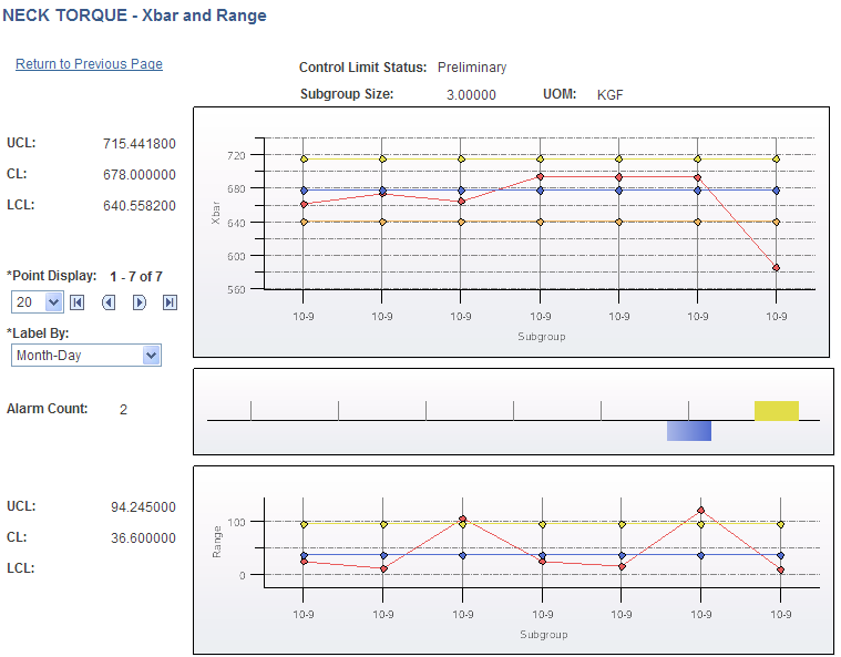
This example illustrates the fields and controls on the Control Chart page 1 of 2. You can find definitions for the fields and controls later on this page.
This example illustrates the fields and controls on the Control Chart page 2 of 2. You can find definitions for the fields and controls later on this page.
In the upper portion of the page, the control chart associated with the subgroups that you selected appears.
The control chart is rendered as two line graphs for plotting means and variance information. Each point on the control chart represents an individual subgroup.
To the left of each graph, the system displays the values and the appropriate labels for upper control limit (UCL), mean (CL), and lower control limit (LCL).
Note: Control limit labels are not set to scale; however, the control limit boundaries are overlaid to scale on each chart.
In the upper portion of the page, the system displays the control limit status, subgroup size, and unit of measure.
Field or Control |
Description |
|---|---|
Point Display |
Select the number of points to display for the control charts. Values are: 05, 10, 15, 20, and 25. |
|
Click this button to view the next group of control chart points. |
|
Click this button to view the previous group of control chart points. |
Label By |
Select how to label the control charts. Values are:
|
Alarm Count |
The alarm count represents the number of subgroups within the current chart that have an out-of-control condition. Next to this field, a bar graph represents the type of alarm that occurred for each subgroup. A red bar extending upward represents a specification violation, and a yellow bar extending upward represents a means (upper) control chart violation. A blue bar extending downward represents a variance (lower) control chart violation. Additionally, the actual control test description appears when you hover over a subgroup point, enabling you to easily view the specific alarms corresponding to the bar graphs. |


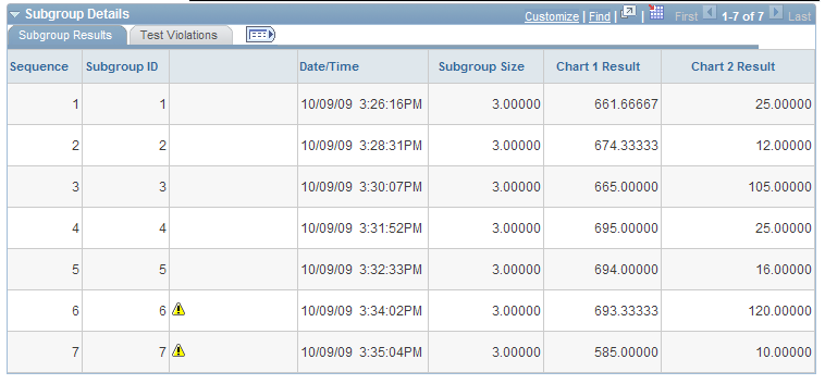
Subgroup Details
View details of the subgroup results and test violations for each subgroup.
Use the Histogram page (QS_HISTOGRAM_RVW) to view a histogram associated with the selected subgroups.
Navigation:
Select Histogram in the Display Graph field on the Review Ctrl Plan Performance - Stream Review inquiry page.
This example illustrates the fields and controls on the Histogram page 1 of 2. You can find definitions for the fields and controls later on this page.
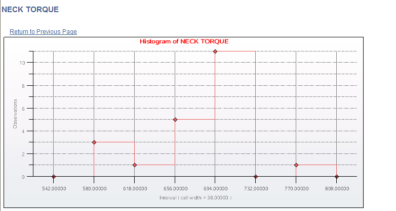
This example illustrates the fields and controls on the Histogram page 2 of 2. You can find definitions for the fields and controls later on this page.
In the upper portion of the page, the histogram associated with the subgroups that you selected appears. A histogram is used to display distribution analysis.
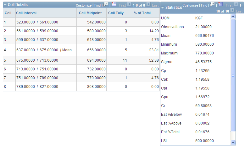
Cell Details
Field or Control |
Description |
|---|---|
Cell Interval |
Displays the high and low boundaries that this cell represents. This field is derived by dividing the distribution range by the number of cells desired for display. The left brace ({) character indicates in which cell the mean, lower specification limit, and upper specification values are contained. |
Cell Midpoint |
Displays the midpoint of the cell interval. |
Cell Tally |
Displays the total number of individual values in a cell. |
% of Total (percent of total) |
Displays the percent of individual values in a cell. |
Statistics
Summary statistics are calculated based upon active values for this subset.
Use the Pareto Chart page (QS_PARETO_RVW) to view a Pareto chart of type comments, corrective actions, defects, or probable causes associated with the selected subgroups.
Navigation:
Select Pareto of Alarms, Pareto of Comments, Pareto of Corrective Actions, Pareto of Defects, or Pareto of Probable Causes in the Display Graph field on the Review Ctrl Plan Performance - Stream Review inquiry page.
This example illustrates the fields and controls on the Pareto Chart page. You can find definitions for the fields and controls later on this page.
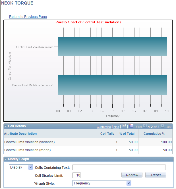
In the upper portion of the page, a Pareto chart associated with the selected subgroups and attribute type appears. You can create a Pareto chart of alarms, comments, corrective actions, defects, or probable causes. With Pareto charts, you can display attribute counts in a ranked-order format.
Cell Details
Field or Control |
Description |
|---|---|
Attribute Description |
Displays the attribute description. For example, for defects, defect attribute descriptions appear, and for alarms, alarm attribute descriptions appear. |
Cell Tally |
Displays the attribute count. |
% of Total (percentage of total) |
Displays the percentage of the number for that particular attribute type for which the attribute accounts. For example, for a Pareto chart of defects, this field represents the percentage of the number of defects for which that attribute accounts. |
Cumulative % (cumulative percent) |
Displays the cumulative percent value. If you were to plot this line on the Pareto chart, it would represent the cumulative percent line, also known as the Lorenze curve. |
Modify Graph
Field or Control |
Description |
|---|---|
Graph Style |
Select the style of graph to display. Options are:
|
Redraw |
Click this button to redraw the Pareto chart with the selected options (cells containing text, cell display limit, and graph style). The complete list of cell statistics always appears, regardless of the modification options that you select. |
Reset |
Click this button to restore the number of cells that appear in the Pareto chart to the number of cells that appeared when the graph was first displayed. The number of cells that appear in the Pareto chart can change when you use the Cells Containing Text and Cell Display Limit fields. When you click the Reset button, the cells that appear in the Pareto chart are redrawn to there original appearance. Reset does not effect the graph style. |
Use the Bar Graph page (QS_BARGRAPH_RVW) to view a bar graph associated with the selected subgroup.
Navigation:
Click the Graph Results button on the Compare Data Statistics page.
This example illustrates the fields and controls on the Bar Graph page. You can find definitions for the fields and controls later on this page.
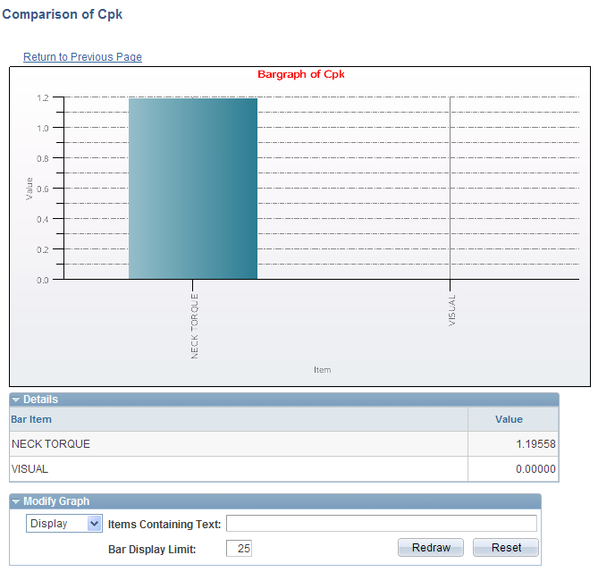
In the upper portion of the page, a bar graph associated with the selected subgroups appears. With bar graphs, you can compare a selected statistic between multiple subsets.
Details
The details (bar item and value) for the bar graph appear.
Modify Graph
Field or Control |
Description |
|---|---|
Redraw |
Click this button to redraw the bar graph with the options (items containing text and bar display limit) that you selected. The complete list of details always appears, regardless of the modification options that you select. |
Reset |
Click this button to restore the number of items that appear in the bar graph to the number of items that appeared when the graph was first displayed. The number of items in the bar graph can change when you use the Items Containing Text and Bar Display Limit fields. When you click the Reset button, the items that appear in the bar graph are redrawn to their original appearance. |