 Understanding Pages
This chapter provides an overview of pages and discusses how to:
Use effective dates.
Work with page elements.
Use data-entry fields.
Use spell check.
Work with HTML trees.
Work with rich text editor fields.
Work with field-level prompts and validation.
Working with mouse over popup windows.
Work with related content.
Understanding Pages
Pages are the primary graphical interface by which you view and alter data in the PeopleSoft system. In many cases, these pages are representations of rows of data in the database tables. You use pages to view, enter, and update data stored in application tables. Each page also provides buttons or links to help you navigate through the system. As you change or add information to the database, you need to be familiar with effective-dating logic and the various page action options as you work with historic, current, and future data. PeopleSoft applications use many different types of elements to organize information on pages and to enable you to enter data, including data-entry, functional, and data processing elements.
PeopleSoft applications use Asynchronous JavaScript and XML (AJAX) technology to limit server trips and perform partial page refreshes. With a partial page refresh, the browser refreshes the entire page only when the user navigates to a new page. Any server trips triggered by PeopleCode functions such as FieldChange and FieldEdit for related display fields do not redraw the entire page; the refresh updates only the changed fields. Because of AJAX technology, much of the communication with the server happens in the background. You continue to work uninterrupted during the process and notice only the spinning processing icon that lets you know that the system is using AJAX technology to retrieve information.
This list includes the actions supported by partial page refresh:
Changing a related field.
Enabling and disabling fields.
Hiding and unhiding fields.
Expanding and collapsing group boxes.
Using scroll area and grid navigation links, such as Next, Previous, and so on.
Inserting and deleting rows in scroll areas and grids.
Saving a page.
Many PeopleSoft components run in deferred processing mode to reduce interaction with the server thereby providing better performance. This means that, when using some pages in the browser, you can input data with minimal interaction with the server. If deferred processing mode is specified for a component, a page within that component or a field on a page within the component also performs processing in deferred mode.
Note. Interactive mode is the opposite of deferred mode processing.
Note. AJAX server trips and deferred processing mode work together, but are not the same. Use AJAX and deferred processing mode together for best performance regarding server trips.
Using Effective Dates
This section provides an overview of effective dates and discusses page action options and effective dates.
 Understanding Effective Dates
PeopleSoft’s effective-dating logic enables you to maintain an accurate history of information in the database. Effective dating allows you to store historical data, see changes in your data over time, and enter future data. For example, you may want to track several events in the career of Tom Sawyer: when he was hired, transferred, and promoted. By inserting rows of data based on his employee ID, and significant dates, you can build a job history.
When you enter new information that is related to existing data (in this case about an employee), such as a transfer or pay rate change, you do not want to lose or overwrite the data already stored in the database. To retain history, add a data row identified by the date when the information goes into effect: the effective date. You can use the information to look at what has happened up to now and plan for the future. The PeopleSoft system categorizes effective-dated rows into the following basic types:
|
The data row with the date closest to—but not greater than—the system date. Only one row can be the current row. |
|
|
Data rows that have effective dates earlier than the current data row. |
|
|
Data rows that have effective dates later than the system date. |
Describing Page Action Options and Effective Dates
The types of actions that you can perform on rows of data depend on the data row type. When you retrieve, modify, or insert rows in a table, the Update/Display, Include History, and Correct History actions apply specific rules based on the effective date:
Note. Not all tables are effective-dated. The Include History and Correct History options only appear on pages that access effective-dated tables.
|
Action |
Rule |
|
Retrieves only current and future rows. You can change future rows but not current rows. You can also add a new current row. |
|
|
Retrieves all rows. However, you can modify future rows only. You can also add a new current row. |
|
|
Retrieves all rows and allows you to change or correct any row and insert new rows regardless of the effective date or sequence number. Note. This option is available only to users with the proper permission. |
To see how these actions work together, take a look at four possible events in the career of employee Tom Sawyer, listed by effective date. Assume that today is February 1, 2009:
|
Effective Date |
History |
Current |
Future |
|
Hired: January 1, 1994 |
X |
– |
– |
|
Transferred: January 1, 2000 |
X |
– |
– |
|
Promoted: August 1, 2005 |
– |
X |
– |
|
Expected termination: December 31, 2009 |
– |
– |
X |
The action type that you select dictates whether you can access certain fields and what you can do with each type of row:
|
Action Mode |
View |
Change |
Insert New Rows |
|
Current, Future |
Future only |
Effective date greater than or equal to current row. |
|
|
History, Current, Future |
Future only |
Effective date greater than or equal to current row. |
|
|
History, Current, Future |
All existing rows |
No effective date restrictions. |
The page action buttons appear in the toolbar in the lower-right corner of any relevant pages. A shaded button indicates that the page is currently in that mode. For example, the CTI Agent Configuration page is currently in Correct History mode.
When you select Update/Display, you can access only current and future rows; you cannot access history. Using the example, you can view only the current data, which is effective-dated August 1, 2001, and the future data, which is effective-dated January 1, 2006 (the employee's promotion and then the employee's termination).
You can also:
Insert new rows with an effective date later than the date on the current row—after August 1, 2001.
Change the future-dated row, effective-dated January 1, 2006, and change any additional rows that you insert with a date later than today, February 1, 2005 (assumed to be today's date).
If you insert rows with effective dates between August 1, 2001, and February 1, 2005, you cannot change them if you return to the page in Update/Display mode.
Select Include History to view any of Tom Sawyer’s job data, from his hire date to the day on which he will be fired. However, as with Update/Display, you can update only future-dated rows, effective-dated February 2, 2005, and on. You can also insert new rows with an effective date later than the current row—that is, any date after August 1, 2001.
Select Correct History to access all data rows. This mode enables you to view, change, and insert rows of data, regardless of the effective date. You can view and edit any of Tom Sawyer’s job data, from his hire date to the day on which he will be fired. You can also insert new rows with any effective date.
Note. As you move between the Update/Display, Include History, and Correct History modes, the system prompts you to save your changes if necessary.
Working With Page ElementsThis section provides an overview of PeopleSoft page element types and discusses how to use certain data-entry fields.
Understanding PeopleSoft Page Elements
PeopleSoft applications include three types of page elements: aesthetic, functional, and data-entry fields. Although you should be aware of all page element types, you interact mostly with data-entry fields as you work in your application.
Aesthetic elements help organize or emphasize different fields or information on the page. These elements are not used to update data in the database; they are purely visual. Aesthetic elements include:
|
Element |
Definition |
|
Display-only box that groups a set of fields on a page. |
|
|
Display-only box, with text labels, that groups and identifies related fields, such as options. |
|
|
Display-only horizontal line that separates fields or other elements on a page. |
|
|
Unchanging graphic, such as your company logo or another visual element. |
|
|
Display-only alphanumeric field that describes a page, field, or group of fields. |
Functional elements are controls, such as buttons and links, that perform a specific function. Aside from the standard toolbar buttons at the bottom of the page, your transaction page may include other buttons and links that are not associated with a grid or scroll area. For example, a button next to a field may perform a calculation based on a value that you just entered. You can activate this button by clicking it or by pressing the Enter key while the element has the focus. You can also activate links by pressing the Enter key.
Pages can include several types of data-entry fields, each designed to provide a simple way to enter and update data in your tables. Understanding the various types of data-entry field helps you use the system more efficiently.
Data-entry fields, which are always associated with specific database fields, include:
To move among the data-entry fields on a page, press the tab key or click the field once. Pressing tab moves you one field at a time in a sequence determined in the page definition. Pressing tab also rests on prompts to give you the option of viewing the prompt table or calendar. To open a prompt or calendar, you can press enter. Or, to get to the next field, press tab again. Press Shift+Tab to move backward rather than forward in the tabbing order.
Note. Pressing Tab may yield different results if you have modified page tabbing behavior on the My Personalizations page.
In most applications, required fields are marked with an asterisk. You must enter data into that field to continue on to the next field or save the page. When the developer has set deferred processing mode for the page, you may not be informed that a field is required until you attempt to save or leave the page. If you save the page without entering required data, the field turns red and an error message appears on the page. Click OK within the error message, and then enter the correct data in that field. Required fields are often drop-down list boxes or are accompanied by a prompt button to help you enter the correct data.
Using Data-Entry Fields
This section discusses how to:
Use edit boxes.
Use long edit boxes.
Use drop-down list boxes.
Work with images.
Using Edit Boxes
Move to and highlight an edit box by pressing the tab key or by double-clicking and highlighting the text. You can type over existing highlighted text. If the text is not highlighted, you are inserting rather than replacing text.
This example shows an edit box:
Edit box
Some edit boxes are associated with database fields that have formatting attributes assigned to them. For example, most name fields are defined with a name format that requires you to enter data in the following way:
LastName,FirstName Initial
This format is case sensitive. Also, note that there is no space between the comma after the last name and the first name. If a field is not case sensitive, the system converts what you type to uppercase before writing it to the database.
Other types of formatting include:
Social security, social insurance, or other government ID numbers.
Dates.
ZIP codes or other postal codes.
International phone numbers.
For these types of formats, you generally type only the characters; the system inserts the appropriate dashes and slashes for you. For dates, enter the standard six-digit date format, such as mm/dd/yy (include zeros); the system automatically changes the display to show a four-digit year.
Note. Number formatting may perform differently for users who have personalized their systems.
Note. PeopleSoft applications are equipped with a spell check feature that you can use on data entered in edit boxes.
In interactive mode, if you enter a field value incorrectly, the system highlights the field in which an invalid value was added, and a warning message appears with an explanation of the problem.
Using Long Edit Boxes
You use long edit boxes to enter anecdotal information such as comments or free form informational text.
Move to and highlight a long edit box by pressing the tab key or by double-clicking and highlighting the text. You can type over existing highlighted text. If the text is not highlighted, you are inserting rather than replacing text. If you enter data that extends beyond the visible area of the long edit box, a scroll bar appears for you to navigate through the data.
This example shows a long edit box with the Display in Modal Window and Spell Check buttons:
Note. PeopleSoft applications are equipped with a spell check feature that you can use on data entered in long edit boxes.
Note. You can zoom a long edit box to a modal window if the Display in Modal Window icon is visible to the right of the long edit box.
Using Drop-Down List Boxes
To select a single item from the list, click the down arrow to display the list, scroll through the list until your choice is visible, and then click the desired list item. The list closes and the selected value appears in the list box. You can also type the first letter of an item to select it. If there is more than one choice for a letter, type the letter repeatedly to cycle through the list. In the following example, first click the down arrow, then, if you want to select Greek, type the letter G twice. Alternatively, press the Down Arrow key to select the field entry that you want. Once your choice is highlighted, press Enter.
This example shows a drop-down list box:
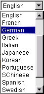
Drop-down list box
Working With ImagesYou can insert or update images in your PeopleSoft system. For example, the Employee Photo page enables you to store and maintain photos of your employees in your PeopleSoft database.
This section discusses how to:
Insert an image.
Delete an image.
You can insert photos into your PeopleSoft database. For example, you may want to store employee photos for company identification badges, or pictures of products for inventory purposes.
To insert an image at runtime:
Open the page in which you want to insert the photo.
Click the Add button.
A search page appears enabling you to search for the image that you want to insert. You can browse for the image from your desktop, your hard drive, or the network.
Click the Browse button to search for and select the image you want to insert.
Click the Upload button.
The upload page closes and your newly inserted image appears on the page.
Deleting an Image
To delete an image at runtime:
Open the page from which you want to delete the image.
Click the Delete button.
The system automatically deletes the image on the page without posting a warning message prior to deletion. However, if you exit the page without saving, the system does not delete the image from the database, and the image is present when you reopen the page.
Using Spell Check
PeopleSoft applications are equipped with a spell check feature that you can use on data entered in edit boxes and long edit boxes. Activate spell check by clicking the spell check icon to the right of those fields where spell check is available or by clicking the spell check toolbar button.
In the following example, spell check is available for the Description, Message Text, and Explanation fields.
The Spell Check button opens the Spell Check page. This page displays the errors in the text and offers a list of alternatives, if applicable. You can choose to ignore the occurrence, ignore all occurrences, change the spelling, change the spelling for all occurrences, or add the word to the current language dictionary.
Certain pages, such as those that require an email response, have a mandatory spell check requirement. When you save these pages, the system automatically runs spell check on spell check enabled fields. A field is eligible for automatic spell check if you have changed its contents and you have not already run spell check for that field. If there is more than one spell check field, spell check runs in succession. If there are no errors, the system saves the data without issuing a message.
Using Foreign Language Dictionaries
Spell check supports numerous languages. The default spell check dictionary is based on your current sign in language. For example, if you select French as your sign in language when you sign in to your PeopleSoft application, your spell check dictionary is also in French. You can change your language dictionary on the My Personalizations page.
To change language dictionaries:
Select My Personalizations from the navigation menu.
Click the Personalize Option button for the General Options personalization category.
Enter the language dictionary that you want in the Override Value edit box for Spell Check Dictionary.
Click OK.
You can only use one dictionary per sign in session. To change language dictionaries again, make the change in My Personalizations and then sign out of the system before proceeding. To return to having your default spell check dictionary selected automatically based on your current sign in language, remove your override value or set it to Use Session Language.
Note. Hyphenation for Hungarian is not currently supported.
Working With HTML Trees
When discussing trees, PeopleSoft uses terminology derived from the idea of a family tree. The nodes that report to the root node are called its children; the root node is their parent. Nodes that have the same parent are called siblings.
These terms refer to the relationship between nodes and are not permanent attributes of the nodes themselves. A single node can be a parent, child, and sibling all at the same time. In the following example, Operations Administration is a child of Office of the President and a sibling of Human Resources, Controller, and Retail Banking Admin.
Click the yellow folders with + (plus) signs to expand another level. The leaves represent the lowest level of the tree and are not expandable. Click the links beside the nodes to see representations of the data. Clicking a link either opens an entirely new page or displays data for that link to the right of the HTML tree.
Navigating Within an HTML Tree
Navigate the tree by using the navigational bar (the horizontal bar at the top of the tree) and the navigation path, as shown in the previous example. You can perform the following actions on the selected tree by using the links and images on the navigation bar.
As you find your way through your tree, navigation paths appear above the navigation bar. They show you a basic map of your route through the tree; you can also use them to jump back to a previously visited node. These navigation paths represent nodes in the current branch (A type nodes) and the parent branch of the opened branch (B type nodes). In the example, node 00001 is the parent branch of C10100 and C10100 is the parent node of C10900.
The maximum number of navigation paths displayed is seven. When you exceed that number, the system removes the earlier ancestor nodes.
See Also
Navigating PeopleSoft Tree Manager
Working With Rich Text-Enabled Fields
This section provides an overview of the rich text editor and discusses how to:
Use the tool bar
Enter, format, and modify text.
Insert and modify images.
Use spell check.
Understanding the Rich Text EditorThe rich text editor control extends the capability of a long edit box. It allows for the rich formatting of text content, including common structural treatments such as lists, formatting treatments such as bold and italic text, and drag-and-drop inclusion and sizing of images. The rich text editor tool bar is extensible by using a custom settings configuration file so that application developers can achieve a high degree of customization.
See Rich Text Long Edit Boxes.
Note. All rich text-enabled fields support multi-language entry.
The rich text editor provides an easy to use interface which should be familiar to users who worked on common desktop text editors such as Microsoft Word or Open Office. It consists of these three distinct elements:
Tool bar
Editing area
Pop up menu
This is an example of the rich text editor control showing the tool bar, editing area, and pop up menu elements:
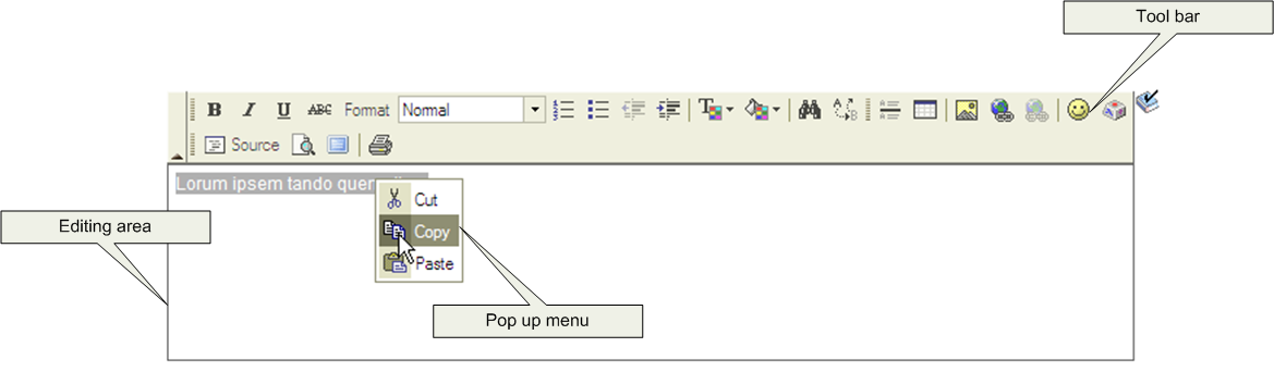
Rich text editor elements
Tool bar
The tool bar is the area at the top of the editor, which contains many different buttons that extend and activate a variety of editor functions. The tool bar is highly customizable and can vary from field to field. The tool bar is collapsible. Click the triangle located beside the tool bar to toggle between visible and collapsed.
Editing Area
The editing area is directly below the tool bar. You enter your text in this area.
Pop up Menu
A pop up menu is a contextual menu that appears when you right-click the mouse inside the editing area. The functions on the menu change based on what element, such as a table or an image, that is under the cursor when you click the mouse.
Using the ToolbarThe toolbar is the area in rich text editor where you can activate most of the editor features. Each button in the toolbar access a different function. There are simple functions such as basic text formatting and more advanced features such as creation of links and tables.
To use the buttons in the toolbar you place the cursor over the button. The button highlights and hover text with the information about the button function appears. Click the button to execute its function. The graphic on the toolbar buttons are standard across many text editors and you will probably find that you know how to use them intuitively. In addition to the toolbar buttons there are also toolbar drop down list boxes, which are white areas with an arrow on its side. You activate drop-down list boxes by clicking the white area or the little arrow. Once you click the menu, it expands so that you can select from one of the available options. To select an option, move your cursor to it and click it.
Entering, Formatting, and Modifying TextWriting in the rich text editor is similar to writing on desktop word processor text editors, such as Microsoft Word or Open Office. There is an important difference to be considered though. You use desktop word processors primarily to create printed content, limited by physical pages. You use the rich text editor to create text that you publish on PeopleSoft application pages, and that you read by using web browsers.
To enter text, move your cursor to the editing area and enter the data using your keyboard. You can also paste text into the area.
To format text, you click the button before you begin entering text, or highlight text and click the button for the format that you want.
Inserting and Modifying Images
To insert an image into the text, click the Image button. The maximum image size is database dependent. Some database platforms support much larger image sizes while others limit the size to 32000 bytes. Consult your database documentation for more information. Use the Image Properties dialog box to upload an image file or insert a URL link.
To modify images after you have inserted them, right-click the image and then click Image Properties.
Image Properties - Upload Tab
Access the Image Properties dialog box (Click the Image button).
When you click the Image button, the Image Properties dialog box appears with the Upload tab activated. You must upload the image before you can change the other properties.
Click the Browse button to locate the file that you want to insert into the text.
Click the Send it to the Server button to send the image to the database.
Image Properties - Image Info Tab
Access the Image Info tab.
Use the Image Info tab to set the alternative text, width, height, border, hspace, vspace, and align properties which in turn sets the HTML <img> tag attributes: alt, width, height, border, hspace, vspace, and align, respectively.
|
URL |
This field is automatically populated when you send the image to the server. This is the URL ID for the image. |
|
Reset size |
Click to change the image size back to its original size. |
|
Lock ratio |
Click to lock the ratio so that the height and width change in conjunction to each other. |
Image Properties - Link Tab
Access the Link tab.
Use the Link tab to automatically link an image to another resource. The Image Info tab URL value must be set, then copy it to the Link tab URL field. This results in the editor enclosing the <img> tag in an <anchor> tag. For example, if you specify http://my.oracle.com/images/myoracle.gif as the URL, it results in: <a href="http://my.oracle.com/images/myoracle.gif"><img alt="" src="http://my.oracle.com/images/myoracle.gif" /></a> The Target drop-down list specifies where or how the image link appears. Selecting a target option of New Window, Topmost Window, Same Window, or Parent Window results in the editor setting the target attribute to “_blank”, “_top”, “_self” or “_parent”, respectively, for example, . <a target= "_top" href="http://my.oracle.com/images/myoracle.gif">
Image Properties - Advanced Tab
Access the Advanced tab.
Use the Advanced tab to set the Id, language direction, language code, long description URL, stylesheet classes, advisory title and style fields which in turn sets the HTML img tag attributes: id, dir, lang, longdescr, class, title and style, respectively.
See Also
FCK Editor User's Guide, http://docs.fckeditor.net/FCKeditor_2.x/Users_Guide
Using Spell Check
You can click the Spell Check button that is outside of the rich text editor field to perform spell check on the field content. This invokes the current PeopleTools spell check functionality. The HTML tags are stripped and only the text is taken into consideration for spell check.
While in Spell Check mode, images that you have uploaded do not appear, but you will see a place holder image that contains an 'x' in the upper left corner.
Working With Field-Level Prompts and Validation
This section provides an overview of field-level prompts and validation and discusses how to:
Use lookup prompts.
Use calendar prompts.
Understanding Prompts and ValidationSome edit box fields are linked to database prompt tables, which store values for information shared across your organization, such as department IDs, country codes, and state codes. These tables are called prompt or lookup tables because you prompt the system to lookup and present a list of valid field values that reside in the prompt table. Prompt fields are defined so that the system compares the values that you enter to values that are in a prompt table to ensure that your values are valid.
Many fields validate against prompt tables. For example, currency codes and country codes are each stored in their own tables: the CURRENCY_CD_TBL and COUNTRY_TBL tables. Fields prompting against these kinds of prompt tables appear on the page as edit boxes with a lookup button to the right.
|
|
Click to open the Look Up page for the current field. |
|
|
Click to open a small calendar that displays the current month. |
Note. Alternatively, you can press Alt+5 while in a prompt or calendar field to open the lookup page or the calendar, respectively.
Using Lookup Prompts
You can perform a full or a partial search.
To perform a full search, click the lookup button. The Look Up page opens as a stationary modal page on top of the primary page. The primary page is grayed out and inaccessible while the prompt page is active. When the Look Up page opens, the Search Resultsgrid displays all valid values for that field up to the maximum row count. Click the field title in the Search Results grid to change the field values sort direction. To narrow the search results, you can enter partial data and click the Look Up button. Click the Advanced Look Up link to narrow the search, both by searching based on more than one field at a time and by using a variety of search operators. When the field value that you need appears in the Search Results grid, click the value link to populate the prompt field on the primary page with the selection.
Note. Your system administrator might exclude extremely large tables from automatically prompting, for performance reasons.
To perform a partial search, enter the partial value in the prompt field and then click the lookup button. As in the full search, the Look Up page opens as a stationary modal page on top of the primary page. The primary page is grayed out while the prompt page is active. When the Look Up page opens, the system populates the Search Results grid with all the field values that match the partial value that you entered in the prompt field. Click the field title in the Search Results grid to change the field values sort direction. When the field value that you need appears in the Search Results grid, click the value link to populate the prompt field on the primary page with the selection.
This is an example of a Look Up page:
Note. Application developers can use Application Designer to disable the partial search feature on lookup pages.
Look Up Page Properties
All Look Up pages share certain characteristics. All Look Up pages are modal and appear above the primary page, which is grayed out. In addition, when working with these pages, you can:
Resize the page.
Close the page from the title bar close icon.
Note. The New Window, Help, Customize Window, and Copy URL links
do not appear on the modal prompt lookup page
Do not use the browser Back button when
accessing prompt windows in AJAX mode. Use application links and button to
navigate PeopleSoft applications. Clicking the browser Back button
in some browsers can cause the spinning processing message to appear. To stop
it, press the Back button again, or click the
browser Stop button and close the lookup prompt
window.
See Also
Using Search Pages to Retrieve Data
Setting Record Field Use Properties
Using Calendar Prompts
When entering information in a date field, you can select the calendar prompt button to the right of the field to help you choose a date. You can also enter the current day's date by entering today in the date field. Press Tab to exit the field; the current date appears. This feature can also use languages specific to the locale.
This example shows the calendar window that displays when you click the calendar prompt button:
To change the calendar month, select the drop-down list box arrow for the month. To change the year, select the drop-down list box arrow for the year. Click the correct day of the month to select the day. Press Esc to cancel and close the calendar.
Working With Mouse Over Popup Pages
Because of AJAX technology, PeopleSoft applications support mouse over popup pages. A mouse over or hover popup page is a small window that is raised or “pops up” when you move your the cursor over a popup-enabled edit box or link on an application page. Popup windows are used to display additional read-only, context sensitive information that would otherwise clutter the main page. Popup pages hover over the main page as long as you leave your mouse over the activating control. When you move your mouse, the popup window disappears.
This is an example of an Employee Information popup page:
Working with Related Content
In addition to the primary content on a page, some PeopleSoft application pages might have related content. Related content appears at the bottom of the main page in its own frame. Related content can be analytics, other PeopleSoft components, external web sites, discussions, wiki pages, or a variety of other content that you find helpful to performing your task on the primary page. You can work with the related content just as you would any other PeopleSoft page. You can collapse and expand the frame, and refresh the content if those buttons are available. Related content is configured and secured by an administrator.
You can have more than one type of related content associated with the main page at a time. If there is more than one related content page, the related content pages appears as tabs in the related content frame; you access each page by clicking the tab.