 Understanding Page Controls
This chapter provides an overview of page controls and discusses how to use:
Charts.
Frames.
Group boxes.
Horizontal rules.
Images.
Static text.
Check boxes.
Drop-down list boxes.
Edit boxes and long edit boxes.
Radio buttons.
Popup pages.
Subpages.
Secondary pages.
Push buttons or links.
HTML areas.
Understanding Page Controls
There are three categories of controls that you use in page design and development. You determine which types of controls that you want to add to your page definition by considering how you want to organize information on a page as well as how your users will enter data.
This section discusses:
Aesthetic controls.
Data entry controls.
Function and data processing controls.
 Aesthetic Controls
Use aesthetic controls to help organize, display, or emphasize information on the page. In most cases, aesthetic controls are not associated with a particular record field that is defined in a record definition and maintained in the database. With the exception of the image control, these controls never update data in the database. Aesthetic controls include:
|
Draws a frame that serves as a placeholder for a chart that you construct using the GetChart field type in PeopleCode. Using the chart control, you draw a box in which the chart appears to the user at runtime. Associate the chart control with a record field in a record definition. |
|
|
Draws a display-only box of variable size to visually group a set of controls on a page. You can drag a frame around almost any control. You can isolate controls, such as HTML areas, from other controls on the page and then hide the frame. Frames generate HTML tables for viewing in the browser. |
|
|
Draws a display-only box of variable size with a text label to visually group and identify related controls, such as radio buttons. Like a frame, you can resize a group box to any length or width. However, with a group box you can assign a visible label. Like frames, group boxes generate HTML tables for viewing in the browser. |
|
|
Draws a horizontal line to separate parts of a page. Use the horizontal rule control as a visual break between controls. |
|
|
Draws a frame that you can associate with a variable image from a record field in the database. The record field stores a graphic, such as a scanned image of an employee or a picture of an asset, in the format that you defined in the record definition. Because an image can change at runtime and is associated with a record and field definition, it is considered a data entry control and an aesthetic control. The field that you associate with your image can be either a standard Image type field or an ImageReference type field, where images might be associated with it depending on user input. The ImageReference field type is a pointer to an image definition, which enables you to display images dynamically. An example of this is referencing a red, yellow, or green light image definition on a page, depending on the context when the page runs. |
|
|
Draws a frame that you can associate with an image definition. It can help organize or identify information that is displayed on a page. A static image is different from an image because it does not change at runtime, and it is not associated with a record field, but instead with a predefined image definition. For example, you might select a static image, such as the yellow Clear button, from the image catalog and place it on top of a push button control so that the user knows to click that button to clear the contents of the page. |
|
|
Adds a static text item—a display-only alphanumeric field with a maximum length of 60 characters to describe a page, control, or group of controls. You might use text for a static note, an extension of a control label, and occasionally a control label itself. Try to avoid using text items because they make it more difficult to translate pages to other languages. Instead you can reference message catalog text to facilitate translation and other maintenance issues. Other methods of displaying text on a page are display-only edit boxes, field labels, or display-only long edit boxes. |
Data Entry Controls
Use data entry controls to offer different ways to enter and maintain information. These types of controls are always associated with a record field that is defined in a record definition and maintained in the database.
Note. The PeopleSoft Application Designer allows you add up to 405 fields on a page. When you have reached this limit, typical system behavior includes being unable to select, move, or edit the page fields with an order number exceeding the 405–field limit. While this limit has no affect on the page during runtime, it has the potential to disrupt productivity during design time. If you find a page nearing the 405-field limit, PeopleSoft recommends using subpages to decrease the number of fields on a single page.
See Using Subpages.
|
Adds a small square box that operates as a toggle switch—on and off—for data controls that can have one of two values (yes or no, or 1 or 0). During data entry, when the page is saved, the enabled or disabled value (whichever represents the current state of the check box) is written to the database. If values are specified in the page definition, the fields are left blank in the database, but you can still select or clear the check box on the page. You won’t know that the database fields are blank until you run a query or report on the field. |
|
|
Adds a drop-down list box from which you select a single value from a list of valid values. Use drop-down list boxes to enable data selection from a list of three or more possible choices. In its closed state, the control displays the current value for the control. The user opens the list to change the value. Drop-down list boxes are a good design choice when presenting users with a small number of selections from which they must select one value. However, when designing for grids and scroll areas, prompts give you better performance. |
|
|
Adds an edit box, which is used for data entry. Edit boxes are also used for displaying fields and translatable text. Use an edit box for text data entry—for example, a record field that is defined as character, number, signed number, or date. |
|
|
Adds a long edit box, which is a variable-length, alphanumeric control that is used for entering long, textual items, such as comments. The length of the control is determined by its contents, rather than the physical size of the box on the page. Use long edit boxes to display long, translatable text. Each long edit box has a built-in scroll bar to enable users to enter and display more data than can be shown at one time on the page. The scroll bar on the long edit box is used only to scroll through the text in the long edit box. Unlike edit boxes, which are limited to the field size that is defined in your record definition, long edit boxes can contain a relatively unlimited number of characters, up to a theoretical maximum of 64KB. This space, however, is shared by a number of other programming elements, so the true size might be closer to 15−25KB, depending on the location of the field in your application and the state of the application. Typically you use long edit boxes for comments, descriptions; or you configure the long edit box as a rich text editor. |
|
|
Adds a small, round button that represents one value for a control with multiple defined values. Add radio buttons in groups. Only one radio button in a group can be selected at one time, like station buttons on a radio—hence the name. Use radio buttons to enable selection of one out of two possible choices. If you have three or more choices, PeopleSoft recommends using a drop-down list box. |
|
|
Adds a predefined, presized group of controls, such as address controls, that are defined on a separate subpage definition. During design time, you add only the subpage control to represent all of the controls in the subpage. You maintain those controls in only one place—the subpage definition. At runtime, you see all of the controls that are defined in the subpage on the page. |
Function and Data Processing Controls
Use function and data processing controls to provide a mechanism for running commands and to maintain levels of information on a page.
|
Adds an area where you can write your own HTML. With other controls, the PeopleSoft system automatically generates the HTML code. The HTML code is then inserted into the dynamically generated code at runtime. See Using HTML Areas. |
|
|
The dynamic tree control is a deprecated feature. Use PeopleCode with the HTML area to create a hierarchical tree. See GenerateTree. |
|
|
Adds a push button or link that represents an internal or external link, PeopleCode command, process through PeopleSoft Process Scheduler, prompt action, scroll action, secondary page, or toolbar action. You can specify whether the control appears as a traditional push button or as a link (highlighted, underlined text). |
|
|
Adds an invisible control that associates a secondary page with the primary page. You then associate the secondary page with a command push button or link or a pop-up menu. Secondary pages gather or display supplemental information that is related to the data in a primary page but less frequently referenced or updated. Secondary pages are displayed using the DoModal PeopleCode function. See DoModal. |
|
|
Provides an easy way for you to group or repeat multiple fields of data in a defined area. Like a grid, users can easily navigate through the rows using links and buttons in a navigation bar, and they can add or delete rows using push buttons. These features are automatically placed in the navigation bar. The navigation bar also provides several other settings, such as a Find feature that enables the user to search all fields and rows for specific data and a View All option so that the user can see all rows of data at once. The fields in the scroll area can be placed randomly, one on top of the other, or side by side. Unlike a grid, you are not limited to the type of controls that you can place in your scroll area. You can even place a grid inside a scroll area. |
|
|
Like the scroll area, scroll bars also contain push buttons and links for navigation, but not in the form of navigation bars. Developers must manually position all navigation items. Like grids and scroll areas, the actual scroll control that you see in PeopleSoft Application Designer when working with scroll bars in page definitions does not appear at runtime. Instead, the scroll bar control has scroll action buttons to replace the visual rendering of the scroll bar as push buttons and links on the web. |
|
|
Adds a grid that looks and behaves like a spreadsheet that is embedded in a page. It has column headings and cells and uses push buttons, links, and tabs to navigate through the data. It is similar to a scroll area on a page. Each row in the grid corresponds to a set of controls in a scroll occurrence. Navigation links and push buttons replace the actual visual scroll bar, and add and delete push buttons enable a user to insert and delete rows. Use instead of a single-level scroll area or scroll bar to manage multirow sets of data. |
Using Charts
Use the Chart Properties dialog box to:
Associate your chart with a record definition and record field.
Assign a page field name.
Set label attributes.
Set the chart as a page anchor.
On the Label tab, add an information-only name for your chart. This label does not appear at runtime, but does appear on the control order list on the Order tab of the page definition and any page definition report that you print. Assigning a label is helpful if you have multiple charts on your page.
See Also
Using Frames
Use the frame control to visually group a set of controls on a page.
To change frame labels and display options:
Double-click a frame to open the Frame Properties dialog box.
On the Label tab, enter a brief text description of the function of the controls in the frame.
The default frame label is Frame. Any label that you attach to a frame is for information only—it doesn’t appear on your page, but it does appear on the page definition printout and in the control order list. Use labels to differentiate among multiple frames on your page.
For example, if you’re enclosing address controls, you might use the label Address Frame.
Select the style for the frame.
You can control the line color and thickness and background color of a frame by specifying a style.
Select the Hide Border check box to hide the border of the frame.
Use this option to use the style to shade only the background of the framed area or to apply other styles. If you select Hide Border, it overrides the border options that are specified in a style.
A frame with a hidden border might also be used to facilitate HTML generation. When a frame is inserted in a page section, the system generates that section as a table in HTML. This is useful to ensure the correct layout. However, in some browsers, adding more HTML tables can result in performance degradation.
Select the Adjust Layout for Hidden Fields check box to enable automatic vertical adjustments to the frame size when hidden fields are present.
If visible fields are not present to the right or left of the hidden field in a frame, the frame collapses to surround the remaining fields.
If the field is associated with multicurrency processing, select the Multi-Currency Field option on the Use tab in the Frame Properties dialog box.
This causes the field to appear at runtime only if the Multi-Currency option on the PeopleTools Options page is selected.
Using Group Boxes
This section discusses how to:
Insert and move a group box.
Set group box properties.
Inserting and Moving a Group Box
To insert and move a group box:
Select Insert, Group Box.
Position the mouse where you want the initial location of the group box and click.
Move the group box to the appropriate location by clicking and dragging.
Adjust the group box size and shape using the "handles" on the edge of the group box.
Remove cursor focus from the group box by clicking anywhere outside of the group box on your page workspace.
Setting Group Box Properties
Associate your group box with a record definition and record field to easily distinguish it from other group boxes on your page in the Order tab.
To link group boxes to record definitions:
Open the Group Box Properties dialog box.
On the Record tab, select record and field names.
Linking a record field with your group box enables you to control hiding and unhiding of the group box.
The label of your group box should reflect how the fields are related. However, if for visual reasons, the group box surrounds a variety of disparate controls, you might change the label, rather than associate it with one record definition and field.
To change the group box label:
Open the Group Box Properties dialog box.
Select the Label tab.
If you are organizing a group of radio buttons with translate values, you can label your group box by associating it with the record definition and field and selecting either the long or short name as the label. If neither the long or short name is appropriate, create a text label.
Group box labels are limited to 50 characters regardless of whether the label is static text or retrieved from the Message Catalog.
In the Display Options region of the Label tab, select the body style for the group box border.
You can control the color, line thickness, and background of the body section of a group box by specifying a style.
Select the Hide Border check box to hide the border.
This overrides border options that are specified in a style.
Select Adjust Layout for Hidden Fields.
If there are hidden fields, the group box adjusts its borders to accommodate them if this feature is selected.
Note. For the group box to adjust automatically, the hidden fields inside the group box must be surrounded by open space or have other hidden fields to the right or left.
Set the remaining group box label properties.
Setting Group Box Use Properties
Access the Group Box Properties dialog box. Select the Use tab.
|
Select if the field is associated with multicurrency processing. If the Multi-Currency option on the PeopleTools Options page is selected, the field displays at runtime only. |
|
|
Select to hide all visible and hidden fields when the group box is hidden. Hide a group box by associating it with a record or field and invoking the PeopleCode field class Visible property. See Visible. |
|
|
Select to collapse the group box into a small image that the user must click to expand. This enables the Default Initial View to Expanded State check box and enables you to select label images for both the expanded and collapsed states, typically small triangles. Each time that a user opens or closes a collapsible section, a transmission to the application server is required. Therefore, the initial state of whether the collapsible section is open or closed is important. You should carefully evaluate the performance and usability aspects of using collapsible sections versus designing a long page that displays all of the data using deferred processing mode instead. |
Example of Collapsible Group Boxes
In the following example, the first group box, Spain, is expanded while the group boxes for France, Italy, and USA are collapsed.
Using Horizontal RulesThis section discusses how to:
Draw a horizontal rule.
Set horizontal rule properties.
Drawing a Horizontal Rule
To draw a horizontal rule:
Select Insert, Horizontal Rule.
Draw a horizontal line to the appropriate length on the page.
Setting Horizontal Rule Properties
This section discusses how to apply informational labels to a horizontal rule and configure how the horizontal rule is used on a page.
Setting Horizontal Rule Label Properties
To set horizontal rule label properties:
Open the Horizontal Rule Properties dialog box.
On the Label tab, enter an information-only label to differentiate the line from other frames and lines on your field order list.
Select the style for the line.
You can control the color and line thickness of a horizontal rule by specifying a style.
Setting Horizontal Rule Use Properties
Access the Horizontal Rule Properties dialog box. Select the Use tab.
|
Multi-Currency Field |
|
|
Manipulate the occurs level of your controls on the page while still preserving the physical tab order at runtime. If you adjust the sequence of fields on the Order tab of the page definition, the tab order for the user at runtime is adjusted to that new order. See Level-Based Controls. Use this setting to specify a scroll level organization that differs from the order of page fields on the Order tab. For example, you might want to create a page that contains multiple collapsing group boxes with each containing level-based controls. By placing a horizontal rule between each of the collapsing sections and selecting Set to Level 0, you return the occurs level to 0 so that you can add additional levels without having to alter the order of controls on the Order tab. In doing so, you can maintain a consistent tab order. |
Using Images
This section discusses how to:
Adjust static image size and shape.
Set static image properties.
Set image properties.
Understanding Static ImagesA static image is different from an image because it:
Does not change at runtime.
Is not associated with a record field.
Static images are associated with a predefined image definition. For example, you might select a static image, such as a yellow Clear button, from the image catalog and place it on top of a push button control so that the user knows to click that button to clear the contents of the page.
Adjusting Static Image Size and Shape
You can adjust the size of a static image by dragging the "handles" on the edge of the image box , or you can adjust the size in the Static Image Properties dialog box on the Label tab by changing the width and height in pixels.
Setting Static Image Properties
To associate a static image with an image definition:
Open the Static Image Properties dialog box.
On the Label tab, select the label type.
If you select Text, enter a label to identify your static image.
The label does not appear on your page at runtime. Use it to track your images in your scroll order list box and on page definition reports.
Select an image ID using one of the following methods:
Select a predefined image definition from the Image ID drop-down list box.
Click the Browse button next to Image ID to preview the list of available images.
The Select Image dialog box appears with a list of the image components available. To the right of the list is a preview of the selected image.
Click OK to return to the Static Image Properties dialog box.
The image that you selected appears in the image area with its width and height displayed in pixels.
Set the format and size attributes for the image.
|
Scale |
Select to scale the image to the size of the frame that you set using the control selection handles or by the width and height that you enter. The scaling occurs when you view the page in a browser. |
|
Size |
Select to display the image as is, regardless of the control size on the page. |
Click OK.
You can now position the static image anywhere on the page.
Note. You can define your own static images, such as your company logo, by creating a new image definition. After you create the image definition, you can then add your logo to a page using a static image control.
See Creating Image Definitions.
Setting Image Properties
To associate a record definition with an image:
Open the Image Properties dialog box.
On the Record tab, select the record and field names with which this image field is associated.
Set the image format and size attributes.
|
Scale |
Select to scale the image to the size of the frame that you set using the control selection handles or by the width and height that you enter. The scaling occurs when you view the page in a browser. |
|
Size |
Select to display the image as is, regardless of the control size on the page. |
Specify the alignment of your image.
Select a style for the image.
Setting Image Label Properties
Be sure to assign an informational label to your image. This is especially important if your application works with screen reader software.
To document an image control with an informational label:
Enter a text description in the Alt tag for image region.
Select one of the following settings from the Type drop-down list box:
The Use tab of the Image Properties dialog is the same as for that of an edit box.
Using Static Text
Access the Static Text Properties dialog box.
|
Text |
If you select Text, you can use either uppercase or lowercase characters. The text label is limited to 60 characters in length. You can also split your text item into multiple lines. To do this, position the cursor in the Text field where you want the split to occur and click the Insert Line Feed button. A thick vertical bar character appears in the Text field, and when you close the dialog box, your text item is split into multiple lines. |
|
Message Catalog |
If you select Message Catalog, enter the appropriate message set and number. As with a text label, you are limited to message catalog text of 60 characters. |
You can control the color, font, size, and other characteristics of the text by specifying a style.
See Creating Style Sheet Definitions.
Set the horizontal alignment of your text control, as determined by the left-hand edge of the field. You can align controls to the left-of-center, centered, or to the right-of-center.
If a text item is associated with multicurrency processing, select the Multi-Currency Field option. This causes the text item to appear at runtime only if the Multi-Currency option on the PeopleTools Options page is selected.
Using Check Boxes
When you insert a check box on a page, it appears with a default label, Dummy Name, until you specify a record definition name and field name, or a text label.
Setting Check Box Properties
Define the check box control by assigning the appropriate properties.
Setting Check Box Record Properties
To link check boxes with associated record definitions:
Open the Check Box Properties dialog box.
On the Record tab, select the record and field names from the drop-down list boxes.
Enter the enabled and disabled values for the check box.
For example, if the enabled value of the check box is Y for yes, and the check box is selected when the user saves the row, the Y value is written to the database. If the disabled value of the check box is N for no, and the check box is cleared when the user saves, the N value is written to the database.
The enabled and disabled values that you enter validate against the Translate table. If a value isn’t found, the system displays a warning message but allows the value to remain. You might find this useful when prototyping pages before defining record definitions.
Setting Check Box Label and Use Properties
After you link the check box to a record definition and field, set the label properties. Otherwise, the default check box label is the field long name. Set how the check box will be used on the Use tab.
See Also
Setting Page Field Properties for Controls
Using Drop-Down List Boxes
This section discusses how to:
Set drop-down list box record properties.
Set drop-down list box label and use properties.
Setting Drop-Down List Box Record Properties
To set drop-down list box record properties:
Open the Drop-Down List Box Properties dialog box.
On the Record tab, associate the drop-down list box with a record and field.
Select a style.
Set the font and color attributes of your drop-down list box data.
Select a displayed text option:
Xlat Short.
Xlat Long.
Prompt Table Field.
If you selected Prompt Table Field, enter the field name in the Prompt Table Field area.
Set the field size for the drop-down list box.
Setting Drop-Down List Box Label and Use Properties
You can set the label and use properties for a drop-down list box.
See Also
Using Radio Buttons
This section provides an overview of radio buttons and discusses how to:
Set radio button record properties.
Set radio button label properties.
Set radio button use properties.
Understanding Radio Buttons
When you insert a radio button on a page, it appears with the default label, Dummy Name, until you specify a record definition name, field, and value for the radio button. Like edit box labels, radio button labels have a dotted box around the 25 percent of extra space that is required for translation purposes in addition to the box around the radio button label itself.
For radio buttons to function as a single group, they must be associated with the same record field and they must be adjacent fields on the Order tab of the page definition. To save time, add all radio buttons in a set, one after the other. After you add the first radio button, the system remembers the record definition name and field name for all subsequent radio buttons—you must enter only the database value for each. Then, place a group box around all of your radio buttons to keep them together and labeled as in this example:
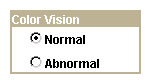
Radio buttons
Setting Radio Button Record Properties
To link a record with radio buttons:
Open the Radio Button Properties dialog box.
On the Record tab, select the record and field name.
The system retrieves the default label text if you enter the record or field.
Enter the database translate value for this radio button.
In the preceding radio button example, N is for Normal. If you select the drop-down list box for the value, you see the translate value and the long name that was assigned to the field. When the user selects this radio button, it indicates a Normal value.
Setting Radio Button Label Properties
To set the label of a radio button:
Open the Radio Button Properties dialog box.
On the Label tab, select the type of label if it is other than the default of XLAT Long.
Select the location of the label for your radio button: to the left or right.
Setting Radio Button Use Properties
You might want to change the way that a radio button is used on a page. For example, you might want the selected value of a radio button to control what appears in another control.
Using Edit Boxes and Long Edit Boxes
This section provides an overview of edit boxes and long edit boxes.
Understanding Edit Boxes and Long Edit BoxesWhen you insert edit boxes and long edit boxes on a page, they appear with the default label, Dummy Name, until you specify a record and field for them or until you specify a text type field label. There is more space than required between the edit box label and the control. Application Designer provides 25 percent extra space for the edit box label for translation purposes.
You control source data, labels, and how the control is used in the respective edit box and long edit box properties dialog boxes in PeopleSoft Application Designer. The settings for these two controls are mostly the same.
Note. Long edit boxes do not limit the number of characters that a user can enter in the browser, regardless of any limits defined in the underlying record field. As such, characters entered by the user that exceed the field definition’s field length may be truncated. For example, if you enter 012345678901234 into a long edit box associated with a field with a field length of 10, input would be truncated and saved to the database as 0123456789. The system treats carriage returns (ASCII=13) and line feeds (ASCII=10) the same as any other character.
Note. When using these controls on pages, application users will see ?<![CDATA*? in place of ?<![CDATA[? and in ?*]>? place of ?]]>? when xml, that contains CDATA sections, is displayed in a page at runtime.
Some edit boxes should display additional information than that which appears on the main page. You can create mouse over popup pages to appear when you hover your mouse over any edit box that is popup enabled. You can identify edit boxes with mouse over popup pages associated with them because these edit boxes are both display-only and they appear with a dashed line beneath the control.
You can configure edit boxes to display popup pages at runtime by configuring properties on the Use tab at design time.
Some edit boxes should be display-only. You might want a page field to govern what is displayed in another control. In some cases, you might want the page control to be invisible because it is required by PeopleCode, but is not a field that is accessible by a user.
If you designate the long edit box as display-only, select the Expand Field When Display Only check box to hide the scroll and automatically expand the size of the edit box as necessary to display large amounts of text in the field.
You can configure controls to be display-only runtime by configuring properties on the Use tab at design time.
Some long edit boxes should display rich text format (RTF). RTF is a format type that enables cross-platform document interchange. Any field that is rich text enabled appears at runtime with rows of text formatting tool bars, which enable you to indicate formatting information in the text such as font; font size; font characteristics, such as bold and italic; margins; and so on.
You can configure long edit boxes to display rich text at runtime by configuring properties on the Options tab at design time.
See Also
Using Popup Pages
This section provides an overview of popup pages and discusses how to:
Design context-sensitive popup pages.
Define popup pages.
Associate popup pages with fields.
Enable Message Catalog popup pages.
Add variables to messages to embed context-sensitive help.
Understanding Popup PagesYou can use popup pages to display expanded context-sensitive information when the main page displays only limited information. For example, you can create a Employee Details popup page to display the employee ID, name, department, current job assignment, phone number, and email address of employees. You can then configure any employee-related main page to display the Employee Details popup page. When you hover over the mouse over field, the popup page appears displaying the appropriate context-sensitive information for the employee that is shown on the main page.
Popup pages look and behave differently from standard pages. For example:
You access popup pages through the primary page only.
You can insert a certain subset of page controls only.
All fields on popup pages must be display-only.
All fields on popup pages are at level zero.
Popup pages appear when you mouse over any display-only edit box or hyperlink with which you associate them.
All PeopleCode should be placed in the Page Activate event or on work records associated with the popup page.
Note. PeopleCode that you write in the RowInit event will not run for any views that you use on popup pages.
Designing Context-Sensitive Popup Pages
For the popup page to retrieve the correct values, the lowest level key field on a popup page looks to the entire component panel buffer to find a field of the same name. These fields do not have to reference the same record and only the lowest level key must be present physically on the parent page. When a field of the same name is found, its value passes to record on the popup page. The popup page uses this value as the key value for the record field, retrieves the correct row from the record referenced by the field on the popup page, and displays the value in the correct page fields.
Consider this example, you have a User Details page that displays an employee's name, photo, department, phone, addresses, and web site URL that appears when you hover over the Employee ID field. This is the popup page:
All of the fields on the popup page reference the QE_EMPL_POPUP_VW record. On this record, make the EMPLID field the only key on this view. At runtime, the QE_EMPL_POPUP_VW view uses the EMPLID field to find the value on the main component, and then selects using this value from QE_EMPL_POPUP_VW to populate all the values on the popup page.
The SQL WHERE clause that retrieves the correct values would be WHERE EMPLID = '25000' where 25000 is the value of EMPLID in the parent component.
Identifying Popup Page Controls
You may insert these controls only on a popup page:
Frames.
Group boxes.
Horizontal rules.
Static text.
Static images.
Check boxes.
Drop-down list boxes.
Edit boxes.
Images.
Long edit boxes.
Push Button/Hyperlinks.
Radio buttons.
Charts.
Note. These controls are automatically set as display-only at runtime even if you do not set the Display-Only property on the control.
Using Push Buttons and Links on Popup Pages
You may use only these destination type values on a popup page:
Note. Do not use other destination types for push button/hyperlink controls on popup pages. Unexpected results will occur.
External link.
Instant messaging action.
Internal link.
PeopleCode command.
Process.
Secondary page.
Defining Popup Pages
Determine which data in the primary page is appropriate for popup information. Typically, this is supplemental information or information that you might accessed from more than one main page.
Note. When planning popup page design, plan for versatility and reusability.
To define popup pages:
Select File, New and select Page from the New Definition dialog box.
Insert the record fields on the popup page.
Right-click the page and select Page Properties to open the Page Properties dialog box.
Select the Use tab.
Select Popup Page from the drop-down list box in the Page Type group box.
|
Auto-Size |
Select to size the page automatically to fit the fields that are defined on it. |
|
Custom Size |
Select to size the popup page by dragging the edge or by entering the width and height in pixels. |
(Optional) Select Adjust Layout for Hidden Fields.
Click OK and save your popup page.
If you selected Auto-Size, the system sizes the page automatically to fit the fields that are defined on it when you save.
Associating Popup Pages with Fields
To associate popup pages with fields:
Select File, Open and select the parent page.
Select Insert, Edit Box or Insert Push button/Hyperlink..
Note. Popup pages can only be associated with display-only edit box and push button/hyperlink controls.
Double-click the control.
Select the Use tab.
Select the Display Only check box.
In the Mouse Over Popup group box, select the Page Popup option.
Select the name of the popup page from the drop-down list box.
Note. Only popup pages appear in the drop-down list.
Click the OK button.
Save the page.
Note. If page controls are placed too close together on a page, the dashed line, which indicates an associated mouse over popup page, might not appear beneath the control.
Enabling Message Catalog Popup Pages
You can enable Message Catalog Popup pages to embed context sensitive help on any PeopleSoft page. This section discusses how to:
Enable message catalog popup pages.
Embed context-sensitive PeopleBooks help in popup pages.
Enabling Message Catalog Popup Pages
To enable message catalog popup pages:
Double-click the field that accesses the popup page.
Select the Use tab.
Select the Display-Only check box.
Note. You must select Display-Only.
Select the Enable Mouse Over Popup.
Select the Message Catalog Popup check box.
Enter the Message Set and Message Number of the of the message whose Message Test and Explain strings appear in the Message Catalog Popup page.
Click the OK button.
Note. You can also enable Message Catalog mouse over popup pages by using PeopleCode.
Embedding Context-Sensitive PeopleBooks Help in Popup Pages
You can add variables to a message to make a Message Catalog popup page context-sensitive to the PeopleBooks Online Library.
Note. You must correctly configure and implement PeopleBooks.
See About These PeopleBooks, Managing the PeopleSoft Online Library and PeopleBooks, Integrating Context Sensitivity.
To add variables to messages to embed context-sensitive help:
Access the Message Catalog. ( PeopleTools, Utilities, Administration, Message Catalog to access the Message Catalog).
Select an existing or create a new message.
Enter an explanation and place the variable in the Explanation field.
Note. The text in the Message Text field appears as the popup page header. The text in the Explanation field appears in the popup page body.
Enable the popup page on the desired edit box control.
See Defining Popup Pages.
This table describes the variables and arguments necessary to create context-sensitive help using Message Catalog popup pages:
|
Variable |
Usage |
|
This variable uses the current page name as the %CONTEXT_ID% in the PeopleBooks Help URL. Because no message catalog reference for the label is listed, the label will default to the page name defined by the %CONTEXT_ID% variable. |
Note. The argument sn is the Set Number. The argument mn is the Message Number. |
This variable uses the current page name as the %CONTEXT_ID% in the Help URL, and if (sn, mn) is a valid Message Catalog entry, then that entry's MESSAGE_TEXT string appears as the label. |
|
This variable uses the CTXT_PG_NM argument as a page name that has a context reference in the PeopleBooks and because no message catalog reference for the label is included, the label defaults to the page name of the %CONTEXT_ID%. When you click this link, it launches PeopleBooks. Note. Your online PeopleBooks library must be installed for the link to function properly. |
Note. The argument sn is the Set Number. The argument mn is the Message Number. |
This variable uses the CTXT_PG_NM argument as the context reference in the PeopleBooks. Also if (sn, mn) is a valid Message Catalog entry, then that entry's MESSAGE_TEXT string will be the one used for the label in place of the default "Help" string. |
Note. The argument sn is the Set Number. The argument mn is the Message Number. |
This variable uses the <URL_IDENTIFIER> argument, which you find in the "URL Identifier" field on the URL_TABLE page in PeopleTools > Utilities > Administration > URLs. This is the URL_ID field from the PSURLDEFN table, which the system uses to retrieve the actual URL to use. If you use the (sn, mn) arguments, they reference a message catalog entry that contains the label to use for the URL. If you do not use these arguments or if you use incorrect message set and message numbers, the system uses the <URL_IDENTIFIER> argument as the label. |
Note. The argument sn is the Set Number. The argument mn is the Message Number. |
This variable enables you to hard-code a URL and reference a message catalog Message Text field entry as the label to use for this URL in the popup. If you do not use the (sn, mn) references or if you use incorrect message set and message numbers, the system uses the URL itself. |
Example
In this example, the %PBCTXT variable uses QRY_ADMIN as a CONTEXT_ID that references the Query Administration page in PeopleBooks.
The 4, 7 part refers to Message Catalog entry (4,7), that contains the label to use for the generated link.
On the Web Profile Configuration page at runtime, mouse over the chosen control to see the generated popup page:
Notice that the popup text comes from Message Catalog entry (4,6) and the link label, Query Administration, defined by the %PBCTXT(QRY_ADMIN, 4, 7) variable comes from Message Catalog entry (4,7). Click on the Query Administration link, and the system accesses the PeopleBooks entry for the QRY_ADMIN CONTEXT_ID using that Help URL entry to ascertain the PeopleBooks location on the web server.
Note. You define the location of your online PeopleBooks by entering a URL in the Help URL field that is located on the Web Profile - General page (PeopleTools, Web Profile, Web Profile Configuration).
See Configuring General Portal Properties.
Using SubpagesThis section provides an overview of subpages and discusses how to:
Define a subpage.
Insert a subpage on a page.
Specify informational subpage labels.
Understanding Subpages
Subpages are a powerful means of factoring out commonly used page functionality in your application. Rather than duplicating the same set of page fields on two or more pages, you can create a single subpage that contains those page fields and add it to any page. This makes it much easier to maintain the functionality that these page fields represent.
Subpages are even more effective when used with corresponding subrecords. In order to support the use of subrecords with subpages, the system uses a record name substitution mechanism for subpage-type page fields. Each subpage has a "from" record, determined dynamically by the page definition in PeopleSoft Application Designer and by the PeopleSoft Pure Internet Architecture. The "from" record is a record associated with one of the page fields in the subpage. Which page field depends upon the page field ordering, the types of page fields on the subpage, and whether it's record is a subrecord. The subpage itself must be fully expanded in order to make this determination. (This is important to keep in mind when working with subpages that contain other subpages.)
The "to" record is specified by you in the SubPage Record Name Substitution group box in the Insert Subpage dialog box that displays after you insert the subpage into a page (and on the Subpage tab of the Subpage Properties dialog). At runtime, when a subpage-type page field is expanded, each page field that is associated with the dynamically determined "from" record is instead associated with the "to" record you specify. This means, for example, that a subpage can be populated with page fields that are associated with a subrecord so that the subrecord is determined to be the "from" record. Then when that subpage is used as a subpage-type page field, you can specify the "to" record as one of the records that contains that subrecord. This enables you to associate a single set of page fields (through the subpage) with a variety of different records (each containing the subrecord).
Defining a Subpage
Creating a subpage is just like creating a brand new page definition. The difference is that you define it as a subpage rather than a standard page in the Page Properties dialog box.
To define a subpage:
Select File, New, Page.
Insert the record fields on the page.
See Adding Page Controls.
Select File, Definition Properties to access the Page Properties dialog box.
Use this dialog box to define the type, size, and layout of the page.
Select SubPage in the Page Type drop-down list box.
Select the size of the page.
Select Adjust Layout for Hidden Fields if necessary.
Select Allow Deferred Processing if appropriate.
Inserting a Subpage Into a Page
After you create the subpage definition, insert a subpage control on your primary page and associate it with the subpage definition.
To insert a subpage into a page:
Open the page on which you want to insert the subpage.
Select Insert, SubPage.
The Insert Subpage dialog box appears.
Select a subpage definition.
Specify the name of the subpage that you want to insert into the open page definition.
Select a record definition in the SubPage Record Name Substitution group box.
The subpage writes its fields to a generic record. Specify the application-specific record name to which you want the information in the subpage written.
See Using Subpages.
Note. All of the fields in a subpage must be associated with fields of a subrecord in the specified record definition.
Click OK.
The subpage appears on the page. Its size reflects the size of the page control group, and it is identified by the subpage definition name. During design time, the fields within the subpage are not visible. At runtime, pages containing subpages are dynamically expanded. Be sure to leave a few pixels of space between the left edge of the main page and the subpage page field to ensure sufficient padding at runtime.
When saving a page with multiple subpages, be aware that you may receive a warning message if duplicate fields are present.
Inserting a Subpage Into a Grid
You can insert a subpage into a grid as you would any other column.
See Inserting and Manipulating Grid Columns.
Specifying Informational Subpage Labels
Document the purpose of the subpage by changing the informational label of the subpage. The default subpage label is Subpage. Any label that you attach to a subpage is for information only—it doesn’t appear on the page, but it does appear on the page definition printout and in the control order list. Use labels to differentiate among multiple subpages on a page.
To change informational subpage labels:
Open the Subpage Properties dialog box.
Note that the Subpage tab displays the information that you entered on the Insert Subpage dialog box.
On the Label tab, enter your informational text label.
Enter the page field name in the General tab.
(Optional) Select Enable as Page Anchor if you want the subpage to serve as a jump destination on the page.
Click OK.
Using Secondary Pages
This section provides an overview of secondary pages and discusses how to:
Define secondary pages.
Insert a secondary page control.
Understanding Secondary PagesWhile a secondary page is just another page to the user at runtime, they look and behave differently than the primary pages. For example:
You can view a secondary page from its primary page only.
A secondary page should have OK and Cancel buttons so that the user can dismiss the page (accepting or canceling input) and return to the primary page.
To offer the user alternative buttons to dismiss the page, disable the default OK and Cancel buttons in the Page Properties dialog box.
Secondary Page or a Push Button?
There are two ways to associate a secondary page with a primary page:
Insert a push button or link and associate it with your secondary page.
This automatically displays the secondary page when the user presses the button or clicks the link and is the preferred method. Use this method when:
No procedural PeopleCode logic is necessary before the secondary page is displayed (PeopleCode can be used on the secondary page just like any other page).
You want to control the formatting of the information (therefore you want to use a page, and not use the Prompt function).
The secondary page is used more than once.
Insert a secondary page control.
This control looks like a command push button, but it is invisible at runtime. When you use a secondary page control, you must also insert a command push button on the page and call the DoModal PeopleCode function from the FieldChange event for the push button to display the secondary page.
Example
In the following example, the Address page contains an Email link at the bottom of the scroll area. This link opens the Email Addresses page, enabling the user to enter email address information.
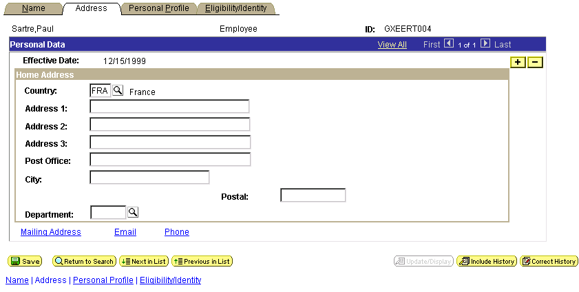
Primary page
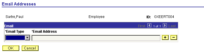
Secondary page
After the user enters the email information in the Email grid, the user can return to the Address page by clicking OK.
Defining Secondary Pages
Determine which data in the primary component is appropriate for a secondary page. Typically, this is supplemental information or information that is accessed from more than one main page.
To create a secondary page:
Select File, New and select Page from the New Definition dialog box.
Open the Page Properties dialog box.
Select the Use tab.
Select Secondary Page from the drop-down list box in the Page Type group box.
|
Auto-Size |
Select to size the page automatically to fit the fields that are defined on it. |
|
Custom Size |
Select to size the secondary page by dragging the edge or by entering the width and height in pixels. |
Select the page style sheet to associate with the secondary page.
To override the default style sheet that is associated with the application, select a different style sheet from the drop-down list box. The style sheet that you select is available only for the controls on the secondary page.
You can control the background of the page and any controls that don't have a style sheet associated with them by specifying a style in the page background.
(Optional) Select Adjust Layout for Hidden Fields.
(Optional) Clear Allow Deferred Processing if you want processing to occur each time the user presses Tab to move through a field.
Click OK and save your secondary page.
If you selected Auto-Size, the system sizes the page automatically to fit the fields that are defined on it when you save.
Inserting a Secondary Page Control
After you define the secondary page, you can place a secondary page control on your primary page and associate it with the secondary page you just created.
To insert a secondary page control on a primary page:
Select Insert, Secondary Page.
Click the primary page where you want to display the secondary page control.
The secondary page control appears like a small push button with the secondary page icon on it. This control is invisible at runtime.
Double-click the control to access the Secondary Page Properties dialog box: Secondary Page tab.
Select the name of the secondary page to associate with the secondary page control on the active page.
Only secondary pages can be associated with secondary page controls. You cannot associate a standard page or subpage with the secondary page control.
Select the Label tab.
This label is for informational purposes only. It appears in the Order tab of the page definition and in the page description printout.
Position the secondary page control at the proper scroll level on the Order tab.
Using HTML Areas
This section provides an overview of HTML area controls and discusses how to:
Insert an HTML area.
Populate an HTML area.
Change an HTML area label.
Understanding HTML Area Controls
You can insert an HTML area control on any PeopleSoft page. It can be inserted at any level on a page and can even be placed in a grid control. This control is rectangular and can be resized easily.
Populate the HTML area control in one of these ways:
Statically, in the page field property sheet.
Dynamically, by associating the control with a record field or HTML definition.
If the control is linked to a record field, the value of the record field is displayed in the HTML area. Use PeopleCode to associate the HTML area control with a predefined HTML definition.
When using HTML areas, consider:
HTML areas are downloaded to Excel as a non-breaking space ( ).
HTML areas are not searched with the Find feature.
Generating Trees in HTML Areas
You can use the GenerateTree PeopleCode function with HTML areas. This example shows the tree that is created by the GenerateTree PeopleCode function next to a grid in a frame:
You can populate an HTML area either statically, using the HTML Area Properties dialog box, or dynamically, by associating the control with a record field. Because the HTML that you write is included in the HTML that is dynamically generated by the system at runtime, consider the following:
The HTML that you include can affect the layout of the page.
Being true to the design-time sizing of the HTML area is the best way to ensure that you do not affect the layout of the other page field controls. Adding an invisible frame around the HTML area control can help ensure that you don't affect other page fields.
You can use only certain types of HTML tags. These tags are not supported by the HTML area control:
<body>
<frame>
<frameset>
<form>
<head>
<html>
<meta>
<title>
Using JavaScript in HTML Areas
If an HTML area contains a reference to third party JavaScript, you need to include the absolutized attribute in the script tag and set it to"false". For example,
<script type="text/javascript" language="javascript" absolutized="false"  ⇒
src="../../../../../ps/spellcheck/lf/spch.js"></script>
Using HTML Areas in AJAX Mode
Note the following code restrictions in HTML areas when running the application in AJAX mode:
Do not include XML tags, such as CDATA.
Do not include empty or commented out <script> elements.
Do not include document.write as part of the HTML in an HTML area.
See Also
Using the GenerateTree Function
Inserting an HTML Area
To insert an HTML area on a page:
Select Insert, HTML Area.
Draw the HTML area on your page.
Move the HTML area control by dragging it with the mouse or by pressing the arrow keys.
Populating an HTML Area
This section discusses how to:
Populate an HTML area statically.
Populate an HTML area dynamically.
Populating an HTML Area Statically
Use the HTML Area Properties dialog box to populate an HTML area.
To populate an HTML area statically:
Access the HTML Area Properties dialog box.
On the HTML tab, select Constant as the value type.
In the long edit box, enter the HTML code that you want to display in the HTML area.
Populating an HTML Area Dynamically
To populate an HTML area dynamically:
Access the HTML Area Properties dialog box.
On the HTML tab, select Field as the value type.
Specify the record and field to which you want to associate the HTML area control.
The value of the record field generates the HTML code that is included at runtime in the HTML area.
Note. When you associate an HTML area control with a field, make sure that the field is long enough to contain the data that you want to pass to it. For example, if you associate an HTML area control with a field that is only 10 characters long, only the first 10 characters of your text are displayed. PeopleSoft recommends using long character fields for record fields that are associated with an HTML area control.
Changing an HTML Area Label
Assign a distinct label to your HTML area to distinguish it from other HTML area controls on the Order tab of the page.
To change an HTML area label:
Access the HTML Area Properties dialog box.
Select the Label tab.
Enter a brief text description of the HTML area.
This label does not display at runtime; however, it appears on the Order tab of the page definition.
Using Push Buttons and Links
This section provides an overview of push buttons and links and discusses how to:
Insert push buttons or links.
Specify type properties for push buttons or links.
Specify use properties for push buttons or links.
Specify label properties for push button or link.
Change hover text for the push button or link programmatically.
Understanding Push Buttons and Links
PeopleSoft Pure Internet Architecture supports these features for this control:
Selecting link style.
Selecting these types of push buttons and links:
External link.
Internal link.
Prompt action.
Scroll action.
Toolbar action.
Selecting these image options:
On mouse over.
When disabled.
Inserting Push Buttons or Links
After you add a push button or link control to your page you can define the attributes by opening the Push Button/Hyperlink Properties dialog box.
To insert a push button or link:
Select Insert, Push Button/Hyperlink.
Click where you want the upper, left-hand corner of the control to begin.
A push button of small image size appears.
Double-click the push button to access the Push Button/Hyperlink Properties dialog box.
On the Type tab, select whether the control appears as a push button or link.
Select a destination type from the Destination drop-down list box.
Select the record and field names with which you want to associate the push button or link.
Select any of the remaining Type options:
|
Select to make the push button or link available to users who have display-only access to this page. Display-only access is set per user and user class in Security. |
|
|
Select to have the page that is displayed by the URL to appear in a new window, as opposed to replacing the existing window. |
|
|
Select to activate the push button or link when the user presses the Enter key. You can have more than one push button or link with this feature set per page, as long as only one of these fields is enabled at runtime. Otherwise, only one push button or link with this attribute enabled is allowed per page. This feature is available for all control types except external links. When using Activate by Enter Key in a scroll area or grid with an occurs count greater than one, the Enter key triggers the first row only. Note that on a secondary page with the standard OK and Cancel buttons enabled, the Enter key activates the OK button rather than a custom button or link. |
|
|
Select to enable the ComponentChanged built-in PeopleCode function when the user selects the push button or link. This issues a save warning if the user attempts to leave the page. This setting is cleared by default. See ComponentChanged. |
Specifying Type Properties for Push Buttons or Links
Access the Push Button/Hyperlink Properties dialog box.
Type
Each destination type that you select enables a different region on the Type tab, enabling you to further define your push button or link. Select one of these values from the Destination drop-down list box:
|
Accesses a uniform resource locator (URL). You can select a value from the URL table or use the value of a record field to define the destination. Selecting this option enables the External Link group box. You can choose to have the URL encoded or not by selecting the Encoded by Application check box. This applies an external link to your page in the form of a push button or link that accesses a new page, taking the user to the external website that you designate. To return to the primary page, the user closes the new page. When setting the record and field name consider these points:
|
|
|
Accesses a PeopleSoft page. Parameters include the menu path to the page and a check box to specify whether data from the current page should be used in the search dialog box. Selecting this option enables the Internal Link group box. This adds an internal link in the form of a push button or link that you can use to access another component or page from within the system or another PeopleSoft database or node. You can even specify the type of action mode to open in for that page. To control the push button or link in PeopleCode, enter the record and names. Like the external link, if you associate a record and field name with this link, the tool tip that appears at runtime draws from the RFT long label for the record field. However, the RFT long label only displays if it is different from the assigned display value of the link. |
|
|
Select to add an instant messaging button to the page. Associate the button with a record field that contains entries in the form of <user>@network (such as John@Yahoo). For this purpose we provide the MCFIMNETWORKS table. The MCFIMDOMAIN field is the source for the instant messaging network providers. This table contains only three network providers: AOL, Yahoo, and SameTime Connect. You should never enter additional networks not already in this table. See Configuring Instant Messaging in PeopleSoft MultiChannel Framework. |
|
|
Enables the user to jump to the anchor tag that you designate for a page field on the General tab of the properties dialog box for that field. This enables the user to jump from one destination (the link that you assign as the page anchor) to another (the field that you enable as the page anchor) in your page. When you select this option, the page fields that you previously set as page anchors on the General tab of the properties dialog box appear in the Related Control drop-down list box in the Actions group box. You can place as many page anchor buttons or links on the page as necessary. |
|
|
Associates with a field in a record, so when the user clicks the push button or link, the system runs any FieldChange PeopleCode that is associated with that field. Enter the record and field names. The field should have PeopleCode in the FieldChange event. |
|
|
Runs processes that you set up previously with PeopleSoft Process Scheduler. Associate process push buttons with a specific process definition; the process is run each time that a user clicks the button. Selecting this value enables the Process group box, where you can specify the type and name of the process that you want to run. |
|
|
Displays a prompt dialog box for a specific control field. Adds a custom prompt button or link next to a field on the page in place of the standard prompt that is associated with that field. For example, you might want the prompt to read Find an Airport Code. Selecting this value enables the Actions group box. In the Related Control drop-down list box, select the field that you want to associate with the prompt. The action type, Prompt, is set automatically. Set the text label properties for the link on the Label tab. |
|
|
Represents certain actions that a user can perform on a grid, scroll area, and scroll bar, such as bottom, top, insert row, and so on. Use to provide action buttons for the grid, scroll area, or scroll bar in areas outside of that control, such as at the bottom of the page or outside the borders of the control. Selecting this value enables the Actions group box, where you can specify the action type and related control. The Action Type field enables you to select the action to be performed in the specific level. The level is specified in the Related Control field. Specify one of the following scroll actions: Bottom, Next, Previous, Row Delete, Row Insert, and Top. For example, if you want a user to be able to move through a page at runtime, set the action type to Next or Previous and specify which scroll area you want those actions to control. |
|
|
Access an existing secondary page. After you have designed a secondary page, you must associate it with a control on the primary page. The secondary page push button or link is the starting point for the user for that secondary page. Selecting this option enables the Secondary Page group box, where you can select the name of the secondary page that you want to associate with the push button or link. |
|
|
Represents the various toolbar actions to the user. A user can perform several actions on a page, such as save, display the next page in a group, correction mode, and so on. These normally reside on the toolbar at the bottom of each PeopleSoft Pure Internet Architecture page. Use this type of push button or link for placing save, next in list, or other toolbar functions on the page. Selecting this value enables the Actions group box, where you can specify the action type: Add, Correction, Next in List, Next in Worklist, Next Page, Notify, Previous in List, Previous in Worklist, Previous Page, Refresh, Return to List, Save, Update/Display, Update/Display All, or View Worklist. |
In this group box, select Dynamic or Static, and enter the URL ID, if necessary. Select a value from the URL Maintenance table of a record field to define the destination. For example, a derived record field might be used to set the destination value dynamically at runtime. The value of the derived record field is placed in the HREF tag of the HTML.
See URL Maintenance.
Internal Link
|
Select the portal to which you want the internal link to point. Use Current is the default. Valid values include all of the values in the PORTAL_NAME column of the PSPRDMDEFN table. |
|
|
Select the PeopleSoft database to which you want the internal link to point. Local stands for the node which is marked as the default only. So if the content reference you need is registered with a non-default local node, make sure you choose the exact same value from this drop-down list box. Valid values include all of the values in the MSGNODENAME column of the PSMSGNODEDEFN table. If you select a node other than Local, the Use data from current page in search check box is cleared. The node that you select should match the node for the destination component in the Registration Wizard or on the Content Ref Administration page. Select PeopleTools, Portal, Structure and Content. Click the Edit link to access the Content Ref Administration page. |
|
|
Select the menu name in which the destination page is contained. |
|
|
Select the component in which the destination page is contained. These values depend on the menu that you select. |
|
|
Market |
Select the market of the destination component. |
|
Select the page on which you want the user to land. These values depend on the component that you select. |
|
|
Select the action mode in which you want the page to begin. |
|
|
Select if you want data from the current page to be used in the search dialog box. This option ensures that the new page inherits the proper keys from the context of the current page. The process is almost identical to the Transfer() PeopleCode function, and it performs a similar function. If this check box is selected, the system discards the existing keylist. A new keylist is built from the current component buffer using the field's context (when there is a choice between rows in a scroll area). This keylist is then used to start the new component. If this option is cleared, the system uses the existing keylist in the normal manner. |
Specifying Label Properties for Push Buttons or Links
This section discusses how to:
Specify a text label.
Specify an image label.
Specifying a Text Label for the Push Button or Link
To specify a text label for a push button or link:
Access the Push Button/Hyperlink Properties dialog box.
Select the Label tab.
In the Type group box select Text.
Select the size.
There are three standard push button sizes, depending on what kind of text or image you want to display on the button face.
|
Small Image |
Creates toolbar-sized buttons that handle small 16 × 16 pixel images. |
|
Large Image |
Handles 32 × 32 pixel images. |
|
Standard Text |
Matches the Microsoft standard dimensions for text push buttons. |
|
Custom |
Select if none of these sizes meets your needs. When you click OK, the push button displays selection handles that you can use to resize it. |
Specify the type of label text.
Depending on the destination type that you selected, the values in the Type drop-down list box differ.
|
Select to reference a message that exists in the message catalog. Enter the message set and number. Message catalog items are all translatable. |
|
|
Select to label the push button with the short name for the field from a record definition. RFT is an abbreviation of record field table, which stores attributes for fields in a record definition. Use this option only if you specified a record definition and field name on the Type tab in the Push Button/Hyperlink Properties dialog box. The RFT short name appears on the push button when you click OK and return to the page. Select the label ID if you do not want to use the default label if more than one label has been set for the record field. |
|
|
RFT Long (record field table long) |
Select to label the push button with the long name for the field. Use this option only if you specified a record definition and field name on the Type tab in the Push Button/Hyperlink Properties dialog box. The RFT long name appears on the push button when you click OK and return to the page. Select a different label ID if you do not want the default label if more than one label has been set for the record field. The system uses the RFT long label as the tool tip at runtime for links if it is different from the assigned display value of the link and it is not null. If more than one label is stored for the record field you can select an alternate tool tip from the Label ID drop-down list box. |
|
Select to enter the text to appear on the label. |
|
|
URL Description |
Select if you selected External Link as the destination on the Type tab. Select the style from the drop-down list box. |
This option is only available if you selected Hyperlink for the type on the Type tab. Push button text is automatically centered for controls that appear as push buttons. Push buttons with text and images are automatically center aligned when used in grids.
Note. Some browsers do not support custom push buttons.
See "Troubleshooting Browser Limitations" on Customer Connection.
Specifying an Image Label for a Push Button or Link
To specify an image label for your push button or link:
Access the Push Button/Hyperlink Properties dialog box.
Select the Label tab.
Select Image for the type.
Specify the size.
If you select Custom, the Image/Format Size group box becomes available.
|
Scale |
Select to adjust the width and height as percentages. |
|
Size |
Select to set the image size by altering the width and height in pixels. |
|
Reset to actual image size |
Resizes the image according to its natural size. That is, the images size is not manipulated by custom width or height values. |
Specify the image ID.
Select one of the predefined image definitions or click the Browse button to view push button images.
In the Alt tag for image group box, specify the hover text type.
|
Select to reference a message that exists in the message catalog. Enter the message set and number. Message catalog items are all translatable. |
|
|
RFT Long (record field table long) |
Select to use the long name of the record field as the hover text. Use this option only if you specified a record definition and field name on the Type tab in the Push Button/Hyperlink Properties dialog box. The system uses the RFT long label as the tool tip at runtime for links if it is different from the assigned display value of the link and it is not null. If more than one label is stored for the record field you can select alternate hover text from the Label ID drop-down list box. |
|
Select to use the short name of the field as the hover text. Use this option only if you specified a record definition and field name on the Type tab in the Push Button/Hyperlink Properties dialog box. If more than one label is stored for the record field you can select alternate hover text from the Label ID drop-down list box. |
|
|
Select to enter the text to appear on the label. |
(Optional) Select the image to appear on a mouse over.
For example, you might want to highlight an image so that users can easily see which option they're selecting.
(Optional) Select an image to appear when the button is disabled.
Specify Use Properties for Push Buttons or LinksAccess the Push Button/Hyperlink Properties dialog box. Click the Use tab.
Field Use Options
This table describes the Field Use options:
|
Enable When Page is Display Only |
Select this option to make the push button/hyperlink control accessible to the application user even when the entire page is in display-only mode. |
|
Open in New window |
Select this option to open the destination content in a new browser window. |
|
Activate by Enter Key |
Select this option to enable the Enter key to activate the push button/hyperlink control. |
|
Set Component Changed |
Enables the system to issue a save warning for the field if the user changes the value and attempts to exit the page before saving. This setting reinforces current save warning behavior. This option is set by default for edit boxes, long edit boxes, radio buttons, check boxes, and drop-down list boxes. Clearing this option overrides the save warning that normally displays to users. The user will not see a save warning after changing the value of the field and attempting to exit the page. An example of when this might be necessary is for a drop-down list box that includes links to another page. If the user selects a link from this field to transfer to another page but has not made any other changes to the page, it is not necessary for the system to issue a save warning. By clearing the Set Component Changed flag, you insure that no save warning message is issued for this field. This option works for fields associated with a derived work field or database record field. For the push button/hyperlink control the default setting is cleared instead of selected, unlike with other page controls. |
Grid Cell Alignment
Push buttons with images or text are center aligned automatically when in a grid. Otherwise, select Left, Centered, or Right.
Note. Grid Cell Alignment properties are only enabled when the push button field is in a grid and is configured as a text hyperlink.
Modal Window
The Modal Window options are available when you select a destination type of either PeopleCode command or Secondary page.
This table describes the Modal Window options:
|
None |
Indicates that the secondary page is displayed normally as a PIA page. |
|
Close Modal |
Indicates that the push button/hyperlink control, when placed on a secondary page and displayed in a modal window, can close the modal window and bring the user back to the primary page. The Close Modal radio button is used when a secondary page does not define the standard OK and Cancel secondary page buttons. |
|
Display in Modal Window |
Indicates that you can click an icon to have the secondary page appear in a modal window hovering over the standard page; the Height and Width parameters are the initial height and width of the modal window. |
Select the Display Only check box to enable the Mouse Over Popup options. Select from these mouse over popup options:
|
No Popup |
Select this option to have no popup page. This is the default. |
|
Page Popup |
Select this option to associate this control with a popup page that you choose from the drop-down list box. Only popup pages appear in the Page Popup drop-down list box. |
|
Message Catalog Popup |
Select this option to associate this control with a system-defined message popup page that displays a message from the message catalog. You can design and implement message catalog popup pages to be context sensitive. See About These PeopleBooks:Managing the PeopleSoft Online Library and PeopleBooks,Integrating Context Sensitivity See Message Catalog. |
Note. Attempts to make a pushbutton/hyperlink editable at runtime when it has a mouse over popup page associated with it for example, using PeopleCode, will fail.
Changing Hover Text for the Push Button or Link ProgrammaticallyHover text or mouse over text enables you to display additional or supplemental information about the button or link. Under certain circumstances, you might want to vary the hover text based on the context of application data on the page.
You can alter hover text by using the PeopleCode HoverText Field property. This property sets the hover text for any buttons or links associated with the field. The maximum length of hover text is 100 characters. You can use the Message Catalog to store hover text.
Example of Changing Hover Text Programmatically
To set hover text for a push button or link at runtime, use PeopleCode to define the HoverText property for a field definition.
QE_ABSENCE_HIST.QE_ABSENCE_TYPE.HoverText = MsgGetText(95, 5037, "Personalize Layout");
Note. The HoverText field property is available for the Push button/Hyperlink page control only.