
 Understanding Page Design
Pages are the graphical interface between your users and your application database. As a system designer, you configure or build pages that meet the data requirements of the application and that are easy to use and understand. Using PeopleSoft Application Designer, you can create, modify, and delete page definitions in your PeopleSoft system.
This chapter provides an overview of page design and development and discusses how to:
Use page development tools.
Create new page definitions.
Add page controls.
Manipulate page controls.
Set page field properties for controls.
Create display control and related fields.
Order and space page controls.
Design inquiry pages.
Align page controls.
Maximize performance.
Access PeopleCode in page definitions.
View pages in the browser.
Produce pages.
Understanding Page Design
This section discusses:
Level-based controls.
Keys for accessing pages.
Multiple occurrences of data.
Prompt fields.
Derived work fields.
Sensitive data.
Hidden pages.
Upgrade considerations.
End user page customization.
Level-Based ControlsPage design hinges on the type of data that you plan to access and maintain. In some cases, a page references a single record definition; in others, you may want to reference multiple records. To accommodate a variety of page designs, PeopleSoft created level-based controls. The three level-based controls are:
Grids
Scroll areas
Scroll bars
There are four levels in level-based controls: Level 0, Level 1, Level 2, and Level 3. These levels are referenced as occurs levels on the Record tab in the page field properties for the level-based control that you are setting.
Level 0
This is the nonscrolling area that directly relates to the key information of the underlying record. Level 0 information is usually display-only with data that the user entered on the initial search page.
Levels 1−3
These levels include the scrolling data that is related to the Level 0, nonscrolling data. Level 1 is subordinate to Level 0; Level 2 is subordinate to and nested in Level 1; and Level 3 is subordinate to and nested in Level 2. You can nest level-based controls up to 3 levels.
The first occurs level on a page is Level 0. In general, this level is reserved for the primary key fields that are used to search for pages. It is possible to have a page that contains no level-based controls, making all fields set to Level 0. This is particularly true for secondary or subpages that contain few data entry fields, as shown in this example. The second column, Lvl (level), of the Order tab indicates that all fields on the page are at Level 0.
After you add a level-based control to your page, such as a scroll area, the default occurs level for that control is set to one in the properties dialog box. If you place a field in or below that scroll area, it is also set to Level 1 in the Order tab, even if it is another level-based control. If necessary, you can use the Set to Level 0 feature of the horizontal rule control to restart the occurs level on your page.
Note that you can have any number of level-based controls at the same level.
Nesting controls involves two or more level-based controls on a page, such as two scroll areas, when the second scroll area has an occurs level of 2. You nest controls when the new data that you want to add is a repeating set of data for each entry in your first level-based control. In doing so, you create a hierarchical, or "parent and child" relationship between the controls and the processing of the record definitions. The Level 2 control is the child of, and is subordinate to, the Level 1 control.
For example, on the Compensation page, the Level 2 grid is nested in the Level 1 scroll area. On the Amounts tab of the grid, there are two rate codes for each compensation action in the Level 1 scroll area.
You can nest up to three levels of scrolls or grids on your page. For example, the Additional Pay 1 page shows three levels of data that can be entered, two of which are nesting scroll areas in the Earnings scroll area.
In this case, we want to maintain information about the compensation history for a single employee, and, for each change or override in compensation status, enter the details about that change. The first scroll area, Earnings, associates the earning code with the second, subordinate scroll area, Eff Date (effective date) and Default Job Data, which enables the user to enter the effective date for the status change. The third scroll area, Or Overrides to Job Data, which is subordinate to the second, enables the user to enter the overrides to the default job data that appears in the second scroll area.
For each of the three scroll areas, you can have several rows of data. While you don't see actual scroll bars on your page, the navigation buttons and links in the navigation bars for each scroll area enable you to navigate or scroll through the rows.
As shown previously, you can nest a grid in a scroll or scroll area. The following page shows the Other Earnings grid at Level 3, which is nested in the Earnings scroll area at Level 2, which is nested in the Paysheet Details scroll area at Level 1. A nested grid serves the same function as a nested scroll area. It can offer a more compact way of viewing many fields of data, particularly if you use a tabbed grid.
Note. While you can nest a grid in a scroll area, you cannot nest a scroll area in a grid or a grid in another grid.
Levels play an important role in runtime processing. The component processor relies on the level at which you place a field on a page to determine how to process any PeopleCode attached to the field in the record definition.
Effective Dates and Level-Based Controls
EFFDT (effective date) must be the only key field that is controlled by level-based controls that you create to help users maintain multiple occurrences of data that is keyed by effective date. Otherwise, the effective date processing for update actions does not function correctly.
See Also
Referencing Data in the Component Buffer
Keys for Accessing PagesNo matter how much time and effort you invest in defining and refining your page, it's useless unless the user can access it. This means adding it to a component, then adding that component to a menu. When you add a page to a component, you determine what actions the user must perform to access the page and the keys that are required to retrieve rows of information.
The search record that you define for a component determines the key list; that is, keys for which users are prompted when they select a page and an action. A search record can be either a view that concatenates information stored in several tables or the underlying table itself. Select the search record that contains all of the key items for the primary record underlying the page.
The keys for which the search dialog box prompts should populate the high-level (Level 0 in the page definition) key controls on a page. These key controls always appear above any level-based control on the page and are typically display-only. A search record might differ from a primary record definition, but it must contain all of the Level 0 keys that you have placed on the page.
When you create a view that should use key values from a page, each of those keys must be:
Listed as output columns from the view (not just referenced in the WHERE clause of the view).
Marked as key fields of the view.
For example, suppose that a page has PERSON.PERSONID as a Level 0 field. PERSONID is the key of the PERSON record. A grid on the page uses the PERSON_ADDRESS_VW view to display addresses for the current person. The SQL statement for the view cannot just mention PERSON.PERSONID in the WHERE clause; PERSONID must be both an output column of the view and a key field of the view.
See Also
Creating Component Definitions
Multiple Occurrences of DataOn some pages, you may want a few of the field controls to display multiple rows or occurrences of data. To do this, you can add a level-based control—a scroll area, a grid, or a scroll bar. Users can then add, edit, delete, find, and scroll through multiple occurrences of data in a page control or group of controls using action buttons, links, or the browser's scroll bar, depending on how you set the occurs count. Using a scroll area or a grid, rather than a scroll bar, is the preferred page design to show multiple occurrences of data.
For example, this Checklist Table page contains the Assignment Checklist Item grid with an occurs count of 5. The Checklist Item scroll area in which it is nested must have an occurs count of 1 since we can see only one row of data in the scroll area.
To see the next set of five rows in the Assignment Checklist Item grid, a user can click the right arrow button. To see all rows of data at once, in either the grid or scroll area, the user can select the View All link in the navigation bar.
In PeopleSoft Application Designer, you set the occurs count for a level-based control on the General tab in the properties dialog box. You can set the occurs count to any number. You also have the option of selecting Unlimited Occurs Count so that the user sees all rows of data. If there are more options than can be seen in the window at runtime, the browser displays a scroll bar enabling the user to scroll to the bottom of the page.
Note. When occurs count is set to a number other than 1, the grid displays the specified number of rows. However, when it is set to 1, the grid displays as many rows as possible within the given space allocated for the grid control at design time.
Prompt FieldsAt runtime, you may want to enable your users to look up the valid values that they can enter in a field. For this, PeopleSoft provides prompts or look up buttons. There are three types of prompts:
This is a small list that opens below a field in the current page, such as the Job Indicator field on the Work Location page. To use a drop-down list box, the user clicks the down arrow inside the field. One does not have to exit the page. The drop-down list box is a predefined control that you place on your page.
Calendar drop-down prompt.
A calendar drop-down prompt opens a small calendar next to a date field to enable the user to easily scan for the correct date. The Work Location page contains calendar prompts for the Effective Date, Position Entry Date, and Department Entry Date fields. Place a calendar prompt on a page by associating any date field with an edit box control and selecting the Show Prompt Button in the Display Options of the Record properties of the edit box.
Note. The calendar prompt feature is not supported on all browsers.
See "Troubleshooting Browser Limitations" on Customer Connection.
Prompt button.
A prompt or lookup button opens a lookup page in the user's browser populated with up to 300 available values for that field. The user can then either select the desired value or refine their search further. For extremely large tables, the system administrator has the option of excluding that table from auto prompting on the Lookup Exclusion Table via PeopleTools, Utilities, Administration.
In PeopleSoft Application Designer, you can only associate a prompt button with an edit box control. Do this by selecting the Show Prompt Button check box from the Display Options on the Record tab of the Edit Box Properties. The record field with which you associate the edit box must list values in the Translate Table or prompt table for the system to display the prompt button.
See Also
Specifying Date Field Attributes
Derived and Work FieldsYou can use a field definition from a derived or work record to store a temporary value that PeopleCode uses to determine the values of other field controls on the page.
For example, for a budgeting transaction in PeopleSoft General Ledger, assume that you have an annual amount that you must spread to multiple accounting periods. You can create a page that includes both a field control from a derived record for the annual amount and an amount control for each accounting period. You then write PeopleCode to derive the amount per accounting period from the annual amount. When a user enters the annual amount in the derived field control, PeopleCode calculates the amount per accounting period and inserts it into each accounting period field control. The annual amount isn't stored in the database, but the period amounts are.
Sensitive DataYou can allocate sensitive data to a single page and limit access to that page to the users who need to update it. Alternatively, you can enter PeopleCode to hide certain fields on pages based on whatever criteria are appropriate. The page approach is simpler, however, and can be used in most situations. For secondary pages, this sort of security is more complex to manage.
See Also
Hidden PagesHidden pages are work pages that are associated with derived or work records and are often used in work groups. You can store all of your work field controls there. Create these pages when you want calculations to be performed in the background by PeopleCode that the user does not need to see. As a convention, PeopleSoft assigns work pages that are delivered with your application names that end with the suffix, _WRK. PeopleSoft recommends that you follow the same naming convention. For example, MC_TYPE_WRK.
Hide a page by selecting the Hidden check box in the component grid as you set up the component definition.
See Also
Upgrade ConsiderationsIf you adapt a PeopleSoft application, you might affect your use of future PeopleSoft releases. The closer your PeopleSoft system is to the standard product, the easier your upgrades will be. Avoid superfluous or cosmetic changes to data structures in the standard product. Document all of your changes in the comment area on the General tab in the Page Properties dialog box.
End User Page CustomizationEnd users of PeopleSoft applications can customize various settings on a page including tab order, the display state of scroll areas and grids, and the state of collapsible sections. Users can also choose the default page to display for a component each time they open that component. In addition, users can choose to share their customization settings with or copy settings from another user.
The page customization option is set in the Component Properties dialog box, Internet tab. The Customize Page Link check box is selected by default. This enables the Customize Page link in the pagebar at runtime for all pages.
See Also
Using Page Development Tools
This section discusses how to:
Use page definition menus.
Use page definition toolbars.
Use the page layout grid.
Using Page Definition Menus
As you build pages, use the tools and options in these menus.
In addition to the standard options for opening, deleting, and renaming pages, use this menu to access the definition (page) properties and project properties.
Access the page field properties from this menu. To find out what other definitions reference the active page, select Find Definition References. You can also search for a text string in types of PeopleCode or SQL objects.
Select View Definition to view the underlying definition, such as the subpage or record, for the selected control.
You can view the PeopleCode for the page or the underlying record definition.
Edit Fill Display, Edit Fill All, and Edit Fill None refer to how controls appear only during design time.
They do not affect the page during runtime.
Use the Show Page Control Inspector tool to view summary data of the selected page field.
Use Show Grid to display or hide a layout grid on the page that you are designing to help you place controls more accurately.
Use this menu to insert different types of controls on your page. You can also insert the page on which you are working into a project.
This menu provides access to various utilities, such as data administration, change control, upgrade, and translate.
Use this menu to modify the number of pixels between points on the layout grid. Options on this menu also enable you to align page controls, view the processing order of the controls on the page, and test the tab order between fields on your page.
The View in Browser function enables you to see a very general image of the page in the selected browser without data. Note, however, that PeopleCode is not run on this page rendering, so the page may look significantly different for the user if PeopleCode is used to hide or unhide page fields.
The Generate HTML function creates a text file containing the HTML for your page and places it in the TEMP directory of your local drive. Note that the HTML generated contains no data or context. It is therefore likely to differ from the HTML on a page at runtime.
Using ToolbarsThe toolbars in PeopleSoft Application Designer change, depending on the active window. When a page window is active, you see the page definition toolbar and the page control toolbar.
The page control toolbar contains a button for each type of page control that you insert. The buttons display images that look like the controls that they insert. You can move this toolbar on your workspace independently of the system toolbar or the other half of the page definition toolbar.
|
|
|
|
|
|
|
|
|
|
|
|
|
|
|
|
|
|
|
|
|
|
|
|
|
|
|
|
|
|
|
|
|
|
|
|
|
|
|
|
|
|
|
|
|
|
|
|
|
|
|
|
|
|
|
|
|
|
|
|
|
|
Using the Page Layout GridWhen you open a page definition, evenly spaced dots appear in the workspace. This is the page layout grid that you use to align controls. When you're running applications, the grid doesn't appear on pages. It appears only as a design aid in the page definition.
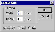
Layout grid
The default grid spacing is 4 × 4, which means that each row has one dot per 4 pixels and that the rows are 4 pixels apart on the vertical axis. PeopleSoft builds most of the pages in the standard applications using this grid. To change the spacing, open the Layout Grid dialog box by selecting Grid Settings from the Layout menu.
You can turn off the grid view of your page by clicking the Toggle Grid button in the page definition toolbar.
Changing Page Layout Grid Settings
To change the grid spacing:
Select Layout , Grid Settings.
Enter values for the width and the height, which is the spacing of the dots in pixels.
The smaller the value, the finer the grid. The finer the grid, the more difficult it is to align fields precisely without using the align functionality. Note that if either the width or height are set to one, then the grid will be slightly off.
Select a Show Grid option to activate or deactivate the page grid.
If you copy an existing page and save it under another name, you also copy the grid settings that were used to create the original page. For example, if the original page was built with a 5 × 5 grid, your new page also has a 5 × 5 grid, by default. You can change the grid settings anytime while working on a page. Doing so has no effect on the position of a field.
The snap-to-grid functionality is only available when the layout grid is showing.
Creating New Page DefinitionsTo create a new page definition, either clone an existing page or begin with a blank page. Cloning is more efficient, because you don’t have to re-create controls that are common to all pages. You can also create a template that contains only the controls that you need.
This section discusses how to:
Clone page definitions.
Create a blank page.
Note. When saving new definitions, always make sure to adhere to accepted naming conventions.
See Saving Definitions.
Cloning Page Definitions
To clone a page definition:
Select File, Open.
The Open Definition dialog box appears.
Specify Page for the definition and locate the page that you want to clone.
When the system retrieves the page definition, select File, Save As.
If you save after you make modifications, you might accidentally overwrite the old page definition.
To create a new page template, name the page so that it appears at the top of your page list.
Click OK.
Note. Record definition names are restricted to a maximum of 15 characters, while page names can have up to 18 characters.
See Also
Creating a Blank PageTo create a new page without copying an existing page, select File, New, Page.
When saving the page, make sure that you adhere to the accepted naming conventions.
See Saving Definitions.
Adding Page Controls
There are multiple ways to add page fields to a page. You can copy page fields from one page and paste them onto another, or you can drag-and-drop page fields from one page to another. In addition to these basic methods, this section discusses how to:
Drag field definitions from a record onto a page.
Drag record fields from the project workspace onto a page.
Drag record definitions onto a page.
Use the page control toolbar.
Use the Insert menu.
Dragging Field Definitions From a Record Onto a PageTo drag field definitions from a record onto a page:
Open an existing record definition by selecting File, Open, Record.
Open a new page by selecting File, New, Page.
Drag field definitions from the record to the page.
The system selects the page definition control type based on the record field attributes. In the preceding page, the EMPLID (employee identification) field was defined as a prompt table edit in the record, so a Prompt button was added for EmplID when it was dragged onto the page.
Double-click the new page field to set the properties.
When you drag field definitions, the properties from the record definition are used to set page field default properties. You can alter the properties using the Properties dialog box.
Dragging Record Fields From the Project Workspace Onto a PageTo drag record fields from the project workspace onto a page:
Open the project that you want to drag from an existing or new page.
Drag record fields from the project workspace to the page.
Double-click the new page field to set the properties.
Note. When you drag fields from the project workspace, use fields that are contained in records (as in record.fieldname), not field definitions.
Dragging Record Definitions Onto a PageYou can add an entire record definition to a page at once. This can save a great deal of time when generating pages. You can then arrange the fields as desired on the page.
Note. This can also be done for a grid. You can drag an entire record definition into a grid control that you've placed on a page.
See Inserting and Manipulating Grid Columns.
To drag record definitions onto a page:
Open the project that you want to drag from an existing or new page.
Drag the record definition onto the page.
PeopleSoft Application Designer positions the record fields on the page as page fields in a cascading manner. Fields are in the order that they appear in the record with the appropriate control value assigned to each one.
Reposition the fields as necessary on your page.
Double-click each new page field to set the properties.
Using the Page Control ToolbarYou can insert page controls by using the page control toolbar. When you click one of the page control buttons, the cursor changes to a cross-shaped icon or hand, depending on which control type you select. You can then move the cursor to where you want to position the control and click once. If you select a control from the toolbar erroneously and want to cancel the selection, press the Esc key, and then select the desired page control button.
If the control is a fixed size during insertion, the cursor changes to a cross-shaped icon. If the control type requires that you define the size of the control at the time of insertion, the cursor changes to the monogrammed hand icon. When a hand-shaped icon appears, press and hold the left mouse button as you drag the hand diagonally downward to where you want the lower, right-hand corner of the frame. Release the mouse button.
If the control isn't correct the first time that you draw it, you can easily adjust it. The dotted box and black or blue handles surrounding the control indicate that it is selected. Use any of the four directional arrow keys on the keyboard to move the frame one page grid unit in the indicated direction. You can also use Shift+ the arrow key to resize the page control.
Using the Insert MenuSelect the control that you want to add to your page from the Insert menu. Your cursor changes to a cross-shaped icon or a hand, depending on which control type you select. Move the cursor to where you want to position the control and click once.
Manipulating Page ControlsAfter you place a control on the page, you have several choices for manipulating it.
This section discusses how to:
Select controls.
Resize controls.
Use the Page Control Inspector.
Delete controls.
Move controls on the same page.
Copy and move controls to another page.
Move labels.
Selecting ControlsBefore you do anything to a control, you must select it. You can do this by clicking the control or by using the Edit menu. A check mark beside the option in the menu indicates which of these modes you’re in:
|
Select Field |
Select one control on the page by clicking on it. To deselect a control, click once outside the dotted box. This is the default mode. |
|
Select a group of controls by drawing a box around the controls that you want to select. You can also activate this option by clicking and dragging over the target fields. Note. You are in Select Group mode when the cursor changes to a pointing finger. If the cursor does not change when you select Edit, Select Group, try first selecting an individual control on the page and then selecting Edit, Select Group again. |
|
|
Select All |
Select all of the controls on the active page. The result is the same as using the Select Group option to draw a box around the controls. |
Resizing ControlsYou can adjust the size or shape of any page control that displays selection handles when it is selected.
Note. Some browsers do not support the resizing of certain control types. In these cases, changing the size in PeopleSoft Application Designer has no effect upon the runtime size of the field.
See "Troubleshooting Browser Limitations" on Customer Connection.
To resize a control, use one of these methods:
Select the control and drag a handle to adjust the height or width.
Note. Some control types can be adjusted only in width.
Hold down the Shift key while pressing the Up Arrow, Down Arrow, Left Arrow, or Right Arrow key.
The frame size is adjusted one grid unit in the indicated direction.
Note. The position of the top, left-hand corner of the frame does not change; resizing with the keyboard occurs by adjusting the position of the bottom, right-hand corner.
Using the Page Control InspectorThe Page Control Inspector provides location, size, type, and data source information for the selected page control on the page. The first six values, Left, Width, Right, Top, Height, and Bottom, display the exact bounding coordinates in pixels of the control on your page in PeopleSoft Application Designer. The remaining values help distinguish the selected control from others on the page.
Access the Page Control Inspector from the View menu or by clicking the Toggle Inspector button on the page definition toolbar. When you finish viewing the values for one control, simply click another control to view its values. This enables you to check multiple controls on the page in quick succession.
Note. The HTML that is generated for your page uses table layout, rather than pixel layout. It is important to preview how your
page might look in the PeopleSoft Pure Internet Architecture as you design it. Spacing of fields at runtime may not appear
exactly the same as during design time.
While the Page Control Inspector displays values for a grid, no information is available for individual grid columns.
Deleting ControlsIf you remove a control from a page, look for other controls that are related to it, such as display controls or invisible controls used by PeopleCode. You may need to delete them as well, or alter their attributes so that they can be standalone fields.
Check for PeopleCode that references this control on the page by opening the field definition and selecting View, Find Definition References. If any references exist, modify or delete them because the control no longer exists on the page.
To delete controls from a page:
Select the controls.
Select Edit, Clear.
Moving Controls on the Same PageTo move controls to another position on the same page, use one of these methods:
Select a control and drag it to the new position.
Select a control and press the Up Arrow, Down Arrow, Left Arrow, or Right Arrow key.
The control moves one grid unit in the indicated direction.
Select a group of controls and drag them to the new location.
Copying and Moving Controls to Another Page
To copy a single control to another page, drag the control from one page to the other. Or for a group of controls, select the controls and use the copy/paste functionality.
To move a group of controls to another page, cut and paste the group onto the new page.
Moving LabelsOn the page definition in PeopleSoft Application Designer, you can move the label that you just assigned independent of the control.
To move a label, use one of these methods:
Select the label and drag it to the new position on the page.
Use a directional arrow key on the keyboard to move the label one grid unit in the indicated direction.
To return the label to its default position, select Use default position on the Label tab in the properties dialog box.
Setting Page Field Properties for ControlsFor each of the page controls that you add to a page you can control how they look and function in your application page by setting page field properties. In most cases, you can access the property settings by double-clicking the control. Alternatively, you can highlight the control and select Page Field Properties from the Edit menu or the pop-up menu, which is activated by right clicking the control.
This section provides an overview of page field properties and discusses how to:
Set record properties.
Set label properties.
Set use properties.
Set general properties.
Setting Record PropertiesFor most controls, you must set record properties to assign the control to a specific field in a record definition. There's a distinct correlation between the field types in a record definition and controls in a page definition.
To select the appropriate page control type to associate with the corresponding field in your record definition use this table:
|
Record Definition Field Type |
Page Definition Control Type |
|
Character |
Edit box |
|
Character (Yes or No Table Edit) |
Check box Edit box |
|
Character (Translate Table Edit) |
Radio button Edit box Drop-down list box |
|
Long Character |
Long edit box, HTML area |
|
Number |
Edit box |
|
Signed Number |
Edit box |
|
Date |
Edit box |
|
Time |
Edit box |
|
DateTime |
Edit box |
|
Subrecord |
Not applicable; no direct association to subrecords |
|
Image |
Image |
To set the record properties for a page control, access the page field properties for the control and select the Record tab.
Note. This section applies to both edit boxes and long edit boxes. Other controls may contain only a few, if any, of the properties listed in the following tables. Refer to the discussion of the specific control for more information.
|
Record Name |
Select the record name of the record definition where the field is located. If you already added a field to your page and associated it with a record definition, the system uses the last record definition name that you entered. |
|
Field Name |
Select the field name. If the field is a related display field that contains a long name or short name from the translate table, use PSXLATDEFN as the record definition name. The field name is either long name (30 characters) or short name (10 characters), depending on whether you want to use the long or short name. |
After you link the control with a record name and field, the system automatically calculates the page control size. The size is based on the length of the field that is defined in your record definition, the font metrics of the field style, and any formatting options (currency symbol, 1000 separators, and so on) that apply. Because many fonts have variable width characters (for example, a W character is much wider than an l character) three size options are available.
Note. Some browsers do not support custom sizing for edit boxes, long edit boxes, drop-down list boxes, and push buttons.
See "Troubleshooting Browser Limitations" on Customer Connection.
|
Average |
Select to provide sufficient space to display the field control length in average-width characters. |
|
Maximum |
Select to provide enough space to display the field control length in maximum-width characters. |
|
Select to define a custom size for edit boxes that are not display-only. If you set a display-only edit box to Custom, it appears as its defined length. If your edit box is in a grid, this field wraps. |
Alignment in this case indicates the runtime alignment of data within a page field. These settings have no affect on the relative alignment of page fields.
|
Auto |
Select to left-justify the contents of character fields and right-justify the contents of number and signed number fields. This is the default. |
|
Left |
Select to left-justify the contents of the field. Note. If the field is not display-only, the alignment is always left-justified. If the field is display-only, the system uses the alignment that you specify. |
|
Right |
Select to right-justify the contents of the field. Do not use this option in the PeopleSoft Pure Internet Architecture for fields that are not display-only. |
|
Family Name |
Displays the current family name, which was set when the field was created, if it's applicable to your control . |
|
Display Name |
Select an option to override the display format that is associated with a field. |
Display Options
This table shows how Auto Decimal affects a numeric field control with a length of 4.2, depending on what you enter online:
|
Entered |
Displayed |
|
100 |
1.00 |
|
100. |
100.00 |
|
1 |
0.01 |
Setting Label PropertiesThe Label tab enables you to set the label that appears on the control. This can be the long or short name that is specified on the record definition or other text. Use this tab to verify the label ID that is used as the internal reference.
Access the page field properties for the control and select the Label tab.
Note. This section applies to the following controls: edit boxes, long edit boxes, check boxes, drop-down list boxes, group boxes, radio buttons, and static text.
Select the type of label. If you want the label to remain blank, you must first set up a blank label in the field definition that you are using. The blank label then appears as an option in the Label ID drop-down list box.
|
None |
Select to display no control label on the page. Use this option for controls such as related displays. |
|
Select to display text that you enter in the Text field. The default text is the long name for the field from the associated record definition. For translation purposes, avoid using this option if possible. |
|
|
Select to display the RFT short name for the field from the associated record definition. |
|
|
RFT Long (record field table long) |
Select to display the RFT long name for the field from the associated record definition. This is the default. |
|
Enter the text exactly as it should appear on the page. The default is Dummy Name until you assign a record and field to the control. This field is only enabled if you selected Text as the type. Otherwise, it displays the label text assigned to the field for the Label ID you select. |
|
|
Select from the drop-down list box the label you want to appear for the page field. The choices available here are based on the Label ID column and the Long Name column for the selected field definition. The default setting for this option is Use Default Label. This default is determined by the label you select as the default for the field definition. |
|
|
Click to split your control label into multiple lines at the position of the cursor in the Text field. A thick vertical bar character appears in the Text field. When you close the properties dialog box, the label is split into multiple lines. This option is only active when you select Text for the Type. |
|
|
Select an option to control the color, font, and other characteristics of a label. If you do not select a different label style from the default, Use Default Style, the system uses the label style specified on the style sheet on the PeopleTools Options page. |
The label alignment in the page field properties controls the alignment for both page fields placed on a page and page fields as grid columns. For a grid column, the label becomes the column heading and is aligned within the column boundaries as specified by this attribute, either left, centered, or right.
|
Left |
Select to align the label to the left-of-center horizontally. This is the default. |
|
Centered |
Select to center the label horizontally. |
|
Right |
Select to align the label to the right-of-center horizontally. |
These position options are available for edit boxes, long edit boxes, and drop-down list boxes only.
|
Left |
Positions label immediately adjacent to the left side of the field. Left is the default position of the label for fields newly added to the page. If you move the label on the page from the left position, PeopleSoft Application Designer changes the selection to Custom. |
|
Top |
Positions label above the field. Selecting this option automatically moves the label to the top of the field. If you later move the label on the page from the top position, PeopleSoft Application Designer changes the selection to Custom. |
|
Custom |
Indicates that the label has been manually moved on the page. Labels can be adjusted using the keyboard arrows. Selecting this option does not automatically move the label on the page. See Moving Labels. |
To set labels to the left position for individual page fields:
Select the control that you want to affect.
Select Layout, Left Label Position.
This option is only enabled if the label is set to the custom position. The system moves the label for that control to the left position. The position indicator in the page field properties does not change from Custom. Note that you may need to readjust the positioning of other fields and labels to accommodate this change.
Note. If you move a page field label manually on the page, the label position in the page field properties dialog box automatically updates to Custom.
|
Select to display the label only with the first occurrence of a child page field in a scroll area. |
|
|
Select this option if you do not want a colon to display at the end of the label text. This option is selected by default for edit boxes, long edit boxes, and check boxes. |
If you’re adding a related display page control with a label type of None, enter an information-only label that identifies the related field but that isn't identical to the label on the control field. A little documentation now can save you time in the future, should you modify this page again. For example:
|
Control Label |
Related Field Label (Information-Only) |
|
Department |
Department Description |
|
Jobcode |
Jobcode Description |
|
Regular/Temporary |
Regular/Temporary XLAT (XLAT is from the Translate Table) |
When defining labels for columnar controls in a multi-occurrence scroll, you can apply several techniques. The first technique is to select First occurs only. This limits the display of the label to the control's first scroll occurrence, allowing the label to be used as a column heading. The second technique is to select No colon to omit the colon from the label, because column headings typically do not need a colon.
Setting Use PropertiesThe Use tab defines how to use the page field on the page. You can make fields display-only or invisible. Use this tab to define the display and related control fields and the processing of the control.
Access the page field properties for the page control and select the Use tab.
Note. These controls contain the same or very similar use properties: edit boxes, drop-down list boxes, check boxes, images, long edit boxes, and radio buttons.
Field Use and Other Options
Note that long edit boxes have slightly different field use options.
The Display-Only Appearance attributes, Text Only and Disabled Edit Control, apply to edit boxes and drop-down list boxes only. These properties, in conjunction with other attributes you apply to the field, such as Display Only on the Use tab or the Gray function in PeopleCode to disable the field, and whether or not the field is in a grid, control the base style the system uses to render these controls at runtime.
The default base style for a normal edit box, meaning editable and enabled (as opposed to display-only or disabled), is PSEDITBOX. The default base style for drop-down list boxes is PSDROPDOWNLIST. The base style then changes depending on the attributes that you select and where you place your field, as shown by the default base style examples in the following table.
If you choose a custom base style for the field on the Record tab of the control properties, the system uses the style's associated display only and disabled variants as appropriate to create the additional looks. For example, if you select XYZ base style, and set the field as display-only, the related XYZ_DISPONLY style is used if it exists, otherwise the base XYZ style is used.
|
Display-Only Appearance Option |
Normal Edit Field |
Display-Only Edit Field |
Disabled Edit Field |
|
Text Only |
Non-Grid: PSEDITBOX Grid: PSEDITBOX |
Non-Grid: PSEDITBOX_DISPONLY Grid: PSEDITBOX_DISPONLY |
Non-Grid: PSDISABLED Grid: PSEDITBOX_DISPONLY |
|
Disabled Edit Control |
Non-Grid: PSEDITBOX Grid: PSEDITBOX |
Non-Grid: PSDISABLED Grid: PSDISABLED |
Non-Grid: PSDISABLED Grid: PSDISABLED |
Note that for Text Only disabled edit boxes using the default PSEDITBOX base style, the system applies PSDISABLED to non-grid fields and PSEDITBOX_DISPONLY to fields in a grid. As a result, these fields render differently at runtime, as shown in the example below. If the field is outside of a grid, for example, selecting the Display Only field use option with the Text Only appearance option displays the field value as disabled text within a grayed border, whereas if the field is located in a grid with the same attributes, the field value renders as display only text without a border.
Note. The previous examples may render differently at runtime depending on the style sheet that is in use.
Pop-up menus are lists of menu items that you can associate with a field on a page. At runtime, the menu appears on a separate page as a list of links to related pages. Designate these links when creating a pop-up menu definition. You can then associate the newly created pop-up menu with a field on your page on the Use tab in the properties dialog box for most controls.
A pop-up menu can be identified by either of these two icons:
|
|
This page field icon appears if the pop-up menu contains more than one item. The user goes to a new page to select among the menu items listed. Note. This icon also appears if PrePopup PeopleCode is associated with the pop-up menu and there is only one item remaining in the list after the PeopleCode has run. The transaction page opens automatically. |
|
|
This page field icon appears if the pop-up menu contains only one menu item. In this case, the user goes directly to the assigned transaction page. |
|
Enables deferred processing for this page field. A transaction can run in two modes: deferred and interactive. |
|
|
Enables the system to issue a save warning for the field if the user changes the value and attempts to exit the page before saving. This setting reinforces current save warning behavior. This option is set by default for edit boxes, long edit boxes, radio buttons, check boxes, and drop-down list boxes. Clearing this option overrides the save warning that normally displays to users. The user will not see a save warning after changing the value of the field and attempting to exit the page. An example of when this might be necessary is for a drop-down list box that includes links to another page. If the user selects a link from this field to transfer to another page but has not made any other changes to the page, it is not necessary for the system to issue a save warning. By clearing the Set Component Changed flag, you insure that no save warning message is issued for this field. This option works for fields associated with a derived work field or database record field. This option is also available for the push button/hyperlink control though the default setting is cleared instead of selected. |
Setting General PropertiesThe General tab enables you to specify an optional internal page field name that is referenced by the page.
Access the page field properties for the control and select the General tab.
Note. For most controls, the General tab contains only the Page Field Name and Enable as Page Anchor settings. Grids and scroll areas have additional settings on the General tab that are described later. The Enable as Page Anchor check box is available for all controls that have a page field name.
|
Enter a name for the page field that you are creating. This is a system-only setting. It does not appear as the label for the page field. The page field name enables you to refer to a particular field on a page using PeopleCode. This setting is optional unless you select the Enable as Page Anchor check box. |
|
|
Select to apply an anchor tag to the current page field on the page. If you select this check box, you must add a page field name to identify this field when setting the related control for the link. This check box is cleared, by default. |
Creating Display Control and Related FieldsThis section discusses how to:
Use display control and related fields.
Create related edit fields.
Create invisible control fields.
Using Display Control and Related FieldsA related display field is for display purposes only—it always references a row that’s not being updated from the current page. The display control and related display fields must both be at the same level. In the Payroll page, the Pay Group, Employee Type, Tax Location Code, and Holiday Schedule fields all show related display fields to their right. Search level fields, such as those shown above the horizontal rule, are display-only fields.
Because of the nature of control fields and related fields, PeopleSoft recommends that you:
Place them side-by-side on a page to indicate their relationship.
Provide adequate space between the fields.
Do not overlap them; otherwise, they appear skewed when viewed through the browser.
Change the label type for the related field to None so that it doesn't appear on the page.
Enter a text description to document the purpose of the field.
Note. The display control and related fields must be in the correct order on the order page. The display control field must be positioned before the associated related field; otherwise, a warning dialog box appears when you save the page. Also, fetching the related field after the control field is entered requires a transmission to the server at runtime.
Creating Related Edit FieldsRelated edit fields are slightly different from related display fields. Related edits enable users to enter descriptive values instead of code values and enable prompting on those descriptive values. Changing the value in the control field updates the related edit field, and changing the value in the related edit field updates the value in the control field. If appropriate, the control field can be display-only or even invisible to hide code values from the user.
At runtime, when a user edits a related edit field, it is treated as if the user changed the control field directly. Edits, including any assigned PeopleCode, are run on the control field. PeopleCode is not run for the related edit field.
The following partial screen shot is an example of a related edit field with a control field that is available for entry. When entering company information, the data-entry clerk may not have all company codes memorized, but instead knows just the name of the company. By entering the more descriptive company name in the Description field, (the related edit field) the company code (display control field) is automatically populated in the Company field.
If the user enters Payroll in the Description field and exits that field, the system searches for a match to this value and populates the field if only one is found. The field reads Payroll Services Technology. If more than one match is found, the field turns red, and an error message appears indicating that the user must use the lookup page to view all related values. Alternatively, the user could enter more detailed information in the field before clicking the prompt to further narrow the search.
Related edit field
At design time, you set up a related edit field in the same way that you create a related display field, except that you clear the Display Only check box in the Field Use Options group box so that the field is active at runtime. The control field's prompt table is used. You do not need to define a prompt table for the related edit field, just the control field. The related edit field must be an alternate key in the prompt table. PeopleSoft recommends that the related values in your prompt table be unique so that there is a one-to-one mapping to the control values. This prevents the user from receiving a warning and having to access the prompt page to select the proper value.
In some instances, you may not want the control field to be apparent to the user. PeopleSoft Global Payroll, for example, relies heavily on PINs. While PINs are key values, and therefore very important for tracking and storing information in the database, you may not want to distract the user with such a number. However, you still want this data to be entered into the database with the transaction. Related edit fields are particularly helpful in these situations. You can associate the PIN field with a descriptive field and have only the descriptive, related edit field appear on your page. To do so, hide the control field using PeopleCode.
Note. If the hidden control field that you select is a required field, PeopleSoft Pure Internet Architecture changes the related edit field into a required field as well. At runtime, an asterisk appears next to the field label, marking the field as required. If the user does not enter information in the related edit field, the system displays an error message.
See Also
Creating Invisible Control FieldsYour page design may require an invisible control field. For example, if users are interested only in the contents of the related display field, then make the control field invisible. Unlike visible control fields, you can overlap an invisible control field and its related display field.
Note. If you specify a field as invisible in PeopleSoft Application Designer, you cannot make it visible using the UnHide property in PeopleCode.
To add an invisible control field with a visible label:
Access the properties dialog box for the invisible control for which you want the label to appear.
Select the Use tab.
Set the appropriate field use options:
Select Display Only, Invisible, and Show Label to make the field invisible and its label visible.
Select Display Control Field.
Select OK.
Add an edit box to your page.
Place this edit box directly to the right of the display control field that you just set.
Access the properties dialog box for the new edit box.
Select the Use tab.
Select Related Field.
Select the appropriate control field from the Related Control Field drop-down list box.
Select OK.
Ordering and Spacing Page ControlsThis section provides an overview of page control order and spacing and discusses how to:
Order controls visually.
Order controls logically.
Test page control order.
Apply control order rules.
Change control order using the order list.
Find a field on a page definition.
Use default order.
Space controls on pages.
Understanding Page Control Order and Spacing
The order of the controls that are on your new page is important to both how your users interact with the page and how the component processor interprets the underlying record and field relationships.
Two types of control order are important on pages:
The order in which you visually arrange controls on the page.
The logical processing order—governed by levels—that the system requires to correctly process the page data.
As you add controls to a page, the system automatically builds a processing control order list that can be viewed on the Order tab of the page definition. Usually, you don't want to preserve this order for processing, so you can reorder your controls on the Order tab to indicate how the system should process your page.
Ordering Controls VisuallyOrganize fields from top left to bottom right in a page. Include most important information at top. Use group boxes to group related fields and indicate the hierarchy of information on a page. Guidelines for grouping information include:
Group all key fields at the top of a page (such as Business Unit, Employee ID, and SetID).
Level 1−3
Controls at these levels must be enclosed by a scroll area or grid. At design time, these levels can be stacked. At runtime, they appear nested.
Ordering Controls LogicallyTab ordering through a page at runtime is strictly defined by page field ordering. When you add a control to a page, PeopleSoft Application Designer automatically inserts it in the order list based on where you position it on the page. You can manipulate the ordering of fields on your page by moving them up or down on the Order tab in the page definition. In doing so, you also change the tab order that users follow as they move through fields on the page.
In general, field tab order should flow from top left to bottom right on a page. The flow should reflect the way that the eye naturally scans information. On a page with multiple scroll levels, the tab order should follow the scroll level order, from Level 0 to Level 1, and so on. In a noncolumnar page, the tab order should go from left to right on each line from top to bottom as depicted in this figure:
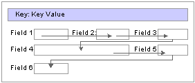
Example flow of noncolumnar page
In a columnar page, the tab order should go from the top to the bottom of the first column, then from the top to the bottom of the second column, and so on.
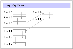
Example flow of columnar page
Fields that share the same label should follow consecutively in the tab order from left to right.
Testing Page Control OrderAfter you have placed all of the controls on your page, you should test the tab order. You can do this using either the test mode or by viewing the page in the browser. Using the View Page in Browser mode is more useful because you can also check the placement of controls and subfields that are on your page. In these testing modes, you can enter data into edit boxes and select radio buttons and check boxes. However, you cannot save data that you enter, and push buttons and links do not function.
Note. The tab order that you establish at design-time may not apply for all browsers.
See "Troubleshooting Browser Limitations" on Customer Connection.
To test tab flow using View Page in Browser mode:
Open the page in PeopleSoft Application Designer that you want to test.
Select Layout, View in Browser.
Select the appropriate browser from the drop-down list box.
Press the Tab key to move from one field to the next.
Press Shift+Tab to move to the previous field.
Applying Control Order RulesIf you’re working with a complex page or you’re new to order lists, you might print out a page definition and work on the hard copy. The sequence number of each control is reflected in the Num column on the page report. You can easily mark where you need to move a control to make your page function properly, or you can look at the Lvl column on the Order tab of the page definition.
Use these rules to order your controls:
For radio buttons to function in a single group, they must be associated with the same record field and be listed together on the Order tab of the page definition. The only control that you can place between related radio buttons is the static text control to extend radio button labels. Put the text immediately after the radio button to which it relates.
List level-based controls (scroll areas, grids, and scroll bars) immediately before the first control that they govern, followed by the controls that are directly governed by that control. Level-based controls directly govern all controls that are listed below them on the order list until they encounter another level-based control that is at the same or lower level (higher occurs level number).
Place display controls before related displays that they govern. The related display controls don't have to follow the display controls immediately, but they must be inside the same scroll area or scroll. However, if you have more than one related display control, placing each immediately following its display control makes the order page easier to read and understand.
Changing Control Order Using the Order ListThe Order tab of the page definition displays attributes about each of the page fields and their field order. The ID column represents the order in which the field was added to the page. If you modify the order of page fields on the page, note that the numbers assigned to each field remain constant. Thus the IDs may not always appear in sequential order. The field ID displays on the Compare report when a database compare is performed to assist you in identifying specific page fields.
Reorder page fields on the Order tab by dragging them in the same view. Changing the order list doesn't change the physical location of controls on the page. It changes only the logical order or tab order in which controls are processed. When you've added and arranged all of your controls, you may want to print your page definition to see how you might need to reorder your controls.
The Order tab also governs processing rules for scrolls and record or field relationships. Consider which controls are associated with which scroll area or scroll bar and which secondary relationships are important to page processing.
To change the order list:
Open the page.
Select the Order tab on the open page.
The Order view appears. Use this view to change the logical processing order of fields on your page.
To move a control to another position in the control order list, select the control that you want to move.
Press the Shift key to select multiple controls.
Drag the selected control to the new position on the Order view.
The system moves the control to the new location in the list. The ID value remains static. The visual display of the page still looks the same—changing the order list doesn't move the control on the page, only the logical processing order of the control.
Finding a Field on a Page DefinitionUse the Order view to locate a field on a page definition. Using this method of locating fields is useful when you are working with detailed page definitions that contain many fields.
To find a field on a page:
Access the Order tab of your page definition.
Select the field that you want to locate on the page.
Select the Layout tab.
The field that you selected on the Order tab is selected in the Layout view.
Using Default OrderYou can rearrange the order list on the Order tab so that the logical control order reflects the physical control order as shown on the Layout tab. Do so by selecting Layout, Default Page Field Ordering. You can use this tool in either the Layout or Order view for your page definition. The system creates the default order by reading the page as though it was on a pixel-by-pixel grid, from top to bottom and left to right.
Note. Use the default ordering option sparingly on existing pages. It may offset any previous order that was created. However, on new pages, you may find default ordering a useful starting point for your control order list.
Spacing Controls on PagesProvide adequate space between controls on a page so that fields and their labels don't touch or overlap other controls or labels in PeopleSoft Application Designer. If they do, then when your page appears in the browser, the label is offset automatically and the overlapped control might shrink.
You can layer or overlap fields only if the one that you are overlapping is set to Invisible on the Use tab of the properties dialog box for that control. When you move through the data entry controls on a page, the component processor recognizes only visible, unhidden fields as available for entry.
You can layer multiple invisible fields. However, you must set up your stacks of edit boxes so that all but one field in the stack are invisible or hidden at RowInit time.
Designing Inquiry PagesYou can design pages for inquiry purposes only. Inquiry pages are usually based on search records that extract specific information from different tables to display different views of your database, such as a summary of expenses by department.
To create an effective inquiry page:
Make all of the fields display-only.
Build in sufficient display control and related field relationships to show relevant descriptions.
When using level-based controls, disable the row action buttons so that the user cannot add or delete rows.
Aligning Page Controls
Page design mode in PeopleSoft Application Designer provides relative alignment functionality in the page definition toolbar to help you ensure that your controls are aligned relative to each other, both horizontally and vertically. The relative alignment tools are enabled when two or more controls on the page are selected.
To align controls on a page relative to one another:
Select the controls that you want to align.
Select controls by pressing Ctrl and clicking each field on the page. Leave the last control to be selected as the guide, or anchor, by which all other selected controls are aligned. The anchor control does not move when you select an alignment button.
Note. Controls can also be selected using the group selection method of dragging the cursor around the controls. However, for relative alignment purposes, the Ctrl + click is the preferred method of selection, because it enables you to explicitly set the anchor control by which the system aligns the other selected controls.
Click the appropriate relative alignment button in the toolbar.
Relative alignment can also be activated from the Layout menu.
Page fields can be moved manually after relative alignment, though previous alignment is not preserved.
See Also
Maximizing PerformancePage definitions permit controlled access to application data. The system can validate the data, write it to the database, and then retrieve and display it upon request. Behind the scenes, the component processor—the PeopleTools runtime processor—builds SQL statements that are based on the actions that you perform on pages. The component processor:
Manages the flow of data processing as users enter information on pages.
Issues INSERT, DELETE, and UPDATE statements to maintain data in the database and SELECT statements to retrieve data.
As you design your pages, some features can adversely affect page performance. There's always a tradeoff between eliminating a useful feature and speeding up page processing. Guidelines for improving page performance include:
Be judicious about references to record definitions other than the primary record definition under each scroll area.
References to other record definitions can include:
Related display controls.
PeopleCode references (such as edits and defaults) to other records.
Defaults to fields on other record definitions.
Field controls on derived or work records.
Put the field control on the appropriate derived or work record, rather than on a regular data record definition to derive its value.
For example, FTE (full-time equivalent) on the JOB record definition would be moved to the DERIVED_HR derived or work record because its value is derived by the system.
Use as few record definitions as possible in a component.
When you open a page in a component, the system loads all record buffers from the entire component into buffers.
Do not remove table edits to improve performance, even though an edit against another table causes a short pause.
Eliminating them may compromise data integrity.
Frames, scroll areas, scroll bars, grids, and group boxes all create HTML tables, which, in some browsers, might slightly degrade the performance of your system.
Be judicious about the number of these types of controls that you use on a page.
Apply deferred processing when possible to fields, pages, and components.
See Also
Designing Pages for Optimal Performance and Accessibility
PeopleCode and the Component Processor
Accessing PeopleCode in Page Definitions
Page fields are associated with a specific record field. You can access the PeopleCode for that record field from the page field in the page definition. You might add PeopleCode to a field to achieve a variety of tasks, ranging from real-time editing of fields to altering the appearance of fields on a page. You can also associate PeopleCode with a component, component record, and component record field.
To edit or add record field PeopleCode through a page definition:
Select File, Open to open the page definition through which you want to access PeopleCode.
Select the field on the page for which you want to view the associated PeopleCode.
Select View, View Record PeopleCode.
The PeopleCode editor appears, providing access to all of the PeopleCode for the record that owns that field.
Select the PeopleCode event type from the drop-down list box in the PeopleCode editor.
You can also select other fields in the primary record from that drop-down list box.
Select File, Save to save your changes.
See Also
Accessing PeopleCode and Events
Viewing Pages in the BrowserThis section discusses how to:
Work with the View in Browser feature.
Change the default browser.
Generate HTML.
View the HTML for a page.
Identify page definitions online.
Working With the View in Browser FeatureDuring the page design process, you should periodically view how your page looks in the browser. How you design your page in PeopleSoft Application Designer may look different when viewed online, particularly if you are using subpages that contain multiple fields.
To do this, select Layout, View in Browser. This feature is helpful if you are changing any of the style characteristics of the page or aligning and spacing controls, such as scroll areas.
The View in Browser feature provides only a rough idea of how your page might look. For a more complete view of the page at runtime, including the navigation header, assign your page to a component and add it to the existing menu structure using the Registration Wizard. You can then access the page from the menu in the PeopleSoft Pure Internet Architecture.
Changing the Default BrowserYou can test your page in any browser by changing the default browser to one other than Microsoft Internet Explorer. After you set up a new browser, you can select in which browser you want to view your pages.
To change the default browser:
Open a page in PeopleSoft Application Designer.
Select Layout, View in Browser, Edit Browser List.
The Browsers dialog box appears.
Click the Add button.
Click the Browse button to locate the browser to add.
You must select the correct path and browser application for the new browser to function properly.
Enter the name, type, and version of the browser.
The name that you enter appears in the Layout, View in Browser menu.
Generating HTMLThe PeopleSoft Pure Internet Architecture system automatically writes HTML forms or tags for all of the page controls that you add to a page. You do not need to know how to write HTML code to create pages in PeopleSoft Application Designer and then view them in the browser. The table shows this conversion:
Page Controls as HTML
|
Page Controls |
HTML Forms |
Static HTML Tags |
|
N/A |
|
|
N/A |
|
|
N/A |
|
|
N/A |
|
|
N/A |
|
|
<INPUT TYPE=BUTTON>
|
N/A |
|
|
N/A |
HTML text |
|
|
N/A |
|
|
|
N/A |
|
You can view the HTML that is created for your page by using the Generate HTML feature. The Generate HTML feature writes the HTML code to a file on the local drive. This feature is mainly used for debugging purposes and is not needed for the creation of pages.
To generate HTML for a page:
Open the page for which you want to generate the HTML.
Select Layout, Generate HTML.
Select the browser type and version.
PeopleSoft Application Designer generates the HTML to the c:\TEMP\pshtml directory. The file is named according to the page name and the browser that you select. For example, the Absence History page is named ABSENCE_HISTORY IE5.00.html.
Viewing the HTML for a Page
To view the HTML for your page:
Open the generated HTML file.
The selected browser appears, displaying how your page appears at runtime.
Select View, Source in your browser window.
Notepad or another text-based application appears with the HTML that was used to create your page.
Note. Different browsers might have different methods for viewing the HTML for your page.
To adjust the look or function of how your page looks in the browser, do so in PeopleSoft Application Designer. If you make
changes directly to the HTML in Notepad, your changes are not saved to the system. Each time that you open the page in the browser, it reverts to the settings of the original page definition.
Identifying Page Definitions OnlineIn some cases, the page name online differs from the actual name of the page definition in PeopleSoft Application Designer. While viewing a page in the browser, locate the page definition name by right-clicking the page and selecting View Source from the drop-down menu. The HTML code appears for your page in a text application, such as Notepad. In most cases, the page name is in the sixth or so line of code after Page:. You can also identify the component and menu definitions for your page next to the page definition name.
Producing PagesThis section provides an overview of page production and discusses how to:
Change general page information.
Change page use information.
Save pages.
Rename and delete pages.
Print page definitions.
Alter page setup.
Read your page definition report.
Understanding Page Production
If you are changing pages or deleting controls in the page definition, use the tools in the Edit and File menus. To avoid making changes that might adversely affect your application database, review your plans with your database administrator. Together, you can evaluate the impact that your actions might have on your system database as a whole.
There are several additional steps in the page design process that help make future editing of page definitions easier.
After you design your page, you must set the attributes for how your page should function and make sure that you have the proper documentation to assist you when performing upgrades. Access the Page Properties dialog box by selecting File, Definition Properties in page definition mode.
Use the General tab in the Page Properties dialog box to document the page. Enter both short and long descriptions of the page here. You can also document what changes have been made, or must be made, to a page.
Changing General Page InformationAccess the Page Properties dialog box. Select the General tab. Enter a description and any comments about the page and assign an Owner ID.
Changing Page Use InformationAccess the Page Properties dialog box. Select the Use tab.
|
Page Type |
Use the standard page, or select subpage or secondary page from the drop-down list box. |
To accommodate different types of workstation monitors, you can adjust the page size.
Note. As a licensee of PeopleTools, you are licensed to use the base portal technology, which is limited to navigation to licensed PeopleSoft applications. If you want to register additional non-PeopleSoft content, customize your homepage, or create any pagelets, you must license PeopleSoft Enterprise Portal.
|
Select a different style sheet for a specific page to override the style sheet that is selected for the application. If you do not select a different page style sheet (keeping ***Use Default Style***), the system uses the style sheet that is specified on the PeopleTools Options page. |
|
|
Select a different page background style class to override the background style of the page style sheet specified above. If you keep the ***Use Default Style***, the background of this page is determined by the default background of the page style sheet. |
Note. The style options you select do not necessarily appear the same in the design time and runtime rendering of the page. For example, font and page control sizing metrics are different in the design time Windows environment and the runtime browser environment. As such, when developing pages, do not rely entirely on the rendering of the page in PeopleSoft Application Designer to gauge layout issues, such as font size and the placement of controls. All pages should be viewed in the runtime browser environment and adjusted accordingly.
Additional Settings
|
Select to set the page to resize automatically when hidden fields are present. |
|
|
Pop-Up Menu |
|
|
Clear if you want the page and all of its fields to follow standard processing. Deferred processing is the default. |
Saving PagesTo save your work, select File, Save or File, Save As.
When you save your page, the system performs various edits and issues warning messages as appropriate. The warning explains any errors that are associated with each control. You can disregard these messages and save your work anyway, but you cannot view the page in the browser until all errors are corrected.
Access the explanation of an error message by clicking the Explain button in the warning message box. You can fix the problem immediately or save the page and return later to correct it.
Renaming and Deleting PagesIf you rename a page, the change is reflected throughout the system, including PeopleCode, so you don’t have to change the page name anywhere else.
To delete a page, particularly a subpage or a secondary page, first use the Find Definition References option to determine which page, component, and menu definitions refer to or use the page you want to delete.
See Also
Printing Page DefinitionsTo keep track of your application definitions and refinements, print your page definitions and keep a log or binder with your new and revised pages as you reconfigure your applications. You may want a reference for each page that includes both the onscreen image and the page control information (the record definitions and special uses or edits that you've applied), as well as the information for any subpages that are included in the page definition.
Printing page definitions also helps you debug during testing. Each report includes a unique identifier that's automatically incremented by the system each time that you change the page.
To print a page definition:
Open the appropriate page.
Select File, Print.
Altering Page SetupAccess the Print Setup dialog box by selecting File, Print Setup.
All print options are selected, by default.
|
Select to print the list of fields on the page and all of the parameters that you've set for each one. |
|
|
PeopleCode |
Select if you used PeopleCode to design your page |
|
Select to provide a snapshot of your page design. Graphics generally take longer to print than page descriptions or PeopleCode reports. |
|
Select to print a header at the top of the report indicating the date and time that you printed the report and the database name, page name, version number, and page number. The default is selected. |
|
|
Select to print a footer at the bottom of the report indicating the date and time that you printed the report and the database name, page name, version number, and page number. The default is cleared. |
|
|
Select to print a border or box around a page report. The default is cleared. |
|
|
Border Space (mm) |
Select to insert a set amount of space between a graphical border around the page report and the margins of the report. Clear this option to print in character mode (faster), rather than in graphics mode (slower). The default space is 3 mm, but can be changed. |
Set the distance from the edge of the page to the left, right, top, and bottom edges of the page image or report. The defaults are:
Top: 20.
Bottom: 5.
Left: 10.
Right: 0.
Note. PeopleSoft has selected the HP LaserJet as the default printer.
Reading Your Page Definition ReportThis table lists the columns on the page definition report and describes their contents:
|
Column |
Contents |
|
Num |
Sequential number that shows the relative position of the field in the field order list for the page. |
|
Field Type |
Field type, such as edit box. |
|
Label Text |
Label that's associated with the field, regardless of whether the label is actually displayed on the page. |
|
Label Type |
|
|
Record Name |
Record name where the field is located. |
|
Field Name |
Field name on the record definition with which the page field is associated. |
|
Siz (size) |
Field size (custom, minimum, or maximum). |
|
Alg (alignment) |
Alignment (left or right). |
|
On |
Value of the radio button or the on value of the check box (typically Y). |
|
Off |
The value of the radio button or the off value of the check box (typically N). |
|
DSP (display) |
Yes indicates a display-only field. |
|
INV (invisible) |
Yes indicates an invisible field. |
|
CTL (control) |
Yes indicates a display control field. |
|
REL (related) |
Yes indicates a related display field. |
|
RelNum (related number) |
Number (Num column) of the display control field for this related display field. |
|
CUR (currency) |
Yes indicates a multicurrency field that does not display unless the user is operating in multicurrency mode. |
|
DER (derived) |
Yes indicates a field from a derived or work record. |
|
OccLvl (occurs level) |
Occurs level of scroll bar that governs this field. |
You may see additional reference lines below each field or at the end of the report:
|
Reference |
Description |
|
Page Help Context: nnn |
Indicates that the page has been assigned a page help context number, linking it to a help file that describes how the field is used wherever it appears in the database. |
|
Field Help Context: nnn |
Indicates that this field, as used on this page, has been assigned a record field help context number, linking it to a help file that describes how the field is used only as it appears in this record definition. |