 Understanding Page Controls
This chapter provides an overview of page controls and discusses how to use:
Charts.
Frames.
Group boxes.
Horizontal rules.
Images.
Static text.
Check boxes.
Drop-down list boxes.
Edit boxes and long edit boxes.
Radio buttons.
Subpages.
Grids.
HTML areas.
Push buttons or links.
Scroll areas and bars.
Secondary pages.
Understanding Page ControlsThere are three categories of controls that you use in page design and development. You determine which types of controls that you want to add to your page definition by considering how you want to organize information on a page as well as how your users will enter data.
This section discusses:
Aesthetic controls.
Data entry controls.
Function and data processing controls.
 Aesthetic Controls
Use aesthetic controls to help organize, display, or emphasize information on the page. In most cases, aesthetic controls are not associated with a particular record field that is defined in a record definition and maintained in the database. With the exception of the image control, these controls never update data in the database. Aesthetic controls include:
|
Draws a frame that serves as a placeholder for a chart that you construct using the GetChart field type in PeopleCode. Using the chart control, you draw a box in which the chart appears to the user at runtime. Associate the chart control with a record field in a record definition. |
|
|
Draws a display-only box of variable size to visually group a set of controls on a page. You can drag a frame around almost any control. You can isolate controls, such as HTML areas, from other controls on the page and then hide the frame. Frames generate HTML tables for viewing in the browser. |
|
|
Draws a display-only box of variable size with a text label to visually group and identify related controls, such as radio buttons. Like a frame, you can resize a group box to any length or width. However, with a group box you can assign a visible label. Like frames, group boxes generate HTML tables for viewing in the browser. |
|
|
Draws a horizontal line to separate parts of a page. Use the horizontal rule control as a visual break between controls. |
|
|
Draws a frame that you can associate with a variable image from a record field in the database. The record field stores a graphic, such as a scanned image of an employee or a picture of an asset, in the format that you defined in the record definition. Because an image can change at runtime and is associated with a record and field definition, it is considered a data entry control and an aesthetic control. The field that you associate with your image can be either a standard Image type field or an ImageReference type field, where images might be associated with it depending on user input. The ImageReference field type is a pointer to an image definition, which enables you to display images dynamically. An example of this is referencing a red, yellow, or green light image definition on a page, depending on the context when the page runs. |
|
|
Draws a frame that you can associate with an image definition. It can help organize or identify information that is displayed on a page. A static image is different from an image because it does not change at runtime, and it is not associated with a record field, but instead with a predefined image definition. For example, you might select a static image, such as the yellow Clear button, from the image catalog and place it on top of a push button control so that the user knows to click that button to clear the contents of the page. |
|
|
Adds a static text item—a display-only alphanumeric field with a maximum length of 60 characters to describe a page, control, or group of controls. You might use text for a static note, an extension of a control label, and occasionally a control label itself. Try to avoid using text items because they make it more difficult to translate pages to other languages. Instead you can reference message catalog text to facilitate translation and other maintenance issues. Other methods of displaying text on a page are display-only edit boxes, field labels, or display-only long edit boxes. |
Data Entry ControlsUse data entry controls to offer different ways to enter and maintain information. These types of controls are always associated with a record field that is defined in a record definition and maintained in the database.
Note. The PeopleSoft Application Designer allows you add up to 405 fields on a page. When you have reached this limit, typical system behavior includes being unable to select, move, or edit the page fields with an order number exceeding the 405–field limit. While this limit has no affect on the page during runtime, it has the potential to disrupt productivity during design time. If you find a page nearing the 405-field limit, PeopleSoft recommends using subpages to decrease the number of fields on a single page.
See Using Subpages.
|
Adds a small square box that operates as a toggle switch—on and off—for data controls that can have one of two values (yes or no, or 1 or 0). During data entry, when the page is saved, the enabled or disabled value (whichever represents the current state of the check box) is written to the database. If values are specified in the page definition, the fields are left blank in the database, but you can still select or clear the check box on the page. You won’t know that the database fields are blank until you run a query or report on the field. |
|
|
Adds a drop-down list box from which you select a single value from a list of valid values. Use drop-down list boxes to enable data selection from a list of three or more possible choices. In its closed state, the control displays the current value for the control. The user opens the list to change the value. Drop-down list boxes are a good design choice when presenting users with a small number of selections from which they must select one value. However, when designing for grids and scroll areas, prompts give you better performance. |
|
|
Adds an edit box, which is used for data entry. Edit boxes are also used for displaying fields and translatable text. Use an edit box for text data entry—for example, a record field that is defined as character, number, signed number, or date. Also use edit boxes for displaying fields and translatable text. |
|
|
Adds a long edit box, which is a variable-length, alphanumeric control that is used for entering long, textual items, such as comments. The length of the control is determined by its contents, rather than the physical size of the box on the page. Use long edit boxes to display long, translatable text. Each long edit box has a built-in scroll bar to enable users to enter and display more data than can be shown at one time on the page. The scroll bar on the long edit box is used only to scroll through the text in the long edit box. Unlike edit boxes, which are limited to the field size that is defined in your record definition, long edit boxes can contain a relatively unlimited number of characters, up to a theoretical maximum of 64KB. This space, however, is shared by a number of other programming elements, so the true size might be closer to 15−25KB, depending on the location of the field in your application and the state of the application. Typically, long edit boxes are used for comments or descriptions. |
|
|
Adds a small, round button that represents one value for a control with multiple defined values. Add radio buttons in groups. Only one radio button in a group can be selected at one time, like station buttons on a radio—hence the name. Use radio buttons to enable selection of one out of two possible choices. If you have three or more choices, PeopleSoft recommends using a drop-down list box. |
|
|
Adds a predefined, presized group of controls, such as address controls, that are defined on a separate subpage definition. During design time, you add only the subpage control to represent all of the controls in the subpage. You maintain those controls in only one place—the subpage definition. At runtime, you see all of the controls that are defined in the subpage on the page. |
Function and Data Processing ControlsUse function and data processing controls to provide a mechanism for running commands and to maintain levels of information on a page.
|
Adds a grid that looks and behaves like a spreadsheet that is embedded in a page. It has column headings and cells and uses push buttons, links, and tabs to navigate through the data. It is similar to a scroll area on a page. Each row in the grid corresponds to a set of controls in a scroll occurrence. Navigation links and push buttons replace the actual visual scroll bar, and add and delete push buttons enable a user to insert and delete rows. Use instead of a single-level scroll area or scroll bar to manage multirow sets of data. |
|
|
Adds an area where you can write your own HTML. With other controls, the PeopleSoft system automatically generates the HTML code. The HTML code is then inserted into the dynamically generated code at runtime. See Using HTML Areas. |
|
|
The dynamic tree control is a deprecated feature. Use PeopleCode with the HTML area to create a hierarchical tree. See GenerateTree. |
|
|
Adds a push button or link that represents an internal or external link, PeopleCode command, process through PeopleSoft Process Scheduler, prompt action, scroll action, secondary page, or toolbar action. You can specify whether the control appears as a traditional push button or as a link (highlighted, underlined text). |
|
|
Provides an easy way for you to group or repeat multiple fields of data in a defined area. Like a grid, users can easily navigate through the rows using links and buttons in a navigation bar, and they can add or delete rows using push buttons. These features are automatically placed in the navigation bar. The navigation bar also provides several other settings, such as a Find feature that enables the user to search all fields and rows for specific data and a View All option so that the user can see all rows of data at once. The fields in the scroll area can be placed randomly, one on top of the other, or side by side. Unlike a grid, you are not limited to the type of controls that you can place in your scroll area. You can even place a grid inside a scroll area. |
|
|
Like the scroll area, scroll bars also contain push buttons and links for navigation, but not in the form of navigation bars. Developers must manually position all navigation items. Like grids and scroll areas, the actual scroll control that you see in PeopleSoft Application Designer when working with scroll bars in page definitions does not appear at runtime. Instead, the scroll bar control has scroll action buttons to replace the visual rendering of the scroll bar as push buttons and links on the web. |
|
|
Adds an invisible control that associates a secondary page with the primary page. You then associate the secondary page with a command push button or link or a pop-up menu. Secondary pages gather or display supplemental information that is related to the data in a primary page but less frequently referenced or updated. Secondary pages are displayed using the DoModal PeopleCode function. See DoModal. |
Using ChartsUse the Chart Properties dialog box to:
Associate your chart with a record definition and record field.
Assign a page field name.
Set label attributes.
Set the chart as a page anchor.
On the Label tab, add an information-only name for your chart. This label does not appear at runtime, but does appear on the control order list on the Order tab of the page definition and any page definition report that you print. Assigning a label is helpful if you have multiple charts on your page.
See Also
Using FramesUse the frame control to visually group a set of controls on a page.
To change frame labels and display options:
Double-click a frame to open the Frame Properties dialog box.
On the Label tab, enter a brief text description of the function of the controls in the frame.
The default frame label is Frame. Any label that you attach to a frame is for information only—it doesn’t appear on your page, but it does appear on the page definition printout and in the control order list. Use labels to differentiate among multiple frames on your page.
For example, if you’re enclosing address controls, you might use the label Address Frame.
Select the style for the frame.
You can control the line color and thickness and background color of a frame by specifying a style.
Select the Hide Border check box to hide the border of the frame.
Use this option to use the style to shade only the background of the framed area or to apply other styles. If you select Hide Border, it overrides the border options that are specified in a style.
A frame with a hidden border might also be used to facilitate HTML generation. When a frame is inserted in a page section, the system generates that section as a table in HTML. This is useful to ensure the correct layout. However, in some browsers, adding more HTML tables can result in performance degradation.
Select the Adjust Layout for Hidden Fields check box to enable automatic vertical adjustments to the frame size when hidden fields are present.
If visible fields are not present to the right or left of the hidden field in a frame, the frame collapses to surround the remaining fields.
If the field is associated with multicurrency processing, select the Multi-Currency Field option on the Use tab in the Frame Properties dialog box.
This causes the field to appear at runtime only if the Multi-Currency option on the PeopleTools Options page is selected.
Using Group BoxesThis section discusses how to:
Insert and move a group box.
Set group box properties.
Inserting and Moving a Group BoxTo insert and move a group box:
Select Insert, Group Box.
Position the mouse where you want the initial location of the group box and click.
Move the group box to the appropriate location by clicking and dragging.
Adjust the group box size and shape using the "handles" on the edge of the group box.
Remove cursor focus from the group box by clicking anywhere outside of the group box on your page workspace.
Setting Group Box PropertiesAssociate your group box with a record definition and record field to easily distinguish it from other group boxes on your page in the Order tab.
To link group boxes to record definitions:
Open the Group Box Properties dialog box.
On the Record tab, select record and field names.
Linking a record field with your group box enables you to control hiding and unhiding of the group box.
The label of your group box should reflect how the fields are related. However, if for visual reasons, the group box surrounds a variety of disparate controls, you might change the label, rather than associate it with one record definition and field.
To change the group box label:
Open the Group Box Properties dialog box.
Select the Label tab.
If you are organizing a group of radio buttons with translate values, you can label your group box by associating it with the record definition and field and selecting either the long or short name as the label. If neither the long or short name is appropriate, create a text label.
In the Display Options region of the Label tab, select the body style for the group box border.
You can control the color, line thickness, and background of the body section of a group box by specifying a style.
Select the Hide Border check box to hide the border.
This overrides border options that are specified in a style.
Select Adjust Layout for Hidden Fields.
If there are hidden fields, the group box adjusts its borders to accommodate them if this feature is selected.
Note. For the group box to adjust automatically, the hidden fields inside the group box must be surrounded by open space or have other hidden fields to the right or left.
Set the remaining group box label properties.
Setting Group Box Use Properties
Access the Group Box Properties dialog box. Select the Use tab.
|
Select if the field is associated with multicurrency processing. If the Multi-Currency option on the PeopleTools Options page is selected, the field displays at runtime only. |
|
|
Select to hide all visible and hidden fields when the group box is hidden. Hide a group box by associating it with a record or field and invoking the PeopleCode field class Visible property. See Visible. |
|
|
Select to collapse the group box into a small image that the user must click to expand. This enables the Default Initial View to Expanded State check box and enables you to select label images for both the expanded and collapsed states, typically small triangles. Each time that a user opens or closes a collapsible section, a transmission to the application server is required. Therefore, the initial state of whether the collapsible section is open or closed is important. You should carefully evaluate the performance and usability aspects of using collapsible sections versus designing a long page that displays all of the data using deferred processing mode instead. |
Example of Collapsible Group Boxes
In the following example, the first group box, Spain, is expanded while the group boxes for France, Italy, and USA are collapsed.
Using Horizontal Rules
This section discusses how to:
Draw a horizontal rule.
Set horizontal rule properties.
Drawing a Horizontal RuleTo draw a horizontal rule:
Select Insert, Horizontal Rule.
Draw a horizontal line to the appropriate length on the page.
Setting Horizontal Rule PropertiesThis section discusses how to apply informational labels to a horizontal rule and configure how the horizontal rule is used on a page.
Setting Horizontal Rule Label Properties
To set horizontal rule label properties:
Open the Horizontal Rule Properties dialog box.
On the Label tab, enter an information-only label to differentiate the line from other frames and lines on your field order list.
Select the style for the line.
You can control the color and line thickness of a horizontal rule by specifying a style.
Setting Horizontal Rule Use Properties
Access the Horizontal Rule Properties dialog box. Select the Use tab.
|
Multi-Currency Field |
|
|
Manipulate the occurs level of your controls on the page while still preserving the physical tab order at runtime. If you adjust the sequence of fields on the Order tab of the page definition, the tab order for the user at runtime is adjusted to that new order. See Level-Based Controls. Use this setting to specify a scroll level organization that differs from the order of page fields on the Order tab. For example, you might want to create a page that contains multiple collapsing group boxes with each containing level-based controls. By placing a horizontal rule between each of the collapsing sections and selecting Set to Level 0, you return the occurs level to 0 so that you can add additional levels without having to alter the order of controls on the Order tab. In doing so, you can maintain a consistent tab order. |
Using ImagesThis section discusses how to:
Adjust static image size and shape.
Set static image properties.
Set image properties.
Understanding Static Images
A static image is different from an image because it:
Does not change at runtime.
Is not associated with a record field.
Static images are associated with a predefined image definition. For example, you might select a static image, such as a yellow Clear button, from the image catalog and place it on top of a push button control so that the user knows to click that button to clear the contents of the page.
Adjusting Static Image Size and ShapeYou can adjust the size of a static image by dragging the "handles" on the edge of the image box , or you can adjust the size in the Static Image Properties dialog box on the Label tab by changing the width and height in pixels.
Setting Static Image PropertiesTo associate a static image with an image definition:
Open the Static Image Properties dialog box.
On the Label tab, select the label type.
If you select Text, enter a label to identify your static image.
The label does not appear on your page at runtime. Use it to track your images in your scroll order list box and on page definition reports.
Select an image ID using one of the following methods:
Select a predefined image definition from the Image ID drop-down list box.
Click the Browse button next to Image ID to preview the list of available images.
The Select Image dialog box appears with a list of the image components available. To the right of the list is a preview of the selected image.
Note. If an image definition is stored as a .GIF file, with no alternate format selected, it does not appear on the Layout tab of the page definition . A warning dialog box appears, telling you to convert the image. If you are not concerned about viewing the image during the design process, you can ignore the message because the image will appear as intended on your page in the browser at runtime.
Click OK to return to the Static Image Properties dialog box.
The image that you selected appears in the image area with its width and height displayed in pixels.
Set the format and size attributes for the image.
|
Scale |
Select to scale the image to the size of the frame that you set using the control selection handles or by the width and height that you enter. The scaling occurs when you view the page in a browser. |
|
Size |
Select to display the image as is, regardless of the control size on the page. |
Click OK.
You can now position the static image anywhere on the page.
Note. You can define your own static images, such as your company logo, by creating a new image definition. After you create the image definition, you can then add your logo to a page using a static image control.
See Creating Image Definitions.
Setting Image PropertiesTo associate a record definition with an image:
Open the Image Properties dialog box.
On the Record tab, select the record and field names with which this image field is associated.
Set the image format and size attributes.
|
Scale |
Select to scale the image to the size of the frame that you set using the control selection handles or by the width and height that you enter. The scaling occurs when you view the page in a browser. |
|
Size |
Select to display the image as is, regardless of the control size on the page. |
Specify the alignment of your image.
Select a style for the image.
Setting Image Label Properties
Be sure to assign an informational label to your image. This is especially important if your application works with screen reader software.
To document an image control with an informational label:
Enter a text description in the Alt tag for image region.
Select one of the following settings from the Type drop-down list box:
The Use tab of the Image Properties dialog is the same as for that of an edit box.
Using Static TextAccess the Static Text Properties dialog box.
|
Text |
If you select Text, you can use either uppercase or lowercase characters. The text label is limited to 60 characters in length. You can also split your text item into multiple lines. To do this, position the cursor in the Text field where you want the split to occur and click the Insert Line Feed button. A thick vertical bar character appears in the Text field, and when you close the dialog box, your text item is split into multiple lines. |
|
Message Catalog |
If you select Message Catalog, enter the appropriate message set and number. As with a text label, you are limited to message catalog text of 60 characters. |
You can control the color, font, size, and other characteristics of the text by specifying a style.
See Creating Style Sheet Definitions.
Set the horizontal alignment of your text control, as determined by the left-hand edge of the field. You can align controls to the left-of-center, centered, or to the right-of-center.
If a text item is associated with multicurrency processing, select the Multi-Currency Field option. This causes the text item to appear at runtime only if the Multi-Currency option on the PeopleTools Options page is selected.
Using Check BoxesWhen you insert a check box on a page, it appears with a default label, Dummy Name, until you specify a record definition name and field name, or a text label.
Setting Check Box PropertiesDefine the check box control by assigning the appropriate properties.
Setting Check Box Record Properties
To link check boxes with associated record definitions:
Open the Check Box Properties dialog box.
On the Record tab, select the record and field names from the drop-down list boxes.
Enter the enabled and disabled values for the check box.
For example, if the enabled value of the check box is Y for yes, and the check box is selected when the user saves the row, the Y value is written to the database. If the disabled value of the check box is N for no, and the check box is cleared when the user saves, the N value is written to the database.
The enabled and disabled values that you enter validate against the Translate table. If a value isn’t found, the system displays a warning message but allows the value to remain. You might find this useful when prototyping pages before defining record definitions.
Setting Check Box Label and Use Properties
After you link the check box to a record definition and field, set the label properties. Otherwise, the default check box label is the field long name. Set how the check box will be used on the Use tab.
See Also
Setting Page Field Properties for Controls
Using Drop-Down List BoxesThis section discusses how to:
Set drop-down list box record properties.
Set drop-down list box label and use properties.
Setting Drop-Down List Box Record PropertiesTo set drop-down list box record properties:
Open the Drop-Down List Box Properties dialog box.
On the Record tab, associate the drop-down list box with a record and field.
Select a style.
Set the font and color attributes of your drop-down list box data.
Select a displayed text option:
Xlat Short.
Xlat Long.
Prompt Table Field.
If you selected Prompt Table Field, enter the field name in the Prompt Table Field area.
Set the field size for the drop-down list box.
Setting Drop-Down List Box Label and Use PropertiesYou can set the label and use properties for a drop-down list box.
See Also
Using Edit Boxes and Long Edit BoxesWhen you insert edit boxes and long edit boxes on a page, they appear with the default label, Dummy Name, until you specify a record and field for them or until you specify a text type field label. There is more space than required between your edit box label and the control. PeopleSoft provides 20 percent extra space for the edit box label for translation purposes.
You control source data, labels, and how the edit box is used in the respective edit box and long edit box properties dialog boxes in PeopleSoft Application Designer. The settings for these two controls are mostly the same.
Note. A Long Edit Box does not limit the number of characters that a user can enter in the browser, regardless of any limits defined in the underlying record field. As such, characters entered by the user that exceed the field definition’s field length may be truncated. For example, if you enter 012345678901234 into a Long Edit Box associated with a field with a field length of 10, input would be truncated and saved to the database as 0123456789. The system treats carriage returns (ASCII=13) and Line feeds (ASCII=10) the same as any other character.
Some edit boxes should be display-only. You might want a page field to govern what is displayed in another control. In some cases, you might want the page control to be invisible because it is required by PeopleCode, but is not a field that is accessible by a user.
If you designate the long edit box as display-only, select the Expand Field When Display Only check box to hide the scroll and automatically expand the size of the edit box as necessary.
See Also
Using Radio ButtonsThis section provides an overview of radio buttons and discusses how to:
Set radio button record properties.
Set radio button label properties.
Set radio button use properties.
Understanding Radio ButtonsWhen you insert a radio button on a page, it appears with the default label, Dummy Name, until you specify a record definition name, field, and value for the radio button. Like edit box labels, radio button labels have a dotted box around the 20 percent of extra space that is required for translation purposes in addition to the box around the radio button label itself.
For radio buttons to function as a single group, they must be associated with the same record field and they must be adjacent fields on the Order tab of the page definition. To save time, add all radio buttons in a set, one after the other. After you add the first radio button, the system remembers the record definition name and field name for all subsequent radio buttons—you must enter only the database value for each. Then, place a group box around all of your radio buttons to keep them together and labeled as in this example:
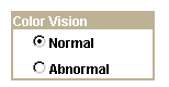
Radio buttons
Setting Radio Button Record PropertiesTo link a record with radio buttons:
Open the Radio Button Properties dialog box.
On the Record tab, select the record and field name.
The system retrieves the default label text if you enter the record or field.
Enter the database translate value for this radio button.
In the preceding radio button example, N is for Normal. If you select the drop-down list box for the value, you see the translate value and the long name that was assigned to the field. When the user selects this radio button, it indicates a Normal value.
Setting Radio Button Label PropertiesTo set the label of a radio button:
Open the Radio Button Properties dialog box.
On the Label tab, select the type of label if it is other than the default of XLAT Long.
Select the location of the label for your radio button: to the left or right.
Setting Radio Button Use PropertiesYou might want to change the way that a radio button is used on a page. For example, you might want the selected value of a radio button to control what appears in another control.
Using Subpages
This section provides an overview of subpages and discusses how to:
Define a subpage.
Insert a subpage on a page.
Specify informational subpage labels.
Understanding SubpagesSubpages are a powerful means of factoring out commonly used page functionality in your application. Rather than duplicating the same set of page fields on two or more pages, you can create a single subpage that contains those page fields and add it to any page. This makes it much easier to maintain the functionality that these page fields represent.
Subpages are even more effective when used with corresponding subrecords. In order to support the use of subrecords with subpages, the system uses a record name substitution mechanism for subpage-type page fields. Each subpage has a "from" record, determined dynamically by the page definition in PeopleSoft Application Designer and by the PeopleSoft Pure Internet Architecture. The "from" record is a record associated with one of the page fields in the subpage. Which page field depends upon the page field ordering, the types of page fields on the subpage, and whether it's record is a subrecord. The subpage itself must be fully expanded in order to make this determination. (This is important to keep in mind when working with subpages that contain other subpages.)
The "to" record is specified by you in the SubPage Record Name Substitution group box in the Insert Subpage dialog box that displays after you insert the subpage into a page (and on the Subpage tab of the Subpage Properties dialog). At runtime, when a subpage-type page field is expanded, each page field that is associated with the dynamically determined "from" record is instead associated with the "to" record you specify. This means, for example, that a subpage can be populated with page fields that are associated with a subrecord so that the subrecord is determined to be the "from" record. Then when that subpage is used as a subpage-type page field, you can specify the "to" record as one of the records that contains that subrecord. This enables you to associate a single set of page fields (through the subpage) with a variety of different records (each containing the subrecord).
Defining a SubpageCreating a subpage is just like creating a brand new page definition. The difference is that you define it as a subpage rather than a standard page in the Page Properties dialog box.
To define a subpage:
Select File, New, Page.
Select File, Definition Properties to access the Page Properties dialog box.
Use this dialog box to define the type, size, and layout of the page.
Select SubPage in the Page Type drop-down list box.
Select the size of the page.
Select Adjust Layout for Hidden Fields if necessary.
Select Allow Deferred Processing if appropriate.
Inserting a Subpage Into a PageAfter you create the subpage definition, insert a subpage control on your primary page and associate it with the subpage definition.
To insert a subpage into a page:
Open the page on which you want to insert the subpage.
Select Insert, SubPage.
The Insert Subpage dialog box appears.
Select a subpage definition.
Specify the name of the subpage that you want to insert into the open page definition.
Select a record definition in the SubPage Record Name Substitution group box.
The subpage writes its fields to a generic record. Specify the application-specific record name to which you want the information in the subpage written.
See Using Subpages.
Note. All of the fields in a subpage must be associated with fields of a subrecord in the specified record definition.
Click OK.
The subpage appears on the page. Its size reflects the size of the page control group, and it is identified by the subpage definition name. During design time, the fields within the subpage are not visible. At runtime, pages containing subpages are dynamically expanded. Be sure to leave a few pixels of space between the left edge of the main page and the subpage page field to ensure sufficient padding at runtime.
When saving a page with multiple subpages, be aware that you may receive a warning message if duplicate fields are present.
Inserting a Subpage Into a Grid
You can insert a subpage into a grid as you would any other column.
See Inserting and Manipulating Grid Columns.
Specifying Informational Subpage LabelsDocument the purpose of the subpage by changing the informational label of the subpage. The default subpage label is Subpage. Any label that you attach to a subpage is for information only—it doesn’t appear on the page, but it does appear on the page definition printout and in the control order list. Use labels to differentiate among multiple subpages on a page.
To change informational subpage labels:
Open the Subpage Properties dialog box.
Note that the Subpage tab displays the information that you entered on the Insert Subpage dialog box.
On the Label tab, enter your informational text label.
Enter the page field name in the General tab.
(Optional) Select Enable as Page Anchor if you want the subpage to serve as a jump destination on the page.
Click OK.
Using GridsThis section provides overviews of grids and discusses how to:
Insert and resize grid controls.
Insert and manipulate grid columns.
Set column properties.
Create a tabbed grid.
Freeze grid columns.
Use multiple grids on a page.
Enable grid personalization.
Set grid general properties.
Set grid label properties.
Set grid use properties.
Note. A specific type of grid called an analytic grid can be used exclusively for applications built for the PeopleSoft Analytic Calculation Engine.
See Also
Understanding Grid Control ScopeYou can insert these page controls into a grid:
Check boxes.
Drop-down list boxes.
Edit boxes.
Long edit boxes.
Push buttons or links.
Images.
HTML areas.
Secondary pages.
Subpages.
Tab separators.
Note. When designing grids, use prompts in place of drop-down list boxes for better performance.
Understanding Grid PropertiesThe default grid displays:
A data navigation bar at the top of the table that enables the user to page through additional rows of data.
Delete and Add buttons at the end of each row that enable the user to insert and delete rows in the grid.
The inserted row appears under the current row. These buttons appear automatically as determined by the grid properties (display-only, no row insert, and no row delete).
An occurs count of 1.
You can set the grid to be any size at design time and then set the occurs count to control the maximum number of rows to display at runtime.
There are three areas on a grid to which you can apply labels or image buttons to help the user navigate through the data in the grid. Set properties for these areas:
Header
Body
Footer
Understanding Grid CustomizationPeopleSoft Application Designer enables the user to customize a grid at runtime. This feature is enabled by default as a Customize link on the Personalize tab of the Header Navigation Bar Properties dialog box.
Note. If you do not display the grid header bar, the Customize option is not available to the user unless you enable it for the footer area.
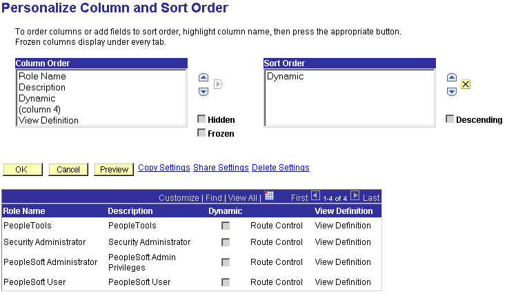
Personalize Column and Sort Order page
When the user clicks the Customize link for a grid on a transaction page, the system opens the Personalize Column and Sort Order page, where custom parameters can be set for that grid. This page contains a sample grid that displays a few rows of real data from the buffer in display-only format. If there is no data in the buffer for that grid, only the column headings appear. Tabs in the grid are active so that the user can view all sample data.
From this customization page, users can control the column and sort order, as well as copy other users' grid settings or choose to share their settings with other users once they save their changes.
The Column Order grid displays the columns in their current order, including tab separators. The list of fields is driven by the page definition but excludes columns that are hidden by PeopleCode. The user can hide columns and change their sort order. Users can also freeze grid columns. Columns that you freeze at design time automatically appear to the user as already frozen. However, the user has the option of overriding this setting.
The Sort Order grid enables the user to control the ascending and descending sort of each column, with the exception of tab separators, images, push buttons, links, and HTML areas. Users can sort hidden fields, however. The default setting is ascending for each column.
After making changes, the user can accept, preview, restore defaults, or cancel selections. If the user saves the new settings by selecting OK, the system stores the new settings as persistent values for that user based on a key structure. Therefore, each time the user accesses this grid, the system uses all personalization options that were set previously. The user can restore all default settings by selecting the Delete Settings link to remove all stored personalization settings from the database.
The user can override the persistent sort order directly on the transaction page by clicking the linked field label to affect the sort. Clicking the link repeatedly toggles between ascending and descending sort order for that column. This type of sorting directly in the transaction page is not persistent.
Note. You can continue to implement the SortScrolls PeopleCode command, but the user can override the defined sort with this feature.
Inserting and Resizing Grid ControlsTo insert a grid on a page:
Select Insert, Grid.
To adjust the grid width, drag the horizontal or vertical control handles.
The horizontal grid width should be roughly equivalent to the columns that you insert into the grid. Otherwise, your grid might appear wider than necessary at runtime.
Inserting and Manipulating Grid ColumnsThis section discusses how to:
Insert grid columns.
Delete grid columns.
Move grid columns on the Layout tab.
Move grid columns on the Order tab.
Resize grid columns.
To insert a grid column:
Use one of these methods to insert a column:
Select a page control from the Insert menu or the page control toolbar and click the grid.
Drag a page field from inside the current page or from another page.
Copy and paste a page field or record field.
Drag a definition (such as a record field, a page field, or an entire record definition) from the project workspace.
The new location of the definition or control is determined by the location of the upper left-hand corner of the drag rectangle, or by the mouse cursor if no drag rectangle appears. PeopleSoft Application Designer automatically places the first column on the left-hand side of the grid.
Click your mouse or release the field in the gray area of the grid.
Place new columns to the right of existing columns by clicking or releasing the control in the gray area of the grid where no columns are present. To place a column between two grid columns, release the new column in the first of the two columns.
When inserting subpages into your grid as a column, be aware that:
You can insert subpages by dragging them from the project workspace or by cutting and pasting from the page to the grid.
Only one column displays in the grid in PeopleSoft Application Designer representing all fields in the subpage.
At runtime, all fields display in the order they appear on the Order tab of the subpage.
You cannot insert subpages that contain fields that are not allowed in grids such as static text or radio buttons.
The system generates an error indicating the invalid field type. Similarly, if at a later point an invalid field type is added to a subpage already in a grid, the system generates a runtime error when the user accesses the page containing the subpage.
The subpage you insert can contain fields that are associated with subrecord record fields.
The same record name substitution mechanism that applies to subpages inserted onto a page applies to those inserted as grid columns. The system replaces the name of the subrecord as part of the expansion process and it is never seen at runtime.
To delete a grid column:
Select a column by right-clicking the column heading.
Be sure that you select only the column and not the grid as a whole; otherwise, you might delete the entire grid instead of just the column. The grid is selected when control boxes appear around the edges of the grid. The column is selected when it turns black.
Select Delete from the pop-up menu.
Moving Grid Columns on the Layout Tab
To move grid columns on the Layout tab:
Select a column by clicking the column heading.
Drag the column to its new location.
Release the mouse button over the column that is to the left of the new location.
Moving Grid Columns on the Order Tab
To move grid columns on the Order tab:
Select the column row by clicking the row number.
The grid and grid columns are clearly distinguished from other page fields on your page. The grid is identified by the Type column. All columns in the grid are directly below in a lighter green. Nongrid page field rows are white.
Drag the row to the new position in the grid.
A red line indicates the new position of the column before you release it. You cannot move a column outside of the grid when working on the Order tab. Similarly, you cannot move an existing page field from elsewhere on the page into the grid. Both of these operations can be performed on the Layout tab.
You can resize grid columns in PeopleSoft Application Designer by dragging the right border of the column heading.
Setting Column PropertiesAfter you insert the page control or field into your grid, you can set the properties for that field as you would set properties for any other page control. Access the field properties by double-clicking the column heading.
Column headings and their alignment are derived from the label text that you select on the Label tab of the page field properties dialog box. The alignment of column contents is derived from the alignment settings on the Record tab of the page field properties dialog box. If alignment settings aren't available on the Record tab, then the system uses the Label alignment settings. For column headings, use the following guidelines for label alignment. Do not use colons in column labels.
|
Type of Field |
Label Alignment |
|
Push button |
Center Align |
|
Link |
Left Align |
|
Character |
Left Align |
|
Numeric |
Right Align |
|
Check box |
Center Align |
|
Field data |
Auto (automatic) |
Creating a Tabbed GridPeopleSoft recommends using a tabbed grid design if your grid contains many columns running off of the right side of the page. Do this by adding tab separator controls to your grid.
You can give users the option of expanding all of the columns to the right so that they are visible when using the browser’s horizontal scroll bar. This is particularly useful to power users who do a great deal of intensive data entry. The Enable View All Columns check box on the Use tab in the Grid Properties dialog box controls this feature and is selected by default. The Expand All button appears to the right of the grid tabs, as shown in the preceding screen shot. After the grid is expanded, the Show Tabs button appears to enable the user to collapse the grid so that the tabs appear again.
Note. Each time the user moves to a new tab results in a transmission to the web server to display the next page.
To create a tabbed grid:
Insert a grid control on the page.
Insert the columns to appear on the first tab.
Insert a tab separator control after the last column.
Set the tab separator properties.
Double-click the tab separator to access the Tab Separator Properties dialog box.
Specify the label properties on the Label tab.
Specify the general properties on the General tab.
Insert the next set of columns to appear on the second tab.
Alternatively, you can place all of the columns in your grid first and then insert the tab separator between the two columns that you want separated.
Repeat steps 3 and 4 if necessary.
Set the tab separator properties by double-clicking the column heading of the tab separator.
On the Label tab, specify the label type.
Select None, Text, or Message Catalog. If you select Text, enter the label text and select the label alignment. The label text that you select appears on the tab in the grid.
On the General tab, determine whether you want to enable the tab separator as a page anchor.
If so, select the Enable as Page Anchor check box and enter a page field name.
Freezing Grid ColumnsYou can freeze the first column or the first several columns in a tabbed grid so that they appear on subsequent tabs. To freeze more than one column, select the freeze option for each column that you want to appear on the following tab.
Freezing grid columns impacts the horizontal scrolling ability of the grid at design time. If you freeze a grid column that is not visible inside the boundaries of the grid at design time, you are not able to view all columns in your grid. Lengthen the width of your grid to accommodate all columns.
Freeze a grid column by selecting the Freeze Grid Column check box on the Use tab of the properties dialog box for that column. Note that the effects of selecting this attribute are visible only at runtime.
Using Multiple Grids on a PageYou can place as many grids on a page as you want, provided that they are at the same occurs level. They can be one above the other or they can be side-by-side, such as those in the following example. This is helpful when you must transfer data from one grid to another without switching between pages.
In the following example, the user can transfer data from the Source Competencies grid on the right to the Assigned Competencies grid on the left by using the double left arrow button. The push button is associated with a PeopleCode program, enabling it to transfer the data between the two grids.
As you can with other level-based controls, you can nest a grid in a scroll area or scroll bar. However, you cannot nest a grid in another grid.
Enabling Grid PersonalizationTo disable grid personalization:
Open the Grid Properties dialog box.
Select the Label tab.
Click the Properties button for the header navigation bar.
This opens the Header Navigation Bar Properties dialog box.
Select the Personalize tab.
Select the Invisible check box.
Click the OK button.
To enable grid personalization in the navigation footer:
Open the Grid Properties dialog box.
Select the Label tab.
Select the Display Navigation Bar check box in the Footer Area group box.
Click the Properties button for the footer navigation bar.
This opens the Footer Navigation Bar Properties dialog box.
Select the Personalize tab.
Clear the Invisible check box.
Click the OK button.
Setting Grid General PropertiesAccess the Grid Properties dialog box.
|
Main Record |
Select the record that contains most of the fields that you want to use in the grid. Fields that you display in the grid that are not from the main record should be display-only or related fields, which you can set on the Use tab of the properties dialog box for that column. |
|
Page Field Name |
Enter a name for the grid. The default is the main record for the grid, however, you can rename the grid as long as it is a unique name for the page or component. This name is used by the PeopleCode GetGrid function to create a grid definition. See File Class, GetGrid. |
|
Occurs Level |
Enter a 1, 2, or 3 to represent at which level the grid resides on the page. Having an occurs level for the grid enables you to designate the hierarchical parent-child relationship. Entering 1 specifies that the grid is at the first level. Entering 2 specifies that a grid is at the second level and is a child of, or nested in, the first level of data, and so on up to 3. A grid can be nested in another level-based control, but it cannot be nested in another grid. See Level-Based Controls. |
|
Occurs Count |
Enter the number of rows to display initially at runtime. |
|
Unlimited Occurs Count |
Select instead of setting an occurs count if you want the system to display all rows of data in the buffer for this grid. Navigation links do not appear at runtime and the size of the grid depends on the number of rows in the buffer. |
|
Enable as Page Anchor |
Select to apply an anchor tag to serve as a jump destination on the page. |
Setting Grid Label Properties
Access the Grid Properties dialog box. Select the Label tab.
The Grid Properties, Label tab provides four main grid setting areas in which you can define settings:
Header Area.
Body Area.
Column Headings.
Footer Area.
Setting Header Area Properties
Display the title of the grid and a navigation bar, where users can access controls for viewing the previous, next, top, or bottom row. You also control the settings for the Find, Personalize, Download, and View All features.
Display Header is selected by default. You can then configure the specific properties for each setting in the header area. In the previous example, the grid title appears in the navigation bar. You can select the alignment of each header element and the style in which they appear to the user. To disable the header, clear the Display Header check box.
To display a title for your grid:
Select the Display Title check box.
Click the Properties button in that row to open the Title Properties dialog box.
Select the type of label text that you want to display for your grid title: Static or Message Catalog.
If you select Static, enter the exact title to appear in the navigation bar. If you select Message Catalog, enter the message set and number of the message to appear as the title.
You can choose to display all header bar options, except the row counter, as either text links or image buttons in the header of the grid.
|
Top |
Controls the attributes for how a user returns focus to the top of the grid or the first row of data in the grid. Text is the default setting, using First from the message catalog. You can also enter static text. |
|
Previous |
Controls how a user can move to a previous row in the grid. Image is the default setting, with the Show Previous Row button as the default image. |
|
Row Cntr (row counter) |
Tracks the number of rows in the grid and in which row the cursor holds focus. Text is the default setting with, for example, 1-6 of 6 appearing in the navigation bar if there are six rows in the grid. Note. The row count that appears is controlled by the occurs count that you set on the General tab in the Grid Properties dialog box (unless the user displays all). Using the previous example, if the occurs count is set to 5, then the row counter is 1-5 of 6. |
|
Next |
Brings focus to the next row in the grid. Image is the default setting with the Show Next Row button appearing to the right of the row counter. |
|
Bottom |
Controls the attributes for how a user moves focus to the last row of the grid. Text is the default setting, using Last from the message catalog. You can also enter static text. |
|
Find |
Displays a link that enables the user to search any field in the grid or scroll area. You can select either text or an image to represent the find feature. The Find feature searches for matches in edit boxes, display-only fields, disabled fields, dynamic links, and text in long edit boxes. It does not find column headings, field labels, text values in icons, static links, and hidden fields, nor does it search outside the grid. |
|
View All |
Enables the user to view all rows of data at once. Text is the default setting using View All as the message catalog entry. |
|
Available for grids only. Displays a download image button in the header or footer bar that enables users to download all active, unhidden rows to a Microsoft Excel spreadsheet, regardless of how many rows are visible on the screen. The default for this setting in the header area is Invisible. For the footer area of a grid, the download button appears by default when you select the Display Navigation Bar check box in the Footer Area group box of the Label tab in the Grid Properties dialog box. Note. Microsoft Excel may display Unicode comma-delimited data differently because Microsoft Excel may be expecting a tab-delimited
file. If display abnormalities occur, you have two options. |
|
|
Customize |
Available for grids only. Displays a Customize link in the header bar that enables the user to access all grid customization options. |
To define the navigation bar properties:
Select the Properties button next to Display Navigation Bar.
The Header Navigation Bar Properties dialog box contains seven tabs, each pertaining to different settings on the navigation bar. Each of these tabs has the same settings. For each setting, you can decide to display it as text or an image. All settings, with the exception of the Download link, are set to display by default.
(Optional) Select the Invisible check box in the upper right-hand corner on each tab to choose not to have that attribute appear to the user.
The View All feature provides a threshold to enable the user to view the data in manageable pieces. If the database returns a number of rows for the grid or scroll area that is greater than the threshold, the View All link displays "View <threshold value>." This feature also modifies the occurs count and the values for the number of non-displayed rows left to scroll through.
The Next and Previous buttons retrieve rows according to the size of the threshold. If the database returns a total number of rows for the grid or scroll area that is less than the View All threshold, then the View All link on the navigation bar remains and functions as is.
The following example uses the View All threshold, occurs count, and total rows in database values:
View All threshold = 100
Occurs count = 7
Total rows in database = 104
These values result in the following for the user:
Viewing 7 Rows
When the user selects View 100, the view value changes to reflect the original occurs count set for the grid. The value for the number of non-displayed rows changes to 100 to match the View All threshold, and the View 100 display changes to View 7:
Viewing 100 Rows
If the Occurs Count, which you define in the properties for grid and scroll areas, is set to a number greater than or equal to the view all threshold, the threshold takes precedence. The View All display changes to View <threshold value> and the link is unavailable. If you select Unlimited Occurs Count, the grid or scroll area displays all rows in the buffer.
Access the Grid Properties dialog box. Select the Label tab. In the Body Area group box, configure the row action buttons and set display properties for the body of your grid.
|
Row Action Buttons |
Select to display Insert and Delete buttons on each grid row at runtime. The action buttons can appear on the left or right side of the grid. Click the Properties button to open the Body Area Row Action Button Properties dialog box, which controls the display of these features. You can choose alternate images to represent Insert and Delete or message catalog text. You can also turn off either or both the Insert or Delete options by selecting the Invisible check box at the top right corner of the properties dialog. |
|
Select a background style to display for the grid as a whole. The style selected here applies to all areas of the grid that are not covered by other elements. |
|
|
Select to display a standard border around your grid. The default is selected. |
|
|
Show Grid Lines |
Select to show grid lines on the grid. The default is to not display grid lines (cleared). |
|
Show Row Headings (runtime) |
Select to number rows at runtime. This option is selected by default. |
Note. The row headings column still appears at design-time even if Show Row Headings (runtime) is not selected. This enables you to more easily select the grid if necessary.
Click the Properties button in the Body Area group box of the Grid Properties, Label tab to open the Body Area Row Action Button Properties dialog box. It contains two tabs: Insert and Delete. The default settings for these buttons are to display the Insert and the Delete buttons. Alternatively, you can select static or message catalog text, or you can make these items invisible so that they do not appear.
Setting Column Heading Properties
Access the Grid Properties dialog box. Select the Label tab.
You can set the grid to display column headings, and you can select the style in which to display them. Select a predefined column heading style from the drop-down list box or use the default. Changing styles alters the foreground, background, and font in the column headings, making it different from the data rows. The default for Show Column Headings is selected.
Setting Footer Area Properties
Access the Grid Properties dialog box. Select the Label tab.
In the footer of your grid, you can display row action buttons and a navigation bar. To enable either of these features, select the appropriate check box, Display Row Action Buttons or Display Navigation Bar, and click the Properties button to configure the settings. Clicking the Properties button opens a separate dialog box: Footer Row Action Button Properties or Footer Navigation Bar Properties respectively.
The row action buttons are the same for the footer area as those described for the body area. The navigation bar property options are the same as those described for the header area. However, all other navigation bar settings for the footer are invisible by default.
Setting Grid Use PropertiesOn the Use tab in the Grid Properties dialog box, you control data entry, row style, and display options, as well as whether your grid has a pop-up menu in the navigation bar at runtime. Both the grid and scroll area share many of the same attributes. Refer to the proceeding term tables for information about these shared settings.
Data Options
|
Suppresses the system from retrieving data from the database automatically. Select to populate the grid or scroll area with data using the ScrollSelect PeopleCode functions. See RowScrollSelectNew. |
|
|
No Auto Update |
Suppresses the system from automatically updating data based on the existing key list. Select when the grid or scroll contains "work" field controls that should affect only a page and not the underlying database. |
|
Suppresses the Add button in the body area so that the user cannot insert rows. If this option is selected, PeopleSoft Application Designer automatically selects and disables the Invisible check box on the Insert tab of the properties dialog box for the body area. |
|
|
No Row Delete |
Suppresses the Delete button in the body area so that the user cannot delete rows. If this option is selected, PeopleSoft Application Designer automatically selects and disables the Invisible check box on the Delete tab of the properties dialog box for the body area. |
|
Set by default, this option ensures that the grid or scroll area processes in deferred mode. This setting overrides any individual field-level settings in your level-based control. |
|
|
Enables the user to add multiple blank rows at once to a grid after a page is displayed. This feature is available only in Add and Update modes. When the user clicks the Add Multiple Blank Rows button, a JavaScript prompt appears so that the user can specify the number of rows to insert between 1 and 99. |
|
|
Enables the end user to perform nonpersistent sorts in a grid at runtime by clicking the column headings. The default is selected to allow column sorting automatically. |
Using the Multirow Insert Option
Each time that a user adds a row to a grid or scroll area requires a transmission to the application server. With the multirow insert option, this transmission occurs only once when the user wants to add multiple blank rows. This can significantly enhance the user’s experience when doing data entry and also meets the developer’s goal of limiting page processing.
At design time in PeopleSoft Application Designer, the default for this feature is disabled. If the No Row Insert check box is selected, the Allow Multi-Row Insert check box is cleared and disabled. Where the multirow insert button appears, in the row or in the footer, depends on how you define the grid or scroll area properties on the Label tab.
You can set any occurs count for your grid. When the end user inserts n rows, the occurs count for the grid or scroll area is temporarily increased to n + 1 (if necessary), showing one row of context plus the new rows. If you select an unlimited occurs count for the grid, this temporary adjustment is not necessary.
Note. This feature should not be enabled for grids and scroll areas with effective-dated rows.
At runtime, the system administrator controls the display and the default of this setting, as well as whether the end user has the option of overriding the default. The system administrator can disable multirow insert by clearing the Enable Option for Multiple Row Insert on the Administer Personalizations page in Security. If the option is not disabled by the system administrator, the user can disable this setting on the Personalization page by selecting PeopleTools, Security, Use, My Profile. Here, the user can override the default of Yes by entering No in the Override Value edit box. When the user disables this feature, the multirow Add button is replaced with the standard Add button in all grids and scroll areas.
When the user saves the page, normal save processing runs, including save-edits on all rows. New, unchanged rows are not saved. After save processing, new, unchanged (and hence unsaved) rows are deleted from the buffer. The only exception is when there is only one row and it is new and unchanged. This row remains in the buffer, even though it has not been saved, because there must always be one row in any rowset.
For the end user pressing Alt+7 works the same with the multirow Add button as it does with the standard Add button.
These options enable the user to select one or more rows in the grid and scroll area. At runtime, indicators appear to the left of row numbers for grids and in the upper left corner for scroll areas. A transmission to the server triggers the selection of the row or rows that the user designates.
|
No Selection Indicator |
This is the default selection. Prevents the user from selecting rows in the PeopleSoft Pure Internet Architecture. |
|
Single Row (radio button) |
Enables the user to select a single row in a grid or scroll area. Inserts a radio button to the left of each row that the user can select. |
|
Multiple Row (check box) |
Enables the user to select multiple rows in a grid or scroll area. Inserts a check box to the left of each row that the user can select. Users can select as many rows as needed. |
|
Enables the user to receive a save warning if a change is made to a row selection indicator in the grid. PeopleSoft Pure Internet Architecture runtime uses this option to set the PPR_CHANGED flag. This option is cleared by default. This property ensures that if there are any changes to the grid, the data is saved to the database. If you disable this property, this means that any row insert, row delete, or field change on the rowset using PeopleCode would not cause the system to treat the component data as changed. |
Note. For the row selection options, PeopleCode can change the selected property, which affects which boxes are selected when the page is regenerated.
Select a preset pop-up menu from the drop-down list box. The pop-up menu button appears in the left-hand corner of the navigation header at runtime.
You can control the color, font, and other characteristics of a row, active tab, inactive tab, and navigation bar by specifying a style in the drop-down list box for each of the row style options.
|
Invisible |
Select to make the grid or scroll area and its associated fields and records invisible. Invisible is used for work grids or scrolls where you want the underlying processing to be transparent to users. Typically, you associate invisible work grids and scrolls with PeopleCode Scroll functions that enable you to further control application processing. |
|
Display Only |
In some cases, you might design grids that enable users to view but not change information. Select this check box if you do not want the user to enter data into the fields in any of the rows. |
|
Selected by default, this attribute displays the grid with contrasting colors by row. The Odd Row Style and Even Row Style drop-down list box options appear instead of the single Row Style option in the Row Styles group box. |
|
|
Select if you want the columns to appear even if all of the cells in a column are hidden. Columns do not collapse. |
|
|
Select to set the grid to a height corresponding to the number of rows in the occurs count attribute. The grid remains fixed at that height even if the actual number of data rows varies from that number. If the fixed height property is not used, the size of the grid dynamically changes based on the occurs count and the number of data rows retrieved. |
|
|
Displays an expand all button to the right of a tabbed grid, enabling the user to view all columns of the grid by scrolling to the right using the browser’s horizontal scroll bar instead of selecting the grid tabs. The show grid tab button appears when columns are expanded to enable the user to view the tabs again. |
|
|
Select to collapse the data area for your grid or scroll area into a header bar with a small image that the user must click to activate or expand it. This enables the Default Initial View to Expanded State check box. You can then select the label image to represent the collapsed and expanded states. |
Expanded grid
Collapsed grid
Using HTML AreasThis section provides an overview of HTML area controls and discusses how to:
Insert an HTML area.
Populate an HTML area.
Change an HTML area label.
Understanding HTML Area ControlsYou can insert an HTML area control on any PeopleSoft page. It can be inserted at any level on a page and can even be placed in a grid control. This control is rectangular and can be resized easily.
Populate the HTML area control in one of these ways:
Statically, in the page field property sheet.
Dynamically, by associating the control with a record field or HTML definition.
If the control is linked to a record field, the value of the record field is displayed in the HTML area. Use PeopleCode to associate the HTML area control with a predefined HTML definition.
When using HTML areas, consider:
HTML areas are downloaded to Excel as a non-breaking space ( ).
HTML areas are not searched with the Find feature.
Generating Trees in HTML Areas
You can use the GenerateTree PeopleCode function with HTML areas. This example shows the tree that is created by the GenerateTree PeopleCode function next to a grid in a frame:
You can populate an HTML area either statically, using the HTML Area Properties dialog box, or dynamically, by associating the control with a record field. Because the HTML that you write is included in the HTML that is dynamically generated by the system at runtime, consider the following:
The HTML that you include can affect the layout of the page.
Being true to the design-time sizing of the HTML area is the best way to ensure that you do not affect the layout of the other page field controls. Adding an invisible frame around the HTML area control can help ensure that you don't affect other page fields.
You can use only certain types of HTML tags. These tags are not supported by the HTML area control:
<body>
<frame>
<frameset>
<form>
<head>
<html>
<meta>
<title>
Using JavaScript in HTML Areas
If an HTML area contains a reference to third party JavaScript, you need to include the absolutized attribute in the script tag and set it to"false". For example,
<script type="text/javascript" language="javascript" absolutized="false" src="../../../../../ps/spellcheck/lf/spch.js"></script>
See Also
Using the GenerateTree Function
Inserting an HTML AreaTo insert an HTML area on a page:
Select Insert, HTML Area.
Draw the HTML area on your page.
Move the HTML area control by dragging it with the mouse or by pressing the arrow keys.
Populating an HTML AreaThis section discusses how to:
Populate an HTML area statically.
Populate an HTML area dynamically.
Populating an HTML Area Statically
Use the HTML Area Properties dialog box to populate an HTML area.
To populate an HTML area statically:
Access the HTML Area Properties dialog box.
On the HTML tab, select Constant as the value type.
In the long edit box, enter the HTML code that you want to display in the HTML area.
Populating an HTML Area Dynamically
To populate an HTML area dynamically:
Access the HTML Area Properties dialog box.
On the HTML tab, select Field as the value type.
Specify the record and field to which you want to associate the HTML area control.
The value of the record field generates the HTML code that is included at runtime in the HTML area.
Note. When you associate an HTML area control with a field, make sure that the field is long enough to contain the data that you want to pass to it. For example, if you associate an HTML area control with a field that is only 10 characters long, only the first 10 characters of your text are displayed. PeopleSoft recommends using long character fields for record fields that are associated with an HTML area control.
Changing an HTML Area LabelAssign a distinct label to your HTML area to distinguish it from other HTML area controls on the Order tab of the page.
To change an HTML area label:
Access the HTML Area Properties dialog box.
Select the Label tab.
Enter a brief text description of the HTML area.
This label does not display at runtime; however, it appears on the Order tab of the page definition.
Using Push Buttons and LinksThis section provides an overview of push buttons and links and discusses how to:
Insert a push button or link.
Specify destination types.
Specify a label for the push button or link.
Understanding Push Buttons and LinksPeopleSoft Pure Internet Architecture supports these features for this control:
Selecting link style.
Selecting these types of push buttons and links:
External link.
Internal link.
Prompt action.
Scroll action.
Toolbar action.
Selecting these image options:
On mouse over.
When disabled.
Inserting a Push Button or LinkAfter you add a push button or link control to your page you can define the attributes by opening the Push Button/Hyperlink Properties dialog box.
To insert a push button or link:
Select Insert, Push Button/Hyperlink.
Click where you want the upper, left-hand corner of the control to begin.
A push button of small image size appears.
Double-click the push button to access the Push Button/Hyperlink Properties dialog box.
On the Type tab, select whether the control appears as a push button or link.
Select a destination type from the Destination drop-down list box.
Select the record and field names with which you want to associate the push button or link.
Select any of the remaining Type options:
|
Select to make the push button or link available to users who have display-only access to this page. Display-only access is set per user and user class in Security. |
|
|
Select to have the page that is displayed by the URL to appear in a new window, as opposed to replacing the existing window. |
|
|
Select to activate the push button or link when the user presses the Enter key. You can have more than one push button or link with this feature set per page, as long as only one of these fields is enabled at runtime. Otherwise, only one push button or link with this attribute enabled is allowed per page. This feature is available for all control types except external links. When using Activate by Enter Key in a scroll area or grid with an occurs count greater than one, the Enter key triggers the first row only. Note that on a secondary page with the standard OK and Cancel buttons enabled, the Enter key activates the OK button rather than a custom button or link. |
|
|
Select to enable the ComponentChanged built-in PeopleCode function when the user selects the push button or link. This issues a save warning if the user attempts to leave the page. This setting is cleared by default. See ComponentChanged. |
Specifying Destination TypesAccess the Push Button/Hyperlink Properties dialog box.
Type
Each destination type that you select enables a different region on the Type tab, enabling you to further define your push button or link. Select one of these values from the Destination drop-down list box:
In this group box, select Dynamic or Static, and enter the URL ID, if necessary. Select a value from the URL Maintenance table of a record field to define the destination. For example, a derived record field might be used to set the destination value dynamically at runtime. The value of the derived record field is placed in the HREF tag of the HTML.
See URL Maintenance.
Internal Link
|
Select the portal to which you want the internal link to point. Use Current is the default. Valid values include all of the values in the PORTAL_NAME column of the PSPRDMDEFN table. |
|
|
Select the PeopleSoft database to which you want the internal link to point. Local stands for the node which is marked as the default only. So if the content reference you need is registered with a non-default local node, make sure you choose the exact same value from this drop-down list box. Valid values include all of the values in the MSGNODENAME column of the PSMSGNODEDEFN table. If you select a node other than Local, the Use data from current page in search check box is cleared. The node that you select should match the node for the destination component in the Registration Wizard or on the Content Ref Administration page. Select PeopleTools, Portal, Structure and Content. Click the Edit link to access the Content Ref Administration page. |
|
|
Select the menu name in which the destination page is contained. |
|
|
Select the component in which the destination page is contained. These values depend on the menu that you select. |
|
|
Market |
Select the market of the destination component. |
|
Select the page on which you want the user to land. These values depend on the component that you select. |
|
|
Select the action mode in which you want the page to begin. |
|
|
Select if you want data from the current page to be used in the search dialog box. This option ensures that the new page inherits the proper keys from the context of the current page. The process is almost identical to the Transfer() PeopleCode function, and it performs a similar function. If this check box is selected, the system discards the existing keylist. A new keylist is built from the current component buffer using the field's context (when there is a choice between rows in a scroll area). This keylist is then used to start the new component. If this option is cleared, the system uses the existing keylist in the normal manner. |
Specifying a Label for the Push Button or LinkThis section discusses how to:
Specify a text label.
Specify an image label.
Specifying a Text Label for the Push Button or Link
To specify a text label for a push button or link:
Access the Push Button/Hyperlink Properties dialog box.
Select the Label tab.
In the Type group box select Text.
Select the size.
There are three standard push button sizes, depending on what kind of text or image you want to display on the button face.
|
Small Image |
Creates toolbar-sized buttons that handle small 16 × 16 pixel images. |
|
Large Image |
Handles 32 × 32 pixel images. |
|
Standard Text |
Matches the Microsoft standard dimensions for text push buttons. |
|
Custom |
Select if none of these sizes meets your needs. When you click OK, the push button displays selection handles that you can use to resize it. |
Specify the type of label text.
Depending on the destination type that you selected, the values in the Type drop-down list box differ.
|
Select to reference a message that exists in the message catalog. Enter the message set and number. Message catalog items are all translatable. |
|
|
Select to label the push button with the short name for the field from a record definition. RFT is an abbreviation of record field table, which stores attributes for fields in a record definition. Use this option only if you specified a record definition and field name on the Type tab in the Push Button/Hyperlink Properties dialog box. The RFT short name appears on the push button when you click OK and return to the page. Select the label ID if you do not want to use the default label if more than one label has been set for the record field. |
|
|
RFT Long (record field table long) |
Select to label the push button with the long name for the field. Use this option only if you specified a record definition and field name on the Type tab in the Push Button/Hyperlink Properties dialog box. The RFT long name appears on the push button when you click OK and return to the page. Select a different label ID if you do not want the default label if more than one label has been set for the record field. The system uses the RFT long label as the tool tip at runtime for links if it is different from the assigned display value of the link and it is not null. If more than one label is stored for the record field you can select an alternate tool tip from the Label ID drop-down list box. |
|
Select to enter the text to appear on the label. |
|
|
URL Description |
Select if you selected External Link as the destination on the Type tab. Select the style from the drop-down list box. |
This option is only available if you selected Hyperlink for the type on the Type tab. Push button text is automatically centered for controls that appear as push buttons.
Note. Some browsers do not support custom push buttons.
See "Troubleshooting Browser Limitations" on Customer Connection.
Specifying an Image Label for a Push Button or Link
To specify an image label for your push button or link:
Access the Push Button/Hyperlink Properties dialog box.
Select the Label tab.
Select Image for the type.
Specify the size.
If you select Custom, the Image/Format Size group box becomes available.
|
Scale |
Select to adjust the width and height as percentages. |
|
Size |
Select to set the image size by altering the width and height in pixels. |
|
Reset to actual image size |
Resizes the image according to its natural size. That is, the images size is not manipulated by custom width or heith values. |
Specify the image ID.
Select one of the predefined image definitions or click the Browse button to view push button images.
(Optional) Select the image to appear on a mouse over.
For example, you might want to highlight an image so that users can easily see which option they're selecting.
(Optional) Select an image to appear when the button is disabled.
Using Scroll Areas and Scroll BarsThis section provides an overview of scroll areas and bars and discusses how to:
Set scroll area general attributes.
Set scroll area label properties.
Set scroll area use properties.
Specify scroll bar label properties.
Specify scroll bar use properties.
Control scrollable data.
Convert scroll bars to grids.
Understanding Scroll Areas and Scroll BarsScroll areas, rather than scroll bars, are the preferred control for representing multiple rows of data from a table, because they are easier to use during design time and offer a wider array of features. The final product at runtime appears more contained because the default setting places a border around the data.
The navigation tools that you select for a scroll area are automatically positioned on the navigation bar or footer bar.
With scroll bars, you must place these buttons and links on the page manually.
Scroll areas provide the option of showing or hiding a border around the data.
Scroll areas provide the option of a View All button and a Find feature.
Scroll areas enable you to determine the text or image that appears for the action items in the navigation bars.
Scroll areas provide a row separator when you select multiple occurrences of data.
Scrolls, Record Relationships, and Page Processing
A page must reflect the underlying table structures so that the system knows where to store data in the database. When you have more than one underlying record definition on a page, the role of scroll areas and scroll bars in page processing is important. Scroll controls define parent and child record definition relationships on a page.
You assign an occurs level to each scroll control on the page to indicate the relationship between the record definitions and the controls and to determine how the data is processed. The primary record on a page at level 0 has no scroll area or occurs level associated with it. If the page contains a record that is subordinate to the primary table, it has a scroll area with an occurs level of 1. A table that is subordinate to the level 2 record has a scroll area with an occurs level of 2. PeopleTools does not support nesting beyond three levels.
PeopleSoft Application Designer automatically nests the scroll area after you set the occurs levels sequentially. Each field that you place on the page after each scroll area is automatically placed inside the scroll area preceding it until the next level-based control is placed on the page.
A scroll area looks like a group box with various controls. The title bar in a scroll area, however, can also serve as a navigation bar. The navigation bar gives the user various options for viewing the data. The plus and minus buttons in the body of the scroll enable the user to add and delete rows of data.
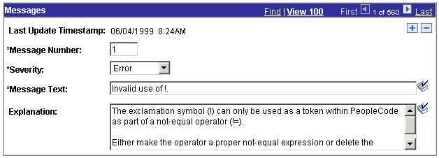
Example of a scroll area
See Also
Setting Scroll Area General AttributesAssign the general attributes of the scroll area. These settings are the same for the scroll area as they are for the grid control.
See Setting Grid General Properties.
Manipulating Fields After the Occurs Count is Set
If you set the occurs count to a number that is greater than one, you must reposition the fields in the scroll area. If you changed the occurs count after placing fields in the scroll area, they might appear one on top of the other, very close together. Unless you indicate otherwise (in the body area of the Label tab), row separator lines might appear to distinguish one row from the next.
In the following example, the occurs count was set to 5 after placing one field, Access Group, in the scroll area. You must reposition the fields and potentially the labels so that they are evenly spaced in the row separator lines.
Before you do so, it is helpful to know a few rules about how you can move these fields in relationship to one another. For example, you do not need to move each individual field to its proper destination. For this example, we call the first field in the column of fields, or the original field that you placed in the scroll area, the head field. The fields following the head field are other occurrences.
The head field controls the horizontal movement of all other occurrences that are below it.
You cannot move the other occurrences horizontally.
To evenly space the occurrences vertically, drag the last occurrence in the column to the appropriate position between the bottom edge of the scroll area and the last row separator.
All occurrences above it reposition themselves equidistant from the others.
The add and delete push buttons (represented by the gray boxes on the right side of the scroll area) cannot be moved horizontally on the page.
You can move them only vertically in the same manner as the fields.
After you move the lowest field, the scroll area should appear as follows:
Setting Scroll Area Label PropertiesThere are three places on a scroll area where you can apply links or push buttons to help the user navigate through multiple rows of data in the scroll area. These options and the associated settings are the same as those for grids. This section references the setting definitions for grid controls that are described earlier in this chapter.
You can display the title of the scroll area and a navigation bar where users can access links for viewing the previous, next, top or bottom row. The Find and View All features appear by default in the navigation bar of the scroll area.
You can:
Display Insert and Delete action buttons on each row of data.
Control the display of the scroll area border.
Add a row separator when more than one row is showing at a time.
Adjust the layout of the scroll area when hidden fields are present.
Specifying Footer Area Properties
If you choose to display a footer row for the scroll area, you can add:
Insert and Delete row action buttons.
A navigation bar, where users can access controls for viewing the previous, next, top or bottom row.
A Find and View All option.
See Also
Setting Scroll Area Use PropertiesYou can select several options to determine how you use the scroll area. As with the label properties, the settings on the Use tab of the Scroll Area Properties dialog box are the same as those on the Use tab of the Grid Properties dialog box, except that the scroll area contains fewer attributes than a grid.
See Also
Setting Scroll Bar Label PropertiesTo help identify scroll bars on the page definition, document the purpose of each scroll bar with an informational field label.
To specify a scroll bar label:
Access the Scroll Bar Properties dialog box.
Select the Label tab.
Enter the text label in the Text field.
This label is for your information only—it doesn’t appear on the page. This label is useful for reordering page controls in the order list if you include a meaningful identifier in the label, such as the primary record definition for the scroll bar. For example, you might want to label it ABSENCE_HIST_SCROLL.
Setting Scroll Bar Use PropertiesYou set the scroll action buttons on the Use tab of the Scroll Bar Properties dialog box:
Access the Scroll Bar Properties dialog box. Select the Use tab.
|
Occurs Level |
Having an occurs level for the scroll bar enables you to designate the hierarchical parent and child relationship. Entering 1 specifies that the scroll bar is at the first level. Entering 2 specifies that a scroll is at the second level and is a child of, or nested in, the first level of data, and so on up to 3. A scroll can be nested in another scroll or scroll area, but it cannot be nested in a grid. See Level-Based Controls. |
|
Occurs Count |
Enter the number of rows to appear at one time in the grid at runtime. See Level-Based Controls. Note. Always reorder your controls, if necessary, before you enter an occurs count. |
|
Invisible |
Select to make the scroll bar invisible. |
|
Default Width |
This does not apply because the scroll bar does not appear on the page at runtime. |
|
No Auto Select |
Select to prevent the system from retrieving data automatically from the database. Select to populate the scroll bar with data using the ScrollSelect PeopleCode functions. |
|
No Auto Update |
Select to prevent the system from updating data automatically based on the existing key list. Select when the scroll bar contains work field controls that should affect only a page and not the underlying database. |
|
Select to prevent the row insert function so that the user cannot insert new rows. |
|
|
No Row Delete |
Select to prevent the delete function so that the user cannot delete rows. |
If you select a Scroll Action Button option, it appears on the page next to the scroll bar in PeopleSoft Application Designer. You must manually move it to the appropriate location on the page definition.
|
Previous Page |
Select to display a link that enables the user to move to the previous row or set of rows in the scroll buffer. |
|
Select to display a button that enables the user to add a row. |
|
|
Top |
Select to display a link that enables the user to go to the first row of the scroll. |
|
Select to display a counter to show users what rows they are viewing and the total number of rows in the scroll bar, for example: <1 of 3>. |
|
|
Select to display a link that enables the user to move to the next row or set of rows in the scroll buffer. |
|
|
Select to display a button that enables the user to delete a row. |
|
|
Bottom |
Select to display a link that enables the user to go to the last row of the scroll bar. |
When working with the row counter when designing pages in PeopleSoft Application Designer (not at runtime in a browser), consider the following:
If the header area navigation bar is set to invisible, the system displays no header area navigation bar row counter button. Likewise, if the footer area navigation bar is set to invisible, the system displays no footer area navigation bar row counter button. If the row counter button of the header area navigation bar is set to invisible, the system displays no header area navigation bar row counter button.
If the row counter button of the footer area navigation bar is set to invisible, no footer area navigation bar row counter button is displayed. Otherwise, if not set to invisible, the row counter button will be displayed as "|<< your_label >>|" where your_label is the specified text.
If the text of the label is an empty string or the label refers to the message catalog with a message set of 0 and a message number of 0, then "your label" appears as an empty string and the label will be rendered as "|<< >>|".
Controlling Scrollable DataYou can control scrollable data using the PeopleCode Data Buffer Access Classes.
See Accessing the Data Buffer.
Converting Scroll Bars to GridsYou can convert a single-level scroll bar to a grid control. PeopleSoft Application Designer provides a utility to automate this task. The Convert Scroll to Grid function:
Designates the size and position of the grid as set to the area covered by the left-most label to the scroll bar.
Issues warnings before deleting controls that are not supported by the grid.
Converts radio buttons to drop-down list boxes.
Sets label alignment of check boxes to center.
The conversion utility provides warnings for scroll bars that can’t be converted to grids due to grid control limitations. The conversion utility validates to the following limitations:
No more than one grid can exist on a page.
The scroll bar to be converted must not have any nested scroll areas or bars under it.
The grid control must be the last control on the page.
Radio buttons are not supported in grids and must be replaced with drop-down list boxes.
To convert a scroll to a grid:
Select the scroll bar.
Right-click and select Convert Scroll To Grid from the pop-up menu.
This menu option is available only for scroll bars that can be converted. This utility searches for all page fields that are defined in the field order after the selected scroll bar control, up until the next scroll bar or scroll area control. It does the following for each field:
Confirms that the scroll control type can be displayed in a grid control.
Creates a grid column of the appropriate type.
Populates in the attributes.
Click OK to display the new grid.
If any of the page fields cannot be displayed in a grid or if other problems are found, the utility displays an error message explaining why the scroll bar cannot be converted to a grid. If no problems are found, the Grid Properties dialog box appears, listing all of the fields that will be converted to columns. You can change any grid or field properties at this time.
Using Secondary PagesThis section provides an overview of secondary pages and discusses how to:
Define secondary pages.
Insert a secondary page control.
Understanding Secondary Pages
While a secondary page is just another page to the user at runtime, they look and behave differently than the primary pages. For example:
You can view a secondary page from its primary page only.
A secondary page should have OK and Cancel buttons so that the user can dismiss the page (accepting or canceling input) and return to the primary page.
To offer the user alternative buttons to dismiss the page, disable the default OK and Cancel buttons in the Page Properties dialog box.
Secondary Page or a Push Button?
There are two ways to associate a secondary page with a primary page:
Insert a push button or link and associate it with your secondary page.
This automatically displays the secondary page when the user presses the button or clicks the link and is the preferred method. Use this method when:
No procedural PeopleCode logic is necessary before the secondary page is displayed (PeopleCode can be used on the secondary page just like any other page).
You want to control the formatting of the information (therefore you want to use a page, and not use the Prompt function).
The secondary page is used more than once.
Insert a secondary page control.
This control looks like a command push button, but it is invisible at runtime. When you use a secondary page control, you must also insert a command push button on the page and call the DoModal PeopleCode function from the FieldChange event for the push button to display the secondary page.
Example
In the following example, the Address page contains an Email link at the bottom of the scroll area. This link opens the Email Addresses page, enabling the user to enter email address information.
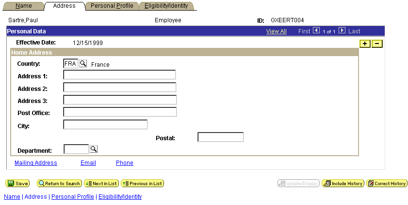
Primary page
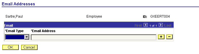
Secondary page
After the user enters the email information in the Email grid, the user can return to the Address page by clicking OK.
Defining Secondary PagesDetermine which data in the primary component is appropriate for a secondary page. Typically, this is supplemental information or information that is accessed from more than one main page.
To create a secondary page:
Select File, New and select Page from the New Definition dialog box.
Open the Page Properties dialog box.
Select the Use tab.
Select Secondary Page from the drop-down list box in the Page Type group box.
|
Auto-Size |
Select to size the page automatically to fit the fields that are defined on it. |
|
Custom Size |
Select to size the secondary page by dragging the edge or by entering the width and height in pixels. |
Select the page style sheet to associate with the secondary page.
To override the default style sheet that is associated with the application, select a different style sheet from the drop-down list box. The style sheet that you select is available only for the controls on the secondary page.
You can control the background of the page and any controls that don't have a style sheet associated with them by specifying a style in the page background.
(Optional) Select Adjust Layout for Hidden Fields.
(Optional) Clear Allow Deferred Processing if you want processing to occur each time the user presses Tab to move through a field.
Click OK and save your secondary page.
If you selected Auto-Size, the system sizes the page automatically to fit the fields that are defined on it when you save.
Inserting a Secondary Page ControlAfter you define the secondary page, you can place a secondary page control on your primary page and associate it with the secondary page you just created.
To insert a secondary page control on a primary page:
Select Insert, Secondary Page.
Click the primary page where you want to display the secondary page control.
The secondary page control appears like a small push button with the secondary page icon on it. This control is invisible at runtime.
Double-click the control to access the Secondary Page Properties dialog box: Secondary Page tab.
Select the name of the secondary page to associate with the secondary page control on the active page.
Only secondary pages can be associated with secondary page controls. You cannot associate a standard page or subpage with the secondary page control.
Select the Label tab.
This label is for informational purposes only. It appears in the Order tab of the page definition and in the page description printout.
Position the secondary page control at the proper scroll level on the Order tab.