
 Understanding Pages
This chapter provides an overview of pages and discusses how to:
Use effective dates.
Work with page elements.
Use data-entry fields.
Use grid and scroll area controls.
Use spell check.
Work with HTML trees.
Work with field-level prompts and validation.
Understanding PagesPages are the primary graphical interface by which you view and alter data in your PeopleSoft system. In many cases, these pages as representations of rows of data in your database tables. You use them to view, enter, and update data stored in application tables. Each page also provides features in the form of buttons or links to help you navigate through the system. As you change or add information to your database, you need to be familiar with effective-dating logic and the various page action options as you work with historic, current, and future data.
Many PeopleSoft components run in deferred processing mode to reduce trips to the server and provide better performance. This simply means that, when using some pages in the browser, you can input data with minimal interruption or trips to the server. Each trip to the server refreshes the page on the browser, which may cause the display to flicker and may also slow down your application. If deferred processing mode is specified for a component, a page within that component or a field on a page within the component also performs processing in deferred mode.
Note. Interactive mode is the opposite of deferred mode processing.
It also helps to familiarize yourself with the types of page elements that you encounter on pages. PeopleSoft uses many different types of elements to organize information on pages and to enable you to enter data, including data-entry, functional, and data processing elements.
Using Effective DatesThis section provides an overview of effective dates and discusses how to describe page action options and effective dates.
Understanding Effective Dates
PeopleSoft’s effective-dating logic enables you to maintain an accurate history of information in the database. Effective dating allows you to store historical data, see changes in your data over time, and enter future data. For example, you may want to track several events in the career of Tom Sawyer: when he was hired, transferred, and promoted. By inserting rows of data based on his employee ID, you can build a job history.
When you enter new information that is related to existing data, such as a transfer or pay rate change, you do not want to lose or overwrite the data already stored in the database. To retain history, add a data row identified by the date when the information goes into effect: the effective date. You can use the information to look at what has happened up to now and plan for the future. The PeopleSoft system categorizes effective-dated rows into the following basic types:
|
The data row with the date closest to—but not greater than—the system date. Only one row can be the current row. |
|
|
Data rows that have effective dates earlier than the current data row. |
|
|
Data rows that have effective dates later than the system date. |
Describing Page Action Options and Effective DatesThe types of actions that you can perform on rows of data depend on the data row type. When you retrieve, modify, or insert rows in a table, the Update/Display, Include History, and Correct History actions apply specific rules based on the effective date:
Note. Not all tables are effective-dated. The Include History and Correct History options only appear on pages that access effective-dated tables.
|
Action |
Rule |
|
Retrieves only current and future rows. You can change future rows but not current rows. You can also add a new current row. |
|
|
Retrieves all rows. However, you can modify future rows only. You can also add a new current row. |
|
|
Retrieves all rows and allows you to change or correct any row and insert new rows regardless of the effective date or sequence number. Note. This option is available only to users with the proper permission. |
To see how these actions work together, take a look at four possible events in the career of employee Tom Sawyer, listed by effective date. Assume that today is February 1, 2005:
|
Effective Date |
History |
Current |
Future |
|
Hired: January 1, 1994 |
X |
– |
– |
|
Transferred: January 1, 1996 |
X |
– |
– |
|
Promoted: August 1, 2001 |
– |
X |
– |
|
Expected termination: January 1, 2006 |
– |
– |
X |
The action type that you select dictates whether you can access certain fields and what you can do with each type of row:
|
Action Mode |
View |
Change |
Insert New Rows |
|
Current, Future |
Future only |
Effective date greater than or equal to current row. |
|
|
History, Current, Future |
Future only |
Effective date greater than or equal to current row. |
|
|
History, Current, Future |
All existing rows |
No effective date restrictions. |
The page action buttons appear in the toolbar in the lower-right corner of any relevant pages. A shaded button indicates that the page is currently in that mode. For example, the CTI Agent Configuration page is currently in Correct History mode.
When you select Update/Display, you can access only current and future rows; you cannot access history. Using the example, you can view only the current data, which is effective-dated August 1, 2001, and the future data, which is effective-dated January 1, 2006 (the employee's promotion and then the employee's termination).
You can also:
Insert new rows with an effective date later than the date on the current row—after August 1, 2001.
Change the future-dated row, effective-dated January 1, 2006, and change any additional rows that you insert with a date later than today, February 1, 2005 (assumed to be today's date).
If you insert rows with effective dates between August 1, 2001, and February 1, 2005, you cannot change them if you return to the page in Update/Display mode.
Select Include History to view any of Tom Sawyer’s job data, from his hire date to the day on which he will be fired. However, as with Update/Display, you can update only future-dated rows, effective-dated February 2, 2005, and on. You can also insert new rows with an effective date later than the current row—that is, any date after August 1, 2001.
Select Correct History to access all data rows. This mode enables you to view, change, and insert rows of data, regardless of the effective date. You can view and edit any of Tom Sawyer’s job data, from his hire date to the day on which he will be fired. You can also insert new rows with any effective date.
Note. As you move between the Update/Display, Include History, and Correct History modes, the system prompts you to save your changes if necessary.
Working With Page Elements
This section provides an overview of PeopleSoft page element types and discusses how to use certain data-entry fields.
Understanding PeopleSoft Page ElementsPeopleSoft applications include three types of page elements: aesthetic, functional, and data-entry fields. Although you should be aware of all page element types, you interact mostly with data-entry fields as you work in your application.
Aesthetic elements help organize or emphasize different fields or information on the page. These elements are not used to update data in the database; they are purely visual. Aesthetic elements include:
|
Element |
Definition |
|
Display-only box that groups a set of fields on a page. |
|
|
Display-only box, with text labels, that groups and identifies related fields, such as options. |
|
|
Display-only horizontal line that separates fields or other elements on a page. |
|
|
Unchanging graphic, such as your company logo or another visual element. |
|
|
Display-only alphanumeric field that describes a page, field, or group of fields. |
Functional elements are controls, such as buttons and links, that perform a specific function. Aside from the standard toolbar buttons at the bottom of the page, your transaction page may include other buttons and links that are not associated with a grid or scroll area. For example, a button next to a field may perform a calculation based on a value that you just entered. You can activate this button by clicking it or by pressing the Enter key while the element has the focus. You can also activate links by pressing the Enter key.
Pages can include several types of data-entry fields, each designed to provide a simple way to enter and update data in your tables. Understanding the various types of data-entry field helps you use the system more efficiently.
Data-entry fields, which are always associated with specific database fields, include:
|
Selecting a check box or radio button enables an option. Typically, you select one by clicking within it or pressing the space bar when the box is highlighted. Click it again or press the space bar to disable the option. Check boxes correspond to fields with only two valid values. You can often select more than one check box in a related set. In contrast, a related set of radio buttons represents a group of mutually exclusive options; typically, you can only select one radio button within a related set. |
|
|
Enter characters or numbers into edit boxes. The character limit is determined by the length of the database field. Edit boxes for fields with prompt tables have a lookup button to the right. Edit boxes with spell check enabled have a spell check button to the right. See Using Edit Boxes. |
|
|
Enter longer strings of data, such as comments, into long edit boxes. These boxes store free-form text fields. If you type more lines than you can see at one time, use the scroll bar on the right to move through text. Long edit boxes with spell check enabled have a spell check button in the upper-right corner. |
|
|
Select a value from a predefined list. Drop-down list boxes look like a data-entry field with a prompt button at one end. Click the prompt button to display a list of valid values from which you can select a single option. |
|
|
Insert photos or other images into your PeopleSoft Application. The format of the image that you insert must match the image format defined for that field by the application developer. Acceptable formats include JPG, BMP, GIF, or DIB. For example, on the Employee Photo page, you can only insert JPG images into the employee photo field. If you try to upload an image of another format, the system displays an error message. |
|
|
Serve as containers or organizers for multifield data entry. Grids display as a minispreadsheet within a page. Scroll areas are like grids except that the fields are arranged in a freeform manner. Both contain rows of data that may include Add, Multi-Row Insert, or Delete buttons. Most include a navigation bar or footer with multiple control and configuration options. You can think of all of the fields in each of these controls as belonging to one table in your database. Each time that you add a new row, you are actually adding a new row of data to the database table, each of which shares the same high-level key. For example, for employee records, you may have more than one emergency contact listed for each employee. If you have two emergency contacts listed for an employee, each of those contacts has that employee’s ID number as a key field. If you insert a new row, the system automatically copies the shared key data into the new row. |
To move among the data-entry fields on a page, press the tab key or click the field once. Pressing tab moves you one field at a time in a sequence determined in the page definition. Pressing tab also rests on prompts to give you the option of viewing the prompt table or calendar. To open a prompt or calendar, you can press enter. Or, to get to the next field, press tab again. Press Shift+Tab to move backward rather than forward in the tabbing order.
Note. Pressing Tab may yield different results if you have modified page tabbing behavior on the My Personalizations page.
In most applications, required fields are marked with an asterisk. You must enter data into that field to continue on to the next field or save the page. When the developer has set deferred processing mode for the page, you may not be informed that a field is required until you attempt to save or leave the page. If you save the page without entering required data, the field turns red and an error message appears on the page. Click OK within the error message, and then enter the correct data in that field. Required fields are often drop-down list boxes or are accompanied by a prompt button to help you enter the correct data.
Using Data-Entry FieldsThis section discusses how to:
Use edit boxes.
Use drop-down list boxes.
Work with images.
Using Edit BoxesMove to and highlight an edit box by pressing the tab key or by double-clicking and highlighting the text. You can type over existing highlighted text. If the text is not highlighted, you are inserting rather than replacing text.
This example shows an edit box:
Edit box
Some edit boxes are associated with database fields that have formatting attributes assigned to them. For example, most name fields are defined with a name format that requires you to enter data in the following way:
LastName,FirstName Initial
This format is case sensitive. Also, note that there is no space between the comma after the last name and the first name. If a field is not case sensitive, the system converts what you type to uppercase before writing it to the database.
Other types of formatting include:
Social security, social insurance, or other government ID numbers.
Dates.
ZIP codes or other postal codes.
International phone numbers.
For these types of formats, you generally type only the characters; the system inserts the appropriate dashes and slashes for you. For dates, enter the standard six-digit date format, such as mm/dd/yy (include zeros); the system automatically changes the display to show a four-digit year.
Note. Number formatting may perform differently for users who have personalized their systems.
In interactive mode, if you enter a field value incorrectly, the system highlights the field in which an invalid value was added, and a warning message appears with an explanation of the problem.
Using Drop-Down List BoxesTo select a single item from the list, click the down arrow to display the list, scroll through the list until your choice is visible, and then click the desired list item. The list closes and the selected value appears in the list box. You can also type the first letter of an item to select it. If there is more than one choice for a letter, type the letter repeatedly to cycle through the list. In the following example, first click the down arrow, then, if you want to select Greek, type the letter G twice. Alternatively, press the Down Arrow key to select the field entry that you want. Once your choice is highlighted, press Enter.
This example shows a drop-down list box:
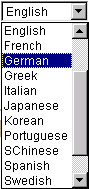
Drop-down list box
Working With Images
You can insert or update images in your PeopleSoft system. For example, the Employee Photo page enables you to store and maintain photos of your employees in your PeopleSoft database.
This section discusses how to:
Insert an image.
Delete an image.
You can insert photos into your PeopleSoft database. For example, you may want to store employee photos for company identification badges, or pictures of products for inventory purposes.
To insert an image at runtime:
Open the page in which you want to insert the photo.
Click the Add button.
A search page appears enabling you to search for the image that you want to insert. You can browse for the image from your desktop, your hard drive, or the network.
Click the Browse button to search for and select the image you want to insert.
Click the Upload button.
The upload page closes and your newly inserted image appears on the page.
Deleting an Image
To delete an image at runtime:
Open the page from which you want to delete the image.
Click the Delete button.
The system automatically deletes the image on the page without posting a warning message prior to deletion. However, if you exit the page without saving, the system does not delete the image from the database, and the image is present when you reopen the page.
Using Grid and Scroll Area Controls
This section discusses how to:
Navigate through data.
Work with grids.
Use scroll areas.
Use effective-dated scroll areas and grids.
Use multiple scroll areas and grids on a page.
Navigating Through DataGrids and scroll areas contain the same type of navigation structure. Instead of using a scroll bar to scroll through the rows of data, PeopleSoft uses navigation buttons and links. These buttons or links appear in the navigation header, within the row itself, or to the right of the tabs in a tabbed grid, as appropriate. Certain options, such as Customize and the download to spreadsheet icon, appear only on grids.
Note. Don't confuse the navigation header for a grid or scroll area with the universal navigation header that appears in the upper-right corner of the page.
This section discusses how to:
Navigate with buttons and links.
Add rows.
Delete rows.
Select rows.
Find data.
Navigating With Buttons and Links
The following table describes the buttons and links that might appear on your grid or scroll area.
There are also keyboard shortcuts for all of the above buttons and links.
See Using Hot Keys.
In addition to these links and buttons, there is a numbering system for the rows. For example, if a grid or scroll area were set to view only one row at a time, the navigation header might read 1 of 2 or 1 of 20, depending on how many entries there were. If the grid or scroll area were set to view three rows of data at a time, it might read 1-3 of 20. Click the arrows to view the next or previous series of rows. In the Message Log scroll area, for example, you can see that it contains 560 total rows of data, displaying just one row at a time. Select View 100 to see the rows in groups of 100 at a time.
You can click the Add or + button to add an empty row after the current row
Note. If you do not insert a new row, any data that you enter overwrites the existing data in the current row. However, the changes that you make do not take effect until you save the page. If you exit the page without saving, the original data remains intact. You can only type over existing data in the effective-dated table in Correction mode.
In some cases, you can add several rows at once to your grid or scroll area by clicking the +... (multi-row insert) button. When you click this button, the system prompts you to specify the number of rows needed. You can add up to 99 rows at once. This option is not always available.
You can also delete rows of data from a grid or scroll area. To delete a row of data, select the row by using the navigation header or by clicking a field in the row. Then click the Delete or – button. The system confirms the deletion by asking if you want to proceed. It also reminds you that the row will not be deleted from the database until you save the transaction; however, the row is automatically removed from the grid or scroll area. To retrieve the row, click the Back button in your browser or close the transaction without saving your changes; the system does not save any other changes that you made to the page.
For certain grids and scroll areas, you can select a single row or multiple rows in case you need to batch a number of processes. Single-row selection is available when the system displays a radio button to the left of each grid row or in the upper-left corner of a scroll area. Select a row by selecting one of the radio buttons in front of the row. Multiple-row selection is available when the system displays a check box to the left of each grid row and in the upper-left corner of a scroll area. Select as many rows as you need by selecting each check box.
The find feature on a grid or scroll area enables you to locate specific data, which is particularly useful if your table contains hundreds of rows. Note that this feature allows you to search the data within the grid or scroll area only. It does not search for any data outside the control. The find feature looks for matches in edit boxes, display-only fields, disabled or shaded fields, dynamic links, and text in long edit boxes. It does not find column headings, field labels, text values on icons, static links, and hidden fields. Find searches from the left-most visible object of the current row down, based on the text that you enter in the search prompt.
The Find link represents the find feature in the navigation bar of your grid or scroll area. Clicking this link displays a dialog box prompting you to enter your search string. The find feature searches through all rows of data in the buffer and brings the first occurrence in your search string to the top of the row list in the grid. If you are in a scroll area that displays only one row of data at a time, the find feature opens that row of data. To find the next occurrence, click the Find link and enter your search string again.
If your search string does not appear in the currently visible rows, the find feature opens a new display of rows so that the row containing the search string appears in the grid. Note that on tabbed grids, the find feature searches only the active tab.
When there are grid areas within a scroll area, the find feature searches only the current scroll level; it does not search the grid data. Each control, if it is set up to perform a find, has a separate Find link in the navigation header of that control.
Note. Your browser may also contain a find feature. This tool, however, does not search through data in your PeopleSoft database. It searches the HTML code for what appears on the current open page only. Thus, it searches field headings, read-only text, and headings in grids, group boxes, and scroll areas only.
Working With Grids
Grids offer several functional benefits that scroll areas do not. This section discusses how to:
Select tabs for multiple views of a grid.
Collapse grids.
Customize grids.
Manipulate grid column sort order.
Download grid data.
Selecting Tabs for Multiple Views of a Grid
Tabbed grids enable you to view multiple columns of information without scrolling to the right. By clicking the Show All Columns button just below the grid's navigation header, you can view the remaining columns of grid data. To restore the grid to its original state, you can then click the Show Tabs button. Alternatively, some grids may have an Expand All button to the right of the tabs, which enables you to expand the grid columns to the right so that no tabs appear.
You may also encounter grids that can be collapsed or expanded. Click the right-pointing triangle in front of the grid heading to expand a grid that is hidden from view (collapsed).
These examples show both the collapsed and expanded states of the Component Interfaces grid.
For most grids, you can customize the order of the columns, the sort order, which columns are frozen, and which columns are hidden. You can also share your grid customizations with other users or copy another users' settings. You control these settings on the Personalize Column and Sort Order page, which you open by clicking the Customize link in the grid's navigation header. Any personalizations that you make to a grid remain in place until you change them.
Note. If there are grid tabs, they remain active so that you can view all sample data.
Use the following toolbar buttons to personalize your grid:
To change the column order:
Under Column Order on the Personalize Column and Sort Order page, select the column that you want to move.
To select multiple adjacent columns, hold down the Shift key as you select additional column names. To select multiple nonadjacent columns, hold down the Ctrl key as you select additional column names.
If your grid contains tabs, the system displays the tab separators in the Column Order list. You can move the tab separator just as you would a regular column, thus altering the number of columns that the system displays on a particular tab at once.
Click the up or down arrow buttons to move the column up or down in the list.
If you move a frozen column below an unfrozen column, the system disables the frozen setting.
Repeat steps one and two to move any additional columns.
Click OK to save your changes and return to the transaction page.
To hide a column:
Under Column Order, select the column that you want to hide.
To select multiple adjacent columns, hold down the Shift key as you select additional column names. To select multiple nonadjacent columns, hold down the Ctrl key as you select additional column names.
Select the Hidden check box.
Note. When you use the find feature in the grid, the system will not search any columns that you set as hidden.
Click OK to save your changes and return to the transaction page.
To freeze a column:
Under Column Order, select the column that you want to freeze.
A frozen column remains immobile when you use the grid's horizontal scroll bar.
Note. Any columns that the developer already defined as frozen appear with the Frozen check box selected. You can override this setting by clearing the check box.
Select the Frozen check box.
The system automatically freezes the selected column and all columns above it. If you move a frozen column after an unfrozen column, the system disables the frozen setting.
Click OK to save your changes and return to the transaction page.
Manipulating Grid Column Sort Order
Under Sort Order on the Personalize Column and Sort Order page, you can alter the grid column sort order. Any sort order changes that you save remain in place until you change them again.
To specify a persistent sort order for a grid:
Under Column Order, select the column on which you want to sort.
Note that you can sort hidden columns; however, you cannot select the following column types for sorting:
Tab separators.
Images.
Buttons or links.
HTML areas.
Click the right arrow to display that column under Sort Order.
To select multiple adjacent columns, hold down the Shift key as you select additional column names. To select multiple nonadjacent columns, hold down the Ctrl key as you select additional column names.
If you have moved more than one column to Sort Order, you can select a column and click the up and down arrow button to alter the sort hierarchy.
You can sort multiple columns at once. The system considers the first column in the list the primary sort, the second the secondary sort, and so on.
To sort columns in descending order (instead of the default ascending order), select the Descending check box for the highlighted column.
The system applies the (desc) text next to the column name to indicate which columns are sorted in descending sort order.
Click OK to save your changes and return to the transaction page.
The system saves your sort settings until you change them again or until you click the Restore Defaults button in the Personalization page.
You can override the sort order of a column in a grid directly in the transaction page without altering the personalization settings. To do so, click the column heading link (not underlined) for the column that you want to sort. This sorts the column in ascending order. You can toggle between ascending and descending order by repeatedly clicking the column heading link. The last column heading link that you click becomes the primary sort for the grid. Note that this type of sorting is only temporary. When you exit the transaction, the system does not save the sort order that you just performed.
Some grids enable you to download grid data to a Microsoft Excel spreadsheet. The download feature extracts all active, unhidden rows, regardless of whether the rows are visible on your screen.
To download grid data:
Click the Download button in the grid's navigation bar.
A new browser window opens, showing the data in a spreadsheet-like format.
Select File, Save As and save the data as a Microsoft Excel (.xls) file.
Note. The system downloads all field types (columns) with the exception of images.
Using Scroll AreasA scroll area behaves like a grid, in that each occurrence represents one row of data in the database. However, within a scroll area the fields are randomly arranged rather than set up like a spreadsheet. These field groupings, although not physically displayed in a row, should still be considered as rows of data in the database.
A scroll area looks like a group box with navigation tools in the navigation header. It does not actually contain a scroll bar that you would use to scroll up and down between the various rows. Instead, use the buttons and links in the navigation header to scroll through the data rows. Insert a new row into the scroll area to insert a new row into the database table.
Using Effective-Dated Scroll Areas and GridsMany scroll areas and grids are controlled by an effective date and an effective-dated status. These scrolls can have two values: active and inactive. The active and inactive values enable you to keep a complete history of data for every value that you add. In most cases, you never want to delete a value; you only make it inactive. Thus, you can retain a complete history of all your data and table values—whether you changed them two years ago or want them to go into effect in two months—for trend analysis and other historical reports.
With all this information at your fingertips, you can "roll back" your system to a particular point from which you can perform analyses or projections for your company. You can also maintain all data on your employees as it changes over time.
For example, when going through the employee review process, it is important to maintain records of past reviews so that you can refer back to see how an employee has improved over time. Then, as employee review time arrives again, you simply add a new row of data to the table by clicking the Add button rather than by typing over the existing row. When you add a new row, the Eff Date (effective date) field automatically populates with the system date, which is usually today’s date. You can keep this date or change it to a future date if the information that you are entering does not take effect until later.
Because the system date is at or after the new effective-dated row that you created, the new information becomes the current row and the previous row is now historical information. If you returned to this page and clicked the Update/Display button, which displays only current and future rows, you would see only the last data row that you entered. If you also wanted to see older data rows, you would have to click the Include History button.
To correct incorrect data already in the system, click the Correct History button. (You should take this approach rather than inserting a row with corrected data.)
See Also
Using Multiple Scroll Areas and Grids on a PageSome PeopleSoft applications include pages that contain multiple scroll areas and grids. These scroll areas and grids may be one on top of the other, side by side, or contained within each other (nested). The fields controlled by one scroll area or grid are associated with only one database table. Pages with multiple scroll areas or grids contain fields that write to multiple tables.
The Competency Assignment page in the following example contains two grids side by side. With this format, you can transfer data from one grid to the other. In the example, you select a value from the Category and Type drop-down list boxes to populate the Source Competencies grid. To select the descriptions that you want to appear on Tom Green’s evaluation, select the appropriate check boxes under the Description field in the Source Competencies grid. Then click the double left arrow button to move those descriptions to the Assigned Competencies grid.
Once you have assigned the competencies to the evaluation, you can evaluate Tom using the Competency Rating page. The Competency Rating page in the following example contains the Assigned Competencies grid nested within the Competency Evaluation scroll area.
The Evaluation ID/Type fields associated with the outer scroll area refer to the type of evaluation. The fields associated with the Assigned Competencies inner scroll area refer to the specific competencies included in the evaluation.
Another way of looking at nesting is to think of the scroll area and grid as having a parent and child relationship. The table that stores information about individual competencies is a child of the table that stores information about particular evaluations. Child tables share the same key structure as the parent tables, plus one or more additional keys to uniquely identify individual rows.
Working with Analytic Grids
This section provides an overview of analytic grids and discusses how to:
Navigate through analytic grid data.
Download analytic grid data.
Pivot data cubes and dimensions.
Expand and collapse dimension data.
Slice analytic grid data.
Saving customized analytic grid layouts.
Understanding Analytic Grids
Analytic grids are specific to PeopleSoft Analytic Calculation Engine, PeopleSoft's multidimensional reporting tool. Within PeopleSoft Analytic Calculation Engine, analytic models define the rules for calculating data. These analytic models consist of data cubes and dimensions. Data cubes are categories of data; you create one for each kind of information in your analytic model—for example, one for sales, one for rent, and one for salary. Dimensions are a list of one kind of data that can span various contexts—for example, months or product codes. You organize data cubes and dimensions into cube collections. Single members of data cubes or dimensions—such as one month—are known as members.
PeopleSoft Pure Internet Architecture pages containing analytic grids display data from cube collections. You can use the analytic grid to edit your data, pivot data cubes and dimensions (move them between the row and column axis of the grid) to gain a different view of your data, and view selected “slices” of your data. Within an analytic grid, you can expand and collapse those dimensions that have a hierarchical structure; you can also drill down into such dimensions. Finally, you can modify preferences within an analytic grid—saving a particular layout that you have created or returning to the default grid layout.
See Enterprise PeopleTools 8.46 PeopleBook: PeopleSoft Analytic Calculation Engine.
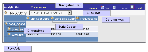
Analytic grid components
Navigating Through Analytic Grid Data
For the most part, the navigation bar at the top of the analytic grid is much like the one associated with an ordinary grid.
In addition, in an analytic grid you can:
Collapse or expand the slice bar by clicking on the arrow to the right of the analytic grid's name (the name is “Analytic Grid” by default), which appears in the grid's upper-left corner.
Collapse and expand the entire grid, provided that the application developer has activated this feature (via the Collapsible Data Area check box on the Use tab of the Analytic Grid Properties dialog box). To do so, you use the arrow to the left of the analytic grid title, which is “Analytic Grid” by default.
Editing Analytic Grid Data
Editing data in an analytic grid is somewhat different from editing data in a standard grid:
Some cells are editable but some cells may be designated as read only.
Calculated cells are read only
In hierarchies (trees), only the lowest level is potentially editable.
The root and total are not editable.
Downloading Analytic Grid Data
You can download the contents of an analytic grid to a Microsoft Excel spreadsheet, much as you can download the data from a regular grid.
See Working With Grids.
Dragging and Dropping Data Cubes and Dimensions
This section outlines the ways in which you can drag and drop data within an analytic grid:
|
Location |
Drag and Drop Possiblities |
|
Row axis |
You can drag from here to the column axis or the slice bar. |
|
Column axis |
You can drag from here to the row axis or the slice bar. |
|
Slice bar |
You can drag from here to the row or column axis. You cannot, however, drag to rearrange objects within the slice bar. |
|
Dimensions |
You cannot drag to rearrange objects within dimensions, whether they are hierarchical or not. |
|
Data cubes |
You cannot reorder data cubes, either on the column or the row axis. |
Pivoting Data Cubes and Dimensions
Using drag and drop, you can easily change the orientation of data cubes and dimensions within an analytic grid to get a different perspective on your data. For example, if your analytic grid's initially displays the Month dimension across the columns, and the Products data cube down the rows, you could pivot the report to display the Months dimension down the rows and the Products data cube across the columns.
To pivot cubes and dimensions within an analytic grid:
Move the mouse pointer over the bullet icon representing a dimension or the cube icon representing a data cube.
The mouse pointer turns into a move cursor (a four-headed arrow), with an associated grabber hand.
Drag the bullet or cube icon from a column heading to a row heading or vice versa.
As you drag, the grabber hand will turn into an international no sign (circle with slash) when you are over locations where you cannot drop. You will instead see a bullet icon (for dimensions) or cube icon (for data cubes) when you drag over locations where you can drop the data cube or dimension.
Note. You can drop data cubes and dimensions onto the row axis, the column axis, and the slicer bar.
Slicing Analytic Grid Data
Slicing allows you to view a subset of your data. You can slice your data by choosing from any list—representing data cubes or dimensions—that appears on the slice bar by default. In addition, you can add data cubes or dimensions to the slice bar and use them to view alternate slices of your data. You can place multiple data cubes or dimensions on the slice bar. You can also slice your data further (viewing subsets of subsets) by choosing members from various data cubes and dimensions upon which to slice.
Note. You can add as many data cubes or dimensions to the slice bar as you like. Three fit per row, so if you add more than three, the fourth and so on are added to a second row on the slice bar. However, note that you can place only a single data cube on the slice bar. When you do so, the analytic grid reflects the data for that data cube only.
To slice your data based on a data cube or dimension that already appears on the slice bar:
Use the list box on the slice bar to display the values for the relevant data cube or dimension.
As an example, for a Months dimension, it would contain a list of months.
Select the desired value from the list box.
The analytic grid changes to show only data related to that value. For instance, if you select the month of March, you will see only data for that particular month.
To add a data cube or dimension to the slice bar and use it to slice your data:
Drag the desired data cube or dimension to the slice bar.
Select a member.
You will now see data related to that member only.
Dimensions that have filter functions applied will behave differently depending on whether they reside on the column axis/row axis or the slice bar. See the following for details.
Working with Hierarchical Dimension Data
Some dimension data has a hierarchical structure. When this is the case, you can expand and collapse dimension data within the analytic grid. In addition, you can drill down into the hierarchy to get a closer look at a particular subset of the data.
To expand or collapse dimension data:
Click the plus sign to the left of the dimension name to expand that dimension, showing all subdimensions immediately underneath it.
This approach expands the dimension one level at a time.
Click the plus sign to the left of any “subdimensions” to expand them as well.
Click the minus sign to the left of any dimension to collapse it.
To drill into and out of dimension data:
Click any dimension or subdimension that has elements beneath it in the hierarchy. (It will be underlined and will have a plus or minus sign to its left.)
The plus or minus sign changes into a Drill out this node arrow, and you see only the dimension or subdimension you clicked on, plus any elements directly underneath it in the hierarchy.
Click the Drill out this node arrow to drill back out within the hierarchy.
The dimension now shows the node you clicked on plus one level above it.
Saving Customized Analytic Grid Layouts
You have learned how to customize the initial layout of the analytic grid by pivoting data cubes and dimensions, viewing selected slices of your data, and more. In addition, you can save your customizations and return to them later. If you have saved a customized layout, you can also easily return the analytic grid to its original settings.
Note. The configuration of the Preferences dialog box will change depending upon whether there is a cube in the column header. If so, you have the option to hide nondimensional fields. If not, this option will not be available.
To save a customized analytic grid layout:
Modify the grid's layout as desired.
Click the Preferences link.
The Preferences dialog box appears.
If applicable, select which nondimensional fields to hide by selecting them and clicking the Hidden check box.
You can hide all nondimensional fields but one. For example, if you have three, you can hide two; if you have four, you can hide three; and so on.
Select the Save Layout check box and click OK.
To restore an analytic grid's default settings:
Click the Preferences link.
The Preferences dialog box appears.
Click Delete Settings.
Note. Delete Settings restores the analytic grid's default layout, and also “unhides” hidden nondimensional fields.
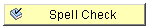
Using Spell CheckPeopleSoft applications are equipped with a spell check feature that you can use on data entered in edit boxes and long edit boxes. Activate spell check by clicking the spell check icon to the right of those fields where spell check is available or by clicking the spell check toolbar button.
In the following example, spell check is available for the Description, Message Text, and Explanation fields.
The Spell Check button opens the Spell Check page. This page displays the errors in the text and offers a list of alternatives, if applicable. You can choose to ignore the occurrence, ignore all occurrences, change the spelling, change the spelling for all occurrences, or add the word to the current language dictionary.
Certain pages, such as those that require an email response, have a mandatory spell check requirement. When you save these pages, the system automatically runs spell check on spell check enabled fields. A field is eligible for automatic spell check if you have changed its contents and you have not already run spell check for that field. If there is more than one spell check field, spell check runs in succession. If there are no errors, the system saves the data without issuing a message.
Using Foreign Language DictionariesSpell check supports 17 languages. The default spell check dictionary is based on your current sign in language. For example, if you select French as your sign in language when you sign in to your PeopleSoft application, your spell check dictionary is also in French. You can change your language dictionary on the My Personalizations page.
To change language dictionaries:
Select My Personalizations from the navigation menu.
Click the Personalize Option button for the General Options personalization category.
Enter the language dictionary that you want in the Override Value edit box for Spell Check Dictionary.
Click OK.
You can only use one dictionary per sign in session. To change language dictionaries again, make the change in My Personalizations and then sign out of the system before proceeding. To return to having your default spell check dictionary selected automatically based on your current sign in language, remove your override value or set it to Use Session Language.
Working With HTML TreesWhen discussing trees, PeopleSoft uses terminology derived from the idea of a family tree. The nodes that report to the root node are called its children; the root node is their parent. Nodes that have the same parent are called siblings.
These terms refer to the relationship between nodes and are not permanent attributes of the nodes themselves. A single node can be a parent, child, and sibling all at the same time. In the following example, Operations Administration is a child of Office of the President and a sibling of Human Resources, Controller, and Retail Banking Admin.
Click the yellow folders with + (plus) signs to expand another level. The leaves represent the lowest level of the tree and are not expandable. Click the links beside the nodes to see representations of the data. Clicking a link either opens an entirely new page or displays data for that link to the right of the HTML tree.
Navigating Within an HTML Tree
Navigate the tree by using the navigational bar (the horizontal bar at the top of the tree) and the navigation path, as shown in the previous example. You can perform the following actions on the selected tree by using the links and images on the navigation bar.
As you find your way through your tree, navigation paths appear above the navigation bar. They show you a basic map of your route through the tree; you can also use them to jump back to a previously visited node. These navigation paths represent nodes in the current branch (A type nodes) and the parent branch of the opened branch (B type nodes). In the example, node 00001 is the parent branch of C10100 and C10100 is the parent node of C10900.
The maximum number of navigation paths displayed is seven. When you exceed that number, the system removes the earlier ancestor nodes.
See Also
Navigating PeopleSoft Tree Manager
Working With Field-Level Prompts and ValidationThis section provides an overview of field-level prompts and validation and discusses how to:
Use look-up prompts.
Use calendar prompts.
Understanding Prompts and Validation
Some edit box fields are linked to database prompt tables, which store values for information shared across your organization, such as department IDs, country codes, and state codes. They are called prompt or lookup tables because you can prompt the system to give you a list of values from which you can select the correct value. In many cases, fields are defined so that the system validates the values that you enter against a prompt table to ensure that the values are valid.
Many of these values have individual prompt tables of their own. For example, currency codes and country codes are each stored in their own tables: CURRENCY_CD_TBL and COUNTRY_TBL. Fields prompting against these kinds of prompt tables appear as edit boxes with a lookup button to the right.
Using Lookup Prompts
To initiate a search, click the lookup button. The Look Up page opens, displaying all valid values for that field up to 300 rows. To narrow your search, you can search by a certain field in the Search By field. If you only have partial data, the search operators in the drop-down list box can help make a search more specific. As with a search page, use the Advanced Look Up page to enter additional criteria by which to search. When you find the field value that you need in the Search Results grid, click the link to automatically populate the field from the original page with your selection.
Alternatively, if you know a partial value of the item you are searching for , you can enter that value on the main page and then click the prompt button, as in the previous example. Search Results is populated with all the choices available to you based on the partial value that you entered.
Note. Your system administrator may opt to exclude extremely large tables from automatically prompting, for performance reasons.
See Also
Using Search Pages to Retrieve Data
Using Calendar PromptsWhen entering information in a date field, you can select the calendar prompt button to the right of the field to help you choose a date. You can also enter the current day's date by entering today in the date field. Press Tab to exit the field; the current date appears. This feature can also use languages specific to the locale.
This example shows the calendar prompt window that displays when you click the prompt button:
To change the calendar month, select the drop-down list box arrow for the month. To change the year, select the drop-down list box arrow for the year. Click the correct day of the month to select the day. Press Esc to cancel and close the calendar.