Viewing Payroll Insights
Payroll Insights provides upper management of an organization the ability to view and analyze payroll expenses, operational data, and trends that are associated with their U.S. and Canada workforce using data visualizations.
These payroll dashboards are built on the PeopleSoft Insights platform, which relies on an underlying analytics engine and search engine. Payroll data that is visible on them comes from U.S. and Canadian payroll search indexes.
These videos provide an overview of Payroll Insights dashboards:
Video: PeopleSoft Payroll Insights
Video: Image Highlights, PeopleSoft HCM Update Image 39: Payroll and Global Payroll Insights Dashboards
Video: Image Highlights, PeopleSoft HCM Update Image 41: Payroll Operations Analytics for North America
Video: Image Highlights, PeopleSoft HCM Update Image 43: Payroll Analytics - Trend Insights
This topic provides an overview of how to set up the dashboards for payroll insights, lists common elements and controls, and discusses payroll insights dashboards.
Understanding PeopleSoft Insights
PeopleSoft Insights is an analytical engine that provides visual reports (visualizations) in the form of charts, tables, graphs and so on. The visualizations are based on queries that retrieve data from the PeopleSoft Search Framework.
These videos provide an overview of the PeopleSoft Insights feature:
Video: Insights with PeopleSoft
Video: PeopleSoft HCM Insights
For information on Insights dashboards, see:
PeopleTools Search Technology: "Monitoring PeopleSoft Search Framework and OpenSearch" and "Working with Insights Dashboards for PeopleSoft Application Data" documentation.
|
Page Name |
Definition Name |
Usage |
|---|---|---|
|
HC_HPY_PAYROLL_INSIGHT_FL_LNK |
Access the Payroll Insights dashboard. |
|
|
HC_HPY_PAYROLL_INSIGHT_FL |
Access Payroll Cost and Operations Analytics. |
|
|
HC_US_PAYROLL_INSIGHT_FL |
Access payroll visualizations on the U.S. Payroll Cost Analytics dashboard. |
|
|
PTSF_KIBANA_COMP (U.S. Payroll Cost Analytics) |
Review and analyze U.S. payroll data using data visualizations. |
|
|
HC_CN_PAYROLL_INSIGHT_FL |
Access payroll visualizations on the Canada Payroll Cost Analytics dashboard. |
|
|
PTSF_KIBANA_COMP (Canada Payroll Cost Analytics) |
Review and analyze Canadian payroll data using data visualizations. |
|
|
HC_US_PAYROLL_OPER_FL |
Access payroll visualizations on the U.S. Payroll Operations Analytics dashboard. |
|
|
PTSF_KIBANA_COMP (U.S. Payroll Operations Analytics) |
Review and analyze operational data for U.S. payroll using data visualizations. |
|
|
HC_CN_PAYROLL_OPER_FL |
Access payroll visualizations on the Canada Payroll Operations Analytics dashboard. |
|
|
PTSF_KIBANA_COMP (Canada Payroll Operations Analytics) |
Review and analyze operational data for Canadian payroll using data visualizations. |
|
|
HC_US_PAYROLL_TRENDS_FL |
Access payroll visualizations on the U.S. Payroll Trends Analytics dashboard. |
|
|
PTSF_KIBANA_COMP (U.S. Payroll Trends Analytics) |
Review and analyze trends for U.S. payroll using data visualizations. |
|
|
- |
View further details of the selected category. |
|
|
HC_CN_PAYROLL_TRENDS_FL |
Access payroll visualizations on the Canada Payroll Trends Analytics dashboard. |
|
|
PTSF_KIBANA_COMP (Canada Payroll Trends Analytics) |
Review and analyze trends for Canadian payroll using data visualizations. |
|
|
- |
View further details of the selected category. |
Before users can access the visualizations for payroll data, the following steps should be performed:
Deploy these payroll indexes:
For Payroll Cost Analytics:
(USA) HC_HPY_CAT_US (Payroll Categories - US) and HC_HPY_MGMT_CHK_US (Payroll Management Checks - US)
(CAN) HC_HPY_CAT_CAN (Payroll Categories - CAN) and HC_HPY_MGMT_CHQ_CAN (Payroll Management Cheques - CAN)
For Payroll Operations Analytics:
(USA) HC_HPY_OPER_CAL_US (Payroll Oper Pay Calendar - US), HC_HPY_OPER_EXC_US (Payroll Oper Exceptions - US), and HC_HPY_OPER_RET_US (Payroll Oper Retropay - US)
(CAN) HC_HPY_OPER_CAL_CAN (Payroll Oper Pay Calendar - CAN), HC_HPY_OPER_EXC_CAN (Payroll Oper Exceptions - CAN), and HC_HPY_OPER_RET_CAN (Payroll Oper Retropay - CAN)
For Payroll Trends Analytics:
(USA) HC_HPY_CT2_US (Payroll Categories 2 - US) and HC_HPY_MGMT_CHK_US (Payroll Management Checks - US)
(CAN) HC_HPY_CT2_CAN (Payroll Categories 2 - CAN) and HC_HPY_MGMT_CHQ_CAN (Payroll Management Checks - CAN)
()
Build deployed payroll search indexes.
()
Deploy payroll tiles and dashboards.
For Payroll Cost Analytics:
(USA) U.S. Payroll Cost Tile and U.S. Payroll Cost Analytics
(CAN) Canada Payroll Cost Tile and Canada Payroll Cost Analytics
For Payroll Operations Analytics:
(USA) U.S. Payroll Operations Tile and U.S. Payroll Operations Analytics
(CAN) Canada Payroll Operations Tile and Canada Payroll Operations Analytics
For Payroll Trends Analytics:
(USA) U.S. Payroll Trends Tile, U.S. Payroll Trends Analytics, and U.S. Payroll Trends Analytics Breakdown
(CAN) Canada Payroll Trends Tile, Canada Payroll Trends Analytics, and Canada Payroll Trends Analytics Breakdown
()
Note: The full index must be run before the dashboard can be deployed.
Assign user roles to users to access and view payroll visualizations for U.S. and Canada respectively.
For Payroll Cost Analytics: NA Payroll Cost Analytics US and NA Payroll Cost Analytics CAN
For Payroll Operations Analytics: NA Payroll Operations US and NA Payroll Operations CAN
For Payroll Trends Analytics: NA Payroll Trends US and NA Payroll Trends CAN
This section lists the common elements and controls that are used in Insights analytics.
For more information on working with data visualizations and filters, see PeopleTools Search Technology, "Working with Insights Dashboards for PeopleSoft Application Data" documentation.
Search and Filter Options:
Note: Filtering options apply to all visualizations, which allows users to drill down on all the charts at once.
|
Term |
Definition |
|---|---|
|
|
Click to save the current query text and filters that you want to reuse in the future, or select an existing query to use to update the visualizations. |
|
Search field |
Enter a query to filter data, if applicable. |
|
|
Enter criteria to filter data on the visualizations. You can apply filters in a number of ways:
Added filters are displayed below the Filters search field for reference. For example, when you select a state or province from the map, the corresponding filter is automatically added to your filters list. When you select the donut chart item for Bonus in the Earnings by Category visualization, the system will prompt you to add the Description: Bonus and Category: Earnings filters since this item consists of more than one filter. Select the Filters link by the search field to hide or show a list of filters that have been applied to the analytics. A badge number appears to show the number of filters currently applied to the analytics. Select the Change all filters icon for a list of actions that can be performed on all filters, for example, disable them temporarily, pin them all so that they can be used between primary and secondary dashboards, delete them permanently, or invert inclusion (show data that does not meet filter criteria). Select a filter item for a list of similar actions that can be performed on it individually. |
|
|
Select a different time period for the analytics. You can enter it manually, or choose from commonly used date ranges provided by the system as well as recently used selections. When a new period is selected, all visualizations are refreshed automatically to reflect that change. If you have selected a commonly used date range, for example, This month, or Week to date, select the Show dates link to view the approximate date period in relation to the current date. For example, the current date is November 1 and the selected date range is Year to date. Selecting the Show dates link displays ~ 10 months ago —> now, which indicates that the selected date range started from approximately 10 months ago and ends on the current date. |
|
(For Payroll Cost Analytics) Company, Business Unit, Department, and Pay Group |
Select to filter payroll data by one or more of these filters, in this order: company, business unit, department, and pay group. To filter by business unit, you must select a company first. Similarly, you must select a business unit before you can filter data by department. Select a department before selecting a pay group as a filter. |
|
(For Payroll Operations Analytics) Company, Pay Group, and Pay Run ID |
Select to filter payroll operational data by one or more of these filters. |
|
(For Payroll Trends Analytics) Company, Pay Group, Business Unit, and Department |
Select to filter payroll data by one or more of these filters, in this order: company, pay group, business unit, and department. To filter by pay group, you must select a company first. Similarly, you must select a business unit before you can filter data by department. |
 (See saved queries)
 (Change all filters), and
  (Calendar) or
 Visualization Options:
When you pause over a visualization, the Options and Legend (if applicable) icons are displayed on the top right and bottom corners respectively. Use them to inspect the chart or table and view the details of that visualization, and toggle the legend display.
|
Term |
Definition |
|---|---|
|
|
Pause over the Options icon to select one of these options:
|
|
|
Select this icon to hide or display the legend for the chart, if available. You can select an item in the legend to change its color, or add it as a filter (if applicable). |
|
Chart item (bar, pie slice, and so forth) |
Pause over a chart item, such as a bar item or pie slice, to view a summary of details for that item. Select a chart item to add a filter for it to apply to all visualizations. |
 (Options)
 (Toggle legend)
Use the Payroll Insights tile to access the Payroll Insights dashboard.
Navigation:
From the Workforce Administrator home page, select the Payroll Insights tile.
This example illustrates the Payroll Insights tile.
Use the Payroll Insights dashboard to access Payroll Cost, Operations, and Trends Analytics.
Navigation:
Select the Payroll Insights tile.
This example illustrates the Payroll Insights dashboard.
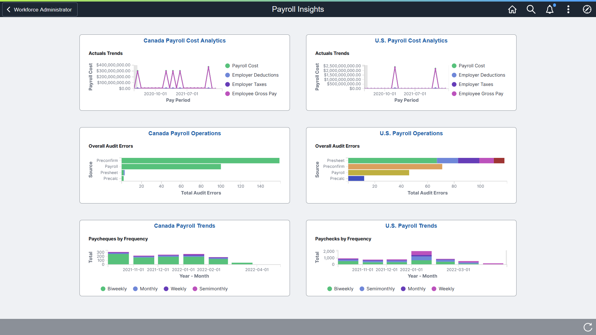
The Payroll Insights dashboard includes these payroll tiles:
You have the option to add other tiles, for example, Payroll WorkCenters, to this dashboard as needed through personalization.
Warning! Dashboards may not render properly if you access them using unsupported platforms.
Use the U.S. Payroll Cost Analytics tile to access payroll visualizations on the U.S. Payroll Cost Analytics dashboard.
Navigation:
The U.S. Payroll Cost Analytics tile is located on the Payroll Insights Dashboard.
This example illustrates the U.S. Payroll Cost Analytics tile.
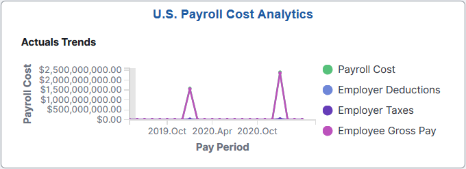
The U.S. Payroll Cost Analytics tile displays the Actuals Trends visualization that is available on the U.S. Payroll Cost Analytics Dashboard.
Use the U.S. Payroll Cost Analytics dashboard to review and analyze U.S. payroll data using data visualizations.
Navigation:
Select the U.S. Payroll Cost Analytics Tile.
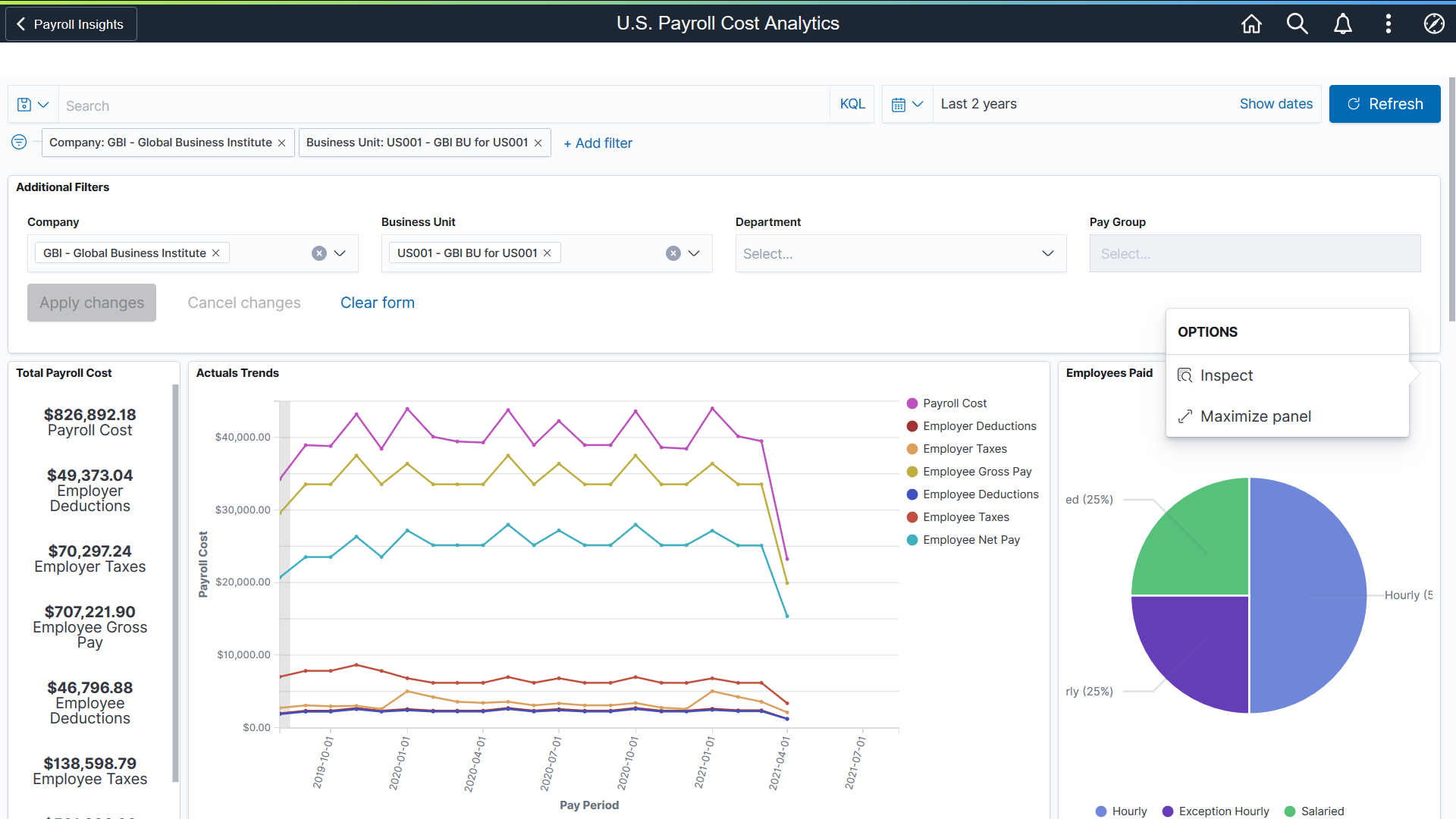
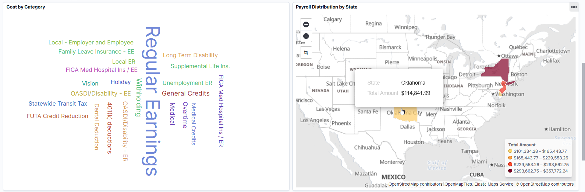
This example illustrates the fields and controls on the U.S. Payroll Cost Analytics dashboard (1 of 3). The dashboard has two filters in place and its visualizations display payroll data for the GBI company and the US001 business unit in the past 2 years. It also shows the Options pop-up that will display when you select the Options icon of a visualization.
This example illustrates the fields and controls on the U.S. Payroll Cost Analytics Dashboard (2 of 3). This screenshot shows the popup menu details that appear when you pause over a chart item on a map visualization.
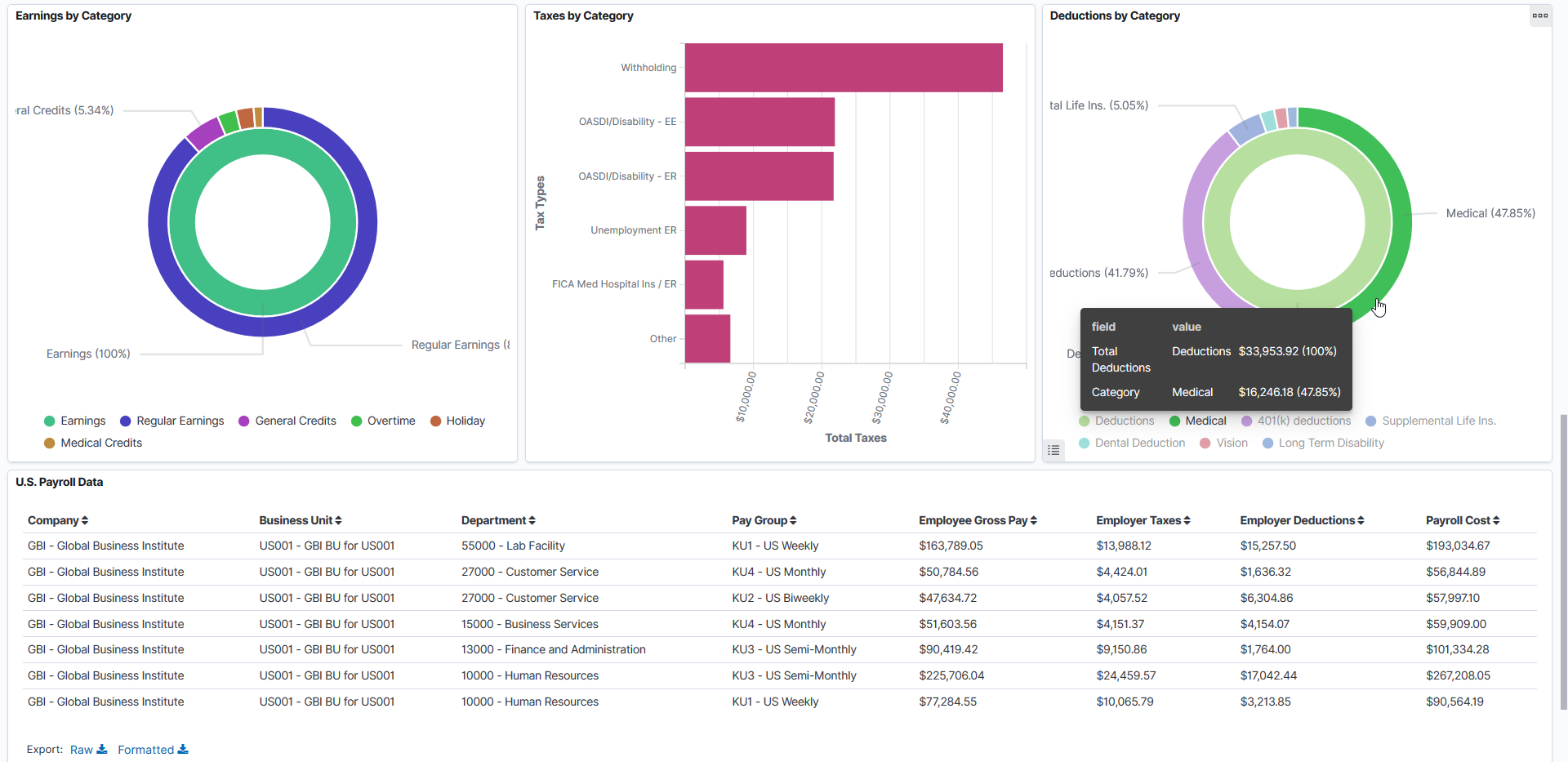
This example illustrates the fields and controls on the U.S. Payroll Cost Analytics Dashboard (3 of 3). The popup menu shows two pieces of information represented by the chart item that you pause over on a 2-level donut visualization.
Using the interactive visualizations that are available on the dashboard, you can see the breakdown of total payroll costs, and compare the trends of different breakdown components over a period of time. You can also view the employee population by type (hourly, salaried, or exception hourly), the distribution of payroll costs by U.S. state or category, as well as the total earnings, deductions and taxes by category. When you select filters or chart items, or modify the date range, the system dynamically updates all visualizations using the source from the index.
The dashboard uses role-level security to display permitted data to the user.
The U.S. Payroll Cost Analytics dashboard delivers these visualizations:
Total Payroll Cost
Actuals Trends
Employees Paid
Cost by Category
Payroll Distribution by State
Earnings by Category
Taxes by Category
Deductions by Category
See Common Elements and Controls.
|
Field or Control |
Description |
|---|---|
|
Total Payroll Cost |
This visualization displays the total cost of payroll and its breakdown numbers. Listed numbers include:
|
|
Actuals Trends |
This line chart visualization presents the trend and highlight fluctuations in various payroll costs. Pause over a point on a line to view the pay period and actuals of the corresponding payroll cost component. |
|
Employees Paid |
This pie chart visualization displays, as a percentage, the breakdown of the total employee population by type, which are:
|
|
Cost by Category |
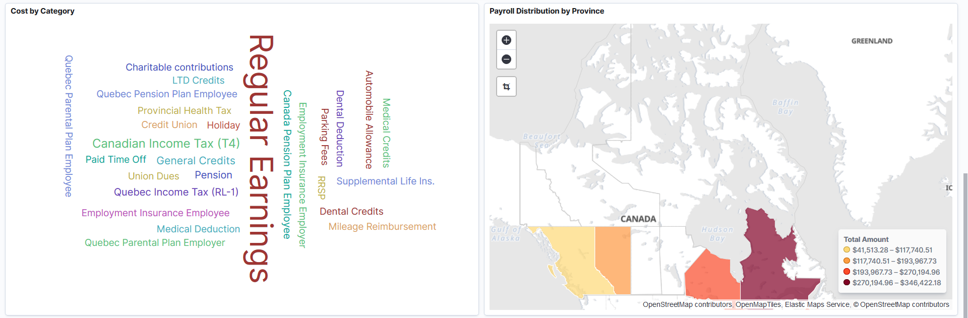
This tag cloud visualization displays common payroll costs that are incurred by the employer. The larger the font size, the higher the payroll cost. |
|
Payroll Distribution by State |
This map visualization represents total payroll costs by U.S. state. The darker the shade, the higher the payroll cost. Selecting on a state changes the visualizations on the dashboard to reflect the information for the selected state. |
|
Earnings by Category |
This donut visualization displays two levels of metrics. The inner ring represents the total earnings. The outer ring breaks down the total earnings in percentage by earnings category. The top 8 earnings categories with the highest amount are shown. Select Other to view the next 8 highest-amount earnings categories, so on and so forth. When Other is selected, the total earnings represented by the inner ring is also refreshed to correspond with the earnings categories displayed in the outer ring. |
|
Taxes by Category |
This horizontal bar chart visualization displays the top 5 employer or employee taxes with the highest amount. Select Other to view the next 5 highest-amount tax categories, so on and so forth. When Other is selected, the dashboard adds a filter that excludes the data pertaining to tax categories previously displayed on this chart, and refreshes its visualizations to reflect the updated information. |
|
Deductions by Category |
This donut visualization displays two levels of metrics. The inner ring represents the total deductions. The outer ring breaks down the total deductions in percentage by deduction category. The top 8 deduction categories with the highest amount are shown. Select Other to view the next 8 highest-amount deduction categories, so on and so forth. When Other is selected, the total deductions represented by the inner ring is also refreshed to correspond with the deduction categories displayed in the outer ring. |
U.S. Payroll Data
This grid lists the payroll data, which is presented in visualizations, in a tabular format.
|
Field or Control |
Description |
|---|---|

(Sort column heading) |
Select a column heading to sort grid rows by the column value in ascending or descending order. |

(Filter for value) and  (Filter out value) |
These filter icons appear when you pause next to a field value. These icons are available for all column values in the grid, and provide a quick way to add filters to the analytics. Select the Filter for value (+ magnify glass) icon to add the shown field value as a filter to all visualizations. For example, if you select to filter for a business unit value, all visualizations will refresh to show payroll data that pertains to that business unit. Select the Filter out value (- magnify glass) icon to remove the shown field value from the filter process for all visualizations. For example, if you select to filter out a business unit value, visualizations will refresh to show payroll data for all except that business unit. Filters can be removed from the Filters area at the top of the page. |
|
Raw or Formatted |
Select to export data from the grid into a .csv file format. |
Use the Canada Payroll Cost Analytics tile to access payroll visualizations on the Canada Payroll Cost Analytics dashboard.
Navigation
The Canada Payroll Cost Analytics tile is located on the Payroll Insights Dashboard.
This example illustrates the Canada Payroll Cost Analytics tile.
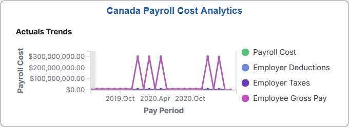
The Canada Payroll Cost Analytics tile display the Actuals Trends visualization that is available on the Canada Payroll Cost Analytics Dashboard.
Use the Canada Payroll Cost Analytics dashboard to review and analyze Canadian payroll data using data visualizations.
Navigation:
Select the Canada Payroll Cost Analytics Tile.
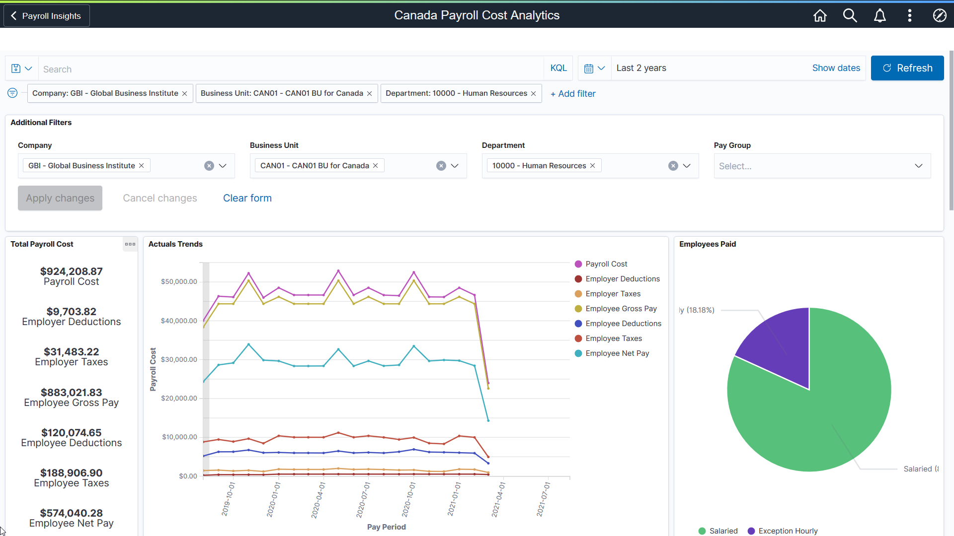
This example illustrates the fields and controls on the Canada Payroll Cost Analytics (1 of 3). The dashboard has three filters in place and its visualizations display payroll data for the GBI company, the CAN01 business unit, and the 10000 - Human Resources department in the past 2 years.
This example illustrates the fields and controls on the Canada Payroll Cost Analytics (2 of 3).
This example illustrates the fields and controls on the Canada Payroll Cost Analytics (3 of 3).
The Canada Payroll Cost Analytics dashboard delivers these visualizations:
Total Payroll Cost
Actual Trends
Employees Paid
Cost by Category
Payroll Distribution by Province
Earnings by Category
Taxes by Category
Deductions by Category
Note: The layout and behavior of the U.S. and Canada Payroll Cost Analytics dashboards are identical, except for the use of Canadian-specific terms and display where appropriate. Refer to the U.S. Payroll Cost Analytics Dashboard topic for details about the Payroll Cost Analytics dashboard.
Use the U.S. Payroll Operations tile to access payroll visualizations on the U.S. Payroll Operations Analytics dashboard.
Navigation:
The U.S. Payroll Operations tile is located on the Payroll Insights Dashboard.
This example illustrates the U.S. Payroll Operations tile.
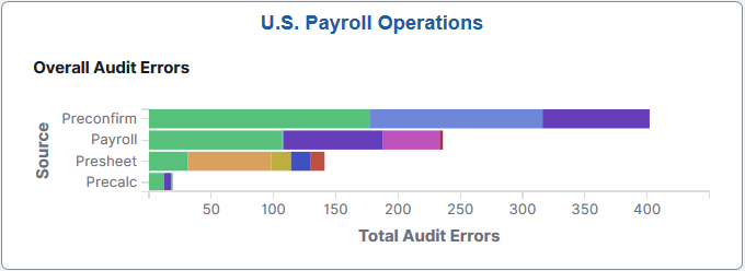
The U.S. Payroll Operations tile displays the Overall Audit Errors by Pay Group visualization that is available on the U.S. Payroll Operations Analytics Dashboard.
Use the U.S. Payroll Operations Analytics dashboard to review and analyze operational data for U.S. payroll using data visualizations.
Navigation:
Select the U.S. Payroll Operations Tile.
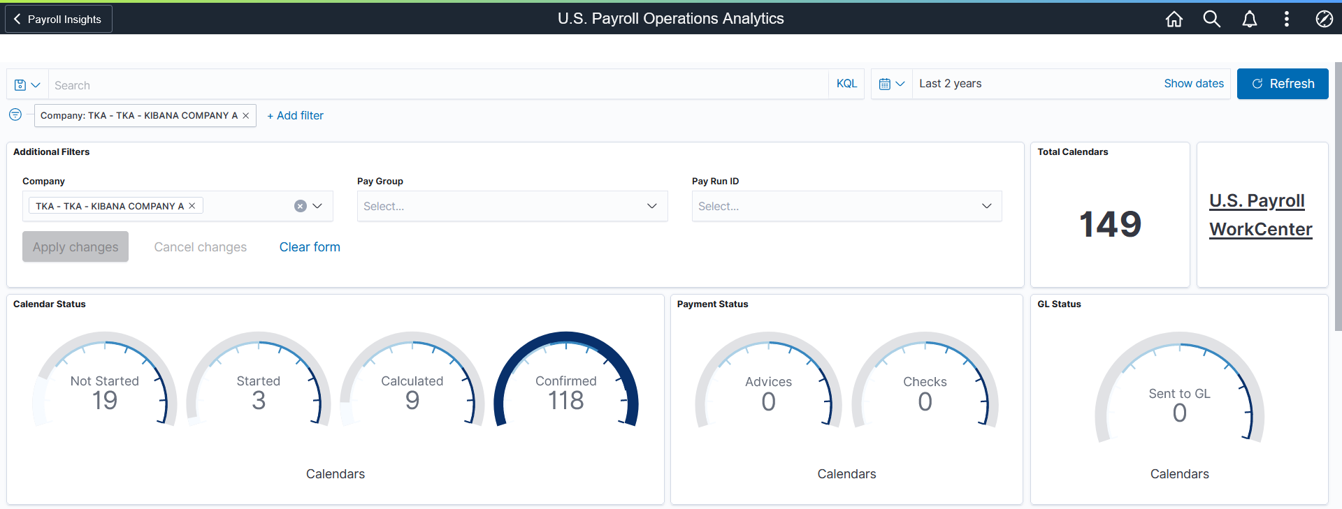
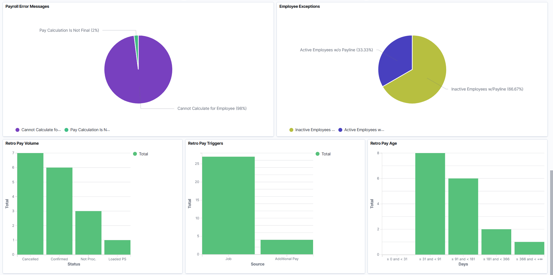
This example illustrates the fields and controls on the U.S. Payroll Operations Analytics dashboard (1 of 3). The dashboard has one filter in place and its visualizations display payroll operational data for the TKA company in the past 2 years.
This example illustrates the fields and controls on the U.S. Payroll Operations Analytics dashboard (2 of 3).

This example illustrates the fields and controls on the U.S. Payroll Operations Analytics dashboard (3 of 3).
Using the interactive visualizations that are available on the dashboard, you can identify potential risks, such as missing payment dates, due to errors. Visualizations also provide insights into how to improve the payroll process, such as changing cut-off dates, reducing volume of off-cycle payrolls, or avoiding retro activity calculation if there are additional payments in the period. When you select filters or chart items, or modify the date range, the system dynamically updates all visualizations.
The dashboard uses role-level security to display permitted data to the user.
The U.S. Payroll Operations Analytics dashboard delivers these visualizations:
Total Calendars
U.S. Payroll WorkCenter
Calendar Status
Payment Status
GL Status
Totals by Error Severity
Overall Audit Errors by Pay Group
Presheet Audit Errors
Precalculation Audit Errors
Preconfirm Audit Errors
Payroll Error Messages
Employee Exceptions
Retro Pay Volume
Retro Pay Triggers
Retro Pay Age
See Common Elements and Controls.
|
Visualization |
Description |
|---|---|
|
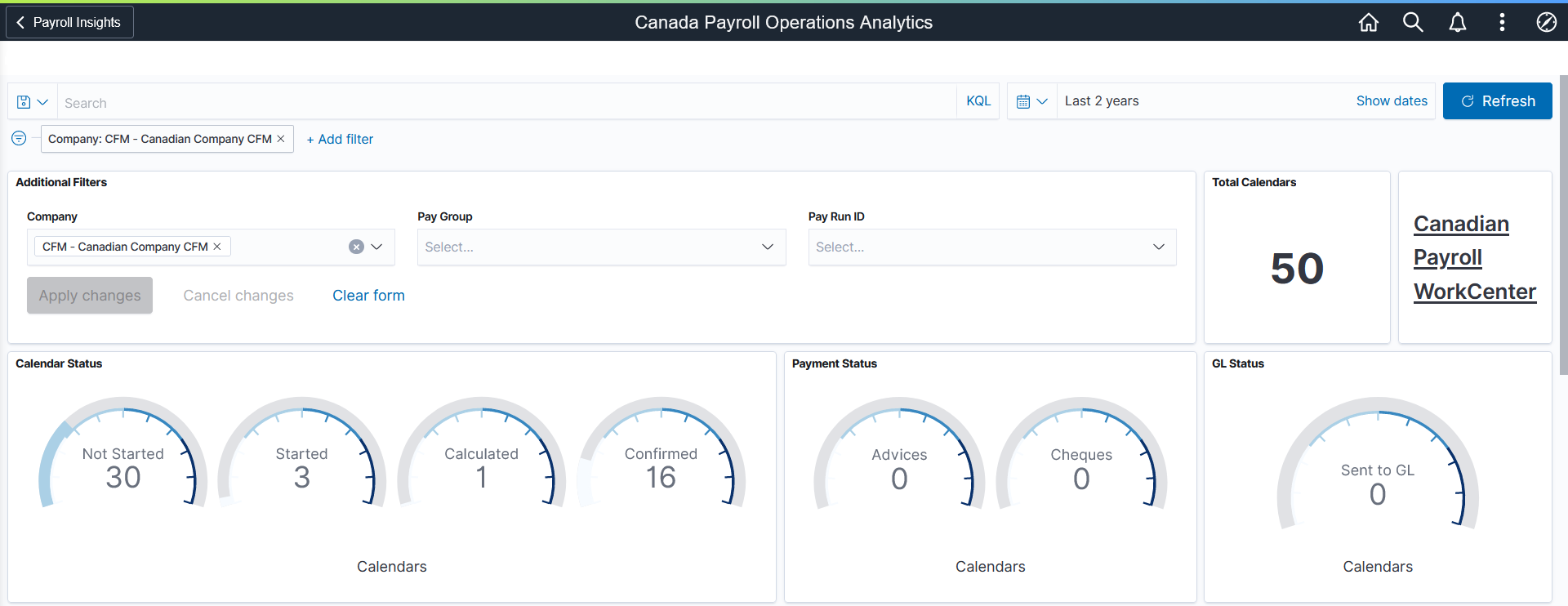
Total Calendars |
This visualization displays the total number of calendars included in the dashboard. |
|
Calendar Status |
This gauge visualization displays, at one glance, the number of calendars distributed by calendar status. The larger the outer dark semicircle, the higher the number of calendars in that status. Available calendar statuses include:
|
|
Payment Status |
This gauge visualization displays the number of on-cycle pay calendars that have successfully run the pay statement processes for paychecks and advices. |
|
GL Status |
This gauge visualization displays the number of calendars that are in the Sent to GL (General Ledger) status. |
|
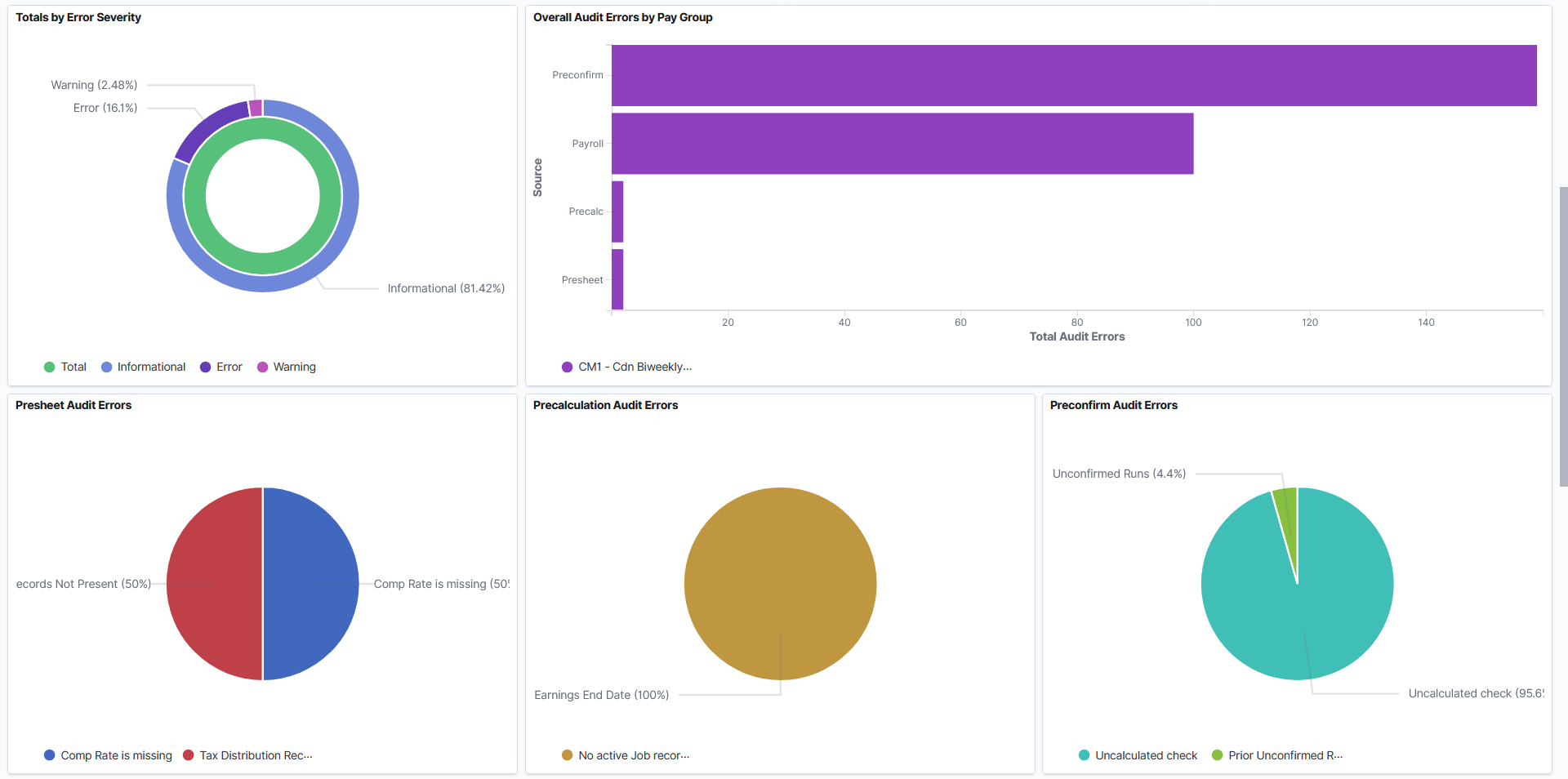
Totals by Error Severity |
This donut chart visualization displays two levels of metrics. The inner ring represents total payroll processing message count and outer ring breaks down the total count by severity (Informational, Error, and Warning). |
|
Overall Audit Errors by Pay Group |
This stacked horizontal bar chart visualization displays the breakdown of payroll processing messages distributed by source and pay group. Results from the audit and error reports will be visible in the dashboard once they have been run with a selected run ID. |
|
Presheet Audit Errors |
This pie chart visualization displays the percentages of presheet audit errors that are captured through the Presheet audit report (PAY034). The top 5 with the highest percentages are shown. Select Other (if available) to view the next 5 messages, and so on. |
|
Precalculation Audit Errors |
This pie chart visualization displays the percentages of precalculation audit errors that are captured through the Precalculation audit report (PAY035) for a specified run ID. The top 5 with the highest percentages are shown. Select Other (if available) to view the next 5 messages, and so on. |
|
Preconfirm Audit Errors |
This pie chart visualization displays the percentages of preconfirm audit errors that are captured through the Preconfirm Audit report (PAY036) for a specified run ID. These are the errors that need to be addressed prior to confirming the payroll. The top 5 with the highest percentages are shown. Select Other (if available) to view the next 5 messages, and so on. |
|
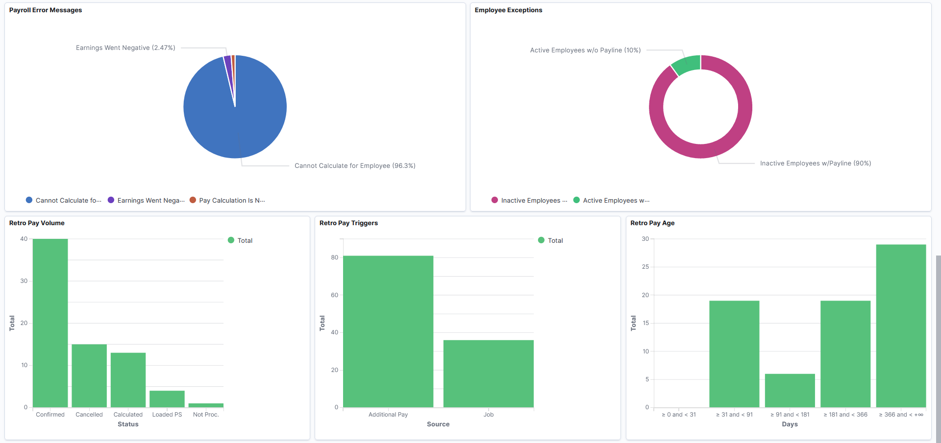
Payroll Error Messages |
This pie chart visualization displays the percentages of payroll errors by message. The top 5 with the highest percentages are shown. Select Other (if available) to view the next 5 messages, and so on. |
|
Employee Exceptions |
This ring visualization displays percentages of employee-specific exceptions (Active Employees without Payline and Inactive Employees with Payline). |
|
Retro Pay Volume |
This vertical bar chart visualization displays the breakdown of retro entries by status. |
|
Retro Pay Triggers |
This vertical bar chart visualization displays the breakdown of retro entries by source record from which the retro trigger is generated. |
|
Retro Pay Age |
This vertical bar chart visualization displays the breakdown of retro entries by day range. Available values are:
|
U.S. Payroll WorkCenter
Select to access the fluid Payroll WorkCenter on a new browser tab or page to view detailed information concerning payroll transactions for all calendars (open and finalized).
To activate the link for the fluid Payroll WorkCenter, the system administrator needs to update the URL identifier with the actual WorkCenter URL on the URL Maintenance page (navigation: PeopleTools, Utilities, Administration, URLs). The names of the URL identifier are:
(U.S. Payroll WorkCenter) PY_OPER_WC_US
(Canadian Payroll WorkCenter) PY_OPER_WC_CAN
The WorkCenter URL will be picked up during the indexing process and used as the Payroll WorkCenter link on the dashboard.
If the fluid Payroll WorkCenter is not used, the system administrator can remove this visualization from the dashboard on the Visualizations page when they edit the dashboard. Here are the names of the fluid Payroll WorkCenter:
(U.S. Payroll WorkCenter) Payroll Oper Link to WC - US
(Canadian Payroll WorkCenter) Payroll Oper Link to WC - CAN
See Also (USA) Using the Fluid Payroll WorkCenter and (CAN) Using the Fluid Payroll WorkCenter.
Use the Canada Payroll Operations tile to access payroll visualizations on the Canada Payroll Operations Analytics dashboard.
Navigation:
The Canada Payroll Operations tile is located on the Payroll Insights Dashboard.
This example illustrates the Canada Payroll Operations tile.
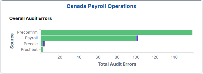
The Canada Payroll Operations tile displays the Overall Audit Errors by Pay Group visualization that is available on the Canada Payroll Operations Analytics Dashboard.
Use the Canada Payroll Operations Analytics dashboard to review and analyze operational data for Canadian payroll using data visualizations.
Navigation:
Select the Canada Payroll Operations Tile.
This example illustrates the fields and controls on the Canada Payroll Operations Analytics dashboard (1 of 3). The dashboard has one filter in place and its visualizations display payroll operational data for the CFM company in the past 2 years.
This example illustrates the fields and controls on the Canada Payroll Operations Analytics dashboard (2 of 3).
This example illustrates the fields and controls on the Canada Payroll Operations Analytics dashboard (3 of 3).
The Canada Payroll Operations Analytics dashboard delivers these visualizations:
Total Calendars
Canadian Payroll WorkCenter
Calendar Status
Payment Status
GL Status
Totals by Error Severity
Overall Audit Errors by Pay Group
Presheet Audit Errors
Precalculation Audit Errors
Preconfirm Audit Errors
Payroll Error Messages
Employee Exceptions
Retro Pay Volume
Retro Pay Triggers
Retro Pay Age
Note: The layout and behavior of the U.S. and Canada Payroll Operations Analytics dashboards are identical, except for the use of Canadian-specific terms and display where appropriate. Refer to the U.S. Payroll Operations Analytics Dashboard topic for details about the Payroll Operations Analytics dashboard.
Use the U.S. Payroll Trends tile to access payroll visualizations on the U.S. Payroll Trend Analytics dashboard.
Navigation:
The U.S. Payroll Trends tile is located on the Payroll Insights Dashboard.
This example illustrates the U.S. Payroll Trends tile.
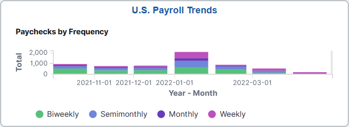
The U.S. Payroll Trends tile displays the Paychecks by Frequency visualization that is available on the U.S. Payroll Trends Analytics Dashboard.
Use the U.S. Payroll Trends Analytics dashboard to review and analyze trends for U.S. payroll using data visualizations.
Navigation:
Select the U.S. Payroll Trends Tile.
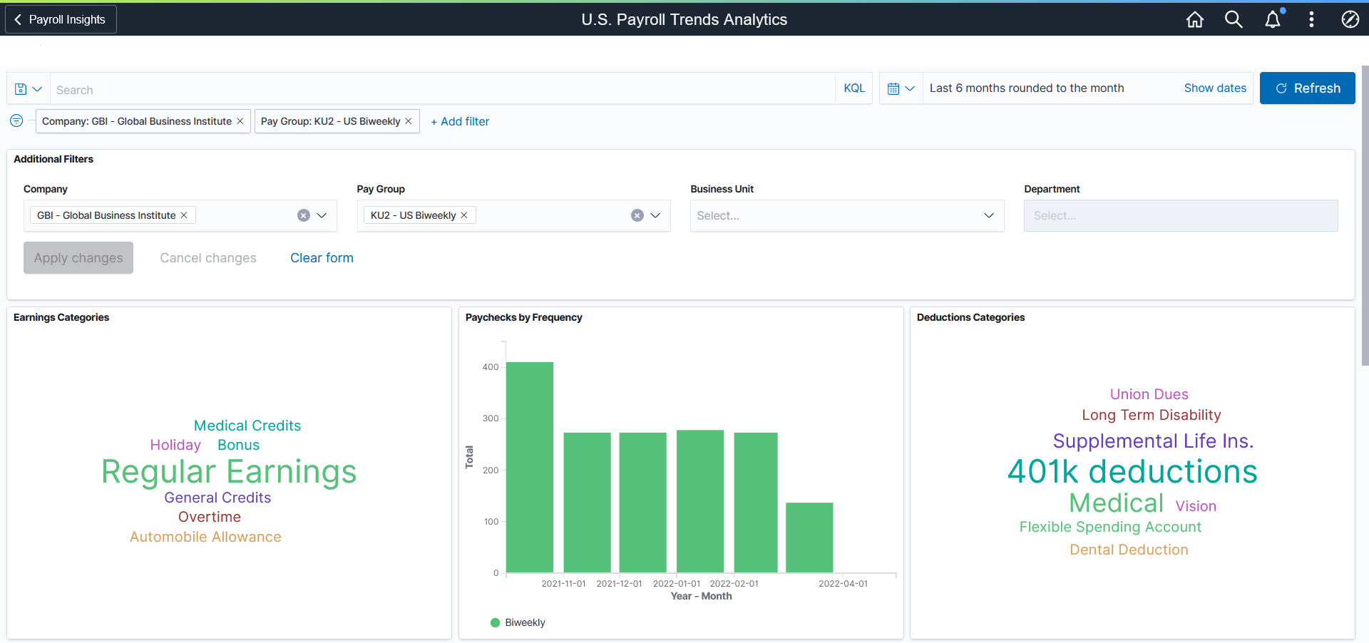
This example illustrates the fields and controls on the U.S. Payroll Trends Analytics dashboard (1 of 3). The dashboard has two filters in place and its visualizations display payroll trends data for the GBI company and KU2 pay group in the past 6 months.
This example illustrates the fields and controls on the U.S. Payroll Trends Analytics dashboard (2 of 3).
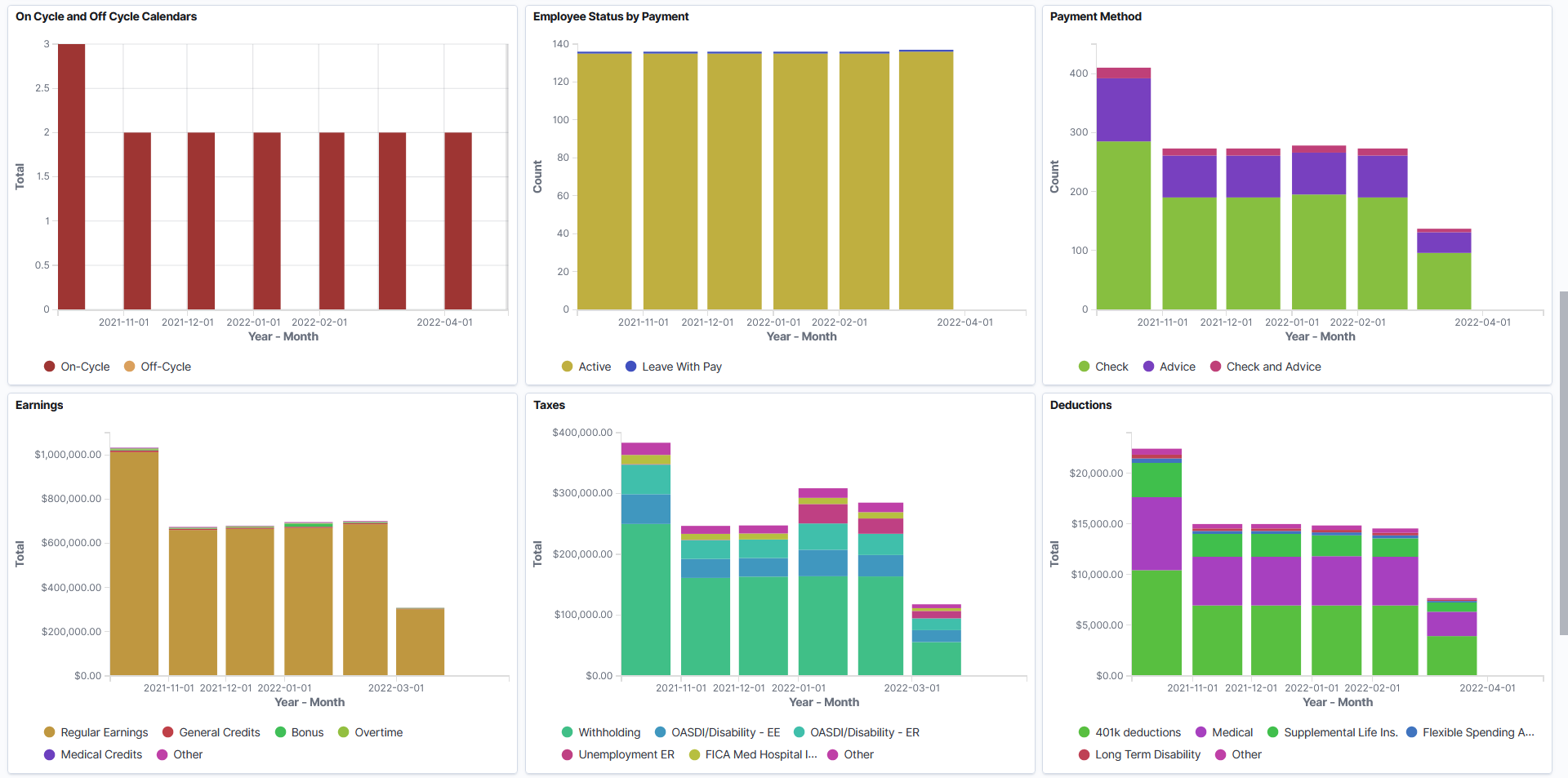
This example illustrates the fields and controls on the U.S. Payroll Trends Analytics dashboard (3 of 3).
U.S. Payroll Trends Analytics consists of two dashboards:
The primary dashboard gives a high-level view of the payroll trends for a specified period in time.
Use interactive visualizations from this dashboard to identify payroll anomalies, such as a spike in the number of off-cycles or a sudden increase in specific earnings, deduction or tax amount.
The secondary dashboard provides a more detailed, closer look at the data, one category at a time.
The dashboard uses role-level security to display permitted data to the user.
The U.S. Payroll Trends Analytics dashboard delivers these visualizations:
Earnings Categories
Paychecks by Frequency
Deductions Categories
On Cycle and Off Cycle Calendars
Employee Status by Payment
Payment Method
Earnings
Taxes
Deductions
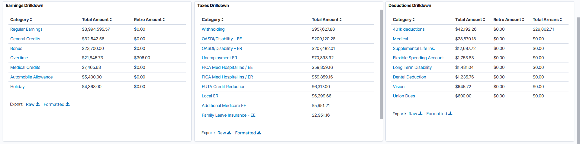
Earnings Drilldown
Taxes Drilldown
Deductions Drilldown
See Common Elements and Controls.
|
Visualization |
Description |
|---|---|
|
Earnings Categories and Deductions Categories |
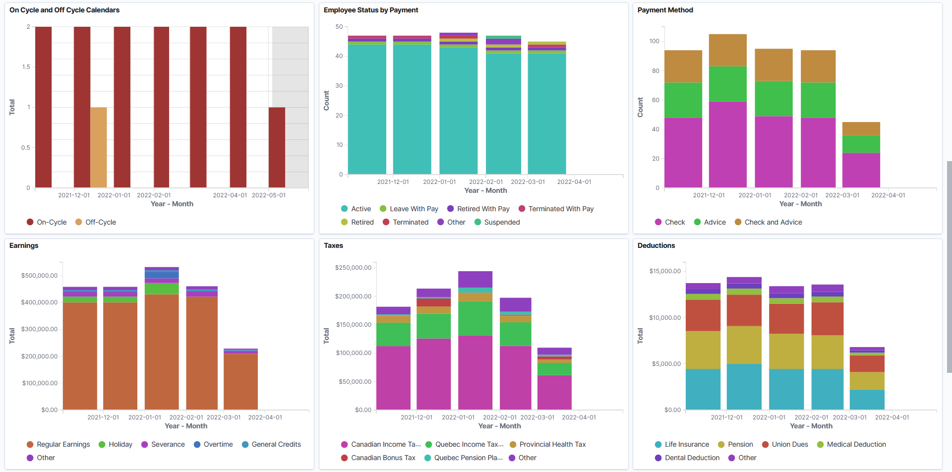
These tag cloud visualizations display common earnings (or deductions) categories in your payroll. The larger the font size, the higher the amount contributed to that category. Payroll administrators can filter the dashboard using tags and examine categories that are associated with unusually large (or small) amounts easily. |
|
Paychecks by Frequency |
This stacked bar chart shows the number of paychecks by pay frequency. |
|
On Cycle and Off Cycle Calendars |
This bar graph visualization displays the number of on-cycle and off-cycle calendars by month. Note: Pay calendars do not include business unit or department information. This visualization does not show any results if you filter the data by business unit or department. When you use the Inspect feature to view or download the data presented in this visualization, the display lists the total on-cycle and off-cycle calendars in chronological order. |
|
Employee Status by Payment |
This bar chart displays employee distribution by payroll status based on the monthly confirmed paycheck information. |
|
Payment Method |
This bar chart displays employees' payment method preferences (check, pay advice, or both). This information can be useful to payroll administrators if they make plans to promote direct deposit payments over checks. |
|
Earnings, Taxes, and Deductions |
These stacked bar charts show the amount distribution for earnings, tax, and deduction categories respectively. |
|
Earnings Drilldown, Taxes Drilldown, and Deduction Drilldown |
Use the Earnings Drilldown visualization to view the list of available earnings categories, as well as the total amount (which includes the retro amount) and the retro amount for each category. Use the Taxes Drilldown visualization to view the list of available tax categories and the total amount for each category. Use the Deduction Drilldown visualization to view the list of available deduction categories, as well as the total amount (which includes the retro amount), the retro amount, and the total arrears value for each category. Select the link of a category to view more information about it in the U.S. Payroll Trends Analytics Breakdown Dashboard. |
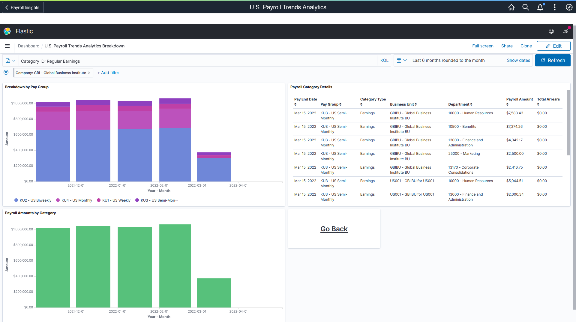
Use the U.S. Payroll Trends Analytics Breakdown dashboard to view further details of the selected category.
Navigation:
Select a category link from a drilldown visualization on the U.S. Payroll Trends Analytics Dashboard.
This example illustrates the fields and controls on the U.S. Payroll Trends Analytics Breakdown dashboard, where the breakdown of the selected category is displayed.
Note: If the Pin all filter option is selected in the primary dashboard, all filters will be carried over to the secondary dashboard.
The purpose of this secondary dashboard is to provide additional information on the category selected from the U.S. Payroll Trends Analytics Dashboard (primary dashboard).
|
Visualization |
Description |
|---|---|
|
Breakdown by Pay Group |
Displays the monthly breakdown of the category by pay group. If the Inspect option is used, the table lists the amounts (from highest to lowest) by month and pay group. |
|
Payroll Amount by Category |
Displays the monthly total amount for the category. Payroll Amount by Category and Breakdown by Pay Group look identical if only one pay group is included in the dashboard. |
|
Payroll Category Details |
Displays additional details about the category from the most recent pay end date by pay group with the total dollar amount as well as any arrears associated with the category. |
|
Go Back |
Select to return to the primary dashboard. |
Use the Canada Payroll Trends tile to access payroll visualizations on the Canada Payroll Trend Analytics dashboard.
Navigation:
The Canada Payroll Trends tile is located on the Payroll Insights Dashboard.
This example illustrates the Canada Payroll Trends tile.
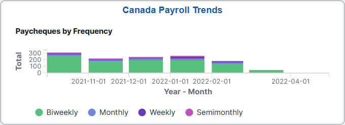
The Canada Payroll Trends tile displays the Paycheques by Frequency visualization that is available on the Canada Payroll Trends Analytics Dashboard.
Use the Canada Payroll Trends Analytics dashboard to review and analyze trends for Canadian payroll using data visualizations.
Navigation:
Select the Canada Payroll Trends Tile.
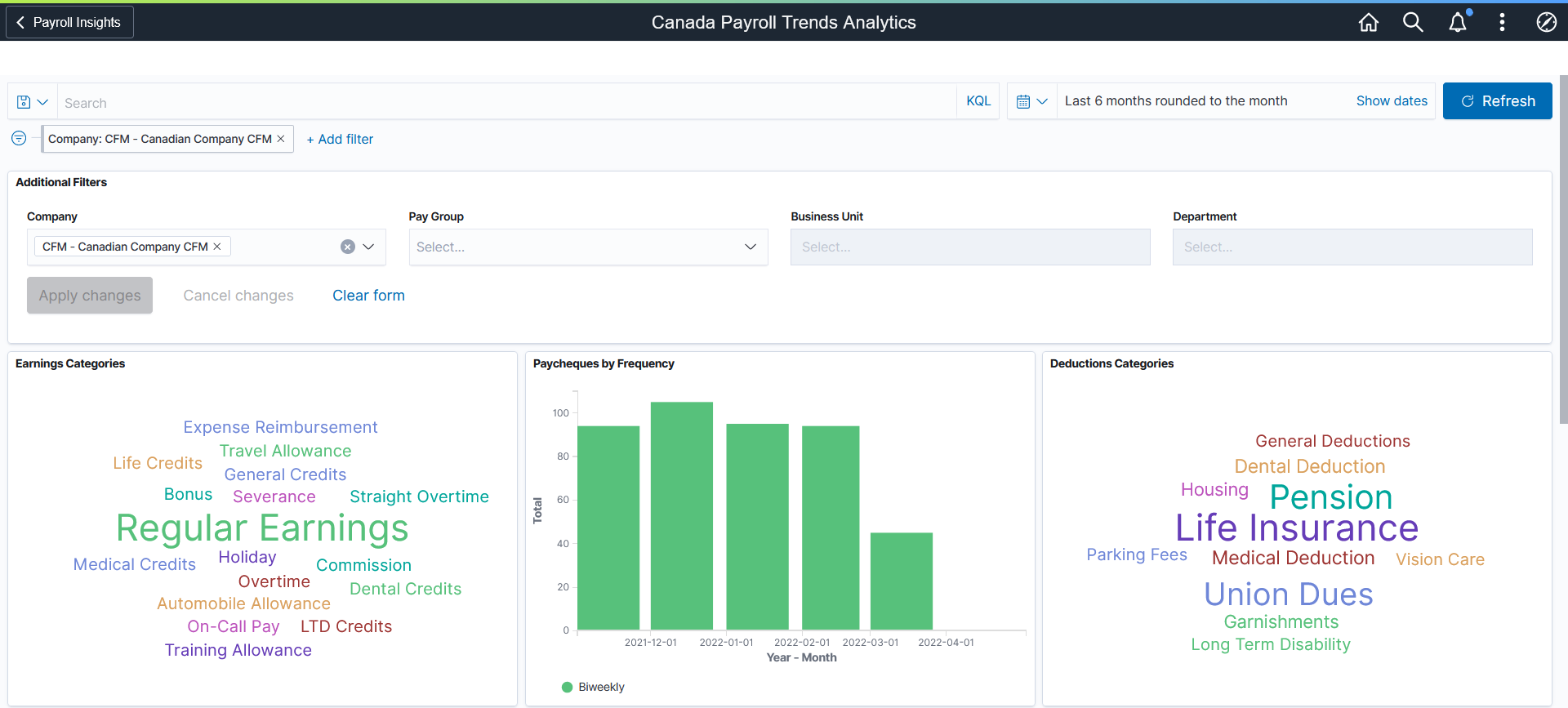
This example illustrates the fields and controls on the Canada Payroll Trends Analytics dashboard (1 of 3). The dashboard has one filter in place and its visualizations display payroll trends data for the CFM company in the past 6 months.
This example illustrates the fields and controls on the Canada Payroll Trends Analytics dashboard (2 of 3).
This example illustrates the fields and controls on the Canada Payroll Trends Analytics dashboard (3 of 3).
The Canada Payroll Trends Analytics dashboard delivers these visualizations:
Earnings Categories
Paycheques by Frequency
Deductions Categories
On Cycle and Off Cycle Calendars
Employee Status by Payment
Payment Method
Earnings
Taxes
Deductions
Earnings Drilldown
Taxes Drilldown
Deductions Drilldown
Note: The layout and behavior of the U.S. and Canada Payroll Trends Analytics dashboards are identical, except for the use of Canadian-specific terms and display where appropriate. Refer to the U.S. Payroll Trends Analytics Dashboard topic for details about the Payroll Trends Analytics dashboard.
Use the Canada Payroll Trends Analytics Breakdown dashboard to view further details of the selected category.
Navigation:
Select a category link from a drilldown visualization on the Canada Payroll Trends Analytics Dashboard.
This example illustrates the fields and controls on the Canada Payroll Trends Analytics Breakdown dashboard.
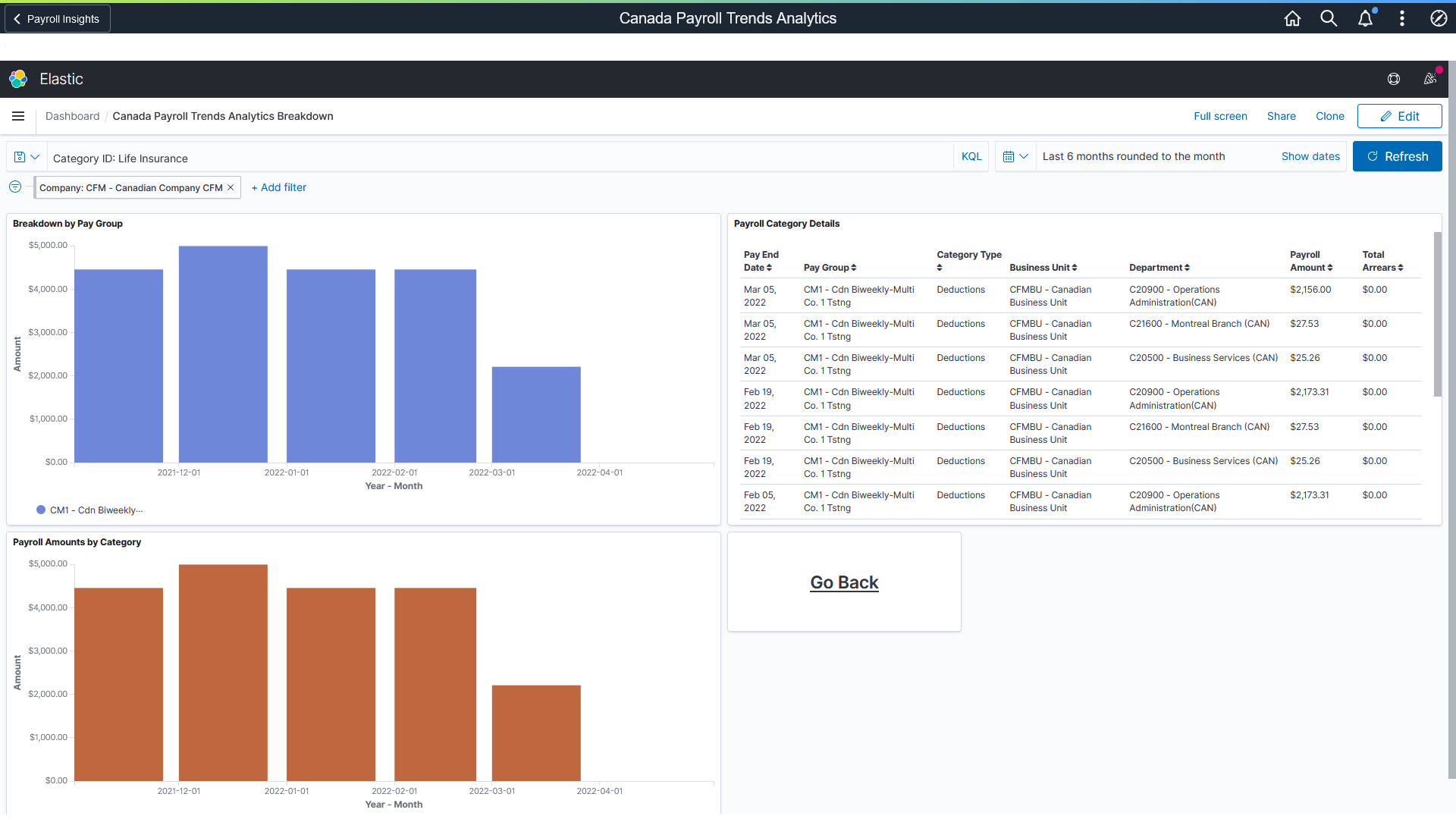
Note: The layout and behavior of the U.S. and Canada Payroll Trends Analytics Breakdown dashboards are identical, except for the use of Canadian-specific terms and display where appropriate. Refer to the U.S. Payroll Trends Analytics Breakdown Dashboard topic for details about the breakdown dashboard.