Using Box Plots
This topic discusses how to use Box Plots.
|
Page Name |
Definition Name |
Usage |
|---|---|---|
|
None |
Display and compare process performance of multiple subsets. |
|
|
None |
Modify settings or display characteristics for active box plots window. |
Use the Box Plots panel to display and compare process performance of multiple subsets.
Navigation:
Click the Box Plots button.
This example illustrates the fields and controls on the Box Plots panel. You can find definitions for the fields and controls later on this page.
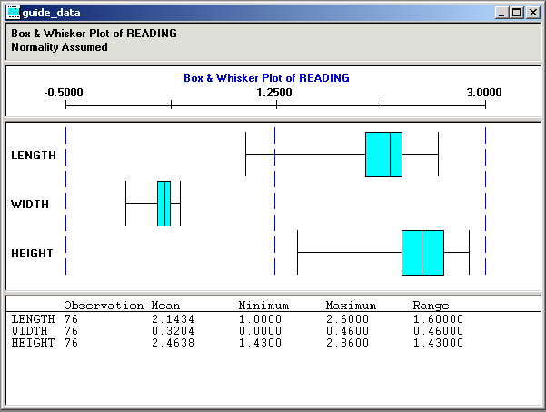
The box plots display is comprised of multiple graph panes (sections), with each section displaying information about the subset that you are examining. Box plots are also referred to as Box and Whisker plots, because of the vertical whisker lines at each end of the horizontal scale.
Box plots supports three styles of plots, including:
Box and Whisker
Capability
Min/Max (minimum/maximum)
When you select multiple subsets on the Selector panel and click the Box Plots button, the displays represent the subsets you select. All selected subsets are overlaid together in the same box plots window.
You can select individual box plots by clicking the subset name. A red box appears around the subset that you selected. The detail section of the display changes from the collective summary of statistics for all box plots to individual summary statistics for the selected subset.
Deselect an individual box plot by clicking above the first box or below the last box in the label area. Click to the left of the boxes.
Title Section
This section includes a heading that indicates the plot type, the data column used as the basis for generating the box plots, and normality criteria for the calculations used to generate the box plots. In the previous illustration, the plot type is Box and Whisker, the data column is Reading, and the normality criteria is Pearson Best Fit.
The graph preference that you select on the Selector panel determines the normality criteria.
Scale Section
This section displays the name of the data column that you are analyzing and a scale, which exhibits the box plot's limits. In the previous illustration, the data column is Reading and the graph type is Box and Whisker.
Note: By default, the system calculates the scale based on the minimum/maximum values of the data to be graphed.
Chart Section
Section contents vary depending on the graph style.
The Box and Whisker chart section contains Box and Whisker displays. The ends of the whisker lines represent the minimum and maximum values, the left and right edges of the boxes represent the first quartile and third quartile values, and the centerlines represent the median value.
The individual boxes correspond to either the subsets that you selected or the data groupings established with the group by column role assignment on the Selector panel.
A capability graph appears in this section:
This image displays the capability graph.
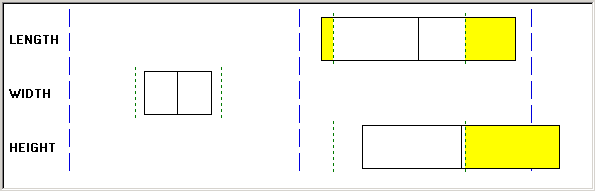
The left and right edges of the capability graph box represent the plus and minus 3 sigma values, and the centerline represents the mean value. In addition, green dashed lines represent the lower-and upper-specification limits, while yellow parts represent the areas out of specification based upon the distribution fitting (Normality, Pearson Best Fit) criteria in effect.
Individual boxes correspond to either the subsets that you selected or the data groupings established with the group by column role assignment on the Selector panel.
A min/max graph appears in the following section:
This image displays the min/max graph.
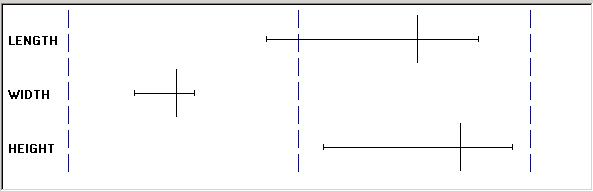
The left and right endpoints represent minimum and maximum values, and the centerline represents the mean.
The individual boxes correspond to either the subsets that you selected or the data groupings established with the group by column role assignment on the Selector panel.
Detail Section
This section of box plots includes the collective summary statistics for all box plots on the display. If you select an individual box plot, then the summary statistics for that individual box plot appear.
Use the Modify Box Plot dialog box to modify settings or display characteristics for active box plots window.
Navigation:
Open a box plot.
You can modify the box plots using the following:
Field or Control |
Description |
|---|---|
Graph Style |
Select a graph style for the chart section of the box plots display. Options are:
|
Fit Plots to Window |
Select to expand the chart to fit the full size of the box plot chart display, eliminating the vertical scroll bar. |
Overlay + / - 3 Sigma Region |
Select to overlay each capability box in the box plots window with a distribution curve. This option is only applicable when the graph style is set to Capability. |
Graph Scale Limits |
The system calculates and displays scales by adding and subtracting a percentage of the upper- and lower-plot values that are based on option and graph type selections. You can change the lower and upper graph scale limits, which change how the box plots appear in the window. The scale section of the display changes to reflect the new graph scale limits. The scale that you enter stays in effect until you select another graph style or (sometimes) when you change the overlay 3 + / - Sigma Region check box. If you change any setting that could potentially alter the assessment of minimum/maximum plot values, the system recalculates the scales. |
An example of a box plot with distribution curves overlaid appears in the following section:
This image displays the overlaying distribution curves.
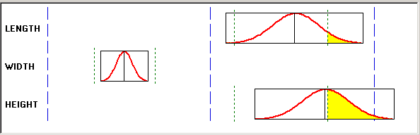
Note: The system calculates the distribution curve according to the normality/curve fitting criteria in effect by the graph preference ID that you selected.