Working with Group Boxes
This topic discusses the many uses of group boxes while creating fluid applications.
Group boxes are essential containers used for the layout of the fluid page as well as containers for encapsulating and managing control and widget behavior, positioning, and appearance.
Any fluid page must have at least one over-arching group box to contain all other elements of the page. Depending on the number of controls and complexity of the page, additional group boxes can be added. The group box can be used to indicate visual cues but it can also act as a logical grouping of related controls. Using the fluid properties for a group box, you can override or customize the style at each group box layer.
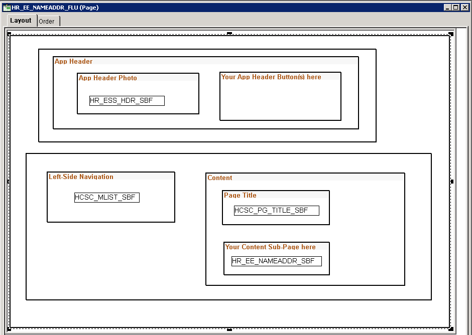
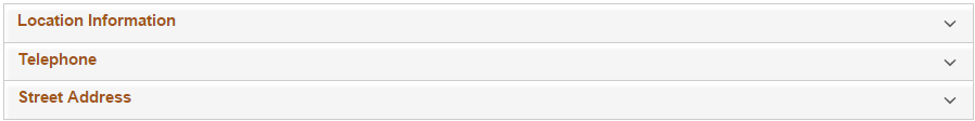
The following example illustrates the use of multiple group boxes in the layout of the fluid page, clearly separating the page elements into distinguishable parts, enabling individual control if needed. For example, the Page Title group box and the Your Content Sub-Page here group box can have individual styles applied if needed.
Every Fluid page should start with a group box. Typically, the outer group box for primary or secondary pages should have the style of ps_apps_content class, though there are exceptions as with 2 panel display. While the ps_apps_content style would not typically be used in subpages, subpages should reside within a containing group box as well.
This example illustrates how group boxes are used in the layout of the fluid page, clearly separating the page elements into distinguishable parts.
In general, it is recommended to be generous in the use of group boxes to layout and organize your page elements. However, group boxes are not just used for layout purposes. For some controls and widgets, it is required that they be encapsulated within a group box in order to apply behavior characteristics.
In addition to using group boxes as a container with a header (the default type of group box), a group box can have additional functions and behaviors. The most common is the usage of a layout type of group box. Layout group boxes are used to enclose elements for specific layout purposes. Some layouts are defined by styles only.
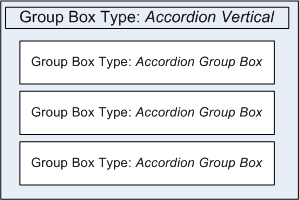
Some group boxes have additional types, like the Accordion Vertical group box which allows for multiple embedded Accordion group boxes to provide the behavior of a mutually exclusive display of group box, with only one of the Accordion Group boxes expanded and visible at any one time. Group boxes can even be put inside of grids to create new virtual columns containing multiple stacked fields.
Group boxes are the most critical element with which you should become familiar for fluid page development.
Note: Embedded help is not supported for group boxes, grids, and scroll areas on fluid pages.
This section describes properties specific to group boxes on a fluid page that you can set on the Fluid tab of the Group Box Properties dialog box.
This example illustrates the options available on the Fluid tab of the Group Box Properties dialog box. Descriptions of the options follow the example.
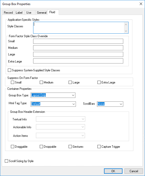
Style Classes and Form Factor Style Class Override are common properties to all fluid controls. See Setting Properties on the Fluid Tab.
|
Field or Control |
Description |
|---|---|
|
Group Box Type |
|
|
HTML Tag Type |
Selecting an HTML tag type enables you to create proper HTML structure as defined by HTML specifications.
|
|
Scroll Bars |
|
|
Group Box Header Extension |
You can specify three different types
of group box header extensions by selecting a group box of type Group Box Header Extension from
the list of available extensions, which are identified by
|
|
Draggable |
Indicates that content can be dragged out of the group box area. Users initiate drag and drop by using touch on touch screen devices and by using the mouse for desktops and laptops. |
|
Droppable |
Indicates that content can be dragged into the group box area. |
|
Gestures |
Select for group boxes where the drag, drop, and swipe gestures need to be available. Use to limit the scope of the drag, drop and swipe features so that these events are set and invoked efficiently. For example, assume you want to allow dragging an element from group box A to group box B, and the parent of these two group boxes is group box C. If you select Gestures for group box C, you do not need to set it individually for group box A and B. |
|
Capture Trigger |
Select for a group box that acts as a container "hotspot" for multiple display-only columns and a hidden trigger field. See Implementing Multiple Hotspots for Grid Rows for more information. |
|
Scroll Sizing by Style |
Indicates that the size of the scroll will be controlled by style. By default, PeopleTools attempts to control the sizing of the group box to accommodate the size of the current page size. If you want to restrict the size of the group box stylistically (using classes and CSS), you can do this so that the system does not attempt to change the size of the group box as needed. |
Container group boxes can be used as a standard container, similar to classic application usage. Use group boxes to associate relevant page field controls and to create a page that is intuitive to the user.
When using container group boxes, keep these items in mind:
A default, system style provides a standard look and feel.
A header will be generated if a label is defined.
Custom styles can be used to override default styles.
The default HTML tag used for group box is “div,” which you can override with the HTML Tag Type option.
You can set the group box as Section and Article elements.
Can be used as a collapsible data area.
The Accordion is a web control that allows you to provide multiple, collapsible panes and display them one at a time. With an accordion group box,
When working with the accordion feature:
Set the parent group box container as Accordion Vertical for vertical accordion behavior (up and down) or Accordion Horizontal for horizontal accordion behavior (left and right).
Set the children group boxes (the group boxes that will be the recipient of the expanding and collapsing behavior) as Accordion Group Boxes.
Note: Horizontal Accordion group boxes should not be used in the current release. It is reserved for internal use.
This example illustrates that when creating an accordion construct, the outer group box is assigned the Accordion Vertical group box type, and the content within resides in group boxes of type Accordion Group Box.
This example illustrates how an accordion group box appears initially, after page load, with all sections collapsed, by default.
This example illustrates how one section can be expanded at a time, showing the page content within, while keeping the other sections collapsed, saving display space.
The layout group box is used only for layout for positioning its child elements. When using layout group boxes, keep these items in mind:
No default look and feel style is applied, such as no border.
No header will be generated.
The label set for the group box will be ignored at runtime, but can be used at design time for reference.
Before creating any sort of custom header (also referred to as an “application header”), become familiar with the default system header page definition, PT_HEADERPAGE.
You can use the Custom Header Left/Middle/Right/Bottom group box types to reparent custom controls to the default header. You will notice that the default PT_HEADERPAGE header page definition contains a left box, middle box, right box and a bottom box. Each of these group boxes also contains a Custom group box; these correspond directly to the Custom Header group box types and are used to inject custom application controls into the header page sections. On your page definition, create Custom Header Left/Middle/Right/Bottom group box types as needed for your custom controls. At runtime, the content of the Custom Header group boxes will replace the content of the related Custom group box in the header page.
Note: During page rendering, the system identifies the first focusable field based on the organization of the page definition and places the cursor there unless overridden by SetCursorPos PeopleCode. When adding custom buttons to the header of a primary page or a secondary page (for example, when using any of the Custom Header group box types), place the group box with the custom buttons at the bottom of your page definition. This will prevent the custom button from being identified by the system as the first focusable field.
Alternatively, if you do not want to use the default system header page, you can create your own custom header page.
Use related field group boxes to group or associate a set of fields. The fields will be enclosed in
<fieldSet>…</FieldSet>
The group header will be within <legend> instead <h..>.
The Collapsible Data Area option should not be used for related field group boxes.
You can display embedded related content on a fluid page using the Related Content group box type. Then, existing tile definitions can be configured as embedded related content on these fluid pages either as an anonymous service or as an explicitly defined related content service using the PeopleSoft Tile URL type.
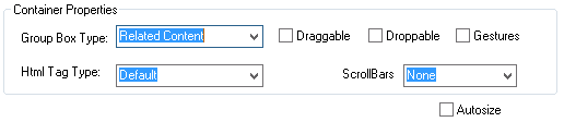
This example illustrates setting the Group Box Type value to Related Content,, which then displays the Autosize check box.
The following procedure provides an example of adding embedded related content to your fluid page. You will complete the first task in Application Designer and then the final task using the Manage Related Content Service component in the browser.
Adding a Related Content Group Box for Embedded Related Content
To add a related content group box for embedded related content only:
Insert a group box on your fluid page in the general position you would like to display embedded related content.
Double-click the group box to open the Group Box Properties dialog box. Then, on the Fluid tab, set the Group Box Type to Related Content.
For interactive embedded related content, you can select the Autosize check box if you always want the content to be fully visible; for non-interactive embedded related content, leave this check box deselected.
(Optional) Apply styling, if needed, to this group box using styles. Recall that the system applies default styles, and you would only require additional styling to override or enhance the default styling. One of the options for styling is to override the default sizing. If no additional styling is specified, then the embedded related content consumes the default size, which depends on the container or page.
Enter styles in the fields in the Application-Specific Styles area. For example, to use less than the full width of the container or page, enter the percentage of the width. For example:
psc_width-80pct.Select the Label tab and enter a descriptive label to identify this related content group box as a drop zone. This label is not rendered at run time, but it will help at design time by:
Differentiating this drop zone from any others on the page.
Providing a label on the drop zone during fluid page preview.
Providing a label for the drop zone during the related content configuration task.
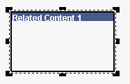
This example illustrates a related content group box added to a fluid page with a label for identification as an embedded related content drop zone.
Save your changes.
Note: When a related content group box is configured in this manner, it can be used for embedded related content only. To create a related content group box that can be used for either dynamic subpages or embedded related content, see Inserting Configurable Drop Zones.
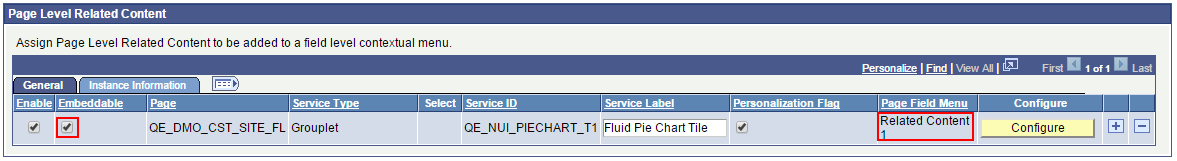
Assigning Page-Level Embedded Related Content
In the browser, select .
Click the Assign Related Content to an Application Page link and select the content reference associated with the component for your fluid page.
On the Configure Related Content page, configure the embedded related content in the Page Level Related Content group box as described in Assigning Related Content to Fluid Components and Pages.
The following example illustrates configuration of embedded related content on a fluid page.
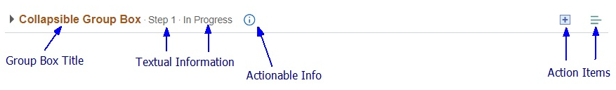
You can create group box header extensions to display additional information and actions related to the contents of the primary group box. Three types of header extensions can be defined:
Textual Info: This textual information is placed immediately to the right of, and becomes part of, the group box title. Its purpose is to provide short, text-only information about the group box and its contents.
Actionable Info: This clickable control is placed immediately to the right of the textual information (if that extension has been defined). Its purpose is to provide a clickable button or icon that displays additional information about the group box and its contents in a modal window or a message box, or that transfers the user to another page containing the additional information.
Action Items: One or more action items are placed at the far right of the group box header. Each action item is a clickable button or icon representing an action associated with the group box contents. For example, actions can be, but are not limited to, adding items, deleting items, a pop-up menu, transferring to another page, and so on.
In this example, the primary group box title appears at the left followed by textual information. Each element of the textual information is preceded by a dot. The actionable information icon immediately follows the textual information. Two action items are displayed at the right margin of the group box header.
To create and associate header extensions with a primary group box:
Create one or more group boxes of type Group Box Header Extension.
Add one or more controls to each group box depending on the type of extension you are defining. See the following sections for additional information.
Create the primary group box if it does not exist already:
On the Label tab, specify the label for the group box.
On the Fluid tab, select either Default or Container as the group box type.
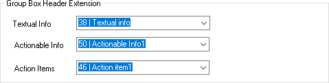
On the Fluid tab under Group Box Header Extension, select one or more extensions, which are identified by
tab_order_# | Group_Box_Label.This example shows selection of group box header extensions.
Textual Info Extensions
Add one or more of these display-only text controls inside the group box:
Check box – On the Use tab, also select Text Only as the display-only appearance.
Drop-down list box – On the Use tab, also select Text Only as the display-only appearance.
Edit box.
HTML area – Use inline HTML tags only. No interactive HTML elements can be used. In addition, do not use block-level tags, such as div, p, section, and so on.
Long edit box – On the Use tab, also select Expand Field When Display Only.
Static text
In addition:
All controls must be set to Display Only.
If you wish to add a dot separator before each text field displayed in the group box header, add the psc_dot-before style to the extension group box itself. Alternatively, you can add the psc_dot-before style to individual text controls to add a dot before that control only. For an HTML area, you must add either ps-text or ps_box-value to the HTML elements inside the HTML area. For example:
<span class="ps-text">Simple <i>HTML</i> Area</span>
Actionable Info Extensions
Add one actionable control that defines a clickable button or icon that displays additional information about the group box and its contents in a modal window or a message box, or that transfers the user to another page containing the additional information.
Action Item Extensions
Add one or more actionable controls that defines an action item as a clickable button or icon representing an action associated with the group box contents. For example, actions can be, but are not limited to, adding items, deleting items, a pop-up menu, transferring to another page, and so on
Additional Considerations
When implementing group box header extensions, consider this additional information:
Group box header extensions are not supported for group boxes used as grouplets.
Group box header extensions are also not supported for group boxes within grids. However, extensions are supported for group boxes within scroll areas.
Do not assign the same group box header extension to more than one main group box on the page.
Because group boxes are essential to the layout of the fluid page and all of its elements, being able to determine exactly the contents of a group box container is also essential. Select Layout Only on the Fluid tab of the Component Properties dialog box.
This example illustrates where you enable group box layout testing on the Component Properties dialog box, by selecting Layout Only.
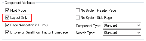
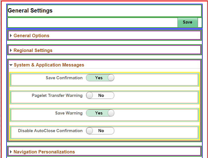
At run time, the system displays the fluid page in the browser using different colored boxes to depict the scope of each group box on the page, providing visual indication for you to verify the scope and contents of each group box container.
This example illustrates the different colored boxes indicating the scope and coverage of each group box using the My Preferences page (PTGP_USER_PERS_FL).