Configuring Overlay
Note: Chart overlay is available when the display option is Chart Only and the data appears in bar charts.
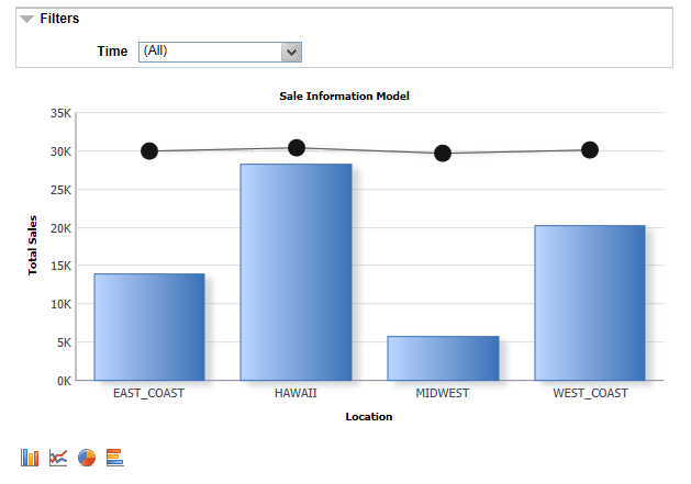
If the display option is Chart Only in the Specify Data Model Options page, selecting a column as an overlay field results in plotting multiple charts based on the Y axis and the overlay field. In this example, Unit Cost is used as an overlay field.
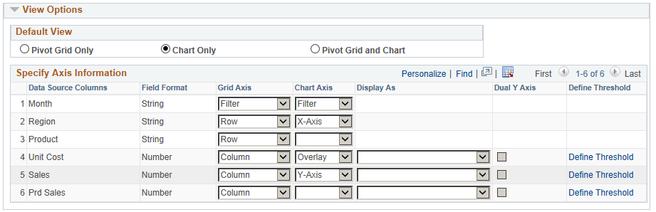
The chart is plotted with Region as the X axis and Unit Sales as the Y axis. The second chart is plotted with Region as the X axis and Unit Cost as the Y axis.
Note: You can change the overlay field using fields in the Specify Data Model Options page, Chart Options section.
See also, Limitations of Charts and Gridsfor limitations on overlay.