Step 5: Specifying Pagelet Display Options
This section lists common elements and discusses how to specify pagelet display options. This is step 5 in the Pagelet Wizard pagelet creation process. Specifically, this section discusses how to:
Specify table display options.
Specify passthru display options.
Specify search list display options.
Specify menu display options.
Specify list display options.
Specify chart display options.
Specify custom display options.
Specify data link details.
This section discusses common elements used in this section.
Common Links
This table describes the common links used in this section.
Field or Control |
Description |
|---|---|
|
Click the Link Options icon to display the Link Details page, where you can associate URLs with field values, which at runtime appear on the pagelet as active links that you click to access additional relevant information. |

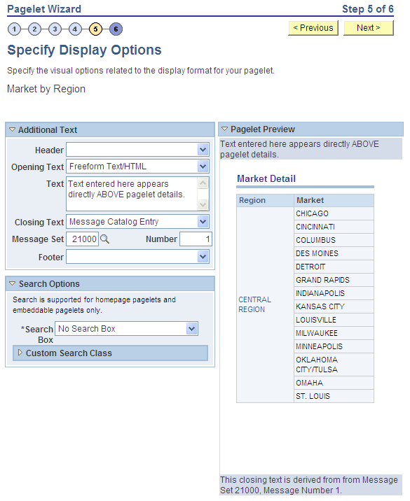
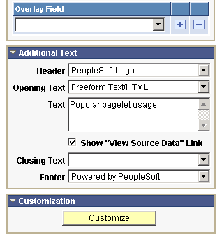
Additional Text
The Additional Text group box contains options to add headers, footers, opening text, and closing text to a pagelet.
Field or Control |
Description |
|---|---|
Header |
Select a pagelet header. You can select from headers that are defined on the Define Header page. See Defining Headers. |
Opening Text |
Select the type of opening text that you want to appear on the pagelet. Options are: Freeform Text/HTML: The Text field appears. Enter the opening text that appears on the pagelet. Message Catalog Entry: The Message Set and Number fields appear. Select the message set and message number that appear as opening text on the pagelet. You can select from the messages defined in the database. See Message Catalog. |
Show “View Source Data” Link |
Displays when PS Query is selected as the data source for a pagelet. Select to display the Full Query Results link on the pagelet. Click the Full Query Results link to access the full results of the query used for the pagelet. |
Closing Text |
Select the type of closing text to appear on the pagelet. Options are: Freeform Text/HTML: The Text field appears. Enter the closing text that appears on the pagelet. Message Catalog Entry: The Message Set and Number fields appear. Select the message set and message number that appear as closing text on the pagelet. You can select from the messages defined in the database. |
Footer |
Select a pagelet footer. You can select from footers that are defined on the Define Footer page. See Defining Footers. |
Search Options
The Search Options group box contains the options to override the default search functionality for the current pagelet only.
See Defining Pagelet Wizard Transformation Types, Display Formats, and Data Types.
Field or Control |
Description |
|---|---|
Search Box |
Select a value from these options to determine the location of the search box field:
|
Package |
Enter the application class package name that you want to use to define and build the search for the pagelet. |
Path |
Enter the names—delimited by colons—of each subpackage in the hierarchy that drills down to the class that contains the method used to define and build the search for the pagelet. |
Class ID |
Enter the application class name that you want to use to define and build the search for the pagelet. The class must exist in the application package and subpackage that you specify. |
Note: If you have not defined default Search Option values for the data type on the Define Data Types page (PeopleTools, Portal, Pagelet Wizard, Define Pagelet Data Types), the Package, Path, and Class ID fields have no default values. You must enter values if you want to activate the pagelet search feature.
Customization
The Customization group box contains the option to customize your pagelet.
Field or Control |
Description |
|---|---|
Customize |
standardClick to customize the pagelet by applying a custom XSL template, or by directly editing the XSL resulting from the pagelet display options that you have defined so far. When you click Customize, you switch from a standard display format selected on the Select Display Format page to a custom format of your definition. The XSL field is populated based on preexisting display options that are set for the original standard display format. You can edit the XSL directly in the XSL field and retain as much of the original standard display options as you want. Remember that if you apply an XSL template using the XSL Template field, the XSL is regenerated based on the selected template, and the original standard display options that you have set may be overridden. Making any edits to the XSL, either directly or by assigning a template, disconnects the pagelet definition from the original standard display format. When you click the Customize button, the current pagelet definition is saved for restoration purposes. You can revert to this standard pagelet definition by clicking the Undo Customizations button. Clicking this button assigns your pagelet to the Custom design format on the Select Display Format page - Step 4. When you return to the Specify Publishing Options page - Step 5, you access the version of the page for the Custom display format. |
After selecting the Table option on the Select Display Format page, select the Specify Display Options page ( On the Select Display Format page, click the Next button.)
This example illustrates the fields and controls on the Specify Display Options page for the table display format. You can find definitions for the fields and controls later on this page.
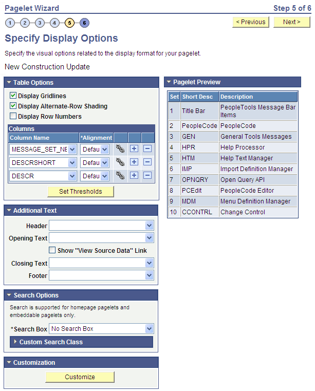
Table Options
Select options that will display grid lines, alternate row shading, and row numbers on the table-formatted pagelet.
Columns
Field or Control |
Description |
|---|---|
Column Name |
Displays possible column headings provided by the selected data source parameters. Use the drop-down list boxes to set the order in which the columns appear on the table-formatted pagelet. Use the Add button or the Delete button to add or remove columns. |
Alignment |
Specify the alignment of the text in the column. Options are Center, Left, and Right. |
|
Click the Link Options icon to display the Link Details page, where you can associate URLs with field values, which at runtime appear on the pagelet as active links that you click to access additional relevant information. |

Setting Thresholds
Access the Set Thresholds page by clicking the Set Thresholds button in the Table Options of step 5 in Pagelet Wizard.
This example illustrates the fields and controls on the Set Thresholds page. You can find definitions for the fields and controls later on this page.
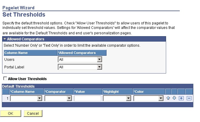
Use the Set Thresholds page to set the column alignment and threshold options.
Field or Control |
Description |
|---|---|
Allowed Comparators |
The system displays the column names and enables you to set the comparators for that column based on numbers, text, or both. |
Allow User Thresholds |
Select to enable users to set their own threshold values for the table from the Personalization page. |
Set the display order and attributes of each column. Use the up and down arrows to change the display order of the columns, if necessary. Each column threshold can have a unique color associated with it—duplicates are allowed. If more than one threshold rule applies for a given value, the rule that is positioned highest in the list is the one that is applied.
Field or Control |
Description |
|---|---|
Column Name |
Select the column name from the drop-down list box. |
Comparator |
Select a comparator value for each column. |
Value |
Enter the threshold value for the column. When this value is reached, the highlight and color attributes become active. |
Highlight |
If you choose to have highlighting for the threshold, select either the entire row or just a single cell. |
Color |
Select the color for the column. |
|
Use the arrows to move each individual column up or down in the table. |


Pagelet Preview
Displays a preview of the pagelet based on most display option settings on this page.
After selecting the Passthru option on the Select Display Format page, select the Specify Display Options page. (Select On the Select Display Format page, click the Next button.)
Note: For OBIEE Reports and pivot grids, Passthru is the only display format option.
This example illustrates the fields and controls on the Specify Display Options page for the passthru display format. You can find definitions for the fields and controls later on this page.
Additional Text
Field or Control |
Description |
|---|---|
Header |
Select a value from this field to display a header below the pagelet header, but above any opening text. |
Opening Text |
Select a value to include text above the pagelet details. Select from these values:
|
Text |
Enter text or HTML. This field appears when you select Freeform Text/HTML as the opening or closing text. |
Closing Text |
Select a value to include text below the pagelet details. Select from these values:
|
Footer |
Select a value from this field to display a footer above the Footer bar, but below any closing text. |
Pagelet Preview
Displays a preview of the pagelet based on most display option settings on this page.
After selecting the Search List option on the Select Display Format page, select the Specify Display Options page. (Select On the Select Display Format page, click the Next button.)
This example illustrates the fields and controls on the Specify Display Options page for the search list display format. You can find definitions for the fields and controls later on this page.
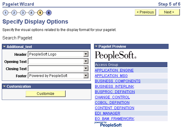
Pagelet Preview
Displays a preview of the pagelet based on most display option settings on this page.
After selecting the Menu option on the Select Display Format page, select the Specify Display Options page (Select On the Select Display Format page, click the Next button.)
This example illustrates the fields and controls on the Specify Display Options page for the menu display format. You can find definitions for the fields and controls later on this page.
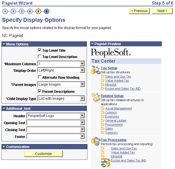
Menu Options
Field or Control |
Description |
|---|---|
Top Level Title |
Select to have the menu pagelet display the top-level title defined in the underlying navigation collection. |
Top Level Description |
Select to have the menu pagelet display the top-level description defined in the underlying navigation collection. |
Maximum Columns |
Select the number of columns to display (options are 1 through 4) on the navigation collection menu pagelet. Narrow pagelets display contents in one column. Wide pagelets can display contents in up to four columns. |
Display Order |
Select the order in which you want navigation collection elements to appear on the menu pagelet. When you create a navigation collection, you define the order of folders and links in the collection using options in the Placement Properties group box on the Edit Folder page and the Edit Link page. Options are: Left to Right: Select to display the elements from left to right on the menu pagelet. Top to Bottom. Select to display the elements from top to bottom on the menu pagelet. |
Alternate Row Shading |
Select to display alternate row shading on the menu-formatted pagelet. |
Parent Images |
Select the type of images that you want to display for parent-level navigation collection elements (folders) on the menu pagelet. When you create a navigation collection, the collection definition includes specified large and small images that appear for parent-level elements in the navigation collection. Options are: Large Images: Select to have the menu pagelet display the large folder image defined for the underlying navigation collection. No Images: Select to prevent parent-level images from appearing on the menu pagelet. Small Images: Select to have the menu pagelet display the small folder image defined for the underlying navigation collection. |
Parent Descriptions |
Select to have the menu pagelet display parent-level folder descriptions defined in the underlying navigation collection. |
Child Display Type |
Select the display type for child links on the menu pagelet. Options are: Comma Delimited: Displays the maximum number of child links separated by commas. List with Images: Displays the maximum number of child links accompanied by icons. This icon is the small content image selected in the navigation collection system or registry options for the underlying navigation collection. Simple List: Displays the maximum number of child links, one child link per row. No bullets, numbers, or icons appear in the list. |
Pagelet Preview
Displays a preview of the pagelet based on most display option settings on this page.
After selecting the List option on the Select Display Format page, select the Specify Display Options page. (Select On the Select Display Format page, click the Next button.)
This example illustrates the fields and controls on the Specify Display Options page for the list display format. You can find definitions for the fields and controls later on this page.
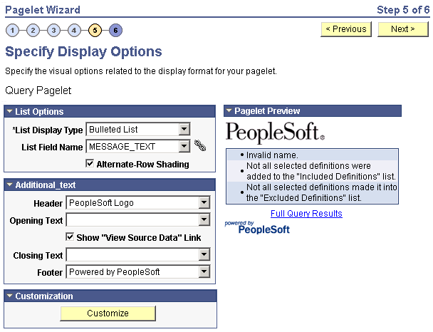
List Options
Field or Control |
Description |
|---|---|
List Display Type |
Select the list format for displaying query results on the list pagelet. Options are: Bulleted List: Displays query results in a bullet list. Numbered List: Displays query results in a numbered list. Simple List: Displays query results in a list with no bullets or numbers. |
List Field Name |
Select the field for which values are displayed in the list on the pagelet. |
Alternate-Row Shading |
Select to use alternate-row shading on the list pagelet. |
Pagelet Preview
Displays a preview of the pagelet based on most display option settings on this page.
After selecting the Chart option on the Select Display Format page, select the Specify Display Options page. (Select On the Select Display Format page, click the Next button.)
This example illustrates a portion of the fields and controls on the Specify Display Options page for the chart display format. You can find definitions for the fields and controls later on this page.
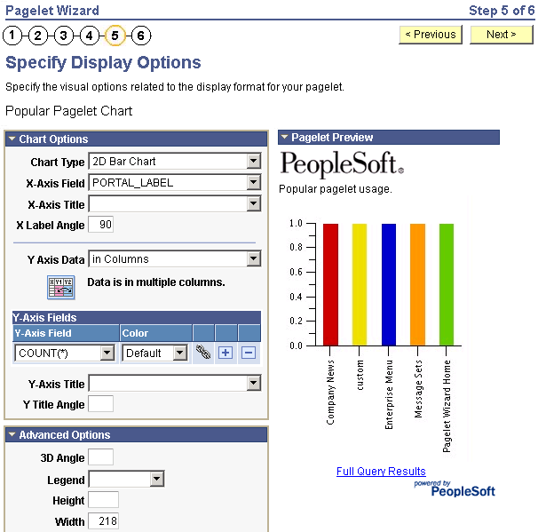
This example illustrates the remainder of the fields and controls on the Specify Display Options page for the chart display format. You can find definitions for the fields and controls later on this page
To generate a chart pagelet using Pagelet Wizard, you include information related to the chart’s x and y axes. The y axis is the axis that contains the query data. In most charts, the y axis is the vertical axis. However, in a horizontal bar chart, the y axis is the horizontal axis. The x axis is the axis against which the y-axis data is measured.
For example, a chart pagelet might have a y axis that displays the number of times that a pagelet has been accessed. This access count could be displayed against an x axis that shows the name of the pagelet accessed.
Chart Options
Field or Control |
Description |
|---|---|
Chart Type |
Select the type of chart to use to display the query results on the pagelet. Available chart formats are those supported by the PeopleCode Chart class. |
X-Axis Field |
Select the field to use to derive x-axis values for the chart. Available values are determined by the output fields of the data source. |
X-Axis Label |
Select the field that you want to use to derive the labels for the x-axis values for the chart. Available values are determined by the output fields of the data source. |
X Label Angle |
Enter the angle at which you want the text of the x-axis labels to appear along the x axis on the pagelet. |
Y Axis Data |
Select to indicate whether the y-axis data is stored in rows or columns in the selected query. This enables Pagelet Wizard to read query data and generate the chart. in Columns: Select if the y-axis data is stored in columns. |
In this example, the query data is stored in columns (labeled Revenue and Profit) as shown here:
|
Quarter |
Revenue |
Profit |
|---|---|---|
|
Q1 |
3562 |
1010 |
|
Q2 |
3473 |
1290 |
|
Q3 |
4568 |
1490 |
|
Q4 |
5668 |
2769 |
Field or Control |
Description |
|---|---|
Y Axis Data (continued) |
in Rows: Select if the y-axis data to be used to generate the chart is stored in rows. |
In this example, the same data is stored in rows with Revenue and Profit stored as data values in the Type column as shown here:
|
Quarter |
Type |
Value |
|---|---|---|
|
Q1 |
Revenue |
3562 |
|
Q1 |
Profit |
1010 |
|
Q2 |
Revenue |
3473 |
|
Q2 |
Profit |
1290 |
|
Q3 |
Revenue |
4568 |
|
Q3 |
Profit |
1490 |
|
Q4 |
Revenue |
5668 |
|
Q4 |
Profit |
2769 |
Field or Control |
Description |
|---|---|
Y-Axis Field |
Select the field that you want to use to derive y-axis values for the chart. Available values are determined by the output fields of the data source. If you set the Y Axis Data field to in Columns, you can select up to four y-axis fields to create a chart pagelet that displays data for multiple fields. For example, if you track sales figures for several departments over multiple years, you can assign each department its own y-axis value. |
Color |
Select the color for the y-axis data. If you select multiple y-axis fields, selecting a different color for each field improves pagelet usability. This option is available only if the y-axis data is in stored columns. |
Y-Axis Series |
This field is available if the Y Axis Data field is set to Rows. Select the field to use to generate a color-coded series of y-axis data. Colors are automatically assigned, but you can override them by supplying custom XSL. |
Advanced Options
Field or Control |
Description |
|---|---|
3D Angle |
If you select a 3D chart type, enter the angle at which you want the 3D data to be displayed. |
Legend |
Select the area of the pagelet for the chart legend to appear. Options are:
|
Height |
Enter the height of the chart in pixels. |
Width |
Enter the width of the chart in pixels. If you do not enter height or width values, the chart is automatically sized based on the pagelet position and size (narrow or wide). |
Overlay Fields |
Select up to three fields for which you want to display data using a line drawn over the background chart. Overlays apply to all chart types except 2D and 3D pie charts. |
Pagelet Preview
Displays a preview of the pagelet based on most display option settings on this page.
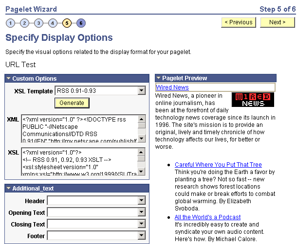
After selecting the Custom option on the Select Display Format page, select the Specify Display Options page. (Select On the Select Display Format page, click the Next button.)
This example illustrates the fields and controls on the Specify Display Options page for the custom display format. You can find definitions for the fields and controls later on this page.
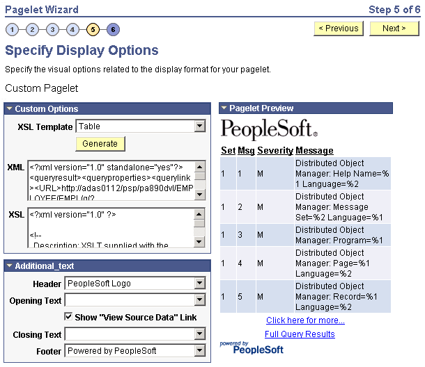
Custom Options
Field or Control |
Description |
|---|---|
XSL Template |
Select the XSL template to use to generate the custom format pagelet. Available XSL templates are defined on the Define XSL page. Only XSL templates defined for the selected data source are displayed. |
Generate |
Click to generate custom XSL for the pagelet based on the selected XSL template. This XSL is displayed in the XSL text box and is applied to the XML in the XML text box to generate the pagelet preview. |
Pagelet Preview
Displays a preview of the pagelet based on most display option settings on this page.
Access the Link Details page. (Click the Link Options icon on the Specify Display Options page.)
This example illustrates the fields and controls on the Link Details page. You can find definitions for the fields and controls later on this page.
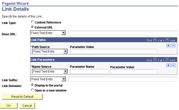
You can access this page for field or column names that appear on the Specify Display Options page if you select the table, rowset, list, and chart formats. Entering information on the Link Details page enables you to associate URLs with field values, which at runtime appear on the pagelet as active links that you click to access additional relevant information.
Pagelet Wizard builds the column data link in the follow way using link path, parameter, and suffix values:
http://baseURL/linkpath1/linkpath2/…/linkpathN/?parm1=val1&parm2=val2&…&parmN=valNlinksuffix
Field or Control |
Description |
|---|---|
Link Type |
Select the type of link destination to define for the data. Options are: Content Reference: Select to define data links to a content reference. External URL: Select to define data links to an external URL. |
Portal Name |
Select the portal in which the content reference resides. This field appears when you select Content Reference as the link type. |
Content Reference |
Select the content reference to which the link points. This field appears when you select Content Reference as the link type. |
Base URL |
Enter the URL to which you want the link to point. This field appears when you select External URL as the link type. Options are: Specified by Data: Select to have the system dynamically generate the link information based on the selected data field. Fixed Text Entry: Select to hard-code the link information by entering a value. |
Link Paths
Field or Control |
Description |
|---|---|
Path Source |
Select the method to use to determine the link destination. Options are: Specified by Data: Select to have the system dynamically generate the link information based on the selected data field. Fixed Text Entry: Select to hard-code the link information by entering a value. |
Link Path |
This field appears if you select Specified by Data as the path source. Select the data field to use to generate the link. |
Parameter Value |
This field appears if you select Fixed Text Entry as the path source. Enter a parameter value. |
Link Parameters
Field or Control |
Description |
|---|---|
Name Source |
Select the method to use to determine the link destination. Options are: Specified by Data: Select to have the system dynamically generate the link information based on the selected data field. Fixed Text Entry: Select to hard-code the link information by entering a value. |
Parameter Name |
Enter a value that corresponds to the value in the Parameter Value field. |
Parameter Value |
If you have selected Specified by Data as the name source, select a data field. If you selected Fixed Text Entry as the name source, enter a parameter value. |
Link Suffix |
Select the method to use to determine the link destination. Options are: Specified by Data: Select to have the system dynamically generate the link information based on the selected data field. Fixed Text Entry: Select to hard-code the link information by entering a value. If you selected Specified by Data as the link suffix, select a data field. If you selected Fixed Text Entry as the link suffix, enter a parameter value. |
Link Behavior |
Options are: Display in portal: Select if you want the content accessed by the data link to be displayed within the portal. Open in a new window: Select if you want the content accessed by the data link to be displayed in a new window. |
Reset to Default |
Click to clear the values on this page and remove the link. |
PeopleTools Portal Technologies XSL Templates
PeopleTools Portal Technologies delivers seven XSL templates that enable you to transform content from internet news sources that use industry-standard formats such as RSS and ATOM. When you select the URL data source and the custom display format, the following additional templates appear in the drop-down list box in Step 5 of Pagelet Wizard.
These include:
ATOM 0.3
ATOM 1.0
RSS
RSS 0.91 - 0.93
RSS 1.0
RSS 2.0
Skeletal XSL
Select the appropriate XSL template from the list and click the Generate button. The formatted news articles appear in the pagelet preview on the right side.
This example illustrates the fields and controls on the Specify Display Options page (using an XSL template).