Additional Branding Tasks
This topic provides an overview of navigation collection used to create custom homepage tabs and discusses how to:
Create and maintain navigation collections for custom homepage tabs.
Generate theme style sheets for fluid components.
Create new theme style sheets and skins.
Use additional style sheets to inject your custom branding.
Create a new branding element.
Create a new user attribute type.
Migrate branding data using application data sets (ADS).
PeopleTools allows you to use specially designed navigation collections as definitions for custom homepage tabs. These navigation collections allow you to create links to local or remote content references that are then rendered as homepage tabs, and which appear after standard homepage tabs beneath the portal header. Because simple content references can be added to these collections, you can now designate any content reference or WorkCenter as a homepage tab. The requirement for creating such a “custom tabs” navigation collection is that the links must reside in the root folder of the navigation collection; links in subfolders will not be displayed as homepage tabs.
Once a navigation collection has been created, it can be designated for use as homepage tabs in the Custom Tabs field on the Branding System Options page or on the Assign Branding Themes page.
The following example displays a homepage that includes four custom homepage tabs: Travel and Expense Center, Payment Request Center, Employee Project Center, and Staffing Apply Online. These tabs have been defined as custom homepage tabs through the use of a navigation collection. These tabs are displayed after the default homepage tab: My Page.
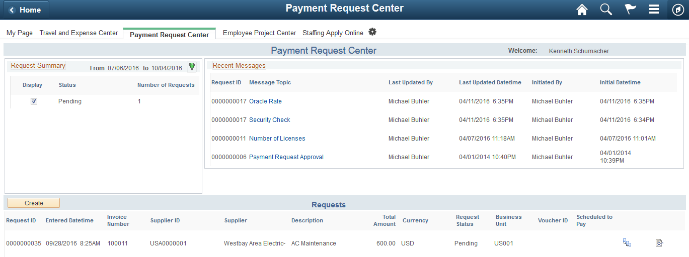
Note: To avoid forcing users to scroll horizontally on the homepage, Oracle recommends that you configure and display no more than seven standard or custom homepage tabs.
Using a navigation collection to designate homepage tabs also provides you with the following benefits with respect to remote content:
Security is checked in real time against definitions in the content provider system.
You do not need to manually import content references or security from the content provider system
If the remote system is down or has not been configured, the homepage tab is not displayed.
Note: Remote items require additional processing whenever a user signs in or the cache expires to check security on the remote content provider system. In addition, the Navigation Collections component only supports adding remote component-based content references. To add other remote items to a navigation collection, you must manually create the content reference through the Structure and Content component.
Note: PeopleSoft Interaction Hub 9.1 Rev 2 (and above) is delivered with navigation collection named Custom Tabs, which includes 12 pre-defined links as sample data. See the documentation for PeopleSoft Interaction Hub for more information on this Custom Tabs navigation collection.
Use the Navigation Collections page to create and maintain links in any custom tabs navigation collection.
Navigation:
Do one of the following:
Click the Add Collection link to create a new navigation collection.
Click the Search button and select an existing navigation collection to maintain.
This example illustrates the fields and controls on the Navigation Collections page for a navigation collection that will be used to display custom homepage tabs.
Note: This Employee Self Service navigation collection was used to generate the custom tabs shown in the previous example.
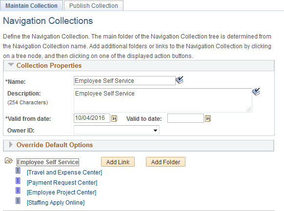
To serve as a custom homepage tab, a link must reside in the root folder of the navigation collection, and not in a subfolder.
To maintain a custom tabs navigation collection:
Click the Add Link button to define a new local or remote link.
Select an existing link and click the Edit Link button to edit an existing link.
Select an existing link and click the Delete Link button to delete an existing link.
Important! Do not edit the properties for the Custom Tabs navigation collection delivered with PeopleSoft Interaction Hub.
Field or Control
Description
Name
Enter a name for the navigation collection.
Description
Enter a description for this navigation collection.
Valid from date
Select the date on which you want this navigation collection to become active.
Valid to date
Select the date on which you want this navigation collection to become inactive.
Owner ID
Set the default owner ID for new definitions you create. Alternatively, leave the option blank, which is the default, to allow users to select the owner ID they want. The Owner ID helps identify which applications team last made a change to a definition.
Add Link
Click to access the Add Link page to define a link for a new custom tab. On the Add Link page, you can create a link to a local menu item or to a remote component based content reference.
See Adding a Link, Selecting a Local Link, and Selecting a Remote Link for more information on creating local and remote links in navigation collections.
Note: Do not select the Open in a new window check box.
If you need to create a remote link to a non-component based content reference, then you will need to edit the custom tabs navigation collection through Structure and Content. See “Creating a Content Reference to a Remote, Non-Component-Based Item” for more information.
Add Folder
Click to add a subfolder to the navigation collection.
Important! Links in subfolders are not supported for custom tabs navigation collection. Do not create a subfolder and links within the subfolder.
Edit Link
Click to access the Edit Link page for a link.
Delete Link
Click to access the Confirmation page to delete or cancel the deletion.
Maintaining Content References in a Custom Tabs Navigation Collection
You can use the Structure and Content component to maintain content references in a custom tabs navigation collection. This will allow you to:
Disable a homepage tab by selecting the hide from portal navigation attribute.
Enable the display of a homepage tab (for example, one of the tabs delivered as sample data) by deselecting the hide from portal navigation attribute.
Manually create a content reference to a remote non-component-based item.
To access a custom tabs navigation collection in the Structure and Content component:
Select .
Click the Portal Objects link.
Click the Navigation Collections link.
Click the link for the custom tabs navigation collection.
This example illustrates the fields and controls on the Structure and Content page for a custom tabs navigation collection.
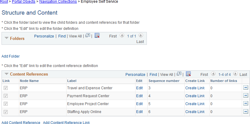
To disable a custom homepage tab, click the Edit link for that content reference. Then, select the Hide from portal navigation option and save the definition.
To enable a custom homepage tab, click the Edit link for that content reference. Then, deselect the Hide from portal navigation option and save the definition.
Creating a Content Reference to a Remote, Non-Component-Based Item
Note: Remote, non-component based content (such as a remote dashboard) must be accessible through unified navigation from the PeopleSoft Interaction Hub system before it can be designated as a homepage tab.
To manually create a content reference to a remote, non-component-based item such as a remote dashboard to be used as a custom homepage tab:
On the Structure and Content page click the link labeled Add Content Reference.
This example illustrates the fields and controls on the Content Ref Administration page.
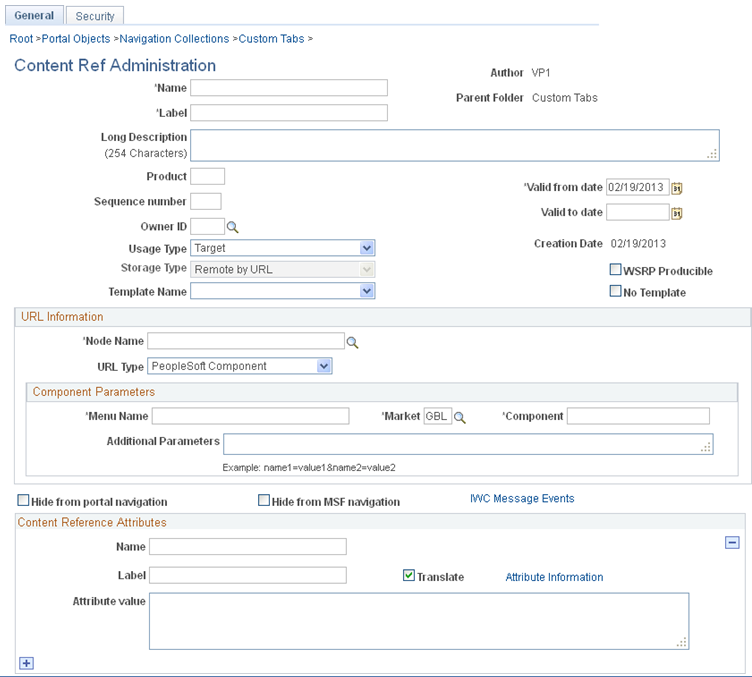
Specify the node name of the portal host node, such as HRMS, ERP, or LOCAL_NODE.
Note: For a remote dashboard, the Node Name field can specify LOCAL_NODE or can be left blank.
In the URL Type field, select one of the following:
PeopleSoft Generic URL – For remote content from a PeopleSoft application.
Non-PeopleSoft URL – For remote content from a non-PeopleSoft system, such as an external web site.
In the Portal URL field, enter a partial or full URL depending on the URL type:
For a PeopleSoft Generic URL, navigate to the remote item through the menu from the local system. Copy the full URL. Then, remove the server, port, servlet, site, portal, and node from the URL, leaving you with a partial URL string.
For example, when navigating using unified navigation from a local PeopleSoft Interaction Hub system, a partial URL string would be similar to the following:
h/?tab=REMOTEUNIFIEDDASHBOARD&unifieddashboard=y&remotedburl=http%3a%2f%2fserver%3aport%2fpsp%2fps%2fEMPLOYEE%2fHRMS%2fh%2f%3ftab%3dHC_HRS_RECRUITING_HOMEPAGE_TAB%26pslnkid%3dHC_HRS_RECRUITING_HOMEPAGE_LNK&uninavpath=Recruiting%20Dashboard{HC_HRS_RECRUITING_HOMEPAGE_TAB}For example, a partial URL string for a remote SmartNavigation folder would be similar to the following:
c/ROLE_EMPLOYEE.HRCD_CO_DIRECTORY.GBL?NAVSTACK=Clear&pt_fname=HC_COMPANY_DIRECTORY&isleaf=false&abnpcode=WEBLIB_HRCD.ISCRIPT1.FieldFormula.IScript_setFolderFromTree&abnds=t&TREE_NAME=COMPANY_DIRECTORY&TREE_SETID=&TREE_USERKEY=&TREE_EFFDT=&TREE_BRANCH=&abnnode=&cmd=uninav&unabnfldr=false&uninavabnpcode=For a Non-PeopleSoft URL, copy the full URL from the browser and paste it into the Portal URL field. For example:
http://server.example.com/content/my_info.htmlNote: Alternatively, you can use the Node Definitions page to create a node definition for the non-PeopleSoft system, which would include the definition of the Content URI Text field—for example,
http://server.example.com/. If you identify that non-PeopleSoft node through the NODE attribute as indicated in step 5, then you can specify a partial URL—for example,content/my_info.html. See Defining Portal Nodes for more information.
Define the following four content reference attributes to link the content reference to a remote menu item and enable real-time security checks:
Name
Attribute Value
CREFID
The name of the remote CREF as defined in the content provider system.
LOCATION
REMOTE
NODE
The portal host node name of the remote node.
PORTAL
The name of remote portal. This must be the same name as the current portal in the local system—for example, EMPLOYEE.
Save the content reference definition.
Note: The Custom Tabs navigation collection delivered with PeopleSoft Interaction Hub 9.1 Rev 2 (and above) includes definitions for several remote, non-component based items that can be used as examples, including the Recruiting Dashboard and the Manager Dashboard, among others.
Use the Generate Theme Style Sheets page to create and maintain theme style sheet stubs for fluid components from original style sheets based on the specified pattern matching file.
Navigation:
This example illustrates the fields and controls on the Generate Theme Style Sheets page before process execution.
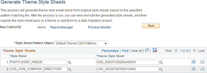
Field or Control |
Description |
|---|---|
Style Sheet Pattern Object |
Select a style sheet pattern object. Currently, PeopleTools delivers one style sheet pattern object, Default Theme CSS Patterns, which will leave color attributes only in the generated style sheets. Note: By definition, a style sheet pattern object is an HTML definition that begins with the PTBR_CSSPTN_ prefix. |
Style Sheet |
Select an original style sheet from which the mapped theme style sheet will be generated. When the run control ID is first created, the system default style sheet for fluid components defined on the Branding System Options page will be added to the list. If none is defined, the PSSTYLEDEF_FMODE style sheet is added to the list. |
Theme Style Sheet |
Note: A unique, random name is generated initially when a style sheet is selected. Enter a unique name for the mapped theme style sheet to be generated. Note: You can use the prompt to look up style sheet objects already defined in the current system to avoid using a non-unique name. |
Click the Run button to execute the process. After process execution, additional options are displayed on this page.
This example illustrates the fields and controls on the Generate Theme Style Sheets page after process execution.
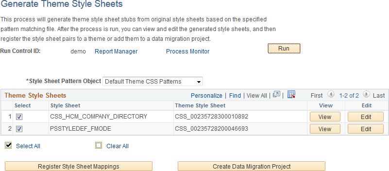
Field or Control |
Description |
|---|---|
SelectSelect AllClear All |
Use the Select, Select All, and Clear All check boxes to select or deselect items for further processing. |
View |
Click the View button to view the content of the generated theme style sheet. Note: This button is displayed only for users who have read permissions on the style sheet object. |
Edit |
Click the Edit button to edit the content of the generated theme style sheet. See Adding and Editing Branding Objects for more information. Note: This button is displayed only for users who have both read and write permissions on the style sheet object. |
Register Style Sheet Mappings |
Click this button to register the selected style sheet pairs to a theme definition. At least one base style sheet/theme style sheet pair must be selected. |
Create Data Migration Project |
Click this button to add the selected theme style sheets and all images they use to a Data Migration Workbench project for migration to a different database. At least one base style sheet/theme style sheet pair must be selected. Note: A Data Migration Project Workbench project is also referred to as an Application Data Set (ADS). |
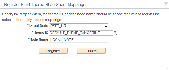
Register Fluid Theme Style Sheet Mappings Page
Use the Register Fluid Theme Style Sheet Mappings page to register a mapped theme style sheet to the specified theme definition. This page provides an alternative to manually selecting the style sheet pair on the Assemble Themes page.
This example illustrates the fields and controls on the Register Fluid Theme Style Sheet Mappings page.
Field or Control |
Description |
|---|---|
Target Node |
Select the default local node to identify the target system. |
Theme ID |
Select the theme definition. |
Node Name |
Select the node to which the style sheet and theme style sheet is to be applied. You can select a specific node name, or one of the following values:
Note: The list of specific nodes includes non-local PeopleSoft nodes that have a defined content URI. |
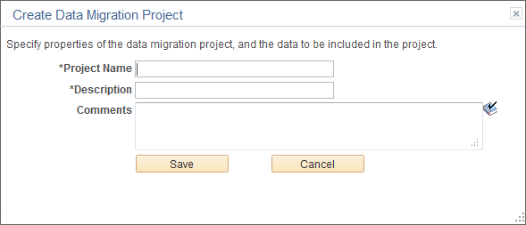
Create Data Migration Project Page
Use the Create Data Migration Project page to add the selected theme style sheets and all images they use to a Data Migration Workbench project. You can use this project to migrate all of the theme style sheets and images to a different system—for example, if you generate the theme style sheets on one system and then must distribute and register these style sheets on other systems in a cluster.
Once the project is created, you will be given the opportunity to open the project in Data Migration Workbench.
This example illustrates the fields and controls on the Create Data Migration Project page.
Field or Control |
Description |
|---|---|
Project Name |
Enter a name for the data migration project. |
Description |
Enter a description for the data migration project. |
Comments |
Enter any additional comments that will appear with the project in Data Migration Workbench. |
For classic components, to create a new theme style sheet or skin:
In Application Designer, clone the DEFAULT_THEME_TANGERINE_ALT free form style sheet.
The DEFAULT_THEME_TANGERINE_ALT contains style class definitions that override the style class definitions for the portal header found in PSSTYLEDEF_TANGERINE. The style class overrides in DEFAULT_THEME_TANGERINE_ALT are grouped as follows:
Header container
Logo
Header links
NavBar links
Global search widget
Hover menu
Menu icons
Modify one or more these override style classes in the new style sheet. Alternatively, you can delete style class overrides or an entire section to retain the settings from the PSSTYLEDEF_TANGERINE style sheet. See Changing Font and Color Settings in Free Form Sub Style Sheets.
Add additional override style class definitions to modify the look of pagelets or other items on your site. The following example provides free form style sheet overrides for pagelets:
/********************
 * Pagelets
 ********************/
#ptpglts .pthpli {
  margin-bottom: 10px;
}

#ptcol0 .PTPAGELETHEADER,
#ptpglts .PTPAGELETHEADER {
  background: url(%Image(MY_THEME_PAGELET_HEADER_BG)) repeat-x scroll 0px 0px #78A4CB;
  border-color: #78A4CB;
  border-radius: 4px 4px 0 0;
  padding: 4px;
}

#ptcol0 .PTPAGELETHEADER .ptpgltlabel,
#ptpglts .PTPAGELETHEADER .ptpgltlabel {
  color: #333333;
  font-size: 12pt;
  font-weight: bold;
  font-family: Tahoma,Arial,Helvetica,Geneva,sans-serif;
}

#ptcol0 .PTPAGELETBODY,
#ptpglts .PTPAGELETBODY {
  border-color: #78A4CB;
  border-radius: 0 0 4px 4px;
  border-style: none solid solid solid;
  border-width: 1px;
  background-color: #FFFFFF;
}

/* Banner pagelets */
#ptcol0 .PTPAGELET {
  padding-%AlignStart: 4px;
  padding-%AlignEnd: 4px;
}

#ptcol0 .ptbannerpglt2 .PTPAGELETBODY {
  border-radius: 4px;
  border-top-style: solid;
}

#ptcol0 .ptbannerpglt3 .PTPAGELETBODY {
  border-radius: 4px;
  border-style: none;
}
To use the new style sheet:
Create a new theme template and select the new style sheet as the theme template for classic components.
Modify an existing theme template and add the new style sheet as an available skin for classic components.
For fluid components, to create a new theme style sheet:
Generate a mapped theme style sheet. See Generating Theme Style Sheets for Fluid Components.
Edit the new style sheet to modify one or more style class definitions.
Map the new theme style sheet to its base style sheet for one or more nodes for use with fluid components.
Assign the base style sheet as the default system style sheet for fluid components, or assign the base style sheet at the component or page level through PeopleCode.
To use additional style sheets to inject your custom branding:
Develop custom style sheets, custom JavaScript objects, or both to implement your custom branding. See Creating and Maintaining Style Sheet Objects and Creating and Maintaining JavaScript Objects.
Use these custom definitions by:
Applying them to classic components system-wide on the Branding System Objects page. See Configuring Branding System Options.
Applying them to individual components on the Component Branding page. See Branding Classic Components.
Example
The following provides and example of how you can use a free form style sheet to modify the display certain page elements and to invoke custom JavaScript to provide additional formatting:
Upload a new free form style sheet object. For example, upload the following as MY_BRANDING_DEMO:
/* Page Titles */
.PAPAGETITLE, .PSSRCHTITLE, .PSQRYTITLE {
  color: #FF0000;
}

/* Grid Border */
.PSLEVEL1GRIDWBO, .PSLEVEL2GRIDWBO, .PSLEVEL3GRIDWBO {
  border-color: #FF0000;
}

/* Group Box Border */
.PSGROUPBOXWBO {
  border-color: #FF0000;
}

/* Highlighter Active Field */
.FIELD_HIGHLIGHTER {
  border-color: #FF0000;
  background-color: #D2D2D2;
}
Upload a new JavaScript object. For example, upload the following as FIELD_HIGHLIGHTER:
(function($) {
  $(document).ready(function(){
    $(document).delegate("input[type='text'], input[type='password'], " +
        "select, textarea", "focus", function(e) {
      // Add a style class when activated
      $(this).addClass("FIELD_HIGHLIGHTER");
    }).delegate("input[type='text'], input[type='password'], " +
        "select, textarea", "blur", function(e) {
      // Remove a style class when not active
      $(this).removeClass("FIELD_HIGHLIGHTER");
    });
  });
})(jQuery);
To inject this custom branding system wide, select .
In the Additional Style Sheet Objects group box, add the MY_BRANDING_DEMO style sheet.
In the Additional Javascript Objects group box, add this JavaScript object first: PT_JQUERY_1_6_2_JS.
Add a new row and add your new JavaScript as a second JavaScript object: FIELD_HIGHLIGHTER.
Save your changes.
Navigate to any page that includes a page title, group box, and grid. For example, select the User Profile - Roles page, or the Assemble Themes page. Search and select value.
Notice the style changes to the page title, group box borders, and grid borders introduced by the additional style sheet.
Place the cursor in any edit box or long edit box.
Notice the highlighting changes to the field introduced by the additional JavaScript object, which calls jQuery to perform the dynamic highlighting.
To create a new branding element:
Create an application class definition that extends the PTBR_BRANDING:Elements:BaseElement class.
Use the PTBR_BRANDING:Elements:Basic* class definitions as examples.
Implement the following methods in the new class:
The class constructor to initialize the object. If the class includes additional attributes, ensure that the constructor also sets an initial value for these attributes.
MyElement(ID as string)clone to create an exact copy of the current object.
clone() Returns
PTBR_BRANDING:Elements:BaseElement
getHTML to return an HTML code fragment representing the object.
getHTML(preview as boolean)
Returns string
Optionally, implement the getStyleDefinitions method to return style definitions for the object as an in-line style definition block or an external style sheet link:
getStyleDefinitions() Returns stringIf the element includes additional attributes, implement the following:
A get property of type
PTBR_BRANDING:Attributes:attr_type. The value of attr_type will depend on the type of attribute (text, image, HTML, and so on)—for example,PTBR_BRANDING:Attributes:TextAttribute.getAttributeByID to return the additional attribute by ID.
getAttributeByID(ID as string, create as boolean) Returns PTBR_BRANDING:Attributes:BaseAttribute
Create a new element type definition.
Example
The following example provides the implementation of the PTBR_BRANDING:Elements:BasicText class.
import PTPP_PORTAL:UTILITY:Collection;
import PTBR_BRANDING:Attributes:BaseAttribute;
import PTBR_BRANDING:Attributes:TextAttribute;
import PTBR_BRANDING:Elements:BaseElement;


/**
  * BasicText Class
  */
class BasicText extends PTBR_BRANDING:Elements:BaseElement
   /* --- Properties --- */
   property PTBR_BRANDING:Attributes:TextAttribute Text get;


   /* --- Methods --- */
   method BasicText(&pId As string);
   method clone() Returns PTBR_BRANDING:Elements:BaseElement;

   method getAttributeByID(&pId As string, &pCreate As boolean) Returns PTBR_BRANDING:Attributes:BaseAttribute;

   method getHTML(&pPreview As boolean) Returns string;


private
   /* --- Private Properties --- */
   Constant &cstText = ".text";


   /* --- Private Methods --- */


end-class;


/**
  * Constructor
  *
  * @param pId ID of the object.
  *
  */
method BasicText
   /+ &pId as String +/

   %Super = create PTBR_BRANDING:Elements:BaseElement(&pId);

   %This.setElementType("BasicText");
   rem %this.setAdvancedOptionsPage (Page.);

   /* Initialize attributes */
   %This.StyleClass = "PSTEXT";
   %This.Text.setText("");

end-method;


/**
  * Make an exact copy of this object.
  * NOTE: Only create the object here, do not copy any class properties.
  *       If there are new class properties, override the copyProperties
  *       method and do it there.  Should invoke the %Super.copyProperties
  *       in that method though.
  *
  * @return BaseElement New object exactly matching this object.
  *
  */
method clone
   /+ Returns PTBR_BRANDING:Elements:BaseElement +/
   /+ Extends/implements PTBR_BRANDING:Elements:BaseElement.clone +/

   Local PTBR_BRANDING:Elements:BasicText &newObj = create PTBR_BRANDING:Elements:BasicText(%This.ID);

   /* Call the copy properties function */
   %This.copyProperties(&newObj);

   Return &newObj;

end-method;


/**
  * Get Attribute By ID
  *
  * @param pId     ID of the attribute.
  * @param pCreate True - create the attribute when not exist.
  *
  * @return BaseAttribute - Attribute object
  *
  */
method getAttributeByID
   /+ &pId as String, +/
   /+ &pCreate as Boolean +/
   /+ Returns PTBR_BRANDING:Attributes:BaseAttribute +/
   /+ Extends/implements PTBR_BRANDING:Elements:BaseElement.getAttributeByID +/

   Local PTBR_BRANDING:Attributes:BaseAttribute &getAttributeByID = %Super.getAttributeByID(&pId, &pCreate);
   Local PTBR_BRANDING:Attributes:TextAttribute &TextAttribute;

   If ((&getAttributeByID = Null) And
         &pCreate) Then

      Evaluate &pId
      When &cstText
         &TextAttribute = create PTBR_BRANDING:Attributes:TextAttribute(&pId);
         &TextAttribute.Label = MsgGetText(219, 7509, "Text");
         &TextAttribute.setText("");
         &TextAttribute.IsVisible = True;
         &getAttributeByID = &TextAttribute;
         Break;

      End-Evaluate;

      If (&getAttributeByID <> Null) Then
         %This.Attributes.insert(&getAttributeByID);
      End-If;

   End-If;

   Return &getAttributeByID;

end-method;


/**
  * Get HTML of the element
  *
  * @param pPreview  True - preview mode.
  *
  * @return String - HTML
  *
  */
method getHTML
   /+ &pPreview as Boolean +/
   /+ Returns String +/
   /+ Extends/implements PTBR_BRANDING:Elements:BaseElement.getHTML +/

   Local string &getHTML = "";

   &getHTML = GetHTMLText(HTML.PTBR_ELM_CONTAINER_SPAN, EscapeHTML(%This.ID), EscapeHTML(%This.StyleClass), EscapeHTML(%This.Text.getRuntimeValue()));

   Return &getHTML;

end-method;


/*****************************
*   Get/Set method pairs
*****************************/

/**
  * Text Property
  *
  */
get Text
   /+ Returns PTBR_BRANDING:Attributes:TextAttribute +/

   Return (%This.getAttributeByID(&cstText, True) As PTBR_BRANDING:Attributes:TextAttribute);

end-get;
To create a new user attribute type:
Create an application class definition that extends the PTBR_BRANDING:UserAttributes:BaseUserAttribute class.
Use the PTBR_BRANDING:UserAttributes:* class definitions as examples.
Implement the following methods in the new class:
The class constructor to initialize the object.
MyUserAttribute(ID as string)getPromptViewName to return the record definition to be used as the search prompt view. If no search prompt view exists, return an empty string.
getPromptViewName() Returns stringvalidateValue to return a Boolean value indicating whether the user has the specified attribute.
validateValue(value as string) Returns boolean
Create a new user attribute type definition.
Example
The following example provides the implementation of the PTBR_BRANDING:UserAttributes:RoleBasedUserAttribute class.
import PTBR_BRANDING:UserAttributes:BaseUserAttribute;


/**
  * RoleBasedUserAttribute Class
  */
class RoleBasedUserAttribute extends PTBR_BRANDING:UserAttributes:BaseUserAttribute
   /* --- Properties --- */


   /* --- Methods --- */
   method RoleBasedUserAttribute(&pId As string);

   method getPromptViewName() Returns string;
   method validateValue(&pValue As string) Returns boolean;


end-class;


/**
  * Constructor
  *
  * @param pId ID of the object.
  *
  */
method RoleBasedUserAttribute
   /+ &pId as String +/

   %Super = create PTBR_BRANDING:UserAttributes:BaseUserAttribute(&pId);

   %This.setUserAttributeType("RoleBasedUserAttribute");

end-method;


/**
  * Return the role prompt view name
  *
  * @return string - the prompt view name
  *
  */
method getPromptViewName
   /+ Returns String +/
   /+ Extends/implements PTBR_BRANDING:UserAttributes:BaseUserAttribute.getPromptViewName +/

   Return Record.PSROLEDEFN_SRCH;

end-method;


/**
  * Validate whether the current has this role
  *
  * @return boolean - the result
  *
  */
method validateValue
   /+ &pValue as String +/
   /+ Returns Boolean +/
   /+ Extends/implements PTBR_BRANDING:UserAttributes:BaseUserAttribute.validateValue +/

   Return IsUserInRole(&pValue);

end-method;
PeopleTools delivers the following application data sets that can be used to migrate branding definitions and configurations:
PTBR_ELEMENT_TYPE - Branding Element Type Definitions.
PTBR_LAYOUT - Branding Header and Footer Definitions.
PTBR_MACRO - Branding Macro Sets.
PTBR_STYLE_SHEET_DEFN - Branding System Options.
PTBR_THEME - Branding Theme Definitions.
PTBR_THEME_ASSIGNMENT - Branding Theme Assignments.
PTBR_USER_ATTRIBUTE_TYPE - Branding User Attribute Type Definitions.
The following sections describe each application data set for branding definitions, the record definitions and related language records (RLRs) included, the fields from the base record, along with a additional information how the fields in the data set correspond to pages and fields in the user interface.
PTBR_ELEMENT_TYPE - Branding Element Type Definitions
Data set: PTBR_ELEMENT_TYPE
Description: Branding element type definitions from the Define Branding Element Types page.
Records (and RLRs): PTBR_ETYPE (PTBR_ETYPE_LN) — Branding element type definition.
Navigation: .
See also: Defining Branding Element Types.
|
Record |
Field |
UI Field |
Mergeable |
In RLR |
|---|---|---|---|---|
|
PTBR_ETYPE |
PTBR_ETYPE_ID |
Name |
N |
Y |
|
PTBR_ETYPE |
DESCR |
Description |
N |
Y |
|
PTBR_ETYPE |
DESCRLONG |
Description (long) |
N |
Y |
|
PTBR_ETYPE |
OBJECTOWNERID |
Owner ID |
N |
N |
|
PTBR_ETYPE |
ACTIVE_FLAG |
Active |
N |
N |
|
PTBR_ETYPE |
PACKAGEID |
Package Name |
N |
N |
|
PTBR_ETYPE |
QUALIFYPATH |
Path |
N |
N |
|
PTBR_ETYPE |
APPCLASSID |
Class ID |
N |
N |
|
PTBR_ETYPE |
CREATEDTTM |
Not applicable |
N |
N |
|
PTBR_ETYPE |
CREATEOPRID |
Not applicable |
N |
N |
|
PTBR_ETYPE |
LASTUPDDTTM |
Not applicable |
N |
N |
|
PTBR_ETYPE |
LASTUPDOPRID |
Not applicable |
N |
N |
PTBR_LAYOUT - Branding Header and Footer Definitions
Data set: PTBR_LAYOUT
Description: Branding header and footer definitions from the Define Headers and Footers page.
Records (and RLRs): PTBR_LAYOUT (PTBR_LAYOUT_LN) — descriptors for the definition, PTBR_LTELT (PTBR_LTELT_LN) — layout element properties, PTBR_LTELTAT (PTBR_LTELTAT_LN) — additional layout element attributes, PTBR_LTATTR (PTBR_LTATTR_LN) — additional style classes, PTBR_LTATTR_CLA — Company Info content for classic, and PTBR_LTATTR_FLU — Company Info content for fluid.
Navigation: .
See also: Defining Headers and Footers.
|
Record |
Field |
UI Field |
Mergeable |
In RLR |
|---|---|---|---|---|
|
PTBR_LAYOUT |
PTBR_LAYOUT_ID |
Name |
N |
Y |
|
PTBR_LAYOUT |
PTBR_LAYOUT_TYPE |
Type |
N |
N |
|
PTBR_LAYOUT |
DESCR254 |
Description (long) |
N |
Y |
|
PTBR_LAYOUT |
OBJECTOWNERID |
Owner ID |
N |
N |
|
PTBR_LAYOUT |
CREATEDTTM |
Not applicable |
N |
N |
|
PTBR_LAYOUT |
CREATEOPRID |
Not applicable |
N |
N |
|
PTBR_LAYOUT |
LASTUPDDTTM |
Not applicable |
N |
N |
|
PTBR_LAYOUT |
LASTUPDOPRID |
Not applicable |
N |
N |
|
PTBR_LTELT |
PTBR_LAYOUT_ID |
Name |
N |
Y |
|
PTBR_LTELT |
PTBR_ELEMENT_ID |
ID |
N |
Y |
|
PTBR_LTELT |
PTBR_ETYPE_ID |
Type |
N |
N |
|
PTBR_LTELT |
DESCR254 |
Notes |
N |
Y |
|
PTBR_LTELT |
PTBR_PELEMENT_ID |
Parent |
N |
N |
|
PTBR_LTELT |
PTBR_SEQ_NUM |
Order |
N |
N |
|
PTBR_LTELTAT |
PTBR_LAYOUT_ID |
Name |
N |
Y |
|
PTBR_LTELTAT |
PTBR_ELEMENT_ID |
ID |
N |
Y |
|
PTBR_LTELTAT |
PTBR_ATTR_ID |
Attribute Name |
N |
Y |
|
PTBR_LTELTAT |
PTBR_ATTR_TYPEVAL |
Attribute Type |
N |
N |
|
PTBR_LTELTAT |
PTBR_ATTR_TXTVALUE |
Default Text |
N |
Y |
|
PTBR_LTELTAT |
PTBR_ATTR_SVALUE |
Attribute Value |
N |
N |
|
PTBR_LTELTAT |
PTBR_ATTR_EB_CLA |
Enable Company Banner Area |
N |
N |
|
PTBR_LTELTAT |
PTBR_ATTR_EB_FLU |
Use Different Content for Classic and Fluid |
N |
N |
|
PTBR_LTELTAT |
PTBR_ATTR_LVALUE |
Static HTML |
N |
N |
|
PTBR_LTATTR |
PTBR_LAYOUT_ID |
Name |
N |
Y |
|
PTBR_LTATTR |
PTBR_ATTR_ID |
Not applicable |
N |
Y |
|
PTBR_LTATTR |
PTBR_ATTR_TYPEVAL |
Not applicable |
N |
N |
|
PTBR_LTATTR |
PTBR_ATTR_TXTVALUE |
Not applicable |
N |
Y |
|
PTBR_LTATTR |
PTBR_ATTR_SVALUE |
Not applicable |
N |
N |
|
PTBR_LTATTR |
PTBR_ATTR_EB_CLA |
Not applicable |
N |
N |
|
PTBR_LTATTR |
PTBR_ATTR_EB_FLU |
Not applicable |
N |
N |
|
PTBR_LTATTR |
PTBR_ATTR_LVALUE |
Style Definitions |
N |
N |
|
PTBR_LTATTR_CLA |
PTBR_LAYOUT_ID |
Name |
N |
N |
|
PTBR_LTATTR_CLA |
PTBR_ATTR_EB_CLA |
Enable Company Banner Area |
N |
N |
|
PTBR_LTATTR_CLA |
PTBR_ATTR_LVAL_CLA |
Company Banner Content |
N |
N |
|
PTBR_LTATTR_FLU |
PTBR_LAYOUT_ID |
Name |
N |
N |
|
PTBR_LTATTR_FLU |
PTBR_ATTR_EB_FLU |
Use Different Content for Classic and Fluid |
N |
N |
|
PTBR_LTATTR_FLU |
PTBR_ATTR_LVAL_FLU |
Fluid Banner Content |
N |
N |
PTBR_MACRO - Branding Macro Sets
Data set: PTBR_MACRO
Description: Branding macro set definitions from the Macro Set page.
Records (and RLRs): PSMACROSET (PSMACROSETLANG) — a branding macro set, and PSMACRO (PSMACROLANG) — individual branding macros.
Navigation: .
See also: Defining Macro Sets and Macros.
|
Record |
Field |
UI Field |
Mergeable |
In RLR |
|---|---|---|---|---|
|
PSMACROSET |
PTMACROSETID |
Macro Set |
Y |
Y |
|
PSMACROSET |
DESCR254 |
Long Description |
Y |
Y |
|
PSMACROSET |
OBJECTOWNERID |
Owner |
Y |
N |
|
PSMACROSET |
VERSION |
Not applicable |
Y |
N |
|
PSMACROSET |
LASTUPDDTTM |
Not applicable |
Y |
N |
|
PSMACROSET |
LASTUPDOPRID |
Not applicable |
Y |
N |
|
PSMACRO |
PTMACROSETID |
Macro Set |
Y |
Y |
|
PSMACRO |
PTMACROID |
Not applicable |
Y |
N |
|
PSMACRO |
PTMACRONAME |
Macro Name |
Y |
Y |
|
PSMACRO |
PTMACROCONTENT |
Macro Content |
Y |
N |
|
PSMACRO |
DESCR100 |
Description |
Y |
Y |
PTBR_STYLE_SHEET_DEFN - Branding System Options
Data set: PTBR_STYLE_SHEET_DEFN
Description: Additional style sheets and JavaScript objects from the Branding System Options page.
Records (and RLRs): PSOPTIONSADDL (none) — Additional objects.
Navigation: .
See also: Configuring Branding System Options.
|
Record |
Field |
UI Field |
Mergeable |
In RLR |
|---|---|---|---|---|
|
PSOPTIONSADDL |
PTCOMPONENTTYPE |
Not applicable Note: Always set to C for classic components. |
N |
Not applicable |
|
PSOPTIONSADDL |
PTSCRIPTTYPE |
|
N |
Not applicable |
|
PSOPTIONSADDL |
PTSCRIPTNAME |
|
N |
Not applicable |
|
PSOPTIONSADDL |
SEQNO |
Not applicable Note: Row order from the grid. |
N |
Not applicable |
PTBR_THEME - Branding Theme Definitions
Data set: PTBR_THEME
Description: Branding theme definitions from the Assemble Themes page.
Records (and RLRs): PTBR_THEME (PTBR_THEME_LN) — theme identifiers, PTBR_THMATTR (PTBR_THMATTR_LN) — theme building blocks, and PTBR_THEME_CSS — additional theme style sheets.
Navigation: .
See also: Assembling Branding Themes.
|
Record |
Field |
UI Field |
Mergeable |
In RLR |
|---|---|---|---|---|
|
PTBR_THEME |
PTBR_THEME_ID |
Name |
N |
Y |
|
PTBR_THEME |
DESCR254 |
Description |
N |
Y |
|
PTBR_THEME |
OBJECTOWNERID |
Owner ID |
N |
N |
|
PTBR_THEME |
CREATEDTTM |
Not applicable |
N |
N |
|
PTBR_THEME |
CREATEOPRID |
Not applicable |
N |
N |
|
PTBR_THEME |
LASTUPDDTTM |
Not applicable |
N |
N |
|
PTBR_THEME |
LASTUPDOPRID |
Not applicable |
N |
N |
|
PTBR_THMATTR |
PTBR_THEME_ID |
Name |
N |
Y |
|
PTBR_THMATTR |
PTBR_ATTR_ID |
Skin Style Sheets: Name |
N |
Y |
|
PTBR_THMATTR |
PTBR_ATTR_TYPEVAL |
Not applicable |
N |
N |
|
PTBR_THMATTR |
PTBR_ATTR_TXTVALUE |
Skin Style Sheets: Description |
N |
Y |
|
PTBR_THMATTR |
PTBR_ATTR_SVALUE |
|
N |
N |
|
PTBR_THMATTR |
PTBR_ATTR_LVALUE |
Theme Style Sheet Mappings: Node, Style Sheet, Theme Style Sheet |
N |
N |
|
PTBR_THEME_CSS |
PTBR_THEME_ID |
Name |
N |
Not applicable |
|
PTBR_THEME_CSS |
MSGNODENAME |
Theme Style Sheet Mappings: Node |
N |
Not applicable |
|
PTBR_THEME_CSS |
STYLESHEETNAME |
Theme Style Sheet Mappings: Style Sheet |
N |
Not applicable |
|
PTBR_THEME_CSS |
PTBR_THEME_CSS |
|
N |
Not applicable |
|
PTBR_THEME_CSS |
LASTUPDDTTM |
Not applicable |
N |
Not applicable |
|
PTBR_THEME_CSS |
LASTUPDOPRID |
Not applicable |
N |
Not applicable |
|
PTBR_THEME_CSS |
OBJECTOWNERID |
Not applicable |
N |
Not applicable |
|
PTBR_THEME_CSS |
VERSION |
Not applicable |
N |
Not applicable |
PTBR_THEME_ASSIGNMENT - Branding Theme Assignments
Data set: PTBR_THEME_ASSIGNMENT
Description: Portal-specific branding theme overrides and user attributed-based overrides from the Assign Branding Themes page.
Records (and RLRs): PTBR_THM_REG (PTBR_THM_REG_LN) — the portal for the theme override, PTBR_THMRGAT (PTBR_THMRGAT_LN) — portal-wide settings, PTBR_THM_UA — user attributes, and PTBR_THMUAAT (PTBR_THMUAAT_LN) — user attribute override settings.
Navigation: .
See also: Assigning Branding Themes.
|
Record |
Field |
UI Field |
Mergeable |
In RLR |
|---|---|---|---|---|
|
PTBR_THM_REG |
PORTAL_NAME |
Portal Name |
N |
Y |
|
PTBR_THM_REG |
EFFDT |
Effective Date |
N |
Y |
|
PTBR_THM_REG |
OBJECTOWNERID |
Owner ID |
N |
N |
|
PTBR_THM_REG |
CREATEDTTM |
Not applicable |
N |
N |
|
PTBR_THM_REG |
CREATEOPRID |
Not applicable |
N |
N |
|
PTBR_THM_REG |
LASTUPDDTTM |
Not applicable |
N |
N |
|
PTBR_THM_REG |
LASTUPDOPRID |
Not applicable |
N |
N |
|
PTBR_THMRGAT |
PORTAL_NAME |
Portal Name |
N |
Y |
|
PTBR_THMRGAT |
EFFDT |
Effective Date |
N |
Y |
|
PTBR_THMRGAT |
PTBR_ATTR_ID |
Not applicable |
N |
Y |
|
PTBR_THMRGAT |
PTBR_ATTR_TYPEVAL |
Not applicable |
N |
N |
|
PTBR_THMRGAT |
PTBR_ATTR_TXTVALUE |
Not applicable |
N |
Y |
|
PTBR_THMRGAT |
PTBR_ATTR_SVALUE |
|
N |
N |
|
PTBR_THMRGAT |
PTBR_ATTR_LVALUE |
Not applicable |
N |
N |
|
PTBR_THM_UA |
PORTAL_NAME |
Portal Name |
N |
Not applicable |
|
PTBR_THM_UA |
EFFDT |
Effective Date |
N |
Not applicable |
|
PTBR_THM_UA |
PTBR_UATA_ID |
Not applicable |
N |
Not applicable |
|
PTBR_THM_UA |
PTBR_SEQ_NUM |
Priority # |
N |
Not applicable |
|
PTBR_THM_UA |
PTBR_UATYPE_ID |
Attribute Type |
N |
Not applicable |
|
PTBR_THM_UA |
PTBR_UA_VALUE |
Attribute Value |
N |
Not applicable |
|
PTBR_THMUAAT |
PORTAL_NAME |
Portal Name |
N |
Y |
|
PTBR_THMUAAT |
EFFDT |
Effective Date |
N |
Y |
|
PTBR_THMUAAT |
PTBR_UATA_ID |
Not applicable |
N |
Y |
|
PTBR_THMUAAT |
PTBR_ATTR_ID |
Not applicable |
N |
Y |
|
PTBR_THMUAAT |
PTBR_ATTR_TYPEVAL |
Not applicable |
N |
N |
|
PTBR_THMUAAT |
PTBR_ATTR_TXTVALUE |
Not applicable |
N |
Y |
|
PTBR_THMUAAT |
PTBR_ATTR_SVALUE |
|
N |
N |
|
PTBR_THMUAAT |
PTBR_ATTR_LVALUE |
Not applicable |
N |
N |
PTBR_USER_ATTRIBUTE_TYPE - Branding User Attribute Type Definitions
Data set: PTBR_USER_ATTRIBUTE_TYPE
Description: User attribute type definitions from the Define User Attribute Types page.
Records (and RLRs): PTBR_UATYPE (PTBR_UATYPE_LN) — user attribute type definition.
Navigation: .
See also: Defining User Attribute Types.
|
Record |
Field |
UI Field |
Mergeable |
In RLR |
|---|---|---|---|---|
|
PTBR_UATYPE |
PTBR_UATYPE_ID |
Name |
N |
Y |
|
PTBR_UATYPE |
DESCR |
Description |
N |
Y |
|
PTBR_UATYPE |
DESCRLONG |
Description (long) |
N |
Y |
|
PTBR_UATYPE |
OBJECTOWNERID |
Owner ID |
N |
N |
|
PTBR_UATYPE |
ACTIVE_FLAG |
Active |
N |
N |
|
PTBR_UATYPE |
PACKAGEID |
Package Name |
N |
N |
|
PTBR_UATYPE |
QUALIFYPATH |
Path |
N |
N |
|
PTBR_UATYPE |
APPCLASSID |
Class ID |
N |
N |
|
PTBR_UATYPE |
CREATEDTTM |
Not applicable |
N |
N |
|
PTBR_UATYPE |
CREATEOPRID |
Not applicable |
N |
N |
|
PTBR_UATYPE |
LASTUPDDTTM |
Not applicable |
N |
N |
|
PTBR_UATYPE |
LASTUPDOPRID |
Not applicable |
N |
N |