Chart Class Methods
These methods are used by the Chart class. The methods are listed in alphabetical order.
Syntax
Reset()Description
Use the Reset method to clear all existing chart settings and data.
Parameters
None.
Returns
None.
Syntax
SetColorArray(&Array_of_Color)Description
PeopleSoft charts are delivered with a default color sequence. If you want to specify a different sequence, use the SetColorArray method to set the colors for a series. You can specify only a one-dimensional array for the parameter.
This method applies to the base chart and to the overlay chart. Color values are applied first to the base chart, then to the overlay chart. For example, if the base chart contains four series, then the fifth color value is applied to the first series in the overlay chart, and so on.
The type of array can be any of the following:
String
Number
Integer
Decimal
Use the SetColorArray method for line charts instead of SetDataColor because SetDataColor does not work with line charts. Individual line segments cannot be colored because there are fewer line segments than points. Use SetColorArray instead to color each complete line (series).
Parameters
Parameter |
Description |
|---|---|
&Array_of_Color |
Specify an already instantiated array that contains the color values that you want for the series. You can specify either a constant or a number. |
The following lists all the values you can specify. You can use either the numeric or constant value.
|
Numeric Value |
Constant Value |
Description |
|---|---|---|
|
-1 |
%ChartColor_Series_Default |
Default series color. When a data point is set to this, the default series color or the color that has been set by the programmer for that series is used instead. This value works only with the SetColorArray method of the Chart class. |
|
0 |
%ChartColor_Black |
Black |
|
1 |
%ChartColor_Blue |
Blue |
|
2 |
%ChartColor_Cyan |
Cyan |
|
3 |
%ChartColor_DarkGray |
Dark gray |
|
4 |
%ChartColor_Gray |
Gray |
|
5 |
%ChartColor_Green |
Green |
|
6 |
%ChartColor_LightGray |
Light gray |
|
7 |
%ChartColor_Magenta |
Magenta |
|
8 |
%ChartColor_Orange |
Orange |
|
9 |
%ChartColor_Pink |
Pink |
|
10 |
%ChartColor_Red |
Red |
|
11 |
%ChartColor_White |
White |
|
12 |
%ChartColor_Yellow |
Yellow |
|
13 |
%ChartColor_Red_Orange |
Red-orange |
|
14 |
%ChartColor_Yellow_Green |
Yellow-green |
|
15 |
%ChartColor_Blue_Violet |
Blue-violet |
|
16 |
%ChartColor_Purple |
Purple |
|
17 |
%ChartColor_Yellow_Orange |
Yellow-orange |
Returns
None.
Example
The following example sets the four series in the chart:
&NumArray = CreateArray(1, 3, 6, 9);

&oChart.SetColorArray(&NumArray);Syntax
SetData({Record_Name | &Rowset})Description
Use the SetData method to specify where the data from the chart is coming from.
You can use either a record name or an already instantiated, populated rowset. In general, specify a record when building a chart from page data and a rowset when building a chart from a standalone rowset.
If you make a change to the underlying data of a chart, call the SetData method again to update the chart.
Parameters
Parameter |
Description |
|---|---|
Record_Name |
Specify the name of a record to be used to populate the chart with data. |
&Rowset |
Specify the name of an already instantiated rowset to populate the chart with data. This is generally a standalone rowset. |
Returns
None.
Example
The following is the minimum code you need to create a PeopleSoft chart.
Local Chart &MyChart;

&MyChart = GetChart(ABS_HIST.CHART);
&MyChart.SetData(ABS_HIST);
&MyChart.SetDataYAxis(ABS_HIST.Reason);
&MyChart.SetDataXAxis(ABS_HIST.Duration);
The following example creates a chart using a standalone rowset.
Function IScript_GetChartURL()
local object &MYCHART;
local string &MYURL;
local rowset &MYROWSET;

&MYCHART = CreateObject("Chart");

&MYROWSET = CreateRowset(Record.ABS_HIST);

&EmplID = %Emplid;

&MYROWSET.Fill("Where EMPLID :=1", &EmplID);

&MYCHART.SetData(&MYROWSET);
&MYCHART.SetDataXAxis(ABS_HIST.ABSENCE_TYPE);
&MYCHART.SetDataYAxis(ABS_HIST.DURATION_DAYS);

&MYURL = %Response.GetChartURL(&MYCHART);

/* use &MYURL in your application */
...
End-Function;Syntax
SetDataColor(Record_Name.Field_Name1, ...)Description
Use the SetDataColor method to specify a field that contains the color for each data point. Each field for each data point must contain either a number or a constant that specifies the color you want to use.
Use the SetColorArray method for line charts instead of SetDataColor because SetDataColor does not work with line charts. Individual line segments cannot be colored because fewer line segments exist than points. Use SetColorArray instead to color each complete line (series). See SetColorArray.
Note: This method has no effect when used with an overlay.
Parameters
Parameter |
Description |
|---|---|
Record_Name.Field_Name1, ... |
Specify the name of the record and one or more fields on that record that contain the colors for the data items for the chart. Note: The number and order of fields specified must correspond to the order specified by the SetDataYAxis method. |
See SetColorArray.
Returns
None.
Syntax
SetDataHints(Record_Name.Field_Name1, ...)Description
Use the SetDataHints method to override the default text that appears as a caption when you mouse over data in a chart (that is, a bar, a pie slice, or a data point).
Important! The ToolTipLabel class provides an alternative method for creating custom tooltips for data items on charts. See Using the ToolTipLabel Class for more information.
The default data hint text that appears is constructed from information about the composition of the chart that you have defined and the row of data being charted. Specifically, its structure depends on whether the chart has a data series or not.
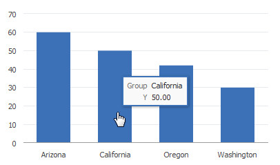
If you do not specify SetDataHints and do not specify SetDataSeries, then the value of the x-axis (Group) and the value of the y-axis appear in the data hint:
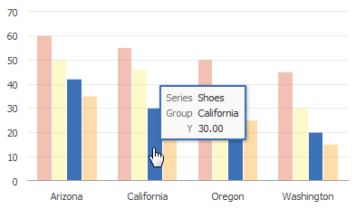
If you do not specify SetDataHints but do specify SetDataSeries, then the value of the x-axis (Group), the y-axis, and the series appear in the data hint:
If you use SetDataHints, the text that appears as a caption when you mouse over data will be precisely that which is in the RECORD.FIELD for that row of data. This is true whether a data series is present or not.
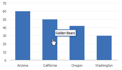
For example, SetDataHints is set as follows:
&cChart12.SetDataHints(DOC_CHRT_SLS_2.DOC_CHRT_MASCOT);Mousing over the bar representing California reveals Golden Bears as the value of the DOC_CHRT_MASCOT field for that row in the DOC_CHRT_SLS_2 rowset:
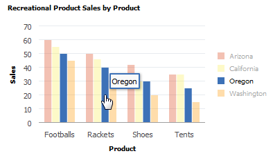
In the following example, SetDataSeries is already set, and SetDataHints is set as follows:
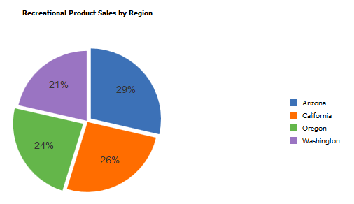
&cChart13.SetDataHints(DOC_CHRT_SLSREC.DOC_CHRT_RGN);Mousing over any bar in the bar chart will display the region represented by the bar.
Parameters
Parameter |
Description |
|---|---|
Record_Name.Field_Name1, ... |
Specify the name of the record and one or more fields on that record that contain the tooltips for the data items for the chart. Note: The number and order of fields specified must correspond to the order specified by the SetDataYAxis method. |
Returns
None.
Example
&cChart13.SetDataHints(DOC_CHRT_SLSREC.DOC_CHRT_RGN);Syntax
SetDataLabel(Record_Name.Field_Name1, ...)Description
Use the SetDataLabel method to set labels for each data series when multiple fields are passed to SetDataYAxis. Otherwise, each series is identified by its field name.
Parameters
Parameter |
Description |
|---|---|
Record_Name.Field_Name1, ... |
Specify the name of the record and one or more fields on that record that contain the labels for the data items for the chart. Note: The number and order of fields specified must correspond to the order specified by the SetDataYAxis method. |
Returns
None.
Example
Consider the following data for a chart.
Note: For ease of viewing, the data has been split into two tables.
Chart data part 1:
|
QE_PARKNAME |
QE_YEARS |
QE_VISITORS |
QE_CHART_COLOR |
QE_CHART_LABEL |
QE_CHART_LABELSTYL |
|---|---|---|---|---|---|
|
ARCHES |
1970 |
1640758 |
2 |
ar |
font-size:8px; |
|
ARCHES |
2000 |
1870577 |
2 |
ar |
font-size:8px; |
|
ARCHES |
2014 |
2082866 |
2 |
ar |
font-size:8px; |
|
GLACIER |
1970 |
1153564 |
4 |
gl |
font-size:10px; |
|
GLACIER |
2000 |
1462035 |
4 |
gl |
font-size:10px; |
|
GLACIER |
2014 |
1890374 |
4 |
gl |
font-size:10px; |
|
SEQUOIA |
1970 |
1202979 |
7 |
sq |
font-size:12px; |
|
SEQUOIA |
2000 |
1306583 |
7 |
sq |
font-size:12px; |
|
SEQUOIA |
2014 |
1506584 |
7 |
sq |
font-size:12px; |
|
YELLOWSTONE |
1970 |
2294326 |
3 |
yl |
font-size:14px; |
|
YELLOWSTONE |
2000 |
2447729 |
3 |
yl |
font-size:14px; |
|
YELLOWSTONE |
2014 |
2888030 |
3 |
yl |
font-size:14px; |
|
YOSEMITE |
1970 |
2551393 |
1 |
ys |
font-size:12px; |
|
YOSEMITE |
2000 |
2853404 |
1 |
ys |
font-size:12px; |
|
YOSEMITE |
2014 |
2691191 |
1 |
ys |
font-size:12px; |
Chart data part 2:
|
QE_PARKNAME |
QE_CHART_POS |
QE_CHART_Z |
QE_CHART_MARKER |
QE_CHART_MARKERSIZ |
|---|---|---|---|---|
|
ARCHES |
auto |
5 |
square |
12 |
|
ARCHES |
aboveMarker |
6 |
square |
12 |
|
ARCHES |
afterMarker |
5 |
square |
12 |
|
GLACIER |
center |
8 |
circle |
16 |
|
GLACIER |
belowMarker |
6 |
circle |
16 |
|
GLACIER |
beforeMarker |
5 |
circle |
16 |
|
SEQUOIA |
aboveMarker |
7 |
triangleDown |
9 |
|
SEQUOIA |
beforeMarker |
8 |
triangleDown |
9 |
|
SEQUOIA |
auto |
7 |
triangleDown |
9 |
|
YELLOWSTONE |
insideBarEdge |
8 |
human |
12 |
|
YELLOWSTONE |
outsideBarEdge |
7 |
plus |
12 |
|
YELLOWSTONE |
center |
8 |
diamond |
12 |
|
YOSEMITE |
aboveMarker |
7 |
triangleUp |
15 |
|
YOSEMITE |
belowMarker |
8 |
triangleUp |
15 |
|
YOSEMITE |
auto |
7 |
triangleUp |
15 |
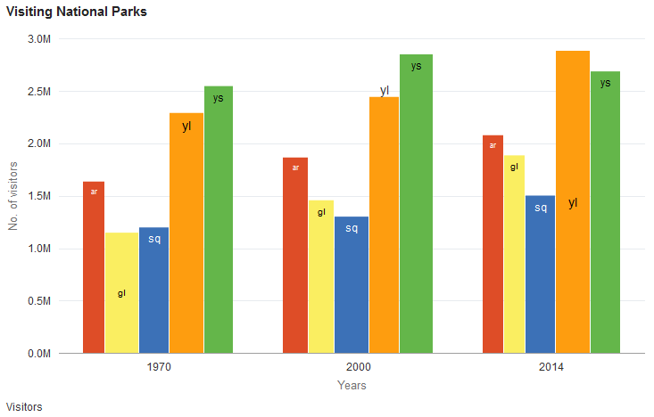
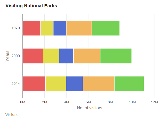
The following PeopleCode program will render the chart data as a bar chart:
rem Set up the chart;
&oChart = GetChart(QE_JET_CHARTWRK.QE_JET2);
&oChart.Reset();
&oChart.Type = %ChartType_2DBar;

rem Set chart data;
&oChart.SetData(Record.QE_CHART_NPARKS);

&oChart.SetDataYAxis(QE_CHART_NPARKS.QE_VISITORS);
&oChart.SetDataXAxis(QE_CHART_NPARKS.QE_YEARS);
&oChart.SetDataSeries(QE_CHART_NPARKS.QE_PARKNAME);
&oChart.XAxisTitle = "Years";
&oChart.YAxisTitle = "No. of visitors";
&oChart.FootNote = "Visitors";
&oChart.MainTitle = "Visiting National Parks";

rem Set data labels and markers;
&oChart.SetDataLabel(QE_CHART_NPARKS.QE_CHART_LABEL);
&oChart.SetDataLabelPosition(QE_CHART_NPARKS.QE_CHART_POS);
&oChart.SetDataLabelStyle(QE_CHART_NPARKS.QE_CHART_LABELSTYL);
&oChart.SetDataMarker(QE_CHART_NPARKS.QE_CHART_MARKER);
&oChart.SetDataMarkerSize(QE_CHART_NPARKS.QE_CHART_MARKERSIZ);

rem Set z-axis value;
&oChart.SetDataZAxis(QE_CHART_NPARKS.QE_CHART_Z);

rem for bubble charts;
rem &oChart.SetDataGlyphScale(QE_CHART_NPARKS.QE_CHART_Z);
Because bar charts do not support data markers, the chart that is rendered does not display markers.
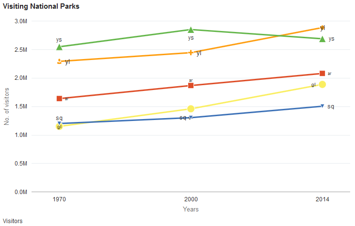
The preceding PeopleCode program can be modified to display the same data as a line chart by changing the chart type:
&oChart.Type = %ChartType_2DLine;The line chart that is rendered from the same data includes the data labels and data markers.
Syntax
SetDataLabelPosition(Record_Name.Field_Name1, ...)Description
Use the SetDataLabelPosition method to set the position of the data labels, which are set by the SetDataLabel method.
Parameters
Parameter |
Description |
|---|---|
Record_Name.Field_Name1, ... |
Specify the name of the record and one or more fields on that record that contain the data for the data label positions for the chart. Note: The order of fields specified must correspond to the number and order specified by the SetDataYAxis method. |
The String value of this field must be one of these values:
|
Value |
Description |
|---|---|
|
center |
Centered on the data item. |
|
aboveMarker |
Above the marker for the data item.* |
|
belowMarker |
Below the marker for the data item.* |
|
beforeMarker |
Before the marker for the data item.* |
|
afterMarker |
After the marker for the data item.* |
|
insideBarEdge |
Inside the edge of a bar chart data item. |
|
outsideBarEdge |
Outside the edge of a bar chart data item. |
|
outsideSlice |
Outside the slice of a pie chart data item. |
|
auto |
The chart engine determines the best position for the label based on the chart type, chart size, label size and other factors. Specifically, for the bar chart family of charts:
|
* This value is not supported for any of the bar chart family of charts; on bar charts, the auto value is substituted instead.
Returns
None.
Example
&oChart.SetDataLabelPosition(QE_CHART_NPARKS.QE_CHART_POS);Syntax
SetDataLabelStyle(Record_Name.Field_Name1, ...)Description
Use the SetDataLabelStyle method to set a string defining the CSS style for the data label.
Parameters
Parameter |
Description |
|---|---|
Record_Name.Field_Name1, ... |
Specify the name of the record and one or more fields on that record that contain the CSS styles for the data labels for the chart. Note: The order of fields specified must correspond to the number and order specified by the SetDataYAxis method. |
Returns
None.
Example
&oChart.SetDataLabelStyle(QE_CHART_NPARKS.QE_CHART_LABELSTYL);Syntax
SetDataMarker(Record_Name.Field_Name1, ...)Description
Use the SetDataMarker method to set the shape of data markers, which can be used to highlight certain data points on a chart. Data markers can be used only with line charts, bubble charts, and scatter charts.
The String value of this field must be one of these values:
|
Value |
Description |
|---|---|
|
square |
Square |
|
circle |
Circle |
|
diamond |
Diamond |
|
plus |
Plus sign |
|
triangleDown |
Triangle with tip down |
|
triangleUp |
Triangle with tip up |
|
human |
Human |
|
auto |
Automatically selected by the chart engine |
Parameters
Parameter |
Description |
|---|---|
Record_Name.Field_Name1, ... |
Specify the name of the record and one or more fields on that record that contain the data for the data marker types for the chart. Note: The order of fields specified must correspond to the number and order specified by the SetDataYAxis method. |
Returns
None.
Example
&oChart.SetDataMarkerSize(QE_CHART_NPARKS.QE_CHART_MARKER);Syntax
SetDataMarkerSize(Record_Name.Field_Name1, ...)Description
Use the SetDataMarkerSize method to set the size of the data markers.
Parameters
Parameter |
Description |
|---|---|
Record_Name.Field_Name1, ... |
Specify the name of the record and one or more fields on that record that contain the data for the data marker sizes for the chart. Note: The order of fields specified must correspond to the number and order specified by the SetDataYAxis method. |
Returns
None.
Example
&oChart.SetDataMarkerSize(QE_CHART_NPARKS.QE_CHART_MARKERSIZ);Syntax
SetDataSeries(Record_Name.Field_Name)Description
Use the SetDataSeries method to specify the name of the field containing the series values. Every distinct value in this field is considered a unique series.
The series is plotted in the order given by the record.
By default, the legend is populated by the value of this field.
If this value is Null, the system assumes there is only one series to plot.
Parameters
Parameter |
Description |
|---|---|
Record_Name.Field_Name |
Specify the name of the record, and the field on that record, that contains the series values for the chart. |
Returns
None.
Example
&MYCHART.SetDataSeries(MYRECORD.MYSERIES);Syntax
SetDataURLs(Record_Name.Field_Name1, ...)Description
Use the SetDataURLs method to specify a URL to be launched when a data point is clicked in the chart. The URL for each point must be a fully formed URL specified as a string. For example:
http://example.org/index.htmThe IsDrillable property must be set to True to enable clicking on data points within the chart.
Parameters
Parameter |
Description |
|---|---|
Record_Name.Field_Name1, ... |
Specify the name of the record and one or more fields on that record that contain the URLs for the data items for the chart. Note: The number and order of fields specified must correspond to the order specified by the SetDataYAxis method. |
Returns
None.
Example
&oChart.IsDrillable = True;
&oChart.SetDataURLs(PB_CHART_RECORD.PB_CHART_DESC);Syntax
SetDataXAxis(Record_Name.Field_Name)Description
Use the SetDataXAxis method to specify the groups along the x-axis.
If this value is not set or Null, the y values are plotted along the x-axis in groups labeled by their order number.
The order of the data is plotted in the order of the data in the record.
By default, the labels along the x-axis are populated by the value of this field.
Parameters
Parameter |
Description |
|---|---|
Record_Name.Field_Name |
Specify the name of the record, and the field on that record, that contains the data for the x-axis for the chart. |
Returns
None.
Example
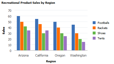
&cChart = GetChart(PB_CHART_DUMREC.PB_CHART_FIELD);

&cChart.SetData(Record.PB_CHART_RECORD);
&cChart.SetDataSeries(PB_CHART_RECORD.PB_CHART_PRODUCT);
&cChart.SetDataXAxis(PB_CHART_RECORD.PB_CHART_REGION);
&cChart.SetDataYAxis(PB_CHART_RECORD.PB_CHART_SALES);
In the following example, the y-axis is set to a numeric amount, while the x-axis is set to the region:
Syntax
SetDataYAxis(Record_Name.Field_Name1, ...)Description
Use the SetDataYAxis to specify the data to plot in the chart. The y-axis is always considered the data axis.
Note: For a funnel chart, you can alternatively use the SetFunnelDataActual method to specify this data.
You can pass more than one field to the SetDataYAxis method to specify more than one data series for a chart. Each field passed into SetDataYAxis will result in one data series in the chart. This methodology is an alternative to using the SetDataSeries method to specify more than one data series. See Creating and Using Data Series with Charts for more information.
Parameters
Parameter |
Description |
|---|---|
Record_Name.Field_Name1, ... |
Specify the name of the record and one or more fields on that record that contain the data values for the data items for the chart. Note: The number and order of fields specified must correspond to the order specified by the SetDataYAxis method. |
Returns
None.
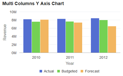
Example1
Consider the following table containing chart data. This data is organized so that a single column (Amount) is passed to SetDataYAxis and Account Type is passed to SetDataSeries:
|
Account Name |
Year |
Account Type |
Amount |
URL |
Chart Color |
Glyphscale |
|---|---|---|---|---|---|---|
|
Revenues |
2010 |
Actual |
8200000 |
http://www.nps.gov/ak/index.htm |
1 |
1 |
|
Revenues |
2010 |
Budgeted |
7600000 |
http://www.nps.gov/as/index.htm |
5 |
3 |
|
Revenues |
2010 |
Forecast |
8100000 |
http://www.nps.gov/az/index.htm |
8 |
5 |
|
Revenues |
2011 |
Actual |
8300000 |
http://www.nps.gov/ca/index.htm |
1 |
1 |
|
Revenues |
2011 |
Budgeted |
7650000 |
http://www.nps.gov/co/index.htm |
5 |
3 |
|
Revenues |
2011 |
Forecast |
7400000 |
http://www.nps.gov/ct/index.htm |
8 |
5 |
|
Revenues |
2012 |
Actual |
8450000 |
http://www.nps.gov/fl/index.htm |
1 |
1 |
|
Revenues |
2012 |
Budgeted |
8000000 |
http://www.nps.gov/ga/index.htm |
5 |
3 |
|
Revenues |
2012 |
Forecast |
6500000 |
http://www.nps.gov/gu/index.htm |
8 |
5 |
However, in the preceding table, there is a considerable amount of redundant data that needs to be passed to the Chart object to create a chart. For the same account there are nine rows of data; and for each year, much of the data is repeated.
Now, consider the same data reorganized as three rows. (For ease of viewing, the data has been split into two tables.)
Chart data part 1:
|
Account Name |
Year |
Actual Amount |
Budget Amount |
Forecast Amount |
URL Actual |
URL Budget |
URL Forecast |
|---|---|---|---|---|---|---|---|
|
Revenues |
2010 |
8200000 |
7600000 |
8100000 |
<URL_A> |
<URL_B> |
<URL_F> |
|
Revenues |
2011 |
8300000 |
7650000 |
7400000 |
<URL_A> |
<URL_B> |
<URL_F> |
|
Revenues |
2012 |
8450000 |
8000000 |
6500000 |
<URL_A> |
<URL_B> |
<URL_F> |
Chart data part 2:
|
Account Name |
Year |
Actual Color |
Budget Color |
Forecast Color |
Glyphscale |
Glyphscale |
Glyphscale |
|---|---|---|---|---|---|---|---|
|
Revenues |
2010 |
1 |
5 |
8 |
1 |
3 |
5 |
|
Revenues |
2011 |
1 |
5 |
8 |
1 |
3 |
5 |
|
Revenues |
2012 |
1 |
5 |
8 |
1 |
3 |
5 |
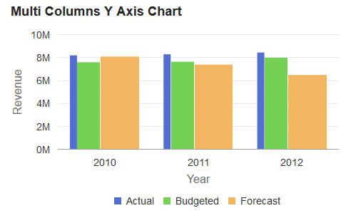
Since the SetDataYAxis method now allows you to specify multiple RECORD.FIELD parameters, you can specify data from multiple columns from the same data record. Doing so reduces the need to have duplicate data in row format. The following PeopleCode program could be used to display the preceding data:
rem Initialize the chart;
&Chart = GetChart(QE_COL_MULTIWRK.QE_CHART_FIELD);
&Chart.Reset();

rem Call function to check the chart type;
&Chart.Type = %ChartType_2DBar;

rem Set chart data record;
&Chart.SetData(Record.QE_COL_MULTI);

rem Set the x-axis;
&Chart.SetDataXAxis(QE_COL_MULTI.LY_YEARS);

rem Set multiple y-axis data columns;
&Chart.SetDataYAxis(QE_COL_MULTI.LY_AMOUNT_ACTUAL, QE_COL_MULTI.LY_AMOUNT_BUDGET, QE_COL_MULTI.LY_AMOUNT_FORCAST);

rem Set multi y-axis colors;
&Chart.SetDataColor(QE_COL_MULTI.LY_CHART_COLOR_1, QE_COL_MULTI.LY_CHART_COLOR_2, QE_COL_MULTI.LY_CHART_COLOR_3);

rem Set multi-column item size;
&Chart.SetDataZAxis(QE_COL_MULTI.LY_CHART_GLYPHSCL1, QE_COL_MULTI.LY_CHART_GLYPHSCL2, QE_COL_MULTI.LY_CHART_GLYPHSCL3);

rem Need labels for all y columns, which now act like series here;
&Chart.SetSeriesLabels(CreateArray("Actual", "Budgeted", "Forecast"));

&Chart.MainTitle = "Multi Columns Y Axis Chart";
&Chart.XAxisTitle = "Year";
&Chart.YAxisTitle = "Revenue";

rem Set the chart legend;
&Chart.HasLegend = True;
&Chart.LegendPosition = %ChartLegend_Bottom;

&Chart.IsDrillable = True;
&Chart.SetDataURLs(QE_COL_MULTI.LY_CHRT_URL_1, QE_COL_MULTI.LY_CHRT_URL_2, QE_COL_MULTI.LY_CHRT_URL_3);
The preceding PeopleCode would produce the following chart:
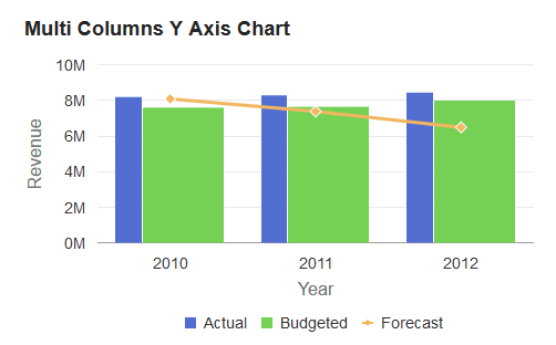
If the SetDataZAxis method is commented out of the preceding PeopleCode, the following chart with equal width bars is produced instead:
rem &Chart.SetDataZAxis(QE_COL_MULTI.LY_CHART_GLYPHSCL1,
QE_COL_MULTI.LY_CHART_GLYPHSCL2,
QE_COL_MULTI.LY_CHART_GLYPHSCL3);
Example2
If you want to plot a specific data series differently from the other series, you can use the Series class. The Series class is used in conjunction with the Chart class to override the default chart type (as defined by the Type property for the Chart object) for selected members of the data series. See Using the Series Class for more information on how to use the Series class to override the default chart type.
The addition of the following code excerpt at the end of the preceding PeopleCode program allows the forecast data to be plotted as a line chart instead of as a bar:
Local Series &S1;
&S1 = GetSeries();
&S1.Name = "Forecast";
&S1.Type = %SeriesType_Line;
&Chart.SetSeries(CreateArray(&S1));
Syntax
SetDataZAxis(Record_Name.Field_Name)Description
Use the SetDataZAxis method to specify a field that contains numerical data defining the size of each data point in a bubble chart or the width of the bar in a bar chart (or the height of the bar in a horizontal bar chart).
Parameters
Parameter |
Description |
|---|---|
Record_Name.Field_Name |
Specify the name of the record and the field on that record that contains numerical data defining the size of each data point. |
Returns
None.
Example
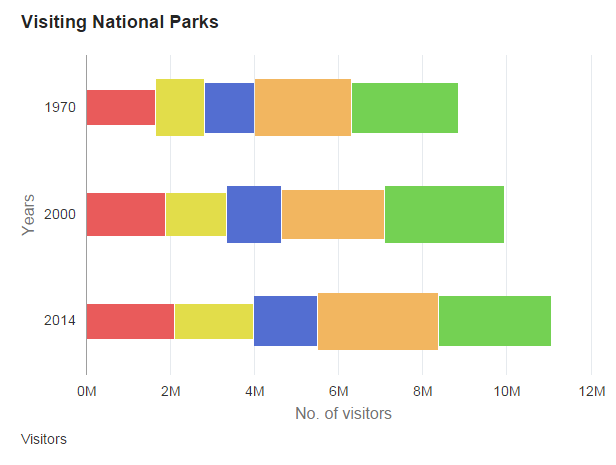
&oChart.SetDataZAxis(QE_CHART_NPARKS.QE_CHART_Z);Because no z-axis data is specified for the following stacked horizontal bar chart, the height of each bar is the same.
Because z-axis data is specified for the following stacked horizontal bar chart, the height of each bar varies according to the data value.
Syntax
SetExplodedSectorsArray(&Array)
Description
Use the SetExplodedSectorsArray method to specify the sectors in a pie chart that you want exploded. Specify a one-dimensional array of type integer to specify which sectors to explode. This is an optional method. The default is no sectors are exploded.
Sector numbers correspond to the rows of data used to generate the chart.
The PIECHARTSEGMENTEXPLOSIONDISTANCE style class in the PSCHARTSTYLE_FREEFORM and in the PSCHARTSTYLE_TANGERINE_FREEFM style sheets controls the explode offset for all pie chart sectors. The explode offset is expressed as a proportion of the pie radius. This style class is delivered with a default value. If you want exploded segments displayed farther from the pie chart center, adjust the value up; if you want segments displayed closer to the center of the pie chart, adjust the value down. We recommend using a value for PIECHARTSEGMENTEXPLOSIONDISTANCE between 0 and 100. The default in PSCHARTSTYLE_FREEFORM is 40 and in PSCHARTSTYLE_TANGERINE_FREEFM it is 100.
Parameters
Parameter |
Description |
|---|---|
&Array |
Specify an already instantiated one-dimensional array of number. This array lists the sector numbers that will be exploded. Sector numbers must be integer values. The default is no sectors are exploded. |
Returns
None.
Example
Local array of number &ExplodedArray;
&ExplodedArray = CreateArray(1,2,3,4,5)
&cChart.SetExplodedSectorsArray(&ExplodedArray);
The following example shows an exploded 2D pie chart:
Syntax
SetFunnelDataActual(Record_Name.Field_Name)Description
Use the SetFunnelDataActual method to specify a field that contains the actual numeric data for the funnel chart. Alternatively, this data can be specified using the SetDataYAxis method. This data is required for a funnel chart, and must be specified by one of these two methods.
The target data for a funnel chart can be specified in either of these ways:
Using the SetFunnelDataTarget method to specify a field. In this way, the target data can vary for each data point.
Using the FunnelPercentMeasure property. When this property is True, a default target value of 100.00 is used (which overrides any target data is specified by the SetFunnelDataTarget method).
Parameters
Parameter |
Description |
|---|---|
Record_Name.Field_Name |
Specify the name of the record, and the field on that record, that contains the data for the y-axis for the funnel chart. |
Returns
None.
Syntax
SetFunnelDataTarget(Record_Name.Field_Name)Description
Use the SetFunnelDataTarget method to specify a field that contains the target numeric data for the funnel chart. Target data is optional. However, when it is specified, the field must reside on the same record definition as specified with the SetFunnelDataActual method.
Note: If the FunnelPercentMeasure property is True, then any specified target data is ignored.
Parameters
Parameter |
Description |
|---|---|
Record_Name.Field_Name |
Specify the name of the record, and the field on that record, that contains the optional target data for the funnel chart. |
Returns
None.
Example
In the following example, the actual and target data for the funnel chart come from the same record definition, which is a required condition for using the SetFunnelDataTarget method:
&oChart.SetFunnelDataActual(CHART_RECORD.CHART_SALES);
&oChart.SetFunnelDataTarget(CHART_RECORD.CHART_X_NUMERIC);
rem &oChart.FunnelPercentMeasure = True;
Description
This method has been deprecated and is ignored.
Syntax
SetLegend(&Array_of_String)Description
Use the SetLegend method to specify alternative legends. By default, the legends are populated from the record field specified with SetDataSeries.
This method is used to write both the overlay legend and the series legend. The labels are overwritten in the order of elements in the array, that is, the first element overwrites the first series, the second overwrites the second, and so on, with the last element in the array overwriting the overlay legend. There can be more than one series in an overlay.
If you do not specify an element for an array (that is, a blank or a null) then no legend is listed for that series.
Note: Default label text is not automatically translated. If you set your own labels, be sure to use translated text, such as message catalog entries.
Note: Legends are not available for funnel charts. Therefore, this method is not applicable for a funnel chart.
Parameters
Parameter |
Description |
|---|---|
&Array_of_String |
Specify an already instantiated array of string, containing the text that you want to use for the legend. |
Returns
None.
Example
The following example displays a legend containing only the overlay.
&LegendArray = CreateArray("", "", "Revenue");

&MyChart.SetLegend(&LegendArray);Syntax
SetOLData({Record_Name|&Rowset})Description
Use the SetOLData method to specify where the data for the overlay is coming from.
If you make a change to the underlying data of a chart, call the SetOLData method again to update the chart.
There are no default values for the overlay data. You must specify the data.
You can specify two different y-axis fields, but you must make certain that different data plotted against the same axis makes sense. For example, while plotting two currency amounts would work technically—plotting currency amounts against number of units sold and sharing the same axis— would not look correct.
Parameters
Parameter |
Description |
|---|---|
Record_Name |
Specify the name of a record to be used to populate the overlay of the chart with data. |
&Rowset |
Specify the name of an already instantiated rowset to populate the overlay of the chart with data. |
Returns
None.
Syntax
SetOLDataSeries(Record_Name.Field_Name)Description
Use the SetOLDataSeries method to specify the name of the field containing the overlay series values. Every distinct value in this field is considered a unique series.
The series is plotted in the order given by the rows in the record.
If this value is Null, the system assumes there is only one series to plot.
Parameters
Parameter |
Description |
|---|---|
Record_Name.Field_Name |
Specify the name of the record, and the field on that record, that contains the series values of the overlay for the chart. |
Returns
None.
Syntax
SetOLDataXAxis(Record_Name.Field_Name)Description
Use the SetOLDataXAxis method to specify the groups along the x-axis if the axis is non-numeric for the overlay.
If the x-axis is numeric, this method is used to give the position of the points along the axis. Only discrete values are supported for the x-axis.
If this value is Null, the y values are plotted along the x-axis in groups labeled by their order number.
The order of the data is plotted in the order of rows in the record.
Parameters
Parameter |
Description |
|---|---|
Record_Name.Field_Name |
Specify the name of the record, and the field on that record, that contains the data for the x-axis for the overlay of the chart. |
Returns
None.
Syntax
SetOLDataYAxis(Record_Name.Field_Name)Description
Use the SetOLDataYAxis to specify the data to plot for the overlay of the chart.
This value must always be numeric.
This method has no default value.
Parameters
Parameter |
Description |
|---|---|
Record_Name.Field_Name |
Specify the name of the record, and the field on that record, that contains the data for the overlay of the chart. |
Returns
None.
Syntax
SetReferenceArea(&Array_of_RefAreas)Description
Use the SetReferenceArea method to specify one or more reference areas for the chart.
Parameters
Parameter |
Description |
|---|---|
&Array_of_RefAreas |
Specify an already instantiated array of ReferenceArea objects as the reference areas for this chart. |
Returns
None.
Syntax
SetReferenceLine(&Array_of_RefLines)Description
Use the SetReferenceLine method to specify one or more reference lines for the chart.
Parameters
Parameter |
Description |
|---|---|
&Array_of_RefLines |
Specify an already instantiated array of ReferenceLine objects as the reference lines for this chart. |
Returns
None.
Syntax
SetSelectedData(Record_Name.Field_Name)Description
Use the SetSelectedData method to redraw a chart while maintaining which data items were previously selected by the user. The specified field must be a single-character String storing the value Y or N.
The information on which data items have been selected by the user are returned in the aSelections property of the ChartClientState class as an array of String.
Parameters
Parameter |
Description |
|---|---|
Record_Name.Field_Name |
Specify the name of the record and field that indicates whether this data item is selected as one of these two String values:
|
Returns
None.
Example
&oChart.SetSelectedData(QE_CHARTPROPS.QE_SELECTED);Syntax
SetSeries(&Array_of_Series)Description
Use the SetSeries method to specify one or more Series objects for the chart to override the default chart type (as defined by the Type property for the Chart object) for selected members of the data series.
Parameters
Parameter |
Description |
|---|---|
&Array_of_Series |
Specify an already instantiated array of Series objects as the overriding chart types for this chart. |
Return
None.
Example
&all_series = CreateArray(&series1, &series2, &series3, &series4);

&cChart.SetSeries(&all_series);
Syntax
SetSeriesLabels(&Array_of_SeriesLabels)Description
Use the SetSeriesLabels method to method to set the label for each series, which are specified by the SetDataYAxis method. These labels are displayed in the legend and tooltips.
Parameters
Parameter |
Description |
|---|---|
&Array_of_SeriesLabels |
Specify an already instantiated array of String values specifying the label for each series. Note: The order of labels specified must correspond to the field order specified by the SetDataYAxis method. |
Returns
None.
Example
&oChart.SetSeriesLabels(CreateArray("Actual", "Budgeted", "Forecast", "Quantity"));Syntax
SetSvgGradientColor1(Record_Name.Field_Name1,
...)
Description
Use the SetSvgGradientColor1 method to assign the first color for the <stop> SVG element. The field must be a string storing a number or a constant that specifies the color you want to use. Value will be ignored if corresponding SetSvgGradientOffset1() is not called to set the offset or a value is not provided in the data row for a specific data item.
Note: The SetSvgGradientColor1 method can be used for bar charts only.
The String value of this field must be one of these values:
|
Value |
Description |
|---|---|
|
Blank |
Default series color. |
|
0 |
Black |
|
1 |
Blue |
|
2 |
Cyan |
|
3 |
Dark gray |
|
4 |
Gray |
|
5 |
Green |
|
6 |
Light gray |
|
7 |
Magenta |
|
8 |
Orange |
|
9 |
Pink |
|
10 |
Red |
|
11 |
White |
|
12 |
Yellow |
|
13 |
Red-orange |
|
14 |
Yellow-green |
|
15 |
Blue-violet |
|
16 |
Purple |
|
17 |
Yellow-orange |
Parameters
Parameter |
Description |
|---|---|
Record_Name.Field_Name1 |
Specify the name of the record and one or more fields on that record that contain the color value for the data items for the chart. Note: The number and order of fields specified must correspond to the order specified by the SetDataYAxis method. |
Returns
None.
Example
&Chart.SetSvgGradientColor1(QE_CHART_NP_REC.QE_CHART_GCOLOR1_S);Syntax
SetSvgGradientColor2(Record_Name.Field_Name1,
...)
Description
Use the SetSvgGradientColor2 method to assign the second color for the <stop> SVG element. The field must be a String storing a number or a constant that specifies the color you want to use. Value will be ignored if corresponding SetSvgGradientOffset2() is not called to set the offset or a value is not provided in the data row for a specific data item.
Note: The SetSvgGradientColor2 method can be used for bar charts only.
Parameters
Parameter |
Description |
|---|---|
Record_Name.Field_Name1 |
Specify the name of the record and one or more fields on that record that contain the color value for the data items for the chart. Note: The number and order of fields specified must correspond to the order specified by the SetDataYAxis method. |
Returns
None.
Example
&Chart.SetSvgGradientColor2(QE_CHART_NP_REC.QE_CHART_GCOLOR2_S);Syntax
SetSvgGradientColor3(Record_Name.Field_Name1,
...)
Description
Use the SetSvgGradientColor3 method to assign the third color for the <stop> SVG element. The field must be a String storing a number or a constant that specifies the color you want to use. Value will be ignored if corresponding SetSvgGradientOffset3() is not called to set the offset or a value is not provided in the data row for a specific data item.
Note: The SetSvgGradientColor3 method can be used for bar charts only.
Parameters
Parameter |
Description |
|---|---|
Record_Name.Field_Name1 |
Specify the name of the record and one or more fields on that record that contain the color value for the data items for the chart. Note: The number and order of fields specified must correspond to the order specified by the SetDataYAxis method. |
Returns
None.
Example
&Chart.SetSvgGradientColor3(QE_CHART_NP_REC.QE_CHART_GCOLOR3_S);Syntax
SetSvgGradientColor4(Record_Name.Field_Name1,
...)
Description
Use the SetSvgGradientColor4 method to assign the fourth color for the <stop> SVG element. The field must be a String storing a number or a constant that specifies the color you want to use. Value will be ignored if corresponding SetSvgGradientOffset4() is not called to set the offset or a value is not provided in the data row for a specific data item.
Note: The SetSvgGradientColor4 method can be used for bar charts only.
Parameters
Parameter |
Description |
|---|---|
Record_Name.Field_Name1 |
Specify the name of the record and one or more fields on that record that contain the color value for the data items for the chart. Note: The number and order of fields specified must correspond to the order specified by the SetDataYAxis method. |
Returns
None.
Example
&Chart.SetSvgGradientColor4(QE_CHART_NP_REC.QE_CHART_GCOLOR4_S);Syntax
SetSvgGradientOffset1(Record_Name.Field_Name1,
...)
Description
Use the SetSvgGradientOffset1 method to set the first offset of the <stop> SVG element which indicates where the gradient color stop is placed. The gradient color is set via SetSvgGradientColor1 method. The field must be a string storing the numeric value in percentage for the gradient offset. No <stop> SVG element will be created for the data item if corresponding SetSvgGradientColor1 is not called to set the color or a value is not provided in the data row for a specific data item.
Note: The SetSvgGradientOffset1 method can be used for bar charts only.
Parameters
Parameter |
Description |
|---|---|
Record_Name.Field_Name1 |
Specify the name of the record and one or more fields on that record that contain the offset value for the data items for the chart. The record field must be defined as character data type field. Note: The number and order of fields specified must correspond to the order specified by the SetDataYAxis method. |
Returns
None.
Example
&Chart.SetSvgGradientOffset1(QE_CHART_NP_REC.QE_CHART_OFFSET1_S);Syntax
SetSvgGradientOffset2(Record_Name.Field_Name1,
...)
Description
Use the SetSvgGradientOffset2 method to set the second offset of the <stop> SVG element which indicates where the gradient color stop is placed. The gradient color is set via SetSvgGradientColor2 method. The field must be a string storing the numeric value in percentage for the gradient offset. No <stop> SVG element will be created for the data item if corresponding SetSvgGradientColor2 is not called to set the color or value is not provided in the data row for a specific data item. Value will be ignored if SetSvgGradientOffset1() is not called or no value is provided.
Note: The SetSvgGradientOffset2 method can be used for bar charts only.
Parameters
Parameter |
Description |
|---|---|
Record_Name.Field_Name1 |
Specify the name of the record and one or more fields on that record that contain the offset value for the data items for the chart. The record field must be defined as character data type field. Note: The number and order of fields specified must correspond to the order specified by the SetDataYAxis method. |
Returns
None.
Example
&Chart.SetSvgGradientOffset2(QE_CHART_NP_REC.QE_CHART_OFFSET2_S);Syntax
SetSvgGradientOffset3(Record_Name.Field_Name1,
...)
Description
Use the SetSvgGradientOffset3 method to set the third offset of the <stop> SVG element which indicates where the gradient color stop is placed. The gradient color is set via the SetSvgGradientColor3 method. The field must be a string storing the numeric value in percentage for the gradient offset. No <stop> SVG element will be created for the data item if corresponding SetSvgGradientColor3 is not called to set the color or value is not provided in the data row for a specific data item. Value will be ignored if SetSvgGradientOffset1() is not called or no value is provided.
Note: The SetSvgGradientOffset3 method can be used for bar charts only.
Parameters
Parameter |
Description |
|---|---|
Record_Name.Field_Name1 |
Specify the name of the record and one or more fields on that record that contain the offset value for the data items for the chart. The record field must be defined as character data type field. Note: The number and order of fields specified must correspond to the order specified by the SetDataYAxis method. |
Returns
None.
Example
&Chart.SetSvgGradientOffset3(QE_CHART_NP_REC.QE_CHART_OFFSET3_S);Syntax
SetSvgGradientOffset4(Record_Name.Field_Name1,
...)
Description
Use the SetSvgGradientOffset4 method to set the fourth offset of the <stop> SVG element which indicates where the gradient color stop is placed. The gradient color is set via the SetSvgGradientColor4 method. The field must be a string storing the numeric value in percentage for the gradient offset. No <stop> SVG element will be created for the data item if corresponding SetSvgGradientColor4 is not called to set the color or value is not provided in the data row for a specific data item. Value will be ignored if SetSvgGradientOffset1() is not called or no value is provided.
Note: The SetSvgGradientOffset4 method can be used for bar charts only.
Parameters
Parameter |
Description |
|---|---|
Record_Name.Field_Name1 |
Specify the name of the record and one or more fields on that record that contain the offset value for the data items for the chart. The record field must be defined as character data type field. Note: The number and order of fields specified must correspond to the order specified by the SetDataYAxis method. |
Returns
None.
Example
&Chart.SetSvgGradientOffset4(QE_CHART_NP_REC.QE_CHART_OFFSET4_S);Syntax
SetToolTipLabels(&Array_of_ToolTipLabels)Description
Use the SetToolTipLabel method to display custom tooltips (also referred to as “data hints” or “hover text”) on charts thereby overriding the default tooltips that are automatically created from the chart data.
Parameters
Parameter |
Description |
|---|---|
&Array_of_ToolTipLabels |
Specify an already instantiated array of ToolTipLabel objects as the tool tips for this chart. |
Returns
None.
Example
&tooltip_labels = CreateArray(&label1, &label2, );

&cChart.SetToolTipLabels(&tooltip_labels);
Syntax
SetXAxisLabels(&Array_of_String)Description
Use the SetXAxisLabels method to specify an array of labels for the x-axis. By default, the labels are populated from the record field specified by SetDataXAxis. Labels specified with SetXAxisLabels overwrite the default labels.
Note: Default label text is not automatically translated. If you set your own labels, be sure to use translated text, such as message catalog entries.
Parameters
Parameter |
Description |
|---|---|
&Array_of_String |
Specify an already instantiated array of string that contain the labels that you want to use for the x-axis. |
Returns
None.
Syntax
SetYAxisColumnType(&Array_of_Y_Axes)Description
Use the SetYAxisColumnType method to assign fields to either the primary y-axis or the secondary y-axis.
Parameters
Parameter |
Description |
|---|---|
&Array_of_Y_Axes |
Specify an already instantiated array of numeric values. Note: The order of fields specified must correspond to the number and order specified by the SetDataYAxis method. |
You can specify either an Integer or constant value for the elements of this array. The values are:
|
Numeric Value |
Constant Value |
Description |
|---|---|---|
|
1 |
%Axis_Y |
Display this field on the primary y-axis. |
|
2 |
%Axis_Y2 |
Display this field on the secondary y-axis. |
Returns
None.
Example
&oChart.SetYAxisColumnType(CreateArray(%Axis_Y, %Axis_Y, %Axis_Y, %Axis_Y2)); Syntax
SetYAxisLabels((&Array_of_String))Description
Use the SetYAxisLabels method to specify an array of labels for the y-axis. Labels specified with SetYAxisLabels overwrite the default labels.
If the greatest y-axis value is less than ten, the default y-axis labels are given a decimal place. If the greatest y-axis value is greater than or equal to ten, the default y-axis labels are displayed as integers.
Note: Default label text is not automatically translated. If you set your own labels, be sure to use translated text, such as message catalog entries.
If you set the labels yourself, you should set YAxisTicks and YAxisMax because you no longer have numbers that correlate to the data points. YAxisTick is used to calculate the increment of each major tick mark. If YAxisTick is not set, tick mark increment will be set to 1.
Note: The SetYAxisLabels method does not work with negative y-axis value.
Parameters
Parameter |
Description |
|---|---|
&Array_of_String |
Specify an already instantiated array of string that contain the labels that you want to use for the y-axis. |
Returns
None.