Viewing Payable Time Analytics
PeopleSoft Payable Time Analytics dashboards provide administrators and managers the ability to view and analyze payable time generated by Time and Labor using Insights visualizations.
There are two Payable Time dashboards, the Payable Time Insight and Payable Time Trend. The Payable Time Insight dashboard is intended for administrators and timekeepers to alert them to possible data or processing issues. The Payable Time Trend dashboard is intended for management roles to help them visualize the trends in time being paid and where there might be anomalies.
The Payable Time visualizations are built on the PeopleSoft Insights platform, which relies on an underlying analytics engine and search engine.
For information on Insights, see PeopleTools Search Technology, “Monitoring PeopleSoft Search Framework and OpenSearch” and “Working with Insights Dashboards for PeopleSoft Application Data” documentation.
These videos provide an overview of the Insights feature:
Video: Insights with PeopleSoft
Video: PeopleSoft HCM Insights
Note: For both the Payable Time Search and Payable Time Exceptions indexes, the Real Time Indexing (RTI) is enabled. With RTI enabled search indexes, you can get up to date data available in analytics and searches.
To use incremental index, enable the Incremental Index for Payable Time from the Time and labor installation page. For more information, see the Insight and Search Index Options section of the Time and Labor Installation Page topic.
For more information on using incremental index, see PeopleTools Search Technology, “Administering PeopleSoft Search Framework”.
These search indexes support RTI with PeopleTools version 8.59.07 or higher. When enabled, RTI allows real-time updates to the indexed data to provide a search using the latest information.
Note: When high volume processing occurs in Time Administration and Pay reversal processes, The RTI will be disabled. Incremental index will be scheduled automatically after the process completes and it enables the RTI.
Note: For more information about Real Time Indexing, refer to PeopleTools Search Technology, "Administering Real Time Indexing."
As part of Currency Conversion Setup, Payable Time Insight and Payable Time Trend Insights dashboards support only one global currency, which is US Dollars.
This topic provides an overview of the deployment and access of the Payable Time Analytics, and discusses how to view Insights Payable Time Analytics visualizations.
|
Page Name |
Definition Name |
Usage |
|---|---|---|
|
HC_TL_PAYABLE_TIME_INSIGHT_FL (this is the cref for the tile) |
Access the Payable Time Insight dashboard. |
|
|
HC_TL_PAYABLE_TIME_INSIGHT_FL |
Review and analyze payable time using Insights visualizations. |
|
|
HC_TL_PAYABLE_TIME_TREND_FL |
Access the Payable Time Trend dashboard. |
|
|
HC_TL_PAYABLE_TIME_TREND_FL |
Review and analyze payable time trend using Insights visualizations. |
This section lists the common elements and controls that are used in Insights analytics.
Note: Filtering options apply to all visualizations, which allows users to drill down on all the charts at once.
|
Term |
Definition |
|---|---|
|
Open in Insights |
This link appears only for users with role TL Administrator Fluid. |
|
|
Click to save the current query text and filters that you want to reuse in the future, or select an existing query to use to update the visualizations. |
|
Search field |
Enter a Insights Query Language (KQL) query to filter data, if applicable. |
|
|
Enter criteria to filter data on the visualizations. You can apply filters in a number of ways:
Added filters are displayed next to the + Add filter link for reference. Click the Change all filters icon for a list of actions that can be performed on all filters, for example, disable them temporarily, remove them permanently, or invert inclusion (show data that does not meet filter criteria). Click a filter item for a list of similar actions that can be performed on it individually. |
|
|
Click to select a different time period for the analytics. You can enter it manually, or choose from commonly used date ranges provided the system as well as recently used selections. When a new period is selected, all visualizations are refreshed automatically to reflect that change. If you have selected a commonly used date range, for example, This month, or Week to date, click the Show dates link to view the approximate date period in relation to the current date. For example, the current date is November 1 and the selected date range is Year to date. Clicking the Show dates link displays ~ 10 months ago —> now, which indicates that the selected date range started from approximately 10 months ago and ends on the current date. |
|
|
Click the Options icon in the upper right hand corner of a visualization to select one of these options:
|
|
|
Click this icon to hide or display the legend for the chart, if available. You can click an item in the legend to change its color, or add it as a filter (if applicable). |
|
Chart item (bar, pie slice, and so forth) |
Pause over a chart item, such as a bar item or pie slice, to view a summary of details for that item. Select a chart item to add a filter for it to apply to all visualizations. |
 (See saved queries)
 (Change all filters), and
  (Calendar) or
  (Options)
 (Toggle legend)
When you pause over a visualization, the Options and Legend (if applicable) icons are displayed on the top right and bottom left corners' respectively. Use them to inspect the chart or table, view the details of that visualization, and toggle the legend display.
For more information on working with Insights and filters, see PeopleTools Search Technology, “Working with Insights Dashboards for PeopleSoft Application Data” documentation.
Before administrators can access the payable time data in Insights, the following steps should be performed:
Deploy the HC_TL_GBL_PAYABLETIME and HC_TL_GBL_PAYABLETIME_EXCPTN (Payable Time data) indexes.
or
()
Build the HC_TL_GBL_PAYABLETIME and HC_TL_GBL_PAYABLETIME_EXCPTN search indexes, on building it you change the indexing type between Full Index and Incremental Index.
Deploy the Payable Time Insight tile, Payable Time Insight dashboard, Payable Time Trend tile, and Payable Time Trend dashboard.
()
Note: The full index must be run before the dashboard can be deployed.
Assign the TL Manager Fluid role to administrators to managers and the TL Administrator Fluid role to administrators to access and view Payable Time Insight Analytics visualizations.
Note: Run the full index first time.
The administrators or managers can use the Payable Time Insight tile to access the Payable Time Insight dashboard using PeopleSoft Insights for Time and Labor.
The Payable Time Insight tile displays the amount of payable time requiring approval and rejected by payroll in hours.
Users can view other statuses inside the dashboard. The reason for only showing theses two statuses upfront is because these are the ones that most urgently need an administrator's attention.
Customers can modify the visualization to change or add other statuses to this tile.
This example illustrates the Payable Time Insight tile.

Note: These insights will consider only positive time reporters and excludes all exception time reporters.
Payable Time as well as Exceptions are results from running the Time Administration process. The Time Administration process takes Reported Time and generated Payable Time by applying the Time and Labor Rules. For more information, refer to Time Administration.
The Time administrators and managers can use the Payable Time Insight dashboard to view several interactive visualizations based on the time reporting time data specified for a date range for the group of employees specified by the filters.
The visualizations are used in the following ways:
Identify the departments that generate the most overtime on average per person.
Identify Payable Time statuses which may indicate a problem.
Calculate the number of hours to be paid by TRC Category.
Identify any exceptions that is block the processing of approvals.
View the overtime trend.
Calculate the payable shift hours.
Identify the total of all overtime worked.
This example illustrates the fields and controls on the Payable Time Insight dashboard. You can find definitions for the fields and controls later on this page.
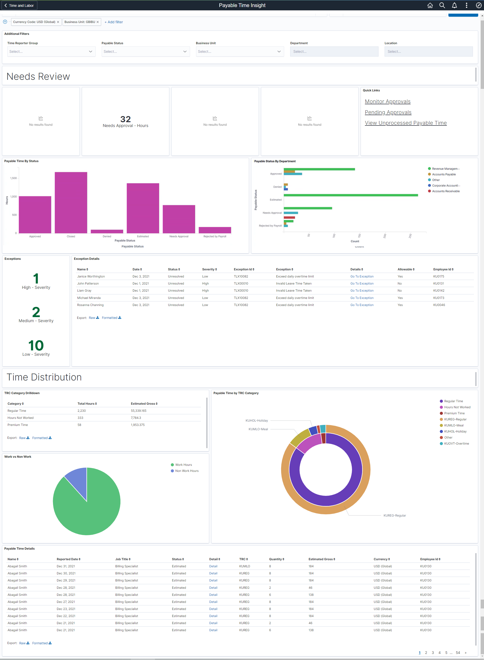
The visualizations are presented in different visual representations to best present data. There are different types of analytics which include:
Needs Review
Payable Time by Status
Payable Status By Department
Exceptions and Details
TRC Category Drilldown
Work Vs Non-Work
Payable Time By TRC Category
Payable Time Details
Additional Filters
With any visualization, you can pause over an item to view the percentage or number counts, as desired.
Filtering options apply to all visualizations, which allows administrators to drill down on all the charts at once.
This example illustrates the fields and controls on the Additional Filters. You can find definitions for the fields and controls later on this page.
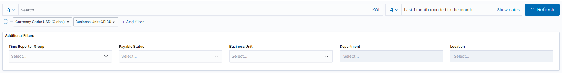
Additional Filters allows you select filters in the areas:
Time Reporter Group
Payable Status
Business Unit
Department
Location
Needs Review
Use the Needs Review visualization to view the Payable Time statuses which may require review.
This example illustrates the fields and controls on the Needs Review visualizations.
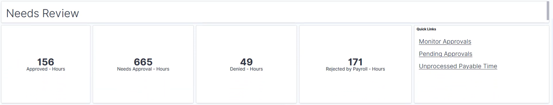
The Quick Links visualizations show approvals status and unprocessed payable time contains links to other pages which might be useful when reviewing the various Payable Time statuses.
Note: Quick Links show top 10 statuses in this visualization in alphabetical order. You can edit visualization and filter to include only specific statuses.
Payable Time By Status Visualization
Use the Payable Time By Status visualization to view all of the payable time statuses.
This example illustrates the fields and controls on the Payable Time By Status.
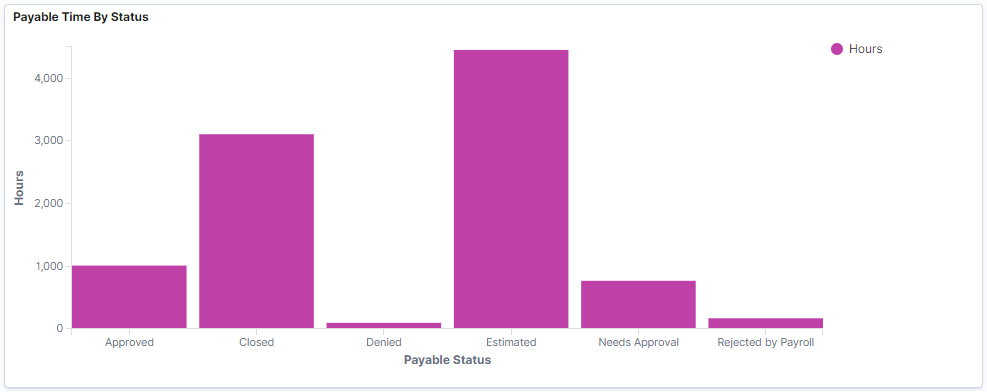
This bar chart displays the status such as approved, closed, denied, estimated, needs approval and rejected by payroll. This include all statuses that have time associated with them.
Payable Status By Department
Use the Payable Statuses By Department visualization to view status by department.
This example illustrates the fields and controls on the Payable Status By Department visualization
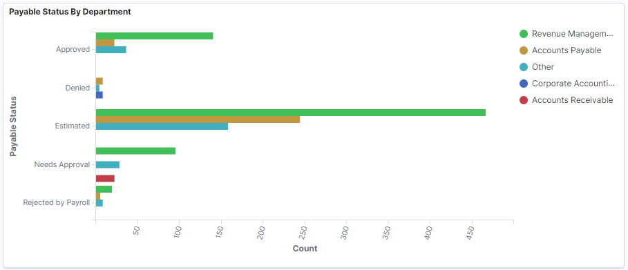
The legends represent the different departments in different colour.The corresponding counts are displayed for respective payable Time status.
Exceptions
Use the Exceptions visualization to view the analytics for severity of high, medium and low.
This example illustrates the fields and controls on the Exceptions.
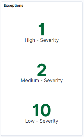
Select to see the Exception details.
Exception Details
Use Exception Details to view details of the exceptions or to export the data in the format which is needed.
The exception index HC_TL_GBL_PAYABLETIME_EXCPTN is used for getting exceptions data.
This example illustrates the fields and controls on the Exception Details.
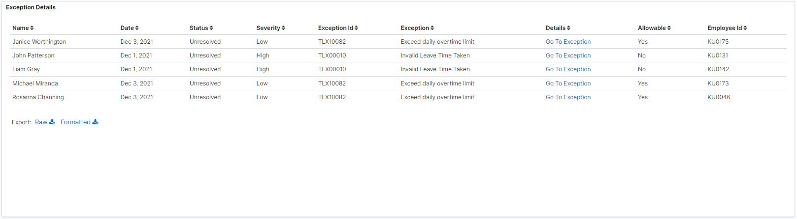
Note: The exception details show only the unresolved exceptions for which the source is Time Administration.
Select the Go to Exception hyperlink to access the Manage Exceptions page.
TRC Category Drilldown
Use the TRC Category Drilldown to view time distribution where multiple TRCs are grouped by TRC category. The categories are based on the TRC Categories that your organization has set up.
This example illustrates the fields and controls on the TRC Category Drilldown.
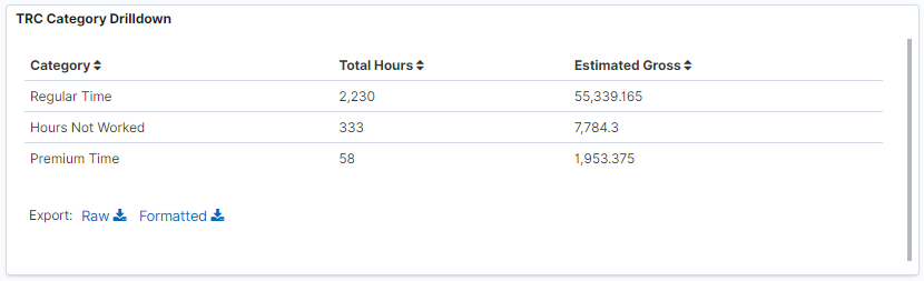
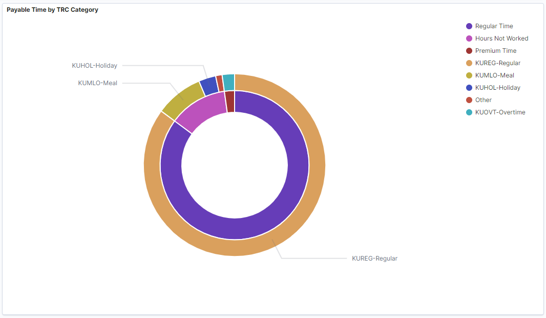
Note: The TRC Categories are pulled in from the TRC Category set-up.
The inner ring contains the TRC Category while the outer ring contains the Time Reporting Codes (TRCs).
Payable Time by TRC Category
Use Payable Time by TRC Category double doughnut visualizations to view the payable time distributed over TRC category.
This example illustrates the fields and controls on the Payable Time by TRC Category.
Work vs Non Work
Use the Work vs Non Work visualization to view the distribution of work and non-work hours.
This example illustrates the fields and controls on the Work vs Non Work visualization. You can find definitions for the fields and controls later on this page.
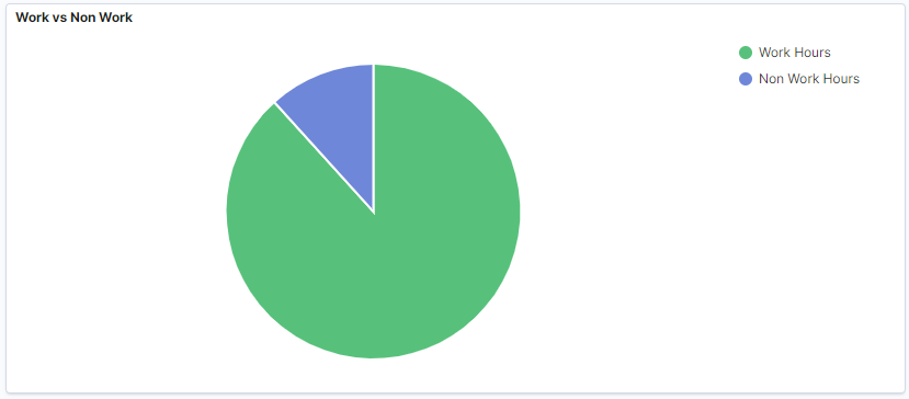
Note: You can configure the items to be displayed in the visualizations for Work vs Non Work. Use the WRKTRC and NONWRKTRC Value lists to categorize TRCs. For more details, refer to Creating Value Lists.
Payable Time Details
Use Payable Time Details to view the details and the data on the visualizations.
This example illustrates the fields and controls on the Payable Time Details.
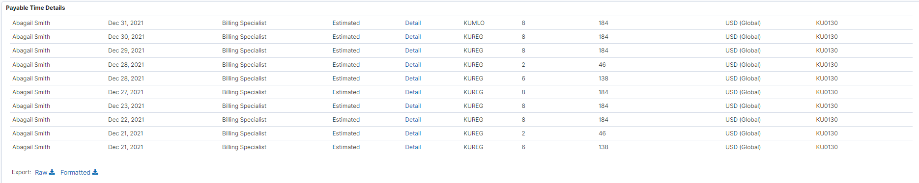
Selecting the Detail link takes you to Payable Time page from where you can manage the view settings.
Use the Payable Time Trend tile to access Payable Time Trend Dashboard.
The tile displays the hours per month trend of payable time.
This example illustrates the Payable Time Trend Tile.
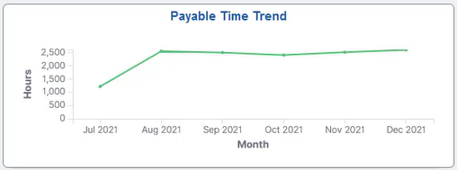
The Payable Time trend visualization displays a rolling period. It shows the past six months trend from the current months context.
Use the Payable Time Trend and to view the payable time and overtime trends Dashboard and overtime trends by department.
The visualizations are used in the following ways:
Identify the departments that generate the most payable time average overtime cost.
View the overtime trend.
This example illustrates the fields and controls on the Payable Time Trend Dashboard.
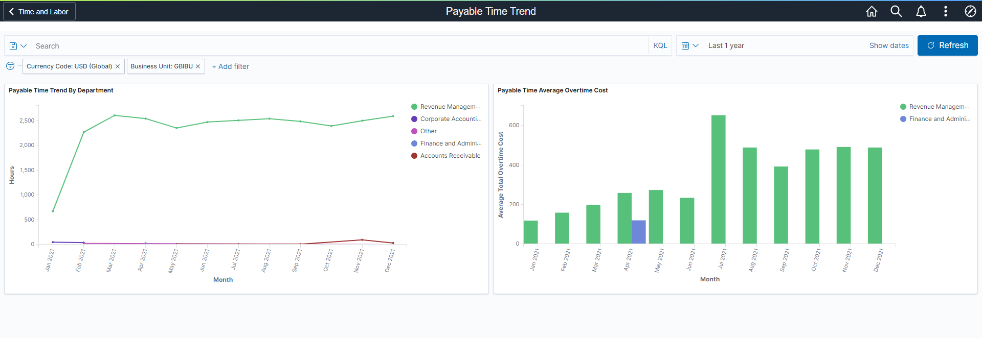
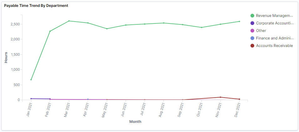
Payable Time Trend By Department
Use Payable Time Trend By Department visualization to view the payable time trend in hours with the respective departments.
This example illustrates the fields and controls on the Payable Time Trend By department.
Payable Time Average Overtime Cost
Use Payable Time Average Overtime Cost visualization to view the payable time trend of overtime cost.
This example illustrates the fields and controls on the Payable Time Average Overtime Cost.
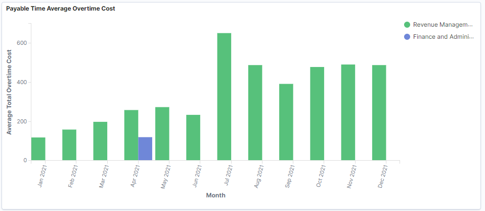
The Payable Time Average Overtime Cost visualization is for a rolling period. It shows the past twelve months average overtime cost from the current months' context by department.