Viewing Global Payroll Insights
The Global Payroll Insights are divided into:
Global Payroll Costs Analytics: It enables upper management of an organization to view and analyze payroll expenses related to their workforce using Insights visualizations.
Global Payroll Operations Analytics: Provides Global Payroll Administrators a clear picture of the payroll status, open errors, payment methods, payroll frequencies etc.
Global Payroll Trends Analytics: Helps Global Payroll Administrators to identify peaks and analyze fluctuation over time for Earnings and Deductions, off-cycle processes, payroll status, payroll frequency, etc. for their work areas.
These payroll visualizations are built on the PeopleSoft Insights platform, which relies on an underlying analytics engine and search engine. Global Payroll data that is visible on the dashboard comes from Global Payroll search indexes.
For information on Insights, see PeopleTools Search Technology, “Monitoring PeopleSoft Search Framework and OpenSearch” and “Working with Insights Dashboards for PeopleSoft Application Data” documentation.
These videos provide an overview of the Insights feature:
Video: Insights with PeopleSoft
Video: PeopleSoft HCM Insights
This topic lists common elements used in Insights visualizations, provides an overview of the deployment and access of the analytics for Global Payroll, and discusses how to review and analyze Global Payroll data using Insights visualizations.
|
Page Name |
Definition Name |
Usage |
|---|---|---|
|
HC_GP_PAYROLL_INSIGHT_LINK_FL |
Access the Global Payroll Insights dashboard. |
|
|
N/A |
Access Insights Global Payroll Cost Analytics, Global Payroll Analytics, Global Payroll Operations, Global Payroll Trends and Global Payroll Administration. |
|
|
HC_GP_PAYROLL_INSIGHT_FL |
Access Global Payroll visualizations on the Global Payroll Cost Analytics dashboard. |
|
|
N/A (Dashboard can be viewed in the Insights Console) |
To view Insights visualizations for Global Payroll based on the Global Payroll data index, and spot inconsistencies in time. |
|
|
HC_GP_OPERATIONS_FL |
Access Global Payroll visualizations on the Global Payroll Operations dashboard. |
|
|
N/A (Dashboard can be viewed in the Insights Console) |
To view Insights visualizations for Global Payroll operations. |
|
|
HC_GP_TRENDS_FL |
Access Global Payroll visualizations on the Global Payroll Trends dashboard. |
|
|
N/A (Dashboard can be viewed in the Insights Console) |
To view Insights visualizations for Global Payroll trends. |
Before users can access the Global Payroll data in PeopleSoft Insights, the following steps should be performed:
Deploy Global Payroll tiles and dashboards.
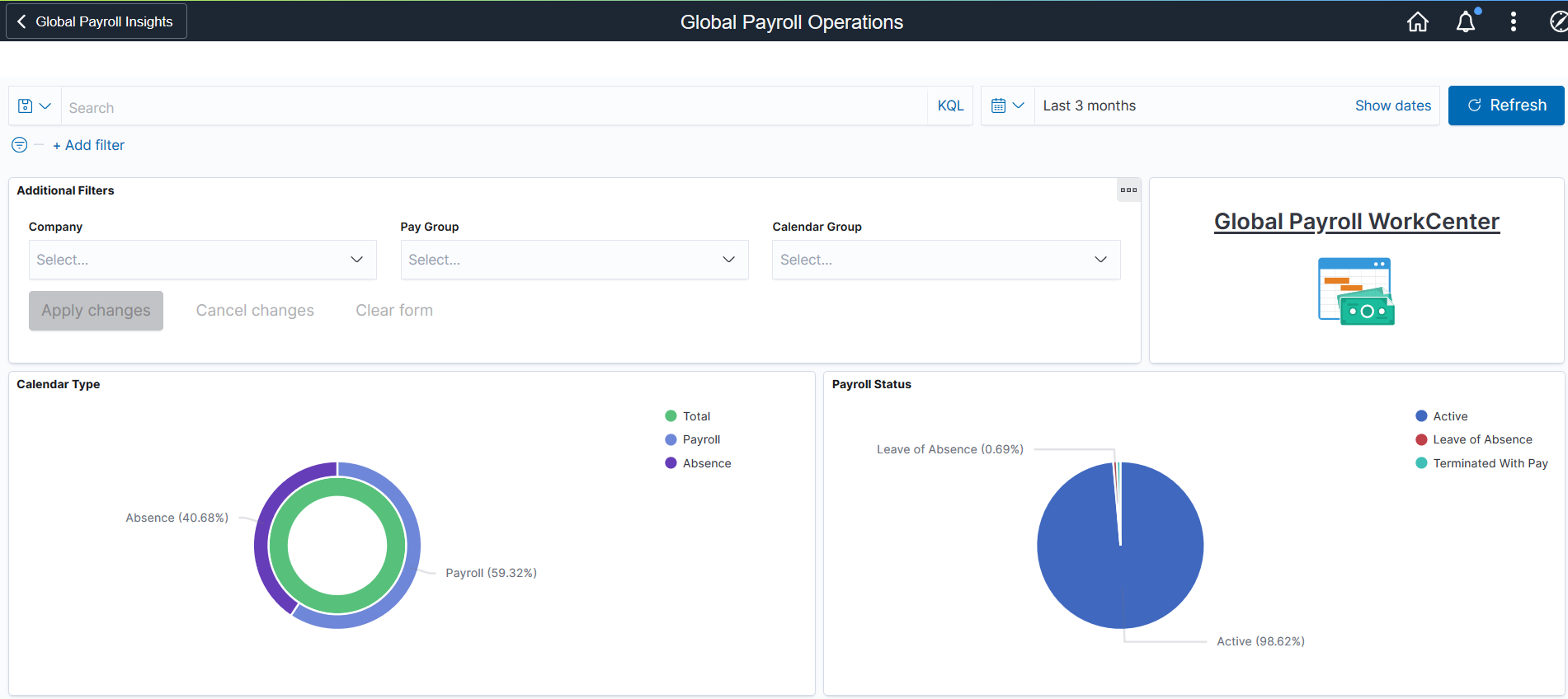
Global Payroll Insights Home
Global Payroll Insights
Global Payroll Operations
Global Payroll Operations Tile
Global Payroll Trends
Global Payroll Trends Tile
()
Deploy and build these payroll search indexes:
GP_KIB_ERN_DED_GN
GP_KIB_ED_GN_SRCH
GP_KIB_OPER_SRCH
GP_KIB_OP_TREND_SRCH
()
Assign the below user role to administrators to access and view Global Payroll visualizations.
GP Administrator, which provides access to the Global Payroll Insights tile and dashboard.
Fluid Dashboard- ESS GP, which provides access to Global Payroll data components, allowing users to view Global Payroll data presented on visualizations.
Add the following tiles:
Global Payroll Insights tile
Global Payroll Cost Analytics tile
Global Payroll Operations tile
Global Payroll Trends tile
Configure element categories (Earnings and Deductions) for your country.
(
Define local currency in the Currency Conversion Setup page.
Run the process to enable access.
Select the Enable Access List Cache option and run the process.
This section lists the common elements and controls that are used in Insights.
Note: Filtering options apply to all visualizations, which allows users to drill down on all the charts at once.
Field or Control |
Description |
|---|---|
Open in Insights |
This link appears only for users with role Search Administrator. |
Filters search
field, |
Enter criteria to filter data on the visualizations. You can add filters in a number of ways:
Added filters are displayed below the Filters search field for reference. For example, when you select a state from the map, the corresponding filter is automatically added to your filters list. When you click the donut chart item for Bonus in the Earnings by Category visualization, the system will prompt you to add the Description: Bonus and Category: Earnings filters since this item consists of more than one filter. Click the Filters link by the search field to hide or show a list of filters that have been applied to the analytics. A badge number appears to show the number of filters currently applied to the analytics. Click the Change all filters gear icon for a list of actions that can be performed on all filters, for example, disable them temporarily, delete them permanently, or invert inclusion (show data that does not meet filter criteria). Click a filter item for a list of similar actions that can be performed on it individually. |
|
Click to select a different time period for the analytics. You can enter it manually, or choose from commonly used date ranges provided the system as well as recently used selections. When a new period is selected, all visualizations are refreshed automatically to reflect that change. If you have selected a commonly used date range, for example, This month, or Week to date, click the Show dates link to view the approximate date period in relation to the current date. For example, the current date is November 1 and the selected date range is Year to date. Clicking the Show dates link displays ~ 10 months ago —> now, which indicates that the selected date range started from approximately 10 months ago and ends on the current date. |
 (Change all filters), and
  (Calendar) or
 When you pause over a visualization, the Options and Legend (if applicable) icons are displayed on the top right and bottom corners respectively. Use them to inspect the chart or table and view the details of that visualization, and toggle the legend display.
Field or Control |
Description |
|---|---|
|
Pause over the Options icon to select one of these options:
|
|
Click this icon to hide or display the legend for the chart, if available. You can click an item in the legend to change its color, or add it as a filter (if applicable). |
Chart item (bar, pie slice, and so forth) |
Hover over a chart item, such as a bar item or pie slice, to view a summary of details for that item. Select a chart item to add a filter for it to apply to all visualizations. |
 (Options)
 (Toggle legend)
For more information on working with Insights and filters, see PeopleTools Search Technology, “Working with Insights Dashboards for PeopleSoft Application Data” documentation.
Use the Global Payroll Insights tile to access the Global Payroll Insights dashboard.
Navigation:
The Global Payroll Insights tile is delivered as part of Workforce Administrator Home Page. You can add the tile, through personalization, to a system-delivered homepage or a homepage that you create.
This example illustrates the Global Payroll Insights tile.

Use the Global Payroll Insights Dashboard to access different Global Payroll tiles.
This example illustrates the Global Payroll Insights dashboard.
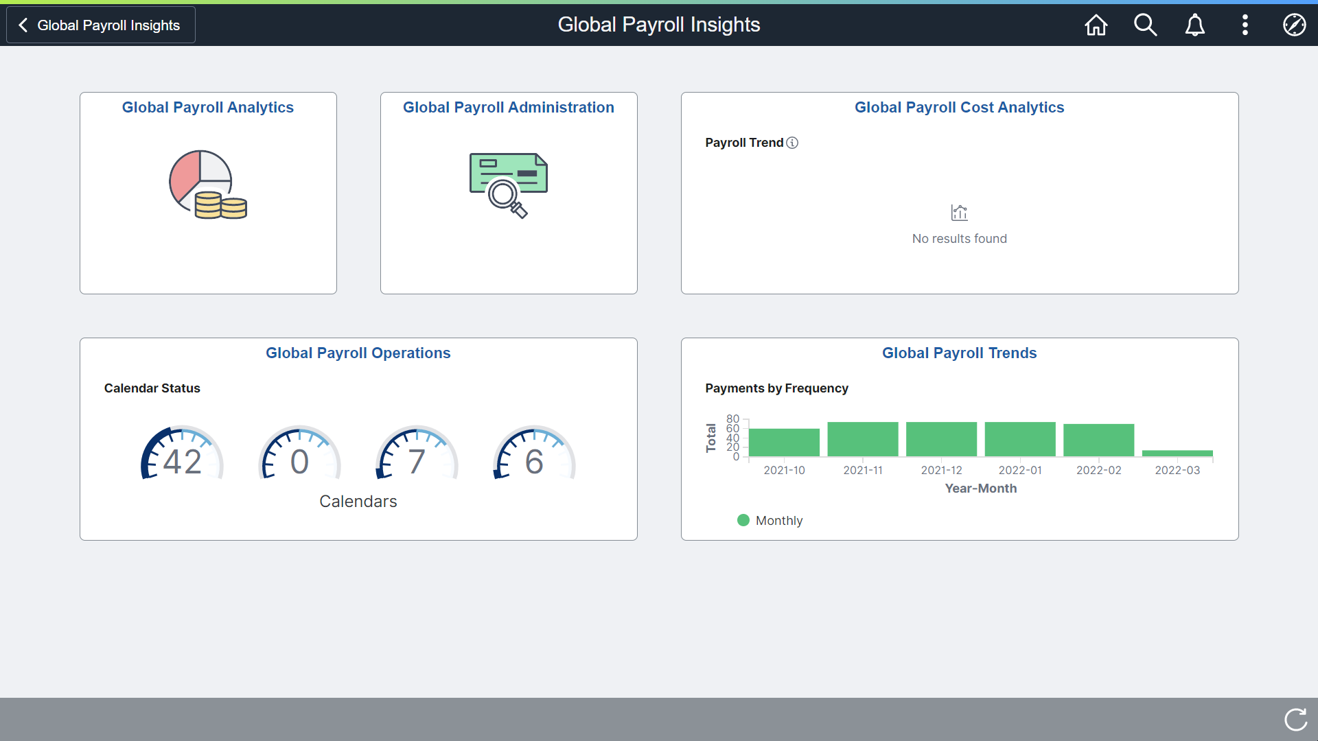
You can access the following Global Payroll tiles from the Global Payroll Insights dashboard:
Global Payroll Analytics
Global Payroll Administration
Global Payroll Cost Analytics
Global Payroll Operations
Global Payroll Trends
Use the Global Payroll Cost Analytics tile to access Global Payroll visualizations on the Global Payroll Cost Analytics dashboard.
The Global Payroll Cost Analytics Tile is located on the Global Payroll Insights dashboard.
This example illustrates the Global Payroll Cost Analytics tile.
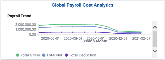
The Global Payroll Cost Analytics tile displays a portion of the Payroll Trend visualization, which is available on the Global Payroll Cost Analytics dashboard.
Use the Global Payroll Cost Analytics dashboard to review and analyze Global Payroll data using Insights visualizations.
Navigation:
Click the Global Payroll Cost Analytics tile.
This example illustrates the fields and controls on the Global Payroll Cost Analytics dashboard (1 of 3). This screenshot shows the popup menu details that appear when you pause over a chart item on a map visualization.

This example illustrates the fields and controls on the Global Payroll Cost Analytics dashboard (2 of 3). The popup menu shows two pieces of information represented by the chart item that you pause over on a two level donut visualization.
This example illustrates the fields and controls on the Global Payroll Cost Analytics dashboard (3 of 3). The screenshot shows the Options pop-up that will display when you click the Options icon of a visualization.
Warning! Insights dashboards may not render properly if you access them using unsupported platforms.
Using the interactive visualizations that are available on the dashboard, you can see the breakdown of total payroll costs, and compare the trends of different breakdown components over a period of time. You can also view the distribution of payroll costs by country and category, total employees paid, category trends as well as the total earnings and deductions by category. When you select filters or chart items, or modify the date range, Insights dynamically updates all visualizations.
Note: If you want to see the updated data in Global Payroll Insights dashboard, you have to run the following indexes in the incremental mode, this process is also triggered by the Calculate Absence and Payroll process:
GP_KIB_ERN_DED_GN
GP_KIB_ED_GN_SRCH
The dashboard uses role-level security to display permitted data to the user. If you add or update any data, you need to run the above indexes again.
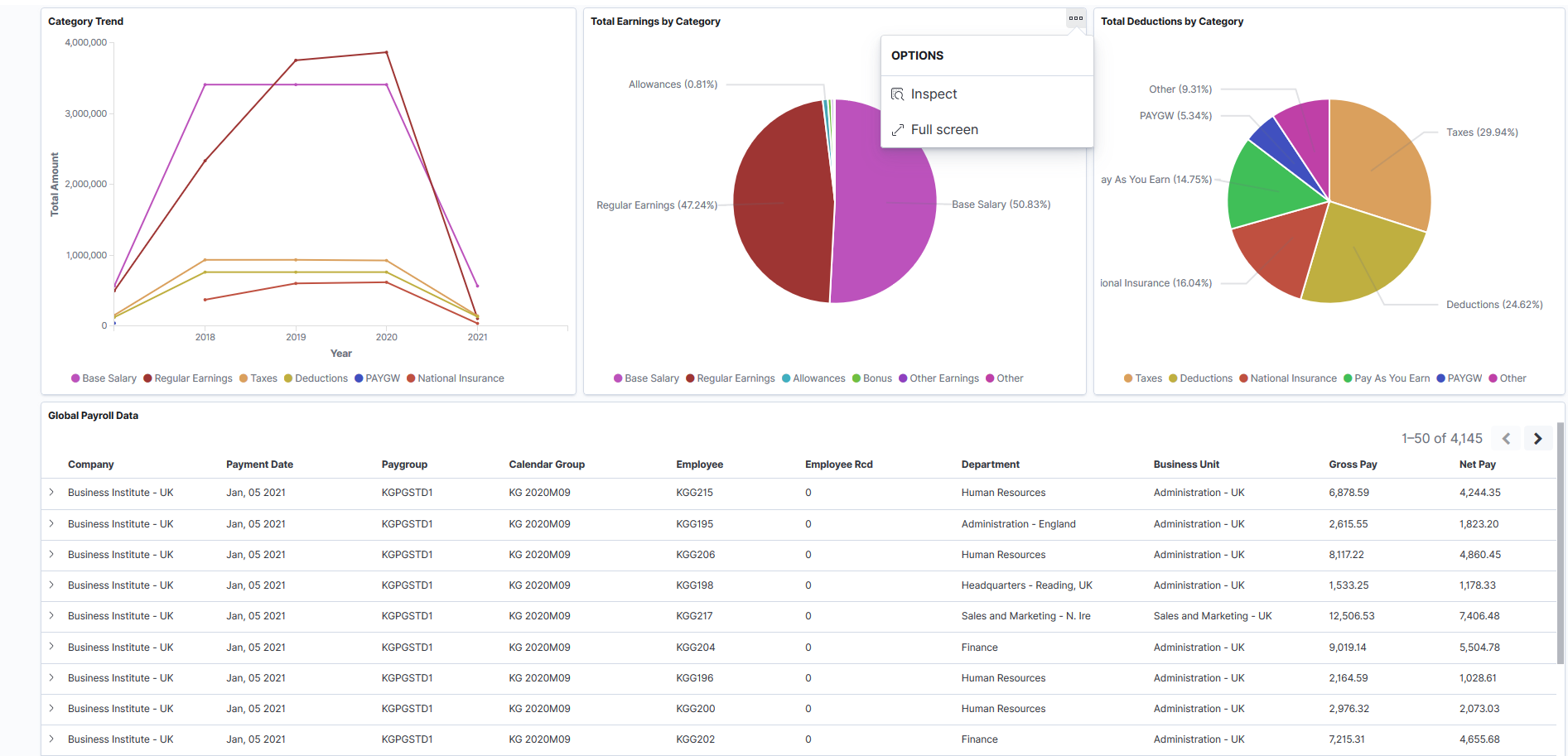
The Global Payroll Cost Analytics dashboard delivers these visualizations:
Total Payroll Cost
Payroll Trend
Totals by Region
Cost by Category
Employees Paid
Category Trend
Total Earnings by Category
Total Deductions by Category
Global Payroll Data
See Common Elements and Controls
Additional Filters
Additional Filters allows you select filters based on below attributes:
Year
Company
Payroll Element
Currency: The currencies displayed in this field are configured using the Currency Conversion Setup page. You need to define local and global currencies in this setup page.
The Insights dashboard displays the data only if the conversion rate is defined in the Currency Conversion Setup page. For details, see Defining Currency Conversion Setup.
By default, the dashboard displays the visualizations in global currency (USD).
Total Payroll Cost
This visualization displays the total cost of payroll and its breakdown numbers. Listed numbers include:
Gross
Deduction
Net
Previous Gross
Previous Net
Gross Variance
Net Variance
Payroll Trend
This line chart visualization presents the trend and highlight fluctuations in various payroll costs.
Pause over a point on a line to view the pay period and actuals of the corresponding payroll cost component.
Totals by Region
This map visualization represents total category costs by region. The darker the shade, the higher the payroll cost.
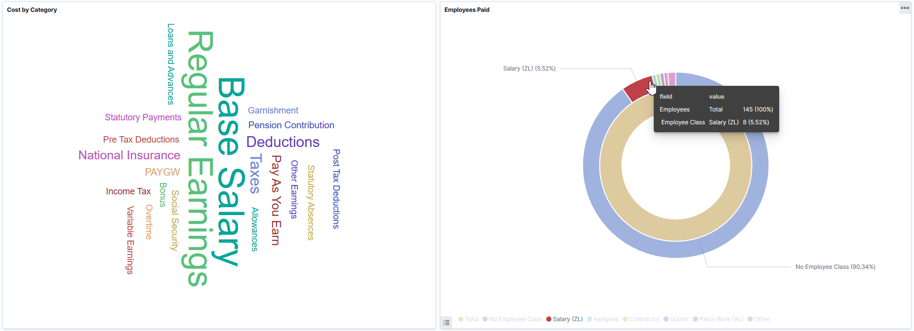
Cost by Category
This tag cloud visualization displays terms of common payroll costs (that is, different earnings and deduction elements) that are incurred by the employer. The larger the term’s font size, the higher the payroll cost.
The earnings and deduction elements displayed in this visualization are configured through the Element Category Configuration page. For details, see Defining Element Category Configuration.
Employees Paid
This donut chart visualization displays two levels of metrics. The inner ring represents total employee count and outer ring breaks down the total employee count by employee class.
The top 8 employee class with the highest count are shown.
Select Other to view the next 8 employee class, so on and so forth.
Category Trend
This line chart visualization presents fluctuation of the top categories cost over the time.
Total Earnings by Category
This pie chart visualization displays the breakdown of total earnings in percentage by earnings category. The top 5 earnings categories with the highest amount are shown.
Select Other to view the next 5 highest-amount earnings categories, so on and so forth.
Total Deductions by Category
This pie chart visualization displays the breakdown of total deductions in percentage by deduction category. The top 5 deduction categories with the highest amount are shown.
Select Other to view the next 5 highest-amount deduction categories, so on and so forth.
Global Payroll Data
This grid lists the Global Payroll data, which is presented in visualizations, in a tabular format.
Field or Control |
Description |
|---|---|
[Column-related actions] |
Sort grid rows by column value in ascending or descending order. |
|
These filter icons appear when you pause next to a field value. These icons are available for all column values in the grid, and provide a quick way to add filters to the analytics. Click the Filter for value (+ magnify glass) icon to add the shown field value as a filter to all visualizations. For example, if you click to filter for a business unit value, all visualizations will refresh to show payroll data that pertains to that business unit. Click the Filter out value (- magnify glass) icon to remove the shown field value from the filter process for all visualizations. For example, if you click to filter out a business unit value, visualizations will refresh to show payroll data for all except that business unit. Filters can be removed from the Filters area at the top of the page. |
 (Filter for value) and
 (Filter out value)
Use the Global Payroll Operations tile to access Global Payroll visualizations on the Global Payroll Operations dashboard.
The Global Payroll Operations tile is located on the Global Payroll Insights dashboard.
This example illustrates the Global Payroll Operations tile.
The Global Payroll Operations tile displays a portion of the Calendar Status visualization, which is available on the Global Payroll Operations dashboard.
Use the Global Payroll Operations dashboard to review and analyze Global Payroll data using Insights visualizations.
Navigation:
Click the Global Payroll Operations tile.
This example illustrates the fields and controls on the Global Payroll Operations dashboard (1 of 3).
You can define the default date option for Global Time Filter used in Insights dashboard. For details, see Insights Option.
Insights time range global filter (applicable to the whole dashboard) will use calendar’s payment date. The Global Time Filter settings are defined in the Installation Options page. For example If Payment Date is selected in the Installation Settings and the global filter value is selected as 'Last 3 months', this translates last 3 months of payroll transactions based on their calendar’s payment date and the visualizations are displayed in the dashboard accordingly.
The Global Time Filter works similarly when users select Period Begin Date or Period End Date.
This example illustrates the fields and controls on the Global Payroll Operations dashboard (2 of 3).
This example illustrates the fields and controls on the Global Payroll Operations dashboard (3 of 3).
Warning! Insights dashboards may not render properly if you access them using unsupported platforms.
Using the interactive visualizations that are available on the dashboard, you can identify potential risks on missing payment date due to errors or give an insight on how to improve payroll process, such as changing cut-off dates, reducing volume of off-cycle payrolls, avoiding retro activity calculation if there are additional payments in the period, they can also provide support to hire a payroll clerk if needed etc. When you select filters or chart items, or modify the date range, Insights dynamically updates all visualizations.
Note: If you want to see the updated data in Global Payroll Insights dashboard, you have to run the following indexes in the incremental mode:
GP_KIB_OPER_SRCH_FULL
GP_KIB_OPER_SRCH_INCR
If you add or update any data, you need to run the above indexes again.
The dashboard uses Work Area User Access security (Set Up HCM > Product Related > Global Payroll & Absence Mgmt > System Settings > Work Area User Access) to display permitted data to the user.
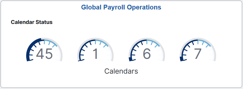
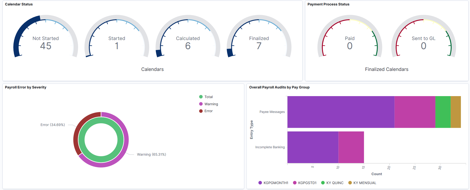
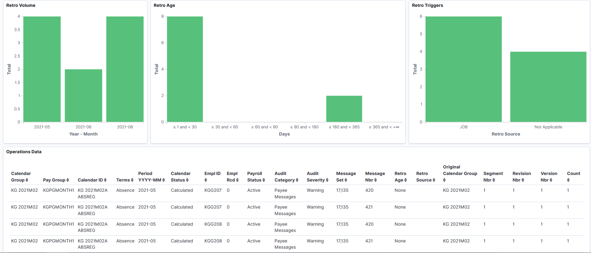
The Global Payroll Operations dashboard delivers these visualizations:
Calendar Type
Payroll Status
Calendar Status
Payment Process Status
Payroll Error by Severity
Overall Payroll Audits by Pay Group
Retro Volume
Retro Age
Retro Triggers
Additional Filters
Used to filter the entire dashboard based on below attributes:
Company
Pay Group: Pay Groups are taken from the calendars being included in the dashboard.
Calendar Group: The calendars that were processed together for an on-cycle run or the off-cycle configured using the Calendar Group page. For details, see Defining Calendar Groups.
Global Payroll WorkCenter
This markdown visualization displays detailed information concerning payroll transactions for all calendars (open and finalized), such as:
Payroll Items
Payee Data
Prepare Payroll
Process Payroll
Review Payroll
Post Payroll
Result Queries
Payroll Analytics
Register
Note: This visualization is helpful only for customers who installed the Global Payroll WorkCenter feature. You can remove it from the dashboard if you are not using the WorkCenter.
Click the Global Payroll WorkCenter link. A new tab in the browser is displayed and the user will have access to the permitted data according to the personalized security.
With Global Payroll WorkCenter feature installed, the system administrators can activate the link directly in the Insights panel.
To activate the link for Global Payroll WorkCenter in the Insights panel, system administrators must know the application server address and the name of the database which is running PeopleSoft HCM. In addition to that, they must have a role of Search Administrator.
Steps to Manually Activate Global Payroll WorkCenter Using Insights Panel
Navigate to Reporting Tools > Insights.
Click Visualize.
Type ‘GP Insights Oper - GP WorkCenter’ in the Search box.
Click on ‘GP Insights Oper - GP WorkCenter’ hyperlink of TSVB visualization type.
On the Markdown window, replace all the occurrences of the application server by the one that is running PeopleSoft HCM.
Replace all the occurrences of the database instance by the one that is running PeopleSoft HCM.
Save the Markdown.
Calendar Type
This donut chart visualization displays two levels of metrics. The inner ring represents total calendars count and outer ring breaks down the total calendars count by calendar type: Absence and Payroll.
Payroll Status
This pie visualization represents the total number of payroll segments distributed by employee status.
The top 5 employee status with the highest count are shown.
Select Other to view the next 5 employee status, so on and so forth.
Calendar Status
This gauge visualization displays, at one glance, the number of all calendars distributed by calendar status. The larger the outer dark semicircle, the higher the number of calendars in that status. The available calendar statuses are:
Not Started
Started
Calculated
Finalized
Payment Process Status
This gauge chart visualization displays two types of metrics. The left gauge represents total calendar count in Paid status and right gauge represents total calendar count in Sent to GL (General Ledger) status.
Payroll Error by Severity
This donut chart visualization displays two levels of metrics. The inner ring represents total payroll processing messages count and outer ring breaks down the total payroll processing messages count by severity: Warning and Error.
Overall Payroll Audits by Pay Group
This horizontal bar chart visualization displays the breakdown of payroll processing messages distributed by Pay Group. The following 4 payroll processing messages are shown:
Payee Messages
Incomplete Banking
Active without Gross
Inactive with Gross
Retro Volume
This vertical bar chart visualization displays the breakdown of retro entries by period (Year – Month). If no retro entries are found for a particular period, it is not displayed.
The top 5 period with the highest count are shown.
Select Other to view the next 5 period, so on and so forth.
Retro Age
This vertical bar chart visualization displays the breakdown of retro entries by period ranges in days. The following period ranges are shown, regardless there are retro entries for them or not:
≥ 1 and < 30
≥ 30 and < 60
≥ 60 and < 90
≥ 90 and < 180
≥ 180 and < 364
≥ 365 and < +∞
Retro Triggers
This vertical bar chart visualization displays the breakdown of retro entries by source record from which the retro trigger is generated. If no source record is found in the retro entry (if the triggers are entered manually), ‘Not Applicable’ message is displayed.
The top 5 retro source with the highest count are shown.
Select Other to view the next 5 retro source, so on and so forth.
Operations Data
This data table visualization lists details of the Global Payroll data, which is presented in a tabular format.
Use the Global Payroll Trends tile to access Global Payroll trends visualizations on the Global Payroll Trends dashboard.
Navigation:
Click the Global Payroll Trends tile.
This example illustrates the Global Payroll Trends tile.
Use the Global Payroll Trends Dashboard to view to view interactive visualizations for the work areas that you are responsible for. This dashboard helps you to identify peaks and analyze fluctuation over the time for Earnings and Deductions, off-cycles processes, payroll status, payroll frequency, and so on.
Navigation:
Click the Global Payroll Trends tile.
This example illustrates the fields and controls on the Global Payroll Trends dashboard (1 of 3).
This example illustrates the fields and controls on the Global Payroll Trends dashboard (2 of 3).
This example illustrates the fields and controls on the Global Payroll Trends dashboard (3 of 3).
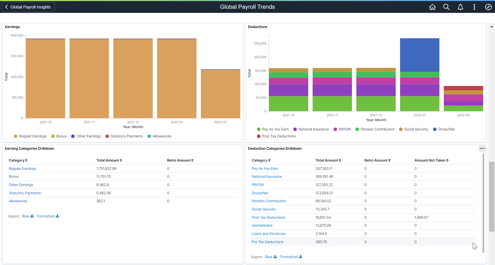
Using the interactive visualizations that are available on the dashboard, you can see the breakdown of total payroll costs, and compare the trends of different breakdown components over a period of time. You can also view the earnings and deduction categories, on-cycle and off-cycle calendars, payroll status, payment method etc. When you select filters or chart items, or modify the date range, Insights dynamically updates all visualizations using the source from the index.
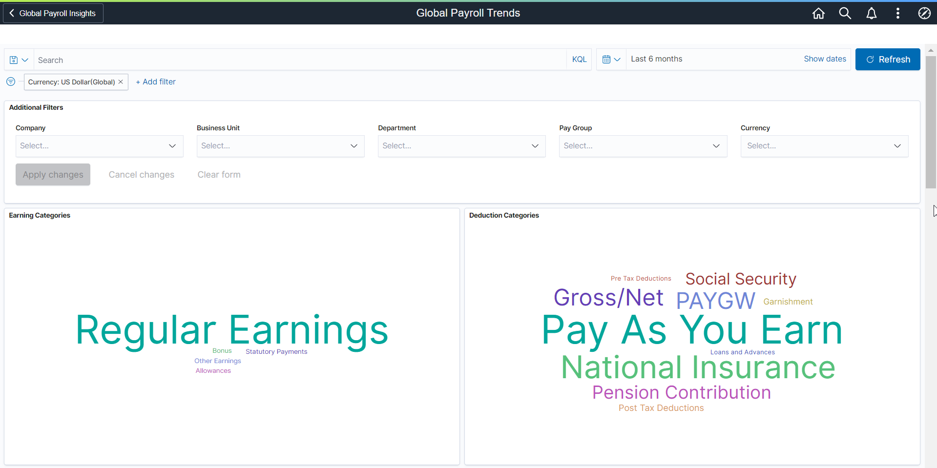
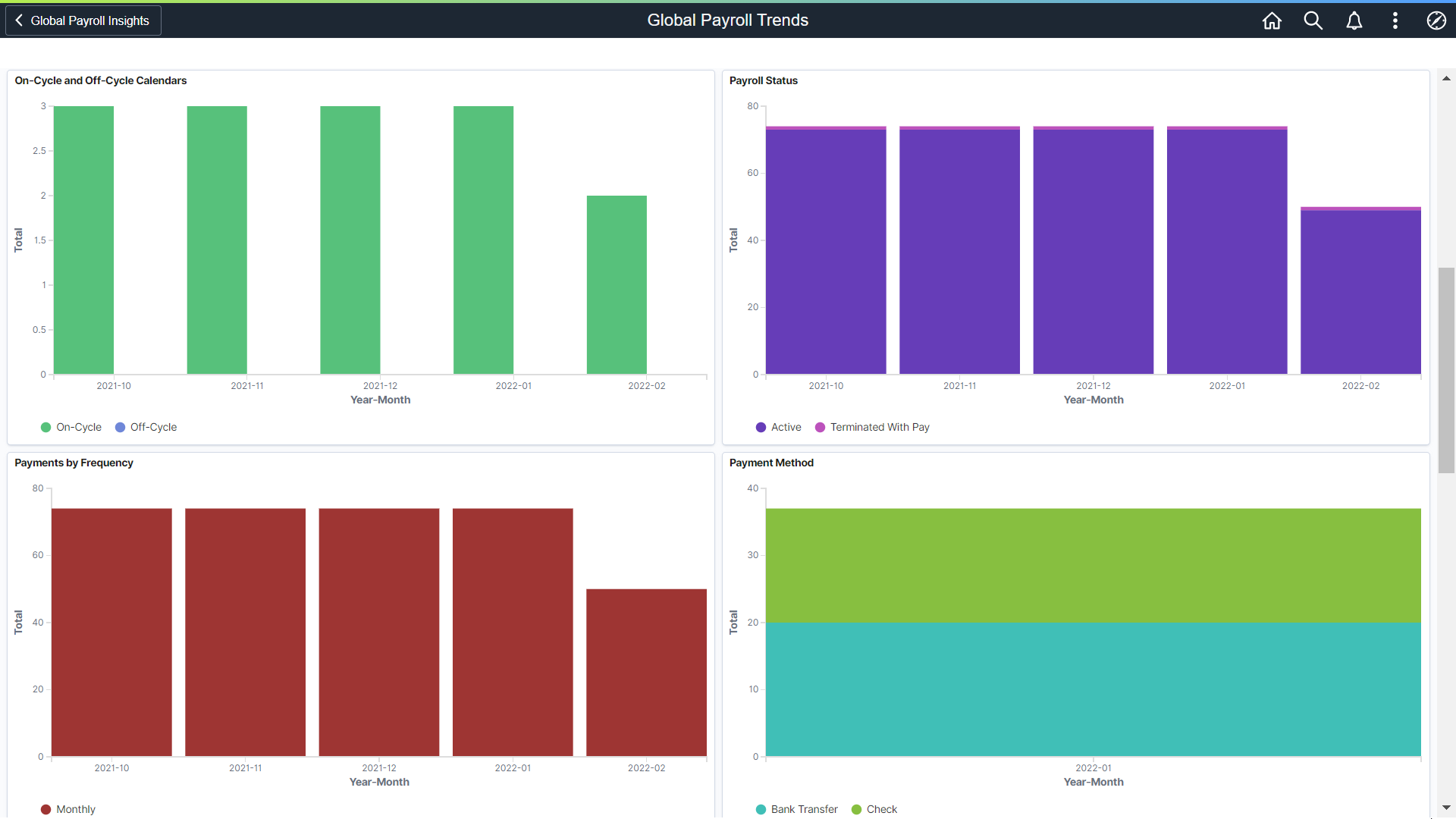
The Global Payroll Trends dashboard delivers these visualizations:
Earning Categories
Deduction Categories
On-Cycle and Off-Cycle Calendars
Payroll Status
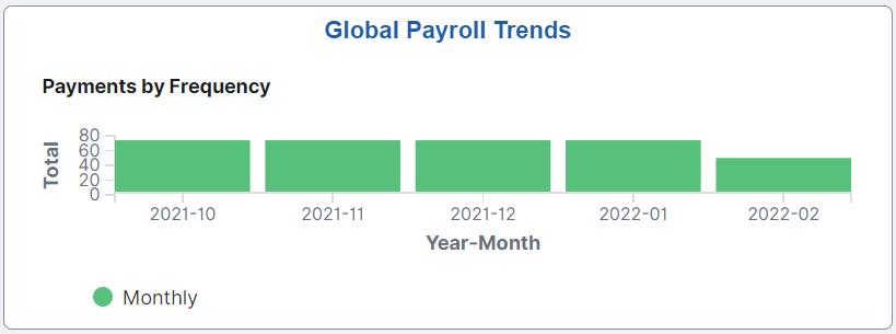
Payments by Frequency
Payment Method
Earnings
Deductions
Earning Categories Drilldown
Deduction Categories Drilldown
See Common Elements and Controls.
Additional Filters
Additional Filters allows you select filters based on below attributes:
Company
Business Unit
Department
Pay Group
Currency
Earning and Deduction Categories
These tag clouds visualizations display the earnings and deductions categories such as Allowances, Gross Pay, Total Tax Withheld etc. These tag clouds help users to easily filter the entire dashboard by a specific category and understand the more expensive categories in Global Payroll application.
On-Cycle and Off-Cycle Calendars
This bar graph visualization displays the number of on-cycle and off-cycle calendars by a specific period of time.
Payroll Status
This visualization displays the total number of employees in different payroll statuses such as Active, Terminated with Pay etc.
Payments by Frequency
This chart displays the payslips for each payment frequency.
Payment Method
This chart displays different payment methods over a period of time.
Earnings
This chart displays the earnings cost by Month and Category.
Deductions
This chart displays the deductions cost by Month and Category.
Earnings Categories Drill Down
This visualization helps to identify the retro amounts. You can review category details such as members, calendars, amounts, employees, etc.
You can drilldown to analyze category members, retro amounts, employees contributing to the category by clicking on the category.
This example illustrates the breakdown information of regular earnings.
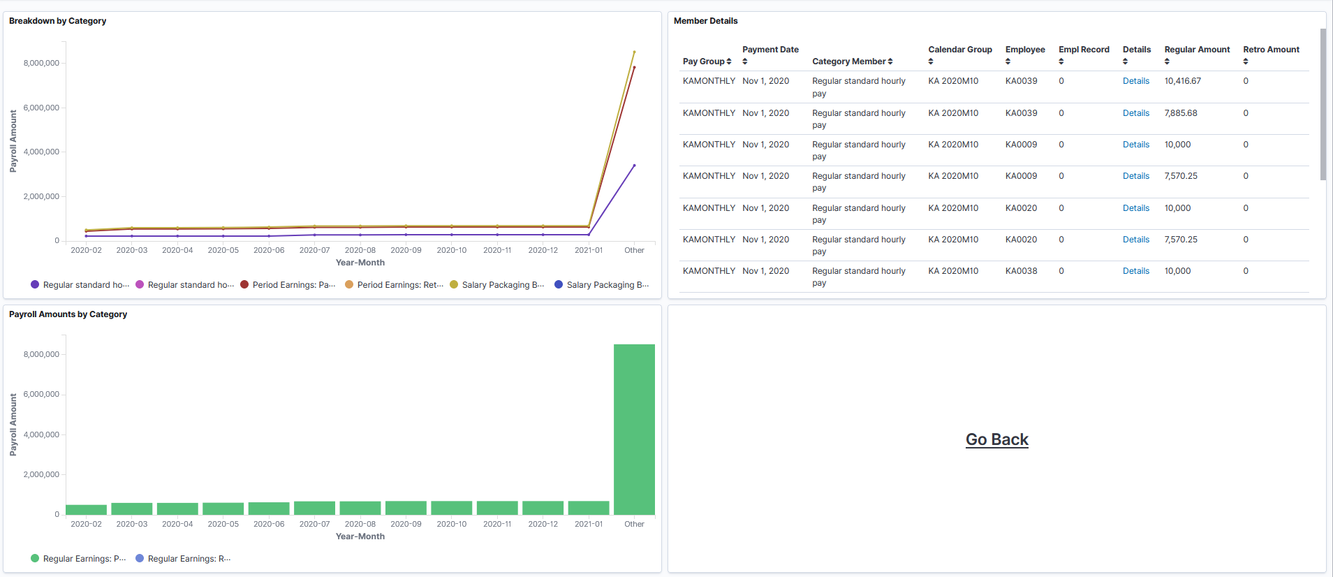
Click on the Details hyperlink to open the Results by Calendar Group for that specific row, or click Go Back button to return to the Global Payroll Trends dashboard.
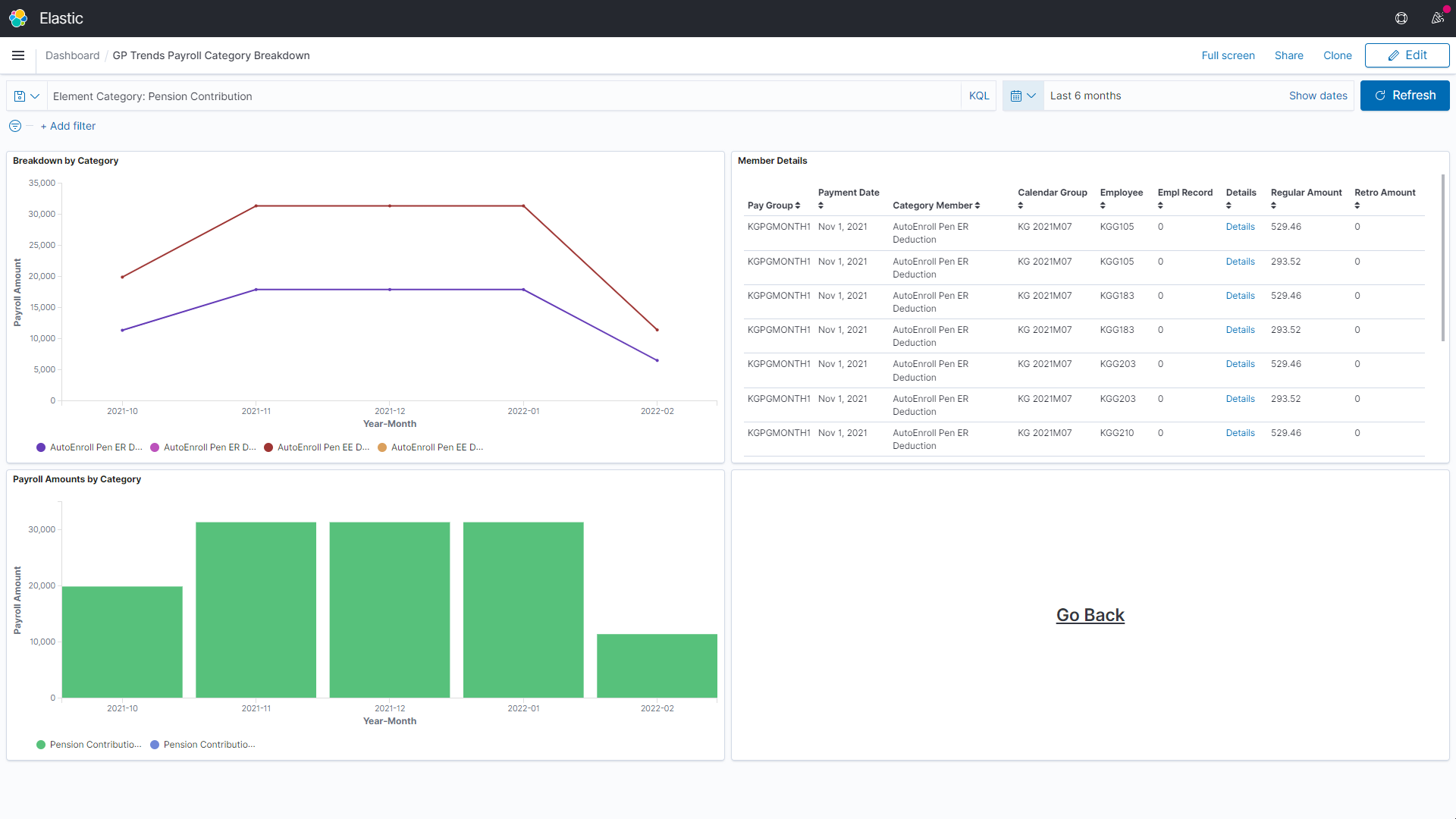
Deduction Categories Drill Down
This visualization helps to identify the retro amount. You can review category details such as members, calendars, amounts, employees, etc. It also helps you to track the amount not taken for deductions.
Click on the detail hyperlink to open the Results by Calendar Group for that specific row, or click Go Back button to return to the Global Payroll Trends dashboard.
This example illustrates the breakdown information of pension contribution.