Viewing PeopleSoft HR HelpDesk Insights
PeopleSoft HR Helpdesk Insights provide rich analytical visualizations and powerful reporting features. It offers great insights of HR Helpdesk data for Agents, Managers and Administrators. Moreover, customers can create and manage their own visualizations using the provided data.
The HR Helpdesk Insights dashboard is built on OpenSearch Dashboards, the data visualization tool used by OpenSearch.
For information on OpenSearch Dashboards, see PeopleTools Search Technology, “Monitoring PeopleSoft Search Framework and Opensearch Using PeopleSoft Insights” and “Working with Insights Dashboards for PeopleSoft Application Data” documentation.
This topic provides an overview of the deployment and access of the insights for HR Helpdesk, discusses how to view PeopleSoft HR Helpdesk Insights for agents and managers, and the steps to enable document level security for managers.
Before users can access the HR Helpdesk data in PeopleSoft Insights, the following steps should be performed:
1. Deploy and run the below search indexes.
(PeopleTools > Search Framework > Administration > Deploy/Delete Object)
Index
Dashboard
CR_RC_AGENT_ESKB
Agent Backlog Insights and Agent Backlog Insights Tile
CR_RC_MANAGER_ESKB
Manager Backlog Insights and Manager Backlog Insights Tile
CR_RC_MANAGER_ARCL_ESKB
Performance Insights and Performance Insights Tile
CR_CO_SOLUTION_KB
Solution Management Insights and Solution Management Insights Tile
Deploy the below dashboards:
Agent Backlog Insights
Agent Backlog Insight Tile
Manager Backlog Insights
Manager Backlog InsightsTile
Performance Insights
Performance InsightsTile
Solution Management Insights
Solution Management Insights Tile
(PeopleTools > Search Framework > Administration > Deploy OpenSearch Dashboards)
Note: You need to run the full index prior to deploying the dashboard. In order to run CR_CO_SOLUTION_KB index, you must run CR_CO_SOLUTION index first.
Assign the below user roles to users to access and view HR Helpdesk Insights:
Dashboard
Roles
Users
Agent Backlog Insights
Agent Backlog Insights Tile
Agent Backlog Insight
Agents
Manager Backlog Insights
Manager Backlog Insights Tile
Manager Backlog Insight
Administrators/Managers and above
Performance Insights
Performance Insights Tile
MGR Performance Report
Administrators/Managers and above
Solution Management Insights
Solution Management Insights Tile
Solution Management Insight
Content Owners and Knowledge Managers
Open Search supports document level security which will reflect in the Insights dashboards as well. Search indexes created for PeopleSoft Insights are provided with document level security attributes, but by default, it is enabled only for CR_RC_AGENT_ESKB index (Agent Backlog Insights Dashboard). The document level security for Insights dashboard is based on provider group. or agents, all the cases applicable to their provider groups are listed when document level security is enabled.
Manage Dashboard Security for Manager Backlog Insights and Performance Insights
To configure document level security for search indexes, follow the below steps:
Undeploy the search definition
(PeopleTools > Search Framework > Administration > Deploy/Delete Object)
Modify the search definition.
(PeopleTools > Search Framework > Designer > Search Definition)
Edit the Search Definition
Navigate to Security Tab
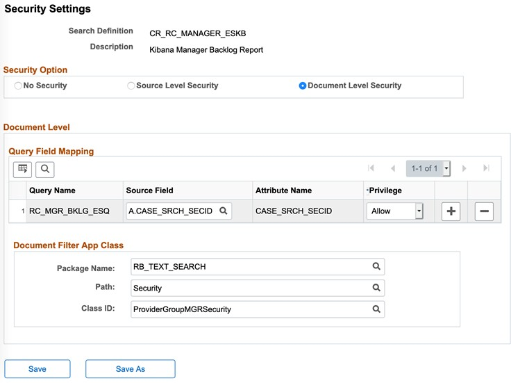
Select “Document Level Security”
In “Query Field Mapping” – “Source Field” – select “A.CASE_SRCH_SECID”
Choose Package Name – RB_TEXT_SEARCH
Path –Security
Class ID -Choose:
For CR_RC_MANAGER_ESKB (Manager Backlog) - ProviderGroupMGRSecurity
For CR_RC_MANAGER_ARCL_ESKB (Manager Performance Report) – ProviderGroupMGRARCLSecurity
Security Settings Page
Deploy Search Definition.
Schedule and Run Search Index.
The Agent Backlog Insight dashboard helps agents to organize their day to day work, review high priority cases, manage unassigned cases and escalations. It allows you to view various dashboard metrics, backlog by provider group, assignments, business unit, etc.
Navigation:
The Agent Backlog Insights tile is delivered as part of HR Service Agent Home Page. You can add the tile, through personalization, to a system-delivered homepage or a homepage that you create.
This topic discuss the pages used to view agent backlogs.
|
Page Name |
Definition Name |
Usage |
|---|---|---|
|
Agent Backlog Insights Tile |
RC_AGT_KIB_CREF |
Access the backlog insights dashboard for agents. |
|
Agent Backlog Insights Dashboard |
N/A |
Review and analyze various agent tasks using PeopleSoft Insights. |
Use the Agent Backlog Insights tile to access the Agent Backlog Insights dashboard.
Agent Backlog Insights Tile
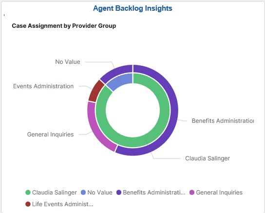
The Agent Backlog Insights tile displays the Case Assignment by Provider Group visualization, which gives a snapshot of the cases assigned to an agent.
Use the Agent Backlog Insights dashboard to view the case backlog insights of agents.
Navigation:
Click the Agent Backlog Insights tile to access Agent Backlog Insights dashboard.
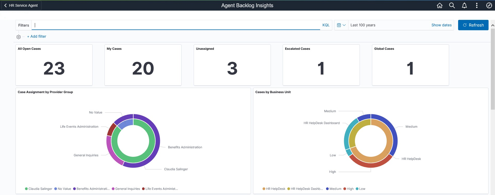
This example illustrates the Agent Backlog Insights dashboard (1 of 2).
This example illustrates the Agent Backlog Insights dashboard (2 of 2).
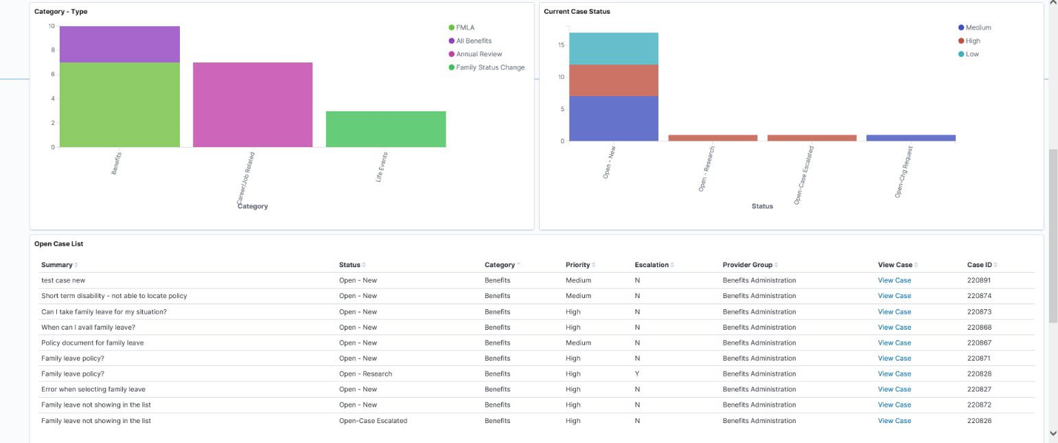
Using the interactive visualizations that are available on the dashboard, you can see the metrics such as open cases (cases assigned to provider group but not to agents), cases assigned to agents, unassigned cases (cases assigned to provider group but not to agents), escalated cases, and global cases. You can also view the case assignment by provider group, case priority as well as case status. When you select filters or chart items or modify the date range, PeopleSoft Insights dynamically updates all visualizations.
The Agent Backlog Insight dashboard delivers these visualizations:
CaseMetrics
Case Assignment by ProviderGroup
Cases by BusinessUnit
Category –Type
Current Case Status
Open Case List
Case Metrics
This metrics displays the following:
All OpenCases
MyCases
Unassigned
Escalated Cases
Global Cases
Case Assignment by Provider Group
This doughnut chart displays the cases assigned to the agent and unassigned cases from agent's provider group. The outer layer shows the provider group of the cases.
Cases By Business Unit
This doughnut visualization displays the open cases by Business Unit and Priority. The outer layer displays the priority and inner layer shows the business unit.
Category – Type
This visualization displays the classification of cases based on its Category and Type.
Current Case Status
This visualization displays the statuses of open category with case priority.
Open Case List
This grid displays the list of open cases, which are presented in the above visualizations. The agent can see the basic details of case and can navigate to case details. Click the View Case link in the View Case column to access the case details.
The Manager Backlog Insight dashboard displays details of backlog such as backlog by business unit and priority, the agent working on escalations and check all the incoming cases are triaged; thereby enables the managers to monitor and track the team’s activity.
This topic discusses the pages used to view manager backlogs.
|
Page Name |
Definition Name |
Usage |
|---|---|---|
|
Manager Backlog Insights Tile |
RC_MGR_KIB_CREF |
Access the backlog insights dashboard for managers. |
|
Manager Backlog Insights Dashboard |
N/A |
Review and analyze various manager tasks using PeopleSoft Insights. |
Use the Manager Backlog Insights tile to access the Manager Backlog Insights dashboard.
Navigation:
The Manager Backlog Insights tile is delivered as part of HR Service Manager Home Page. You can add the tile, through personalization, to a system-delivered homepage or a homepage that you create.
Manager Backlog Insights Tile
Use the Manager Backlog Insights dashboard to view and analyze visualizations related to cases assigned to managers.
Navigation:
Click the Manager Backlog Insights tile to access the Manager Backlog Insights Dashboard.
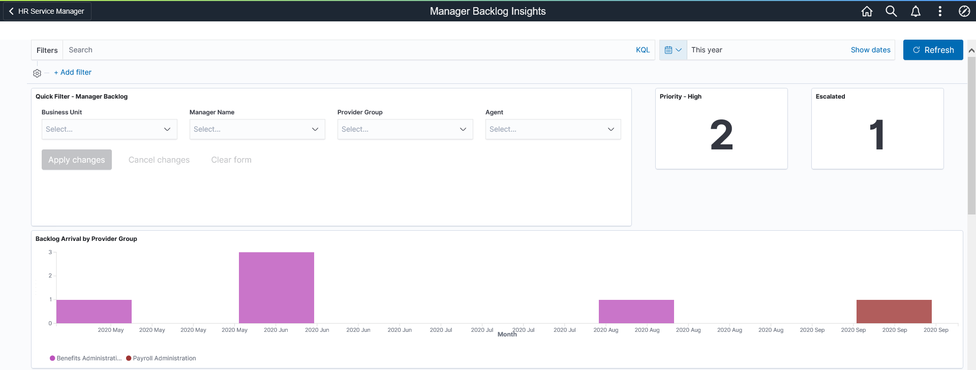
This example illustrates the Manager Backlog Insights dashboard (1 of 3).
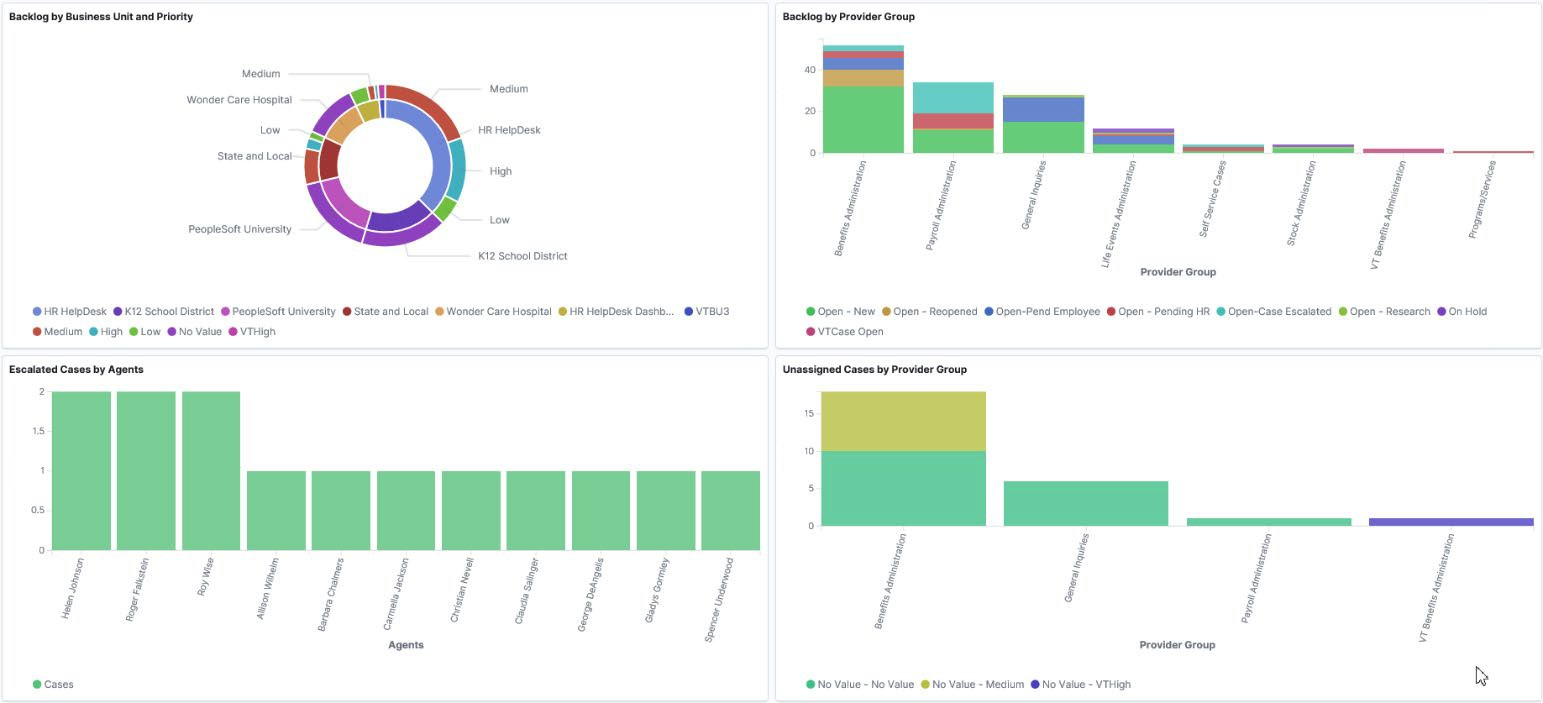
This example illustrates the Manager Backlog Insights dashboard (2 of 3).
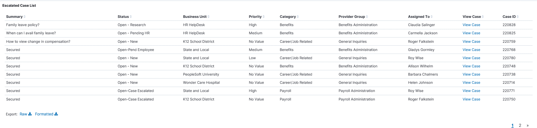
This example illustrates the Manager Backlog Insights dashboard (3 of 3).
The Manager Backlog Insights dashboard in PeopleSoft Insights provides you with different visualizations to analyze the open cases for the respective provider groups and associated managers. You can also view the total number of high priority and escalated cases. When you select filters or chart items, PeopleSoft Insights dynamically updates all visualizations.
For details on common elements and controls used in the visualization, see Common Elements and Controls.
The Manager Backlog Insights dashboard delivers these visualizations:
Case Metrics (High priority cases, escalated cases)
Backlog Arrival by Provider Group
Backlog by Business Unit and Priority
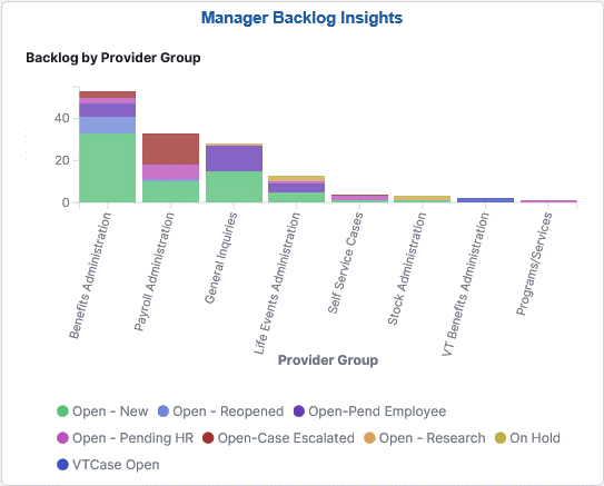
Backlog by Provider Group
Escalated Cases by Agents
Unassigned Cases by Provider Group
Escalated Case List
Quick Filter – Manager Backlog
Additional Filters allows you select filters based on below attributes:
Business Unit
Manager Name
Provider Group
Agent
Case Metrics
This metrics displays the number of high priority and escalated cases.
Backlog Arrival by Provider Group
This visualization displays the open cases based on created month and by its assigned provider group. The default time period is set as ‘month’. You can select the required time range in this chart to dill down by time period.
Backlog by Business Unit and Priority
This double doughnut chart visualization displays the number of open cases by business unit and priority. The inner layer displays the provider group and the outer layer displays the priority of cases in respective provider group.
Backlog by Provider Group
This visualization displays the cases allocated in each provider group and its current status.
Escalated Cases by Agents
This visualization displays the agents and assigned escalated case counts.
Unassigned Cases by Provider Group
This visualization displays the Cases not assigned to an agent (unassigned cases) for different provider group and its priority.
Escalated Case List
The Escalated Case List grid lists the escalated cases, in a tabular format.
Performance Insights facilitates managers to analyze the service delivery performance. You can compare the arrival and closure rates of cases with various parameters.
This topic discusses the pages used to view performance insights.
|
Page Name |
Definition Name |
Usage |
|---|---|---|
|
Performance Insights Tile |
RC_PERF_KIB_CREF |
Access the performance dashboard for managers. |
|
Performance Insights Dashboard |
N/A |
Review and analyze various manager tasks using PeopleSoft Insights. |
Use the Performance Insights tile to access the Performance Insights Dashboard.
Navigation:
The Performance Insights tile is delivered as part of HR Service Manager Home Page. You can add the tile, through personalization, to a system-delivered homepage or a homepage that you create.
Performance Insights Tile
Use the Performance Insights Dashboard to view and analyze visualizations related to service delivery performance.
Navigation:
Click the Performance Insights tile to access the Performance Insights Dashboard.
This example illustrates the Performance Insights Dashboard (1 of 2).
This example illustrates the Performance Insights Dashboard (2 of 2).
For details on common elements and controls used in the visualization, see Common Elements and Controls.
The Performance Insights Dashboard delivers these visualizations:
Arrival VsClosure
Arrivals Vs Closure by ProviderGroup
Case Arrival by ProviderGroup
Case Arrival byCategories
Average Days to CloseCase
Quick Filter – Performance Report
Additional Filters allows you select filters based on below attributes:
BusinessUnit
Manager
ProviderGroup
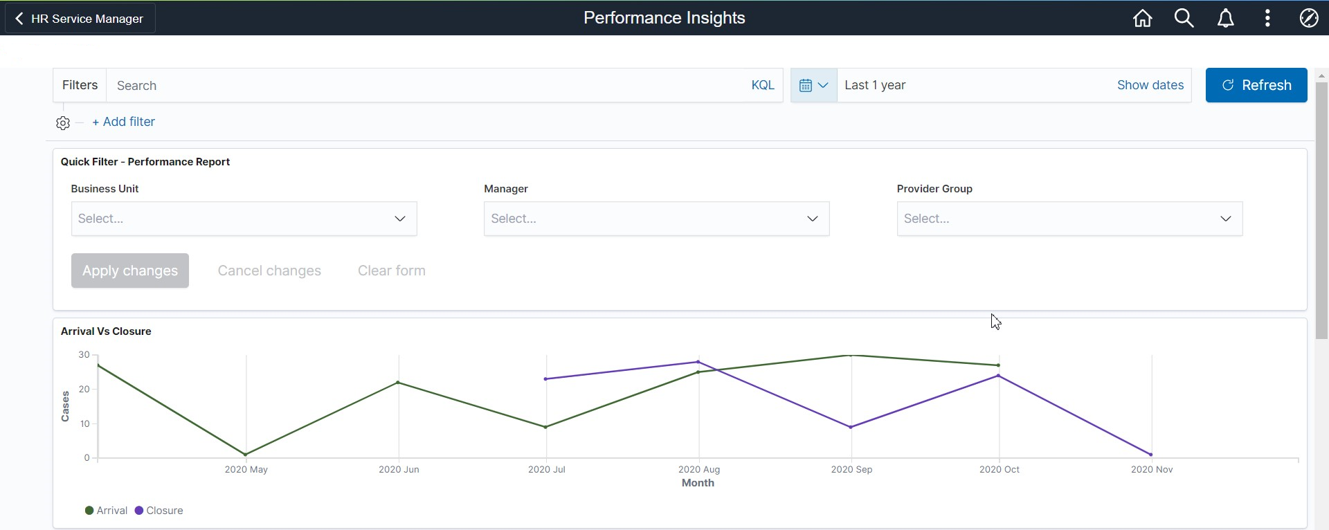
Arrival Vs Closure
This visualization displays the arrivals and closure of cases based on time period. The default time period is set as ‘month’. Users can select the time range in this chart to drill down by time.
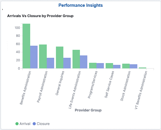
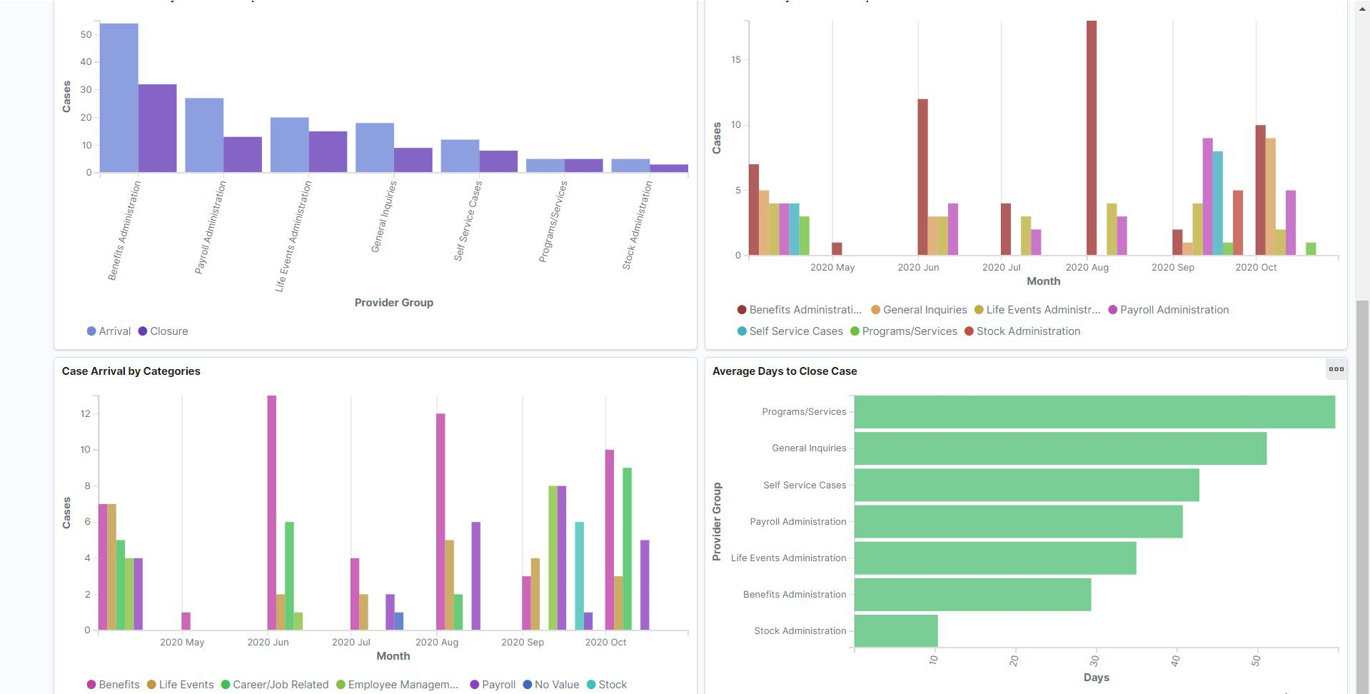
Arrivals Vs Closure by Provider Group
This visualization displays the overall Arrivals and Closure of cases by provider group.
Case Arrival by Provider Group
This visualization displays the case arrival by provider group over a time period. Here, default time period is set as ‘Month’.
Case Arrival by Categories
This visualization displays the case arrival by category over a time period. Here, default time period is set as ‘Month’.
Average Days to Close Case
This visualization displays the average time required to close a case by provider groups.
Solution Management Insights facilitates Content Owners and Knowledge Managers to view the health and statistics of Solution Knowledge Base. You can analyse the usage and efficacy of solutions through Case experience and Self Service usage.
This topic discusses the pages used to view solution management insights.
|
Page Name |
Definition Name |
Usage |
|---|---|---|
|
Solution Management Insights Tile |
RC_SOLN_KIB_CREF |
Access the solution management insight dashboard for content owners and knowledge managers. |
|
Solution Management Insights Dashboard |
N/A |
View and analyze the health and statistics of Knowledge Bases using PeopleSoft Insights. |
Use the Solution Management Insights tile to access the Solution Management Insights Dashboard.
Navigation:
The Solution Management Insights tile is delivered as part of HR Service Manager Home Page. You can add the tile, through personalization, to a system-delivered homepage or a homepage that you create.
This example illustrates the Solution Management Insights tile.
Use the Solution Management Insights Dashboard to view and analyze the health and statistics of Solution Knowledge Base.
Navigation:
Click the Solution Management Insights tile to access the Solution Management Insights Dashboard.
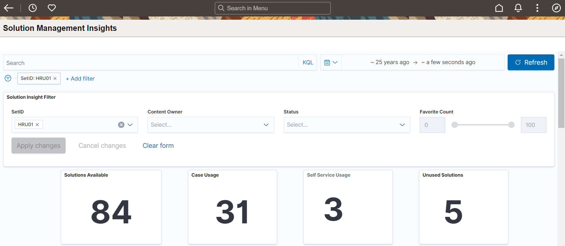
This example illustrates the Solution Management Insights Dashboard (1 of 5).
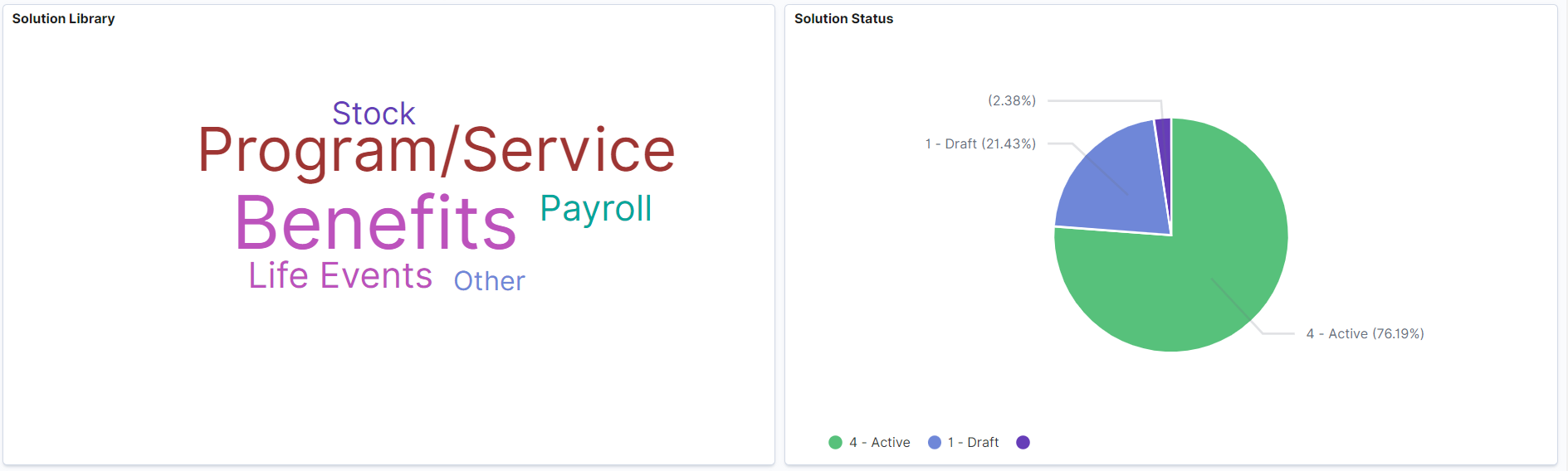
This example illustrates the Solution Management Insights Dashboard (2 of 5).
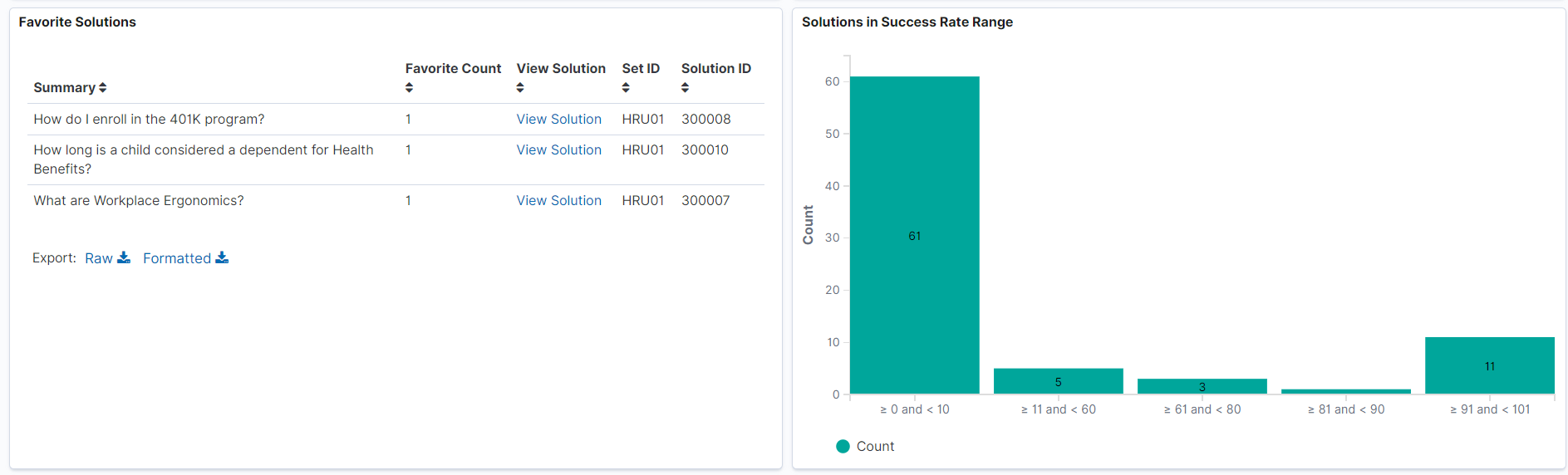
This example illustrates the Solution Management Insights Dashboard (3 of 5).
This example illustrates the Solution Management Insights Dashboard (4 of 5).

This example illustrates the Solution Management Insights Dashboard (5 of 5).
For details on common elements and controls used in the visualization, see Common Elements and Controls.
The Solution Management Insights Dashboard delivers these visualizations:
Overall Solution Usage and Metrics
Solution Library
Solution Status
Favorite Solutions
Solutions in Success Rate Range
Solutions Linked to Case Category
Usage of Solutions by Case Category
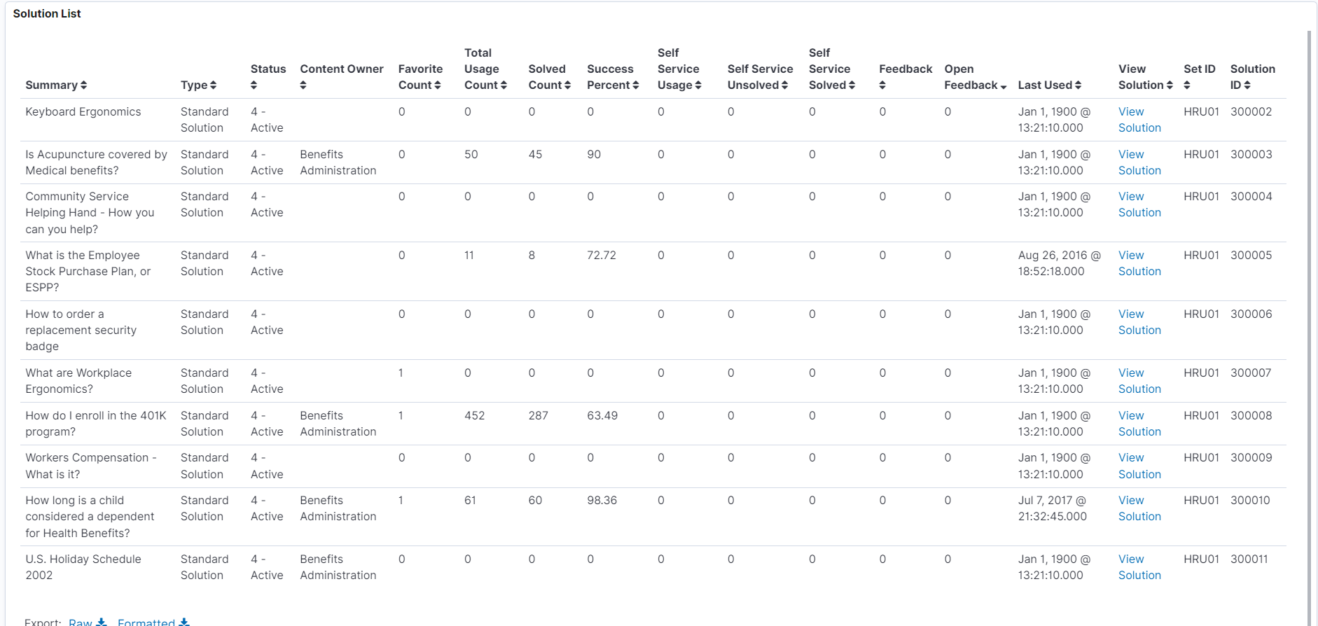
Solution List
Solution Insights Filter
Additional Filters allows you select filters based on below attributes:
Set ID
Content Owner
Status
Favorite Count
Overall Solution Usage and Metrics
This metrics displays the following details:
Total number of solutions available
Solutions used in case (Case Usage)
Solutions accessed by employees using Self Service
Total number of solutions that have not been used. This metrics help you identify which solutions require review or promotion.
Solution Library
This tag cloud visualization displays the solutions associated with libraries.
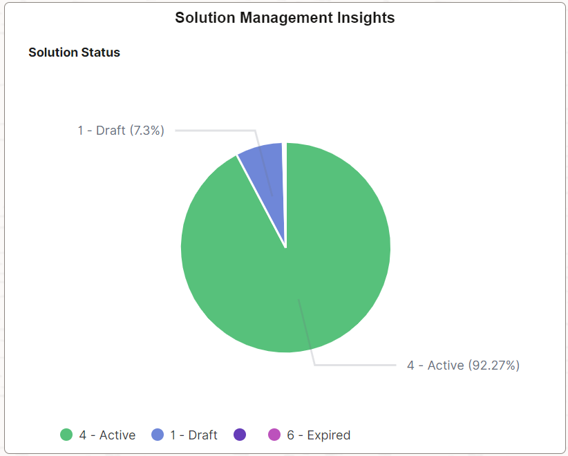
Solution Status
This visualization displays the current status of solutions such as waiting for approval, Draft, Approved, Active etc. Content owners or knowledge managers can review and act on these solutions.
Favorite Solutions
This visualization displays the list of solutions marked as 'Favorite' by agents. Content Owners or Knowledge Managers can refer/promote favorite solutions to other agents working on similar cases.
Solutions in Success Rate Range
This visualization displays the performance of solutions. Content owners or knowledge managers can examine the solutions that require attention, particularly those that fall below the target success rate range.
Solution Linked to Case Category
This visualization displays the Solutions that are used to resolve the case linked with respective case categories. This data will be useful in reusing the agent's experience of addressing cases with solutions.
Usage of Solutions by Case Category
This visualization displays the usage count and solved count on each case category of solutions.
Solution List
The Solution List displays the details and data on the visualizations in tabular form. Click the View Solution link to access the solution details.
This section lists the common elements and controls that are used in PeopleSoft Insights.
Note: Filtering options apply to all visualizations, which allows users to drill down on all the charts at once.
Field or Control |
Description |
|---|---|
Open in OpenSearch Dashboard |
This link appears only for users with role Search Administrator. |
Filters search
field, |
Enter criteria to filter data on the visualizations. You can add filters in a number of ways:
Added filters are displayed below the Filters search field for reference. Click the Filters link by the search field to hide or show a list of filters that have been applied to the insights. A badge number appears to show the number of filters currently applied to the insights. Click the Change all filters gear icon for a list of actions that can be performed on all filters, for example, disable them temporarily, delete them permanently, or invert inclusion (show data that does not meet filter criteria). Click a filter item for a list of similar actions that can be performed on it individually. |
|
Click to select a different time period for the insights. You can enter it manually, or choose from commonly used date ranges provided the system as well as recently used selections. When a new period is selected, all visualizations are refreshed automatically to reflect that change. If you have selected a commonly used date range, for example, This month, or Week to date, click the Show dates link to view the approximate date period in relation to the current date. For example, the current date is November 1 and the selected date range is Year to date. Clicking the Show dates link displays ~ 10 months ago —> now, which indicates that the selected date range started from approximately 10 months ago and ends on the current date. |
 (Change all filters), and
  (Calendar) or
 When you pause over a visualization, the Options and Legend (if applicable) icons are displayed on the top right and bottom corners respectively. Use them to inspect the chart or table and view the details of that visualization, and toggle the legend display.
Field or Control |
Description |
|---|---|
|
Pause over the Options icon to select one of these options:
|
|
Click this icon to hide or display the legend for the chart, if available. You can click an item in the legend to change its color, or add it as a filter (if applicable). |
Chart item (bar, pie slice, and so forth) |
Hover over a chart item, such as a bar item or pie slice, to view a summary of details for that item. Select a chart item to add a filter for it to apply to all visualizations. |
 (Options)
 (Toggle legend)
For more information on working with PeopleSoft Insights and filters, see PeopleTools Search Technology, “Working with Insights Dashboards for PeopleSoft Application Data” documentation.