Using the PeopleSoft Fluid User Interface for the HR HelpDesk Dashboard
The PeopleSoft Fluid User Interface HR Helpdesk Dashboard feature delivers a dashboard page that managers or agents can view on a tablet or mobile device to access pivot-based analytics for operational data reporting. Multiple pivot-based analytics are delivered as individual tiles on this dashboard page. Managers viewing the dashboard page have access to analytics available to the HR Helpdesk manager role while HR Helpdesk agents have access to only tiles displaying information at the agent’s level.
Analytics in the form of pivots help HR Helpdesk managers and agents to see summarized information on case entries. They can also drill down to specific set of records. Users can also perform related actions like notify case contact or agents, view contact info, add notes, and reassign cases.
Note: The PeopleSoft Fluid User Interface enhancements are available from PeopleSoft CRM Call Center Applications release 9.2. For more information on PeopleSoft Fluid User Interface see Understanding the PeopleSoft Fluid User Interface
|
Elements |
Description |
|---|---|

Option Menu |
Tap to perform actions like View Pivot Grid, Update Filters, Export Data, Chart Options, and Save. |

Show Filters |
Tap Show Filters on the left panel to display filters. The filters available in the Manager Dashboard are SLA Category, Priority, Provider Group, Source, Product Group, Case Severity, Case Type, Case Status (Status Category), Secured Cases, Escalated Cases, and Global Cases. The filters available for Agent Dashboard are Provider Group, Case Type, Category, and Business Unit. |

Hide Filters |
Tap to hide the filters. |
Pivot Grid Chart Types |
Tap to display data in the chart type represented by the icon. Available chart types include vertical bar, line, pie, and horizontal bar. |
Related Actions (Displayed in the Grid) |
Tap and perform actions related to the case, such as Notify, View Contact Info, Add Notes, and Reassign Cases. |
For more information on pivot grid functionality, see the product documentation for PeopleTools: Pivot Grid.
Using the Fluid HR Helpdesk - Manager Dashboard page, managers can access a set of analytics which helps to monitor agent efficiency, gain insight into case SLA status and analyze service response activity of the team members.
Logging onto the HR Helpdesk - Manager Dashboard page, a manager can view the following tiles:
Manager Case Backlog tile.
Manager Case Age Analysis by Category tile.
Case Arrival vs. Closure tile.
Pages Used to Perform Analytics as a Manager
|
Page Name |
Definition Name |
Usage |
|---|---|---|
|
CR_RC_PG_MGR_BLOG_FL_GBL |
Tap this tile to access the Manager Case Backlog page. |
|
|
RC_PG_MGR_BLOG_LFL |
To view a pivot chart for the team’s case backlog and view details of the cases. |
|
|
CR_RC_PG_M_CASE_AG_FL_GBL |
Tap this tile to access the Case Age Analysis by Category page. |
|
|
RC_PG_M_CASE_AG_LFL |
To view case age distribution of Open and On Hold Cases for a particular Category (as a default view) against age bands defined for the respective Category definition. |
|
|
CR_RC_PG_M_ARR_CLSR_FL_GBL |
Tap this tile to access the Case Arrival vs. Closure page. |
|
|
RC_MGR_ARR_CLS_LFL |
To view case arrivals compared to case closures over time during the same time frame. |
The Manager Case Backlog tile (CR_RC_PG_MGR_BLOG_FL_GBL) displays live chart data for the manager’s current case backlog. The tile also displays the count of all open (Open and On Hold) cases for the team of Provider Groups which are in red SLA status.
Tap the Manager Case Backlog tile to access the Manager Case Backlog page.
Navigation:
Select Fluid Home under the main menu. The Manager Case Backlog tile is available in the Manager Dashboard page.
This example illustrates the Manager Case Backlog tile.
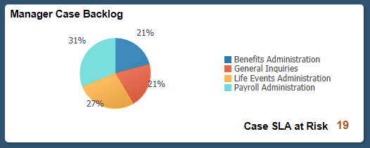
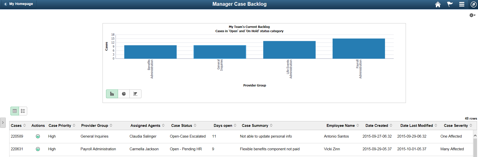
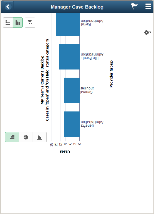
Use the Manager Case Backlog page (RC_PG_MGR_BLOG_LFL) to view an interactive pivot chart for the team’s case backlog and the count of case SLAs at risk.
Navigation:
Tap the Manager Case Backlog tile on the Manager Dashboard page.
This example illustrates the fields and controls on the Manager Case Backlog page using a tablet.
This example illustrates the fields and controls on the Manager Case Backlog page using a smartphone.
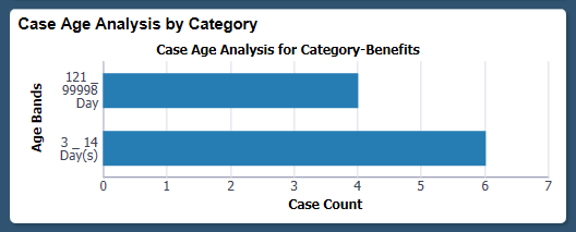
The Case Age Analysis by Category tile (CR_RC_PG_M_CASE_AG_FL_GBL) displays live chart data for case age analysis by category. By default, the chart shows the case age distribution based on age bands for a particular category.
Tap the Case Age Analysis by Category tile to access the Case Age Analysis by Category page.
Navigation:
Select Fluid Home under the main menu, the Case Age Analysis by Category tile is available in the Manager Dashboard page.
This example illustrates the Case Age Analysis by Category tile.
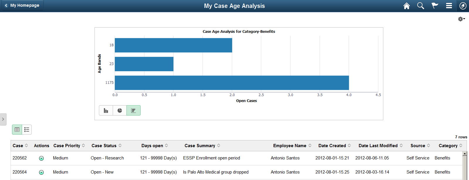
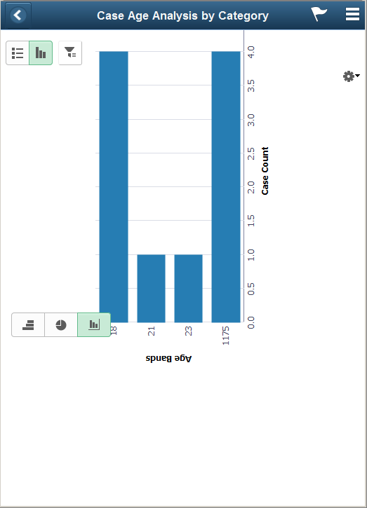
Use the Case Age Analysis by Category page (RC_PG_M_CASE_AG_LFL) to view case age distribution of Open and On Hold Cases for a particular category (as a default view) against age bands defined for that category. The view can be modified by using drill downs to display case counts by status, source etc within each age band.
Navigation:
Tap the Case Age Analysis by Category tile on the Manager Dashboard page.
This example illustrates the fields and controls on the Case Age Analysis by Category page using a tablet.
This example illustrates the fields and controls on the Case Age Analysis by Category page using a smartphone.
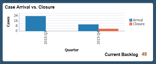
The Case Arrival vs. Closure tile (CR_RC_PG_M_ARR_CLSR_FL_GBL) displays live chart data for case arrivals and cases closed. It also displays the current backlog, i.e. the overall count of open cases across all provider groups for the manager at the moment.
Tap the Case Arrival vs. Closure tile to access the Case Arrival vs. Closure page.
Navigation:
Select Fluid Home under the main menu, the Case Arrival vs. Closure tile is available in the Manager Dashboard page.
This example illustrates the Case Arrival vs. Closure tile.
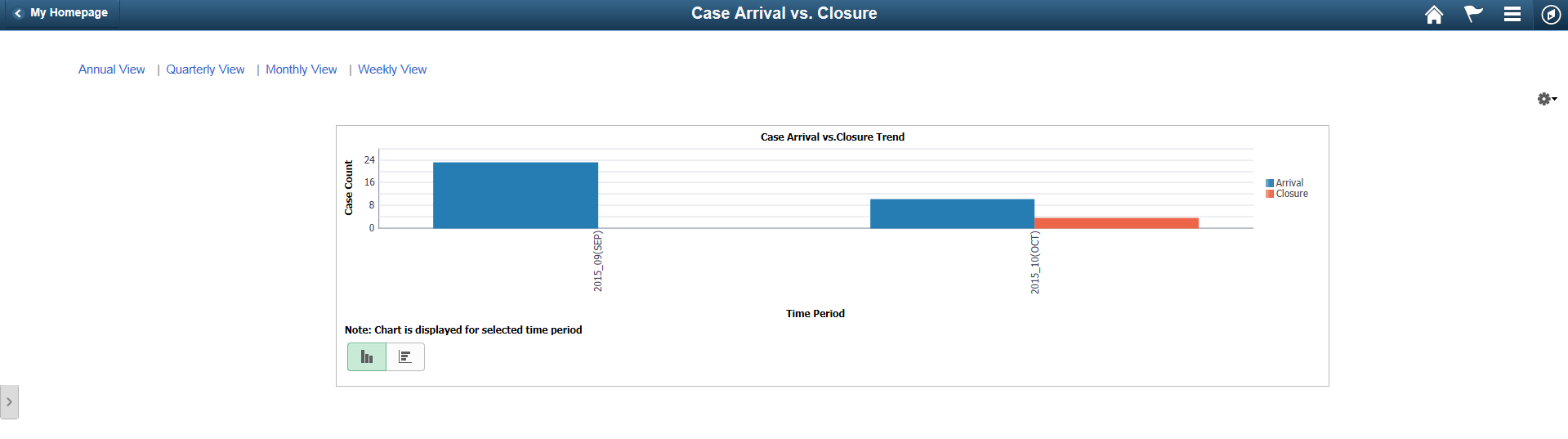
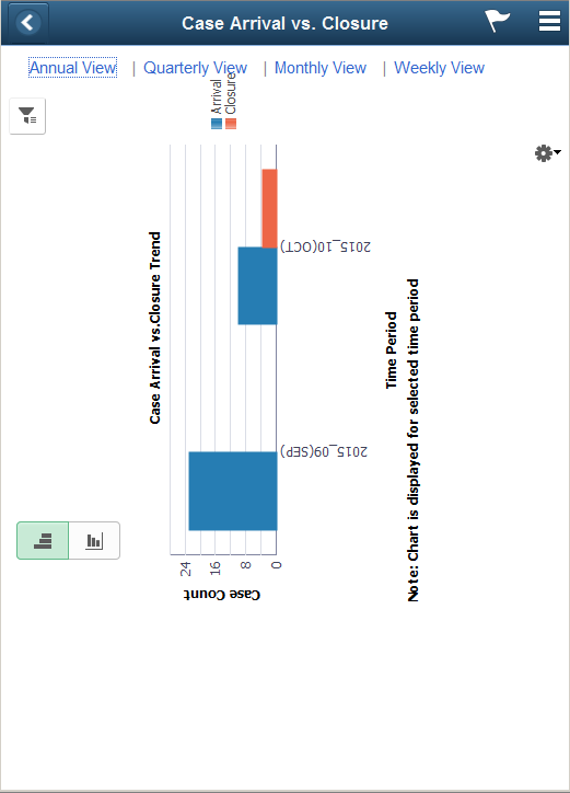
Use the Case Arrival vs. Closure page (RC_MGR_ARR_CLS_LFL) to view the volume of cases arrived vs. closed during a period of time (last 13 months to date is set as the default) for the team.
The Case Arrivals vs. Case Closure report assists the managers to analyze the spikes in call volume; drill to detail to understand the underlying cause of the case backlog, and make predictions regarding the volume of cases that will be closed in the future based on the current case closure trends.
Using this page the managers can also save the prompts for date range to view trend and view the trend by calendar year, quarter, month or week.
Navigation:
Tap the Case Arrival vs. Closure tile on the Manager Dashboard page.
This example illustrates the fields and controls on the Case Arrival vs. Closure page using a tablet.
This example illustrates the fields and controls on the Case Arrival vs. Closure page using a smartphone.
Using the Fluid HR Helpdesk - Agent Dashboard page, agents can access a set of analytics which helps to assess their individual backlog and respective SLA status.
Logging onto the HR Helpdesk - Agent Dashboard page, an agent can view the following tiles:
My Case Backlog tile
My Case Age Analysis tile
Case Arrival vs. Closure tile
|
Page Name |
Definition Name |
Usage |
|---|---|---|
|
CR_RC_PG_AGT_BLOG_FL_GBL |
Tap this tile to access the My Case Backlog page. |
|
|
RC_PG_AGT_BLOG_LFL |
To view an interactive pivot chart of the case backlog for an agent who has logged in. |
|
|
CR_RC_PG_A_CASE_AG_FL_GBL |
Tap this tile to access the My Case Age Analysis page. |
|
|
RC_PG_A_CASE_AG_LFL |
To view an interactive pivot chart for an agent’s open case backlog by category. |
|
|
CR_RC_PG_A_ARR_CLSR_FL_GBL |
Tap this tile to access the Case Arrival vs. Closure page. |
|
|
RC_AGNT_ARR_CLS_LFL |
To view the number of open cases and the cases closed by the agent from different sources, for a particular time period. The initial view provides a concise summary of the case arrivals versus closure trends for the agent. |
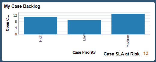
My Case Backlog tile (CR_RC_PG_AGT_BLOG_FL_GBL) displays live chart data for the agent’s case backlog along with the count of all open (Open and On Hold) cases for him that are in the red SLA status.
Tap the My Case Backlog tile to access the My Case Backlog page
Navigation:
Select Fluid Home under the main menu, the My Case Backlog tile is available in the Agent Dashboard page.
This example illustrates the My Case Backlog tile.
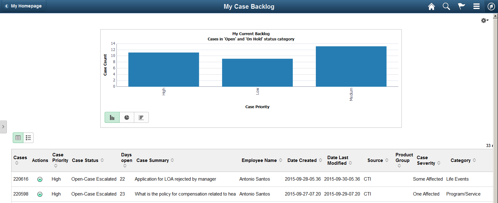
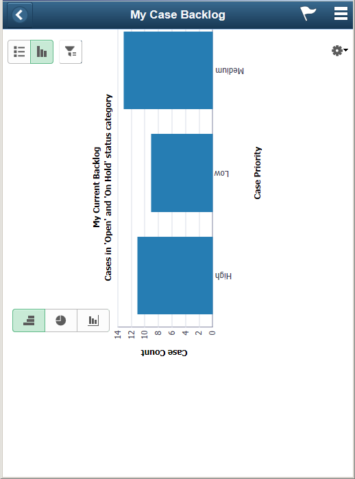
Use the My Case Backlog page (RC_PG_AGT_BLOG_LFL) to view an interactive pivot chart of the case backlog of the agent who has logged in. The breakdown of cases is presented by priority and SLA status in the default view. This enables the agent to prioritize and take action on the cases. The agent can also interact with the chart and modify the view by using various filters and drilldown options.
Navigation:
Tap the My Case Backlog tile on the Agent Dashboard page.
This example illustrates the fields and controls on the My Case Backlog page using a tablet.
This example illustrates the fields and controls on the My Case Backlog page using a smartphone.
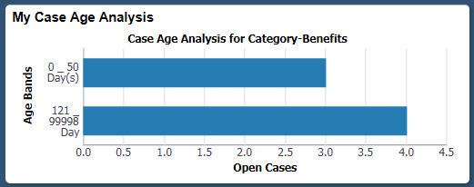
The My Case Age Analysis tile (CR_RC_PG_A_CASE_AG_FL_GBL) displays live chart data for an agent to analyze his case age. By default, the chart displays the case age distribution for cases in a particular category by age bands.
Tap the My Case Age Analysis tile to access the My Case Age Analysis page.
Navigation:
Select Fluid Home under the main menu, the My Case Age Analysis tile is available in the Agent Dashboard page.
This example illustrates the My Case Age Analysis tile.
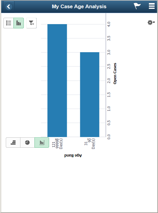
Use the My Case Age Analysis page (RC_PG_A_CASE_AG_LFL) to view an interactive pivot chart for an agent’s open case backlog by category and perform drilldown by case age to see the distribution for case age.
Navigation:
Tap the My Case Age Analysis tile on the Agent Dashboard page.
This example illustrates the fields and controls on the My Case Age Analysis page using a tablet.
This example illustrates the fields and controls on the My Case Age Analysis page using a smartphone.
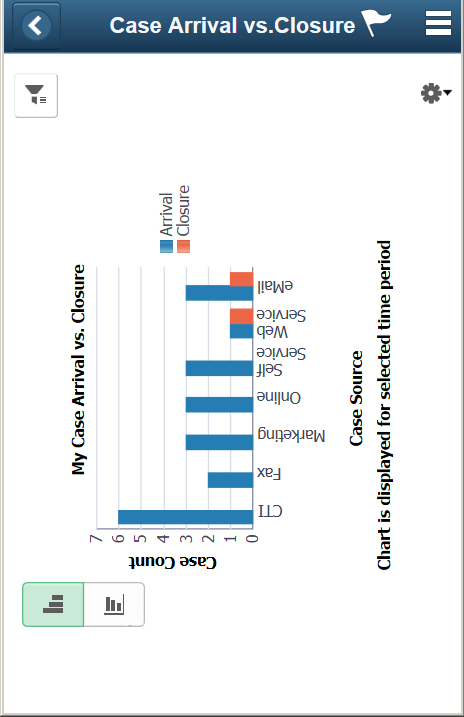
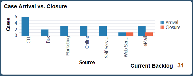
The Case Arrival vs. Closure tile (CR_RC_PG_A_ARR_CLSR_FL_GBL) displays the count of cases which had arrived and which were closed for the agent, based on the source. The tile also shows the overall count of open cases in the agent’s backlog at the moment when the chart is being viewed.
Tap the Case Arrival vs. Closure tile to access the My Case Arrival vs. Closure page.
Navigation:
Select Fluid Home under the main menu, the Case Arrival vs. Closure tile is available in the Agent Dashboard page.
This example illustrates the Case Arrival vs. Closure tile.
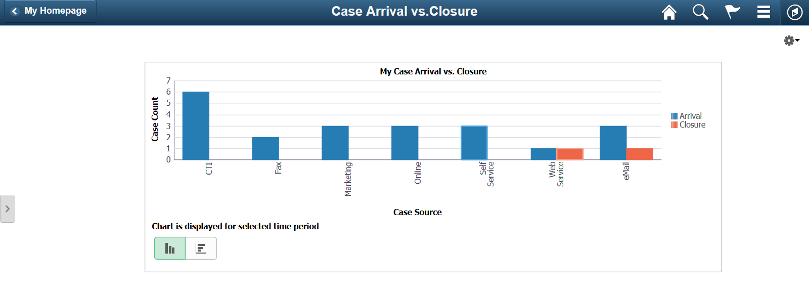
Use the My Case Arrival vs. Closure page (RC_AGNT_ARR_CLS_LFL) to view the number of open cases and the cases closed by the agent from different sources, for a particular time period. The initial view provides a concise summary of the case arrivals versus closure trends for the agent.
Navigation:
Tap the My Case Arrival vs. Closure tile on the Agent Dashboard page.
This example illustrates the fields and controls on the My Case Arrival vs. Closure page using a tablet.
This example illustrates the fields and controls on the My Case Arrival vs. Closure page using a smartphone.